Jump to content


Photo
* * * - - 4 votes

Lewis Hamiltons helmet.


  • This topic is locked This topic is locked
151 replies to this topic

Poll: What colour do you think he should use at Mercedes? (143 member(s) have cast votes)

Which colour?

  1. Yellow (90 votes [62.94%])

    Percentage of vote: 62.94%

  2. Pearl White (11 votes [7.69%])

    Percentage of vote: 7.69%

  3. Black (8 votes [5.59%])

    Percentage of vote: 5.59%

  4. Pink (33 votes [23.08%])

    Percentage of vote: 23.08%

  5. Other (please specify) (1 votes [0.70%])

    Percentage of vote: 0.70%

Vote

#51 MP422

MP422
  • Member

  • 2,157 posts
  • Joined: November 11

Posted 05 January 2013 - 16:26

What about button (He had to change to union flag to JB due to FIA rules :rolleyes: )
Posted Image


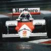
Looked a bit different in 2009.

Advertisement

#52 senna da silva

senna da silva
  • Member

  • 5,750 posts
  • Joined: March 03

Posted 05 January 2013 - 16:38

What about button (He had to change to union flag to JB due to FIA rules :rolleyes: )
Posted Image


OT: Still struggling for balance. Sorry couldn't resist.

Nice photoshop Daimon, just doesn't look as iconic as the yellow IMO.

#53 SpartanChas

SpartanChas
  • Member

  • 910 posts
  • Joined: February 11

Posted 05 January 2013 - 20:31

What about button (He had to change to union flag to JB due to FIA rules :rolleyes: )
Posted Image

How did DC get away with it so long?

#54 DutchQuicksilver

DutchQuicksilver
  • Member

  • 6,326 posts
  • Joined: June 11

Posted 05 January 2013 - 21:48

How did DC get away with it so long?

He didn't, because the FIA doens't ban this. Of course it's allowed to have your nation flag in your helmet. Sergio PĂ©rez had the Mexican flag on his helmet top last season for example.

#55 Group B

Group B
  • Member

  • 14,507 posts
  • Joined: March 02

Posted 05 January 2013 - 22:04

I hope he keeps the same basic design; whether or not I 'like' it I much prefer drivers to stick with the same fundamental design throughout their career rather than the new paint job every week approach.

#56 techspeed

techspeed
  • Member

  • 373 posts
  • Joined: April 09

Posted 05 January 2013 - 22:33

What about button (He had to change to union flag to JB due to FIA rules :rolleyes: )

Button changed to a union jack styled JB logo because that could be copyrighted while the union jack couldn't. If he had stuck with the union jack rival companies could have made unofficial identical helmets and there would be nothing JB could have done about it.

#57 Brandz07

Brandz07
  • Member

  • 3,500 posts
  • Joined: February 10

Posted 05 January 2013 - 22:37

Button changed to a union jack styled JB logo because that could be copyrighted while the union jack couldn't. If he had stuck with the union jack rival companies could have made unofficial identical helmets and there would be nothing JB could have done about it.


Seems possible, surely they wouldn't be able to copy any logos on the helmet that would be needed to make it look real though?

#58 jrg19

jrg19
  • Member

  • 6,118 posts
  • Joined: December 11

Posted 24 January 2013 - 15:29

Not long till we get first pictures, guess no Reebok logos as it looks like that has come to an end.

#59 showtime

showtime
  • Member

  • 3,032 posts
  • Joined: March 09

Posted 02 February 2013 - 00:29

http://instagram.com/p/VNUzHfL01S/

Lewis not changing colours

Edited by showtime, 02 February 2013 - 00:31.


Advertisement

#60 OO7

OO7
  • Member

  • 23,401 posts
  • Joined: November 04

Posted 02 February 2013 - 00:35
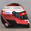
http://instagram.com/p/VNUzHfL01S/

Lewis not changing colours

Tell me that is a fake please!

#61 zack1994

zack1994
  • Member

  • 2,368 posts
  • Joined: July 10

Posted 02 February 2013 - 00:46

Tell me that is a fake please!

Its lewis's official instagram so its not fake.
The yellow looks like its stronger and the monster logo ruins it :|

#62 OO7

OO7
  • Member

  • 23,401 posts
  • Joined: November 04

Posted 02 February 2013 - 00:51

Its lewis's official instagram so its not fake.
The yellow looks like its stronger and the monster logo ruins it :|

zack, while I prefer the old design, in my opinion the quality of picture is not helping. There is a smaller image available which looks much better.

#63 DaiMOn

DaiMOn
  • Member

  • 264 posts
  • Joined: March 11

Posted 02 February 2013 - 00:51

Its lewis's official instagram so its not fake.
The yellow looks like its stronger and the monster logo ruins it :|


It's a bit oversaturated because of the Instagram filter, but it looks good IMHO.


#64 MP422

MP422
  • Member

  • 2,157 posts
  • Joined: November 11

Posted 02 February 2013 - 00:55

Looks hot.

#65 zack1994

zack1994
  • Member

  • 2,368 posts
  • Joined: July 10

Posted 02 February 2013 - 01:01

It's a bit oversaturated because of the Instagram filter, but it looks good IMHO.

Thats a good point, but without the monster logo i think it would look better than his old one tbh.

#66 tomboyracer

tomboyracer
  • Member

  • 119 posts
  • Joined: March 11

Posted 02 February 2013 - 01:02

:love: I love it!

#67 10e10

10e10
  • Member

  • 950 posts
  • Joined: July 12

Posted 02 February 2013 - 01:03

Preferred the old one. This looks a little more....complicated :drunk:

#68 laure

laure
  • New Member

  • 1 posts
  • Joined: January 13

Posted 02 February 2013 - 01:35

I like it, I'm glad he kept the yellow.

#69 chumma

chumma
  • Member

  • 1,346 posts
  • Joined: January 13

Posted 02 February 2013 - 01:37

Posted Image

Edited by chumma, 02 February 2013 - 01:38.


#70 chumma

chumma
  • Member

  • 1,346 posts
  • Joined: January 13

Posted 02 February 2013 - 01:38

He sticks with the Arai just as I said he would. Good on you Lewis, the yellow is very...yellow.

#71 Deluxx

Deluxx
  • Member

  • 2,324 posts
  • Joined: June 12

Posted 02 February 2013 - 01:43

another pic.

idk i dont get it lol

Posted Image

Edited by Deluxx, 02 February 2013 - 01:44.


#72 Boxerevo

Boxerevo
  • Member

  • 3,617 posts
  • Joined: December 10

Posted 02 February 2013 - 02:03

Wicked.

And the back of the helmet ?

#73 OO7

OO7
  • Member

  • 23,401 posts
  • Joined: November 04

Posted 02 February 2013 - 02:12

another pic.

idk i dont get it lol

Posted Image

Cheers Deluxx :up:
That definitely looks much better than the first image and my original impression. I still prefer the older design however, this one just seems too fussy, with too much of the yellow removed and altered. I just noticed that the symbol on the red side is LH, his initials, that's not a good sign or perhaps I'm just slow.

#74 TecnoRacing

TecnoRacing
  • Member

  • 1,796 posts
  • Joined: September 01

Posted 02 February 2013 - 02:14

Bit too much of a mish-mash with the shading, etc...
Loses a bit of visual impact (especially from a distance) but at least it is still mainly yellow. :yawnface:

I like the new(?) 'LH' logo....bit like a gear-shift pattern

#75 jrg19

jrg19
  • Member

  • 6,118 posts
  • Joined: December 11

Posted 02 February 2013 - 03:12

H.A.M

#76 jrg19

jrg19
  • Member

  • 6,118 posts
  • Joined: December 11

Posted 02 February 2013 - 03:17

Unreal how good this is.

#77 OO7

OO7
  • Member

  • 23,401 posts
  • Joined: November 04

Posted 02 February 2013 - 03:21

Unreal how good this is.

Do you prefer it to the old style?

#78 choyothe

choyothe
  • Member

  • 2,312 posts
  • Joined: March 12

Posted 02 February 2013 - 03:41

Much uglier than his old helmet. Is the yellow stronger or am I imagining it?

#79 TF110

TF110
  • Member

  • 3,068 posts
  • Joined: February 11

Posted 02 February 2013 - 03:50

I think the blue doesn't flow. I would have stuck with just red at the bottom.

Advertisement

#80 SirT

SirT
  • Member

  • 722 posts
  • Joined: September 12

Posted 02 February 2013 - 03:52

hmmm.... Not sure about that but I'm glad he's stuck with yellow.

Any pics of the back?

#81 Kvothe

Kvothe
  • Member

  • 7,462 posts
  • Joined: November 10

Posted 02 February 2013 - 05:18

Waiting until the release of some higher quality pics before coming to a conclusive opinion, but preliminary it looks fine, and for those who think the yellow is stronger, if true this might be our first clue that Nico's also keeping his helmet yellow, with Lewis attempting to establish greater differentiation between his and Nico's.

(P.S. yes T cam bar)

#82 Bruce

Bruce
  • Member

  • 8,357 posts
  • Joined: December 98

Posted 02 February 2013 - 06:16

A bit off-topic - but I wish that Drivers would simplify their helmets.

Never been a huge fan if Hamiltons because I feel it's too much of an unacknowledged rip off of Senna;s helmet (that is my opinion - and it's not really worth an argument) - but I will say this- you COULD see him in a Grand Prix.

Damon Hill had a great helmet - taken off his Dad's (the London rowing club - navy blue with white vertical stripes.

Problem with new helmets is you can't describe them. I'm an Alonso fan - let's take his.... well - it's yellow with red and blue - or is that blue with red and yellow? The "perspective (from side - upward "swish")is reasonably consistent, but i challenge you to separate the helmet from the race...

Here's my point.

Lovely helmet, eh? :

http://www.f1fanatic...ndia-f12011-14/

Now let's try to imagine that you are trying to identify a driver from 200 metres at 250 km/h - wouldn't it be more obvious if his helmet looked like this?

http://twicsy.com/i/AaraLb (Helmet at right).

Well?

Simplicity.

If Lewis picked a plain black helemet, he'dstick out like a sore thumb - which would be a good thing.

Where do I think F1 will go?

http://www.visordown...llery/6656.html

Tell me about the details of this from 1000 metres...

#83 AyrtonSauna

AyrtonSauna
  • Member

  • 469 posts
  • Joined: November 10

Posted 02 February 2013 - 07:56

I voted Black because;

*Lewis has set himself up to be the DARK HORSE in 2013 deservedly with he's brave move to Merc.The Colour fits in a positive way even more so than Enstone using it
*Lewis will have more individuality instead of trying to associate himself with Senna and the yellow helmet.
*Lewis is proud to be black so why not have a black helmet.Awesome colour really.I'm loving the Black parts of the new Ferrari just incase you think I'm predudiced against the colour black!


#84 OO7

OO7
  • Member

  • 23,401 posts
  • Joined: November 04

Posted 02 February 2013 - 08:07

I'm loving the Black parts of the new Ferrari just incase you think I'm predudiced against the colour black!

:lol:

#85 pinkypants

pinkypants
  • Member

  • 1,510 posts
  • Joined: September 09

Posted 02 February 2013 - 09:57

https://www.facebook...2...e=1

#86 jrg19

jrg19
  • Member

  • 6,118 posts
  • Joined: December 11

Posted 02 February 2013 - 10:52

Do you prefer it to the old style?


I think I prefer the older style, my drunken state blurred my vision last night!

It will look good in the Mercedes car though.

#87 Watkins74

Watkins74
  • Member

  • 6,090 posts
  • Joined: February 10

Posted 02 February 2013 - 11:19

This helmet is a mess. Nothing to get excited about.

#88 SunnyENTP

SunnyENTP
  • Member

  • 717 posts
  • Joined: August 12

Posted 02 February 2013 - 11:22

This helmet is a mess. Nothing to get excited about.


I agree, it sort of reminds me of the car your profile

#89 jrg19

jrg19
  • Member

  • 6,118 posts
  • Joined: December 11

Posted 02 February 2013 - 11:23

Posted Image

#90 dhill39

dhill39
  • Member

  • 426 posts
  • Joined: November 09

Posted 02 February 2013 - 11:54

Maybe it will grow on me,but the colors are a little too much,it's like Paul Di resta helmet,the colors are all over the place,hopefully he changes it after the negative feedback.

#91 Fonzey

Fonzey
  • Member

  • 655 posts
  • Joined: January 12

Posted 02 February 2013 - 12:03

I'm hating Instagram more and more every day.

The proper photo's of this helmet look much nicer.

#92 DutchQuicksilver

DutchQuicksilver
  • Member

  • 6,326 posts
  • Joined: June 11

Posted 02 February 2013 - 12:12

Posted Image

He needs to drop the blue, that would make it a whole lot better.

#93 jrg19

jrg19
  • Member

  • 6,118 posts
  • Joined: December 11

Posted 02 February 2013 - 12:14

For me the red area should have stayed as one.

#94 10e10

10e10
  • Member

  • 950 posts
  • Joined: July 12

Posted 02 February 2013 - 12:18

For me the red area should have stayed as one.


I will add that I preferred the older red tone.

#95 OO7

OO7
  • Member

  • 23,401 posts
  • Joined: November 04

Posted 02 February 2013 - 12:30

Posted Image

That shot looks so much better I like it, cheers jrg19 :up:

#96 D.M.N.

D.M.N.
  • RC Forum Host

  • 7,491 posts
  • Joined: May 08

Posted 02 February 2013 - 12:30

Posts removed - if you don't want to discuss the topic, don't post. The more you post, the more the thread will stay high up on page 1, so you're really doing it no good at all.

#97 OO7

OO7
  • Member

  • 23,401 posts
  • Joined: November 04

Posted 02 February 2013 - 12:33

For me the red area should have stayed as one.

I agree and the blue at the front and wide green pattern is overkill, but overall I like it, older design was better however.

#98 Mc_Silver

Mc_Silver
  • Member

  • 5,360 posts
  • Joined: May 09

Posted 02 February 2013 - 13:31

Posted Image

Lewis please use this helmet bro :drunk:

#99 P123

P123
  • Member

  • 23,936 posts
  • Joined: February 09

Posted 02 February 2013 - 14:02

Like all the drivers (with the possible exception of JB's) it's a bit of a mess, just recognisable as his lid. The Monster logo doesn't do it any favours either.

Advertisement

#100 bub

bub
  • Member

  • 2,722 posts
  • Joined: July 11

Posted 02 February 2013 - 14:05

Very similar to the old one but not as nice imo. He's had much nicer helmets.

Edited by bub, 02 February 2013 - 15:12.