'Modern day Formula 1 has been year after year made to look uglier by regulations. This I believe is not a matter of opinion but a fact'
'Would love to hear an intelligent discussion on this subject'
Great opening post, but one fundamental flaw.
Beauty is in the eye of the beholder, and very much relevant only to the context and time and at which it sits.
This is a can of worms debate, but F1 design right now is based on a massive set of rules. More rules than there ever were. The argument you imply is indeed that the RULES and RESTRICTIONS are making F1 ugly as opposed to F1 wanting to look the way it does. You can't say to someone 'screw your face up as small as possible, and then call them ugly. F1 is what it is because of these rules and restrictions.
There have always been these constraints, but in the earlier days the constraints were more to do with not physically being able to do what you wanted. Ie, metal not being able to be lighter or curve to the shapes desired etc. The boundaries were almost endless, and capped only by what man could achieve at that time. Possibilities were infinite because this was all about the pinnacle of motorsport and being one thing: fast.
Today, you could argue the intention of F1 has changed. The goalposts have moved. It isn't just about being fast. You need to be safe. Reliable. Cheaper. Greener. Packed in a box this big, and weighing this much. And so on.
This is what has changed F1.
But just going back to what you mentioned: Mk1 Golf wheels. These were designed FOR a MK1 Golf. Of course they would be out of proportion to something today, because the needs and reasons that car was designed that way was suited to physics, regulations, and rules set at that time for that specific thing. The same way Model Ford T wheels look wrong on a Porsche GT3; or Fokker Tri Wings on a Boeing 747.That's why all cars have different wheel sizes and proportions, and there is not a singular scientific rulebook saying Car X needs Y tyres. Full stop.
Design as we know it doesn't work that way - things aren't made in their purest form to be as efficient and effective because they can't. There are ALWAYS factors that govern how something is made now. Nothing is really free-for-all. And today the most common is health and safety. Fuel tanks must be XXX long; glass no higher than YYY or wheelbase no wider than ZZZ. All confinements to a rulebook and tight little box. Not just F1, but everything even down to your toothbrush.
To say design is now 'ugly' is a bit wrong. It is questionable. For every design that 'looks just right' there are a thousand marginal variations that could look 'slightly off'; but could equally on their own could well be 'perfect' to someone else. That's why houses are different. Why we wear out hair differently. Dress differently. And not just now, but each of those mentioned has itself changed specification over time. It's evolution.
In the 1600s, fat girls were all the rage. Now, you need to be a size 6 to be considered tasty in the media. Again, beauty is in the eye of the beholder. But all instances are governed by the constraints in which said 'thing' comes from. C16 women were fat to express wealth. Now, you're skinny because you exercise, workout and have million dollar surgery.
I am an architect, and I do a lot of design work in restoring and renovating classic buildings that were penned purely with the golden section in mind in absolute in-your-face forms. And that does indeed work...for these classic buildings.
HOWEVER
Apply the golden section to some of these modern organic structures, and the golden section just doesn't work. Does this make it bad design, or simply mean that the times have changed and that the golden section is no longer relevant? The golden section was an idea, a highly illustrative concept taken from the study of proportions found in the natural world. Of which a LOT of intentional design now stems from.
But not everything we know comes from the golden section. So do we cast everything not of this as bad? I think not.
Why do people put 10" wheels on a classic mini, but also have 13" on the same model? The chassis and engine, unlike the golf or indeed forumla 1, remained relatively the same over 40 years. The reason for wheel variation? 10's were commonly used for racing, but later cars of the same chassis adopted 12's and 13's from the factory. Yet some people go back and put 10's on a later mini; and some others put 13's on older minis. Yet they are the same chassis proportion. Aesthetics are merely a personal input in this example.
When cars were first designed, form FOLLOWED function. The idea to drive was the main aim. When that was achieved, form was introduced. That's why you get various coach building forms on early cars, all with the same identical chassis. You get a scientifically purposed chassis that does its job, and you design a form to finish it. Numerous options revolving around a singular principal (watch last weeks Top Gear for reference).
I don't know where I am going with this, but there may be a time when we look back at what we see now and it IS considered beautiful.
The world we live in is ever changing to fit our needs. If it wasn't meant to change, and we knew of set 'ideal' of everything, then things would stay the same. We would live in a constant, with no evolution or change.
Everything changes. And sometimes, we agree with it. Other times, we don't.
Just look at fashion.


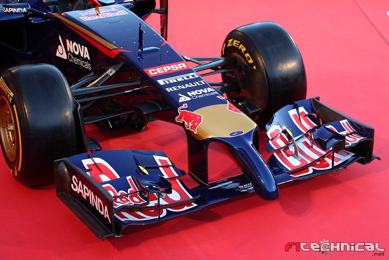


 ). Only the mains shape, of course -from tip of the nose till end of engine cover. Sidepods, wings etc. can be shaped as the designer wishes to, but the main shape is regulated simply by a template.


 I'm sure


