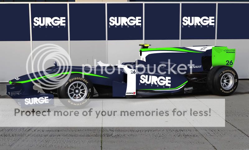
Cool picturesI like the first one more. It has a very clean, professional look to the design. The alpinestars logo on the shark fin seems to fit very well, and I like the swooping green lines on the nose.
The second does look more energy drink like. The white towards the tail looks like the fizzy foam of a carbonated drink. The livery in general reminds me of Ken Block's 08+ STI hatch.
Also, Koni dampers are great. Love em.
Photoshopped!
#651
Posted 24 January 2011 - 23:42
#653
Posted 01 February 2011 - 21:11
#654
Posted 01 February 2011 - 21:14
#655
Posted 01 February 2011 - 21:14
#656
Posted 01 February 2011 - 21:19
#658
Posted 01 February 2011 - 23:10
Ha, with the rate Fernando gets the metaphorical "Blue Shell" when he needs it, I suppose that's not really too far off.
Plus, the Mercedes W02 Platypus is just hilarious.
#659
Posted 02 February 2011 - 02:20
At least the car is not a "turkey"
Advertisement
#660
Posted 02 February 2011 - 02:52
Im actually still laughing my ass off... HILARIOUS!!!! HAHAHAHAAHAHA
#661
Posted 02 February 2011 - 06:06
#662
Posted 02 February 2011 - 16:58
#664
Posted 02 February 2011 - 18:48
You know, for as long as I've been following F1, I've yet to see an official livery for the real life car that wasn't made to look crap by someone with Photoshop. That is a tremendously pretty livery and loads better than we could ever hope to get from McLaren, but the same thing applies to every team these days. The real thing is never as pretty as what could've been.
That's an awful livery. It fails both aesthetically and for sponsorship.
#665
Posted 02 February 2011 - 18:52
im not sure if this should be in this thread but its photoshop so....
for my A level product design course i needed to design an energy drink can and display, which led to me basically designing the whole brand identity. from that i decided that the drink's associated with sport and automatically decided to create an f1 team that would compete in the way red bull have. i've got two designs and i just need a few opinions on which is better, thanks.
Is your can going to be 95% blue with some green and white accents? I'd drop the white on the bargeboards because they pull too much of your focus away from the Surge logo on the sidepod. And I feel like the Surge logo itself needs to 'pop' out more. Like there needs to be something in the space on the R where the cutout would be. Either a logo of some kind or a different color for the cut out. But the Surge logo itself somehow feels less than 3D. Otherwise I like your lines and I like your colors. They clash nicely without being overbearing, and you managed to avoid looking like a Telefonica Movistar ripoff.
#666
Posted 04 February 2011 - 09:11
#667
Posted 04 February 2011 - 12:09
#668
Posted 04 February 2011 - 13:21
You have been Punk'd.
MS: Where did they found such big platypus?
NR: And how the hell they expect us win with this thing? It has no wheels!!!!!!
Edited by ivand911, 04 February 2011 - 13:55.
#669
Posted 04 February 2011 - 16:43
Is your can going to be 95% blue with some green and white accents? I'd drop the white on the bargeboards because they pull too much of your focus away from the Surge logo on the sidepod. And I feel like the Surge logo itself needs to 'pop' out more. Like there needs to be something in the space on the R where the cutout would be. Either a logo of some kind or a different color for the cut out. But the Surge logo itself somehow feels less than 3D. Otherwise I like your lines and I like your colors. They clash nicely without being overbearing, and you managed to avoid looking like a Telefonica Movistar ripoff.
thanks for the advice, already made some changes, but making some more soon with your comments in mind
thanks again
#670
Posted 04 February 2011 - 17:28
I wonder what Norbert thinks about this one!!!
You made me cry with that pic!!! My belly still hurts!!! Winner of this thread!
#671
Posted 04 February 2011 - 17:39
#672
Posted 04 February 2011 - 17:49
#673
Posted 04 February 2011 - 17:53
I'm still laughing at it--definitely the best photoshop in the thread thus far.I wonder what Norbert thinks about this one!!!
You made me cry with that pic!!! My belly still hurts!!! Winner of this thread!
I think it's the smiles on the drivers' faces that makes it so darn funny. Michael's face practically says, "Ross, what the #$!@% is this?"
April Fools' Day has come early at Mercedes GP in 2011.
#674
Posted 04 February 2011 - 23:10
Well there are a few guys that have christened the new McLaren the "Silver Moose"...Yes, let's try to form an entire zoo from the 2011 grid.
#675
Posted 05 February 2011 - 21:11
#676
Posted 06 February 2011 - 00:49
"Guys, seriously ..."
#677
Posted 06 February 2011 - 02:12
fkin genius
Schumi
#678
Posted 06 February 2011 - 08:18
Can somebody put flow viz on it? Or it will be to much for animal protectors?
Edited by ivand911, 06 February 2011 - 08:20.
#679
Posted 06 February 2011 - 08:31
#681
Posted 08 February 2011 - 14:33
Edited by MadYarpen, 08 February 2011 - 14:34.
#682
Posted 08 February 2011 - 19:35
107% rule notwithstanding.
#683
Posted 09 February 2011 - 02:44
or a sign of things to come (more like it)
#684
Posted 09 February 2011 - 05:42
haha yeah I just managed to see it before it was removed. was maybe the worst shop I've seen on here in every way possible
Something offensive about Kubica's deleted photoshop author
#685
Posted 11 February 2011 - 21:13
#686
Posted 12 February 2011 - 07:37
Btw it is original drawing not photoshopped photo. Find some more here: http://www.f1db.ru/q1840From caveman- pf1forum
Edited by Sladex, 12 February 2011 - 07:52.
#687
Posted 12 February 2011 - 07:54
#688
Posted 12 February 2011 - 08:39
Schumacher's expression..
#689
Posted 12 February 2011 - 08:41
Is this really photoshop? Looks real..
LdM: PR Department? Disastro! They found the original! It'sa allova da autorsport forrums!
PR: Stay cool, Luca baby. They think this one is photoshopped.
..and believable.
#690
Posted 21 February 2011 - 21:15
Not sure on the source
#691
Posted 21 February 2011 - 22:12
#692
Posted 21 February 2011 - 23:06
Not sure on the source
Whoever did it, it is a nice work, but wrong:
1. It 's not fair. None of these teams wanted to go and finally will not fly to Bahrein.
2. Mercedes is in the first row.
Edited by weston, 21 February 2011 - 23:12.
#693
Posted 21 February 2011 - 23:11
My God !! the front brakes on the Lotus are powerful !!From caveman- pf1forum
#694
Posted 22 February 2011 - 00:00
On #2: I've never met a German tank I didn't like.Whoever did it, it is a nice work, but wrong:
1. It 's not fair. None of these teams wanted to go and finally will not fly to Bahrein.
2. Mercedes is in the first row.
#695
Posted 22 February 2011 - 01:38
Red Bull to Ferrari: "I'll show you a REAL blown diffuser." *KBLAM*
#696
Posted 22 February 2011 - 01:40
Well, it is only testing.Whoever did it, it is a nice work, but wrong:
1. It 's not fair. None of these teams wanted to go and finally will not fly to Bahrein.
2. Mercedes is in the first row.
#697
Posted 22 February 2011 - 08:52
Awesome!
#698
Posted 22 February 2011 - 11:26
Btw it is original drawing not photoshopped photo. Find some more here: http://www.f1db.ru/q1840
They are really cute I think he scale and shear the cars, or something like that...
#699
Posted 22 February 2011 - 16:13
That should be Markko