Jump to content


Photo

2011 Best/Worst Liveries


  • Please log in to reply
61 replies to this topic

Poll: 2011 Best/Worst Liveries (341 member(s) have cast votes)

2011 Best Livery

  1. Red Bull (24 votes [7.04%])

    Percentage of vote: 7.04%

  2. Mclaren (40 votes [11.73%])

    Percentage of vote: 11.73%

  3. Ferrari (29 votes [8.50%])

    Percentage of vote: 8.50%

  4. Mercedes (68 votes [19.94%])

    Percentage of vote: 19.94%

  5. Renault (58 votes [17.01%])

    Percentage of vote: 17.01%

  6. Williams (38 votes [11.14%])

    Percentage of vote: 11.14%

  7. Force India (4 votes [1.17%])

    Percentage of vote: 1.17%

  8. Sauber (6 votes [1.76%])

    Percentage of vote: 1.76%

  9. Toro Rosso (6 votes [1.76%])

    Percentage of vote: 1.76%

  10. Lotus (36 votes [10.56%])

    Percentage of vote: 10.56%

  11. Hispania (26 votes [7.62%])

    Percentage of vote: 7.62%

  12. Virgin (6 votes [1.76%])

    Percentage of vote: 1.76%

2011 Worst Livery

  1. Red Bull (17 votes [4.99%])

    Percentage of vote: 4.99%

  2. Mclaren (11 votes [3.23%])

    Percentage of vote: 3.23%

  3. Ferrari (11 votes [3.23%])

    Percentage of vote: 3.23%

  4. Mercedes (14 votes [4.11%])

    Percentage of vote: 4.11%

  5. Renault (47 votes [13.78%])

    Percentage of vote: 13.78%

  6. Williams (14 votes [4.11%])

    Percentage of vote: 4.11%

  7. Force India (37 votes [10.85%])

    Percentage of vote: 10.85%

  8. Sauber (112 votes [32.84%])

    Percentage of vote: 32.84%

  9. Toro Rosso (25 votes [7.33%])

    Percentage of vote: 7.33%

  10. Lotus (9 votes [2.64%])

    Percentage of vote: 2.64%

  11. Hispania (26 votes [7.62%])

    Percentage of vote: 7.62%

  12. Virgin (18 votes [5.28%])

    Percentage of vote: 5.28%

2011 Most Improved Livery from 2010

  1. Red Bull (2 votes [0.59%])

    Percentage of vote: 0.59%

  2. Mclaren (1 votes [0.29%])

    Percentage of vote: 0.29%

  3. Ferrari (6 votes [1.76%])

    Percentage of vote: 1.76%

  4. Mercedes (79 votes [23.17%])

    Percentage of vote: 23.17%

  5. Renault (50 votes [14.66%])

    Percentage of vote: 14.66%

  6. Williams (42 votes [12.32%])

    Percentage of vote: 12.32%

  7. Force India (8 votes [2.35%])

    Percentage of vote: 2.35%

  8. Sauber (8 votes [2.35%])

    Percentage of vote: 2.35%

  9. Toro Rosso (2 votes [0.59%])

    Percentage of vote: 0.59%

  10. Lotus (13 votes [3.81%])

    Percentage of vote: 3.81%

  11. Hispania (125 votes [36.66%])

    Percentage of vote: 36.66%

  12. Virgin (5 votes [1.47%])

    Percentage of vote: 1.47%

Vote Guests cannot vote

#1 Nustang70

Nustang70
  • Member

  • 2,439 posts
  • Joined: July 01

Posted 24 February 2011 - 15:55

Time for this year's livery poll. I've added a poll for "Most Improved" since there were some really ugly liveries out there last year.

In case anyone is interested: 2010 Poll Results; 2009 Poll Results


2011 Entries:
Red Bull
Mclaren
Ferrari
Mercedes
Renault
Williams
Force India
Sauber
Toro Rosso
Lotus
Hispania
Virgin

Edited by Nustang70, 24 February 2011 - 16:26.


Advertisement

#2 Dolph

Dolph
  • Member

  • 12,186 posts
  • Joined: March 01

Posted 24 February 2011 - 16:05

Voted McLaren as best as the chrome rocks.

Toro Rosso as worst. The idea of the bull is good on paper but its just a mess on a car doing 200 km/h. Sauber was close second. MAking the car look bland is not the best idea in my opinion.

Lotus Renault as the most improved. The colors look good so far. Probably not as good on TV. But last year's livery was like pornography in my mind - and not in a good way.


#3 Andrew Hope

Andrew Hope
  • Member

  • 7,911 posts
  • Joined: October 09

Posted 24 February 2011 - 16:12

Best - Mercedes. Silver and teal is nice.
Worst - Sauber. Not really a livery.

..and as a general rule, retro liveries suck ass.

#4 senna da silva

senna da silva
  • Member

  • 5,750 posts
  • Joined: March 03

Posted 24 February 2011 - 16:18

McLaren
Sauber
Renault

#5 MrMonaco

MrMonaco
  • Member

  • 604 posts
  • Joined: May 10

Posted 24 February 2011 - 16:19

How can people vote Mercedes for most improved livery if it's the same as last year? It's the chassis that changed not livery.

#6 Nustang70

Nustang70
  • Member

  • 2,439 posts
  • Joined: July 01

Posted 24 February 2011 - 16:21

Best: Lotus. Honorable Mention: Mercedes
Worst: Sauber. Close second: Toro Rosso
Most Improved: Mercedes. Honorable Mention: Williams

Other thoughts: I miss Virgin's tattoos and Renault's yellow and black from last year. I can't decide if I like Force India's better this year or not.

#7 Nustang70

Nustang70
  • Member

  • 2,439 posts
  • Joined: July 01

Posted 24 February 2011 - 16:25

How can people vote Mercedes for most improved livery if it's the same as last year? It's the chassis that changed not livery.


They removed a lot of black from the front and added and integrated the teal better. To me, they are fairly subtle changes that made a world of difference. I found last year's livery awful, and this year's to be one of the best.

#8 Pingu Pi

Pingu Pi
  • Member

  • 3,065 posts
  • Joined: July 09

Posted 24 February 2011 - 16:31

They removed a lot of black from the front and added and integrated the teal better. To me, they are fairly subtle changes that made a world of difference. I found last year's livery awful, and this year's to be one of the best.


Yup, also the Silver is a different tone.

Subtle adjustments but in all honesty apart from the McLaren I think the Mercedes car looks the 2nd best livery wise. First time i saw the live images I was like whoa, even if its slow, its a nice car to look at. Where as last year I thought it was a hideous livery, looked like a rushed job.

#9 Owen

Owen
  • Member

  • 13,178 posts
  • Joined: September 06

Posted 24 February 2011 - 16:44

I think we can safely say the Sauber livery sucks @ss. :lol:
Sorry.

#10 August

August
  • Member

  • 3,277 posts
  • Joined: March 10

Posted 24 February 2011 - 16:45

Best: Macca. It's so stylish. The red is much better integrated than in LRGP's livery.
Worst: Force India. I preferred the smoother design they used to have.
Most improved: HRT. They had the worst livery last year, now the have one of the coolest. 'twas a close call between Macca'n'HRT.

#11 Fastcake

Fastcake
  • Member

  • 12,554 posts
  • Joined: April 10

Posted 24 February 2011 - 16:46

There's a few I do like, McLaren being the top. Mercedes I didn't care for at first, but seeing some pictures of it out in the sun the livery is great, second best for me. Lotus also looks quite good, it's a good thing they kept the green and yellow.


After that, Sauber is just dull, they really need a good paint job.

#12 ed24f1

ed24f1
  • Member

  • 1,201 posts
  • Joined: November 10

Posted 24 February 2011 - 16:47

In general, this year's liveries aren't that great. The best two liveries from last year (Renault and Lotus) have gone backwards this year, in my opinion.

The best this year is surprisingly the Red Bull, for me. I think that without the shark fin it looks really good. Sauber's the worst (a massive missed opportunity), and Mercedes are the most improved - probably because they're one of the few teams to actually improve

#13 Massa

Massa
  • Member

  • 10,114 posts
  • Joined: February 10

Posted 24 February 2011 - 16:54

Best : Ferrari
Worst : Sauber
Most Improved : Mercedes and HRT

#14 Szoelloe

Szoelloe
  • Member

  • 7,054 posts
  • Joined: December 06

Posted 24 February 2011 - 16:56

Best livery Mercedes, Renault for a very strong second, I like the Williams too
Worst livery Sauber, it's a mess.
Most improved HRT by far, Williams has improved a lot, and Mercedes is much better.

Edited by Szoelloe, 24 February 2011 - 17:02.


#15 Lord_Shaitan

Lord_Shaitan
  • Member

  • 1,181 posts
  • Joined: October 09

Posted 24 February 2011 - 17:03

Best livery Renault

Worst Sauber (by far)

Most improved HRT

#16 showtime

showtime
  • Member

  • 3,032 posts
  • Joined: March 09

Posted 24 February 2011 - 17:04

Best: Lotus
Worst: Renault (Red bits spoiled it)
Most improved: Mercedes (Not a big change but not a lot of improvements on the grid either)

#17 Gareth

Gareth
  • RC Forum Host

  • 27,600 posts
  • Joined: March 01

Posted 24 February 2011 - 17:12

Best: Ferrari. But a tough call. I like the McLaren, Red Bull, Mercedes, Torro Rosso, Williams, Lotus and HRT ones too. A lot of good liveries this year, IMO.

Worst: Force India. Yes, Sauber's is very dull. But FI's is awful IMO.

Most improved: HRT. Gone from awful to excellent, IMO.

#18 Mekola

Mekola
  • Member

  • 2,647 posts
  • Joined: November 03

Posted 24 February 2011 - 17:46

Best: HRT
Worst: Sauber
Most improved: HRT

#19 onewingedangel

onewingedangel
  • Member

  • 1,597 posts
  • Joined: January 11

Posted 24 February 2011 - 17:54

Best: Mercedes - just looks right

Worst: HRT - like a naff version of the old BAR concept

Most improved: Mercedes - Everyone else has either remained static, or gone backwards (Renault, Lotus, Virgin, Sauber)


Still wish Toro Rosso livery would look a little more different than Red Bull as well.

Advertisement

#20 Lights

Lights
  • Member

  • 17,877 posts
  • Joined: February 10

Posted 24 February 2011 - 17:58

The Mercedes looks best to me, I like how they used the cyan.

Worst is a tossup between Sauber and Torro Rosso. Both very uninspired and boring. I'll vote for Torro Rosso as it's simply tiring to see the exact same livery year after year.

Most improved: HRT. Not difficult to improve from crap.

Edited by Lights, 24 February 2011 - 17:59.


#21 Ise

Ise
  • Member

  • 218 posts
  • Joined: February 11

Posted 24 February 2011 - 18:00

I don't like any of the liveries out there this year. Apart from Williams which would be impossible to judge in test trim, theres nothing Im really interested in. Nothing sexy or unusual. Its a sea of bland out there but for the worst job, Force India win my vote. Now reminds me of Toyota, only with a worse colour combo and the chubby nose doesn't help matters when viewing from the front.

#22 Nustang70

Nustang70
  • Member

  • 2,439 posts
  • Joined: July 01

Posted 24 February 2011 - 18:06

I don't like any of the liveries out there this year. Apart from Williams which would be impossible to judge in test trim, theres nothing Im really interested in. Nothing sexy or unusual. Its a sea of bland out there but for the worst job, Force India win my vote. Now reminds me of Toyota, only with a worse colour combo and the chubby nose doesn't help matters when viewing from the front.


Williams unveils its difinitive 2011 livery

#23 August

August
  • Member

  • 3,277 posts
  • Joined: March 10

Posted 24 February 2011 - 18:18

IMO Sauber isn't that bad. Last year it looked dull as there were no sponsors but now sponsor logos bring colour. If there were no sposor logos, Ferrari would look even duller than Sauber.

#24 Ise

Ise
  • Member

  • 218 posts
  • Joined: February 11

Posted 24 February 2011 - 18:21

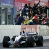
Williams's livery resembles that used by the team back in the 1990s, when it was sponsored by Rothmans.


At the back it does a bit, but thats only if you squint really hard. As for the rest of the car, its okay, a bit meh and Im personally not a fan of the stripey rear, but nothing a bottle of bleach would be required for.

#25 Bunchies

Bunchies
  • Member

  • 1,501 posts
  • Joined: December 09

Posted 24 February 2011 - 18:42

Sauber: Favorite driver, ugliest car.

#26 Ragingjamaican

Ragingjamaican
  • Member

  • 1,001 posts
  • Joined: September 10

Posted 24 February 2011 - 19:56

To be fair, all the liveries are pretty good this year. Nearly every livery looks good.

It was tough for me since I like several liveries this year, but I voted Mercedes livery as the best.

Worst was between Ferrari and Sauber, I gave the title to Sauber.

Most improved definitely for me has to be the Hispania one.

Good year for liveries though :drunk:

#27 morrino

morrino
  • Member

  • 240 posts
  • Joined: January 11

Posted 24 February 2011 - 20:10

It looks so nice in daylight:

Posted Image


#28 LoPresti

LoPresti
  • Member

  • 299 posts
  • Joined: September 10

Posted 24 February 2011 - 20:57

RedBull/Ferrari/McLaren/Toro Rosso/Mercedes – tired and in most cases old liveries.

Williams looks like their old Rothmans livery from 2004 – I like it!

Hispania looks like the old Lucky Strike cars – not bad.

Virgin has got to be the worst – looks like an anteater!


#29 highdownforce

highdownforce
  • Member

  • 4,996 posts
  • Joined: May 09

Posted 24 February 2011 - 21:14
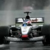
It looks so nice in daylight:

Render of Williams new livery

Sorry but, what daylight?!

Edited by highdownforce, 24 February 2011 - 21:14.


#30 peacockantony

peacockantony
  • Member

  • 1,343 posts
  • Joined: January 11

Posted 24 February 2011 - 21:56

Best Livery - McLaren & Mercedes - Silver is just the best colour for cars IMO, although I do like the Virgin Racing livery, which is used by Manor Motorsport
Worst Livery - toss up between Sauber and Renault - Sauber because it is plain and Renault because it is a blatant copy of another team's retro livery, they haven't even bothered to bring it into the 21 century.
Most improved - Hispania, the 2011 livery is definitely a big improvement on the boring 2010 one

#31 Captain Tightpants

Captain Tightpants
  • Member

  • 8,012 posts
  • Joined: June 09

Posted 24 February 2011 - 22:09

The best is Renault.

The worst is Williams. But if they picked up a few new sponsors and made those find alongside the sidepods dark blue instead of white, it would be significantly better.

The most improved is Mercedes.

#32 MaxisOne

MaxisOne
  • Member

  • 2,342 posts
  • Joined: February 10

Posted 24 February 2011 - 22:14


Best = Mercedes
Seconded By Mclaren

Most improved=Mercedes
Seconded by Williams

Worst= Virgin
Seconded by Renault

Most Regressed= Renault (LOVED the bumblebee black and yellow)
Seconded= Force India

#33 Jackmancer

Jackmancer
  • Member

  • 3,226 posts
  • Joined: September 09

Posted 24 February 2011 - 22:17

Why did 3 people vote Ferrari for most improved livery? ;p rear wing THAT important? :p

#34 Buttoneer

Buttoneer
  • Admin

  • 19,094 posts
  • Joined: May 04

Posted 24 February 2011 - 22:24

How can people vote Mercedes for most improved livery if it's the same as last year? It's the chassis that changed not livery.

It's not the same but not far away enough to be suddenly 'great' IMO. Winner in that category has to be Hispania.

Best - Lotus.
Worst - STR. Ugh.

#35 FenderJaguar

FenderJaguar
  • Member

  • 1,567 posts
  • Joined: October 09

Posted 24 February 2011 - 22:27

Best, close call with Red Bull and Renault. Went with Red Bull even one of my alltime favourites is the old JPS livery but it doesn't look 100% just yet.
Worst, Force India or Sauber, went with Force India because I just don't like it and a lot of people went for the obvious Sauber ugly.
Most Improved, Hispania, they go from worst looking to not so bad.

#36 FenderJaguar

FenderJaguar
  • Member

  • 1,567 posts
  • Joined: October 09

Posted 24 February 2011 - 22:30

The Sauber reminds me of this - Force India is just ugly because of the green combined with orange

Posted Image

#37 Mauseri

Mauseri
  • Member

  • 7,644 posts
  • Joined: March 05

Posted 24 February 2011 - 22:34

Renault is the worst livery. McLaren and Ferrari are good as always, Williams has improved most.

#38 Seanspeed

Seanspeed
  • Member

  • 21,814 posts
  • Joined: October 08

Posted 24 February 2011 - 22:34

Just like last year, I think the Virgin has the best looking livery. The red and black go so well together, and it makes me one day dream of seeing black wings on the Ferrari again!

I think the Williams looks great, too. Close second for them. The Renault is once again pretty nice-looking apart from the red endplates. Same for the Ferrari except for the white front/rear wings(although I think the Italian colors on the back of the rear wing is an awesome touch). I'm also a fan of the Mercedes silver/green livery, too. Wouldn't think it, but the colors go well together.

Worst livery is the Toro Rosso, by far. I just REALLY cant stand that yellow duckbilled nose and the 'darker' Red Bull livery just doesn't work at all, in my opinion. I'm also still very much put off by the 'chrome' Mclaren. I dont like chrome and I think the red front and rear wings make it even worse. I really wish they'd go back to something like a black/silver livery like in the West days.

Most improved is obviously the HRT. Last year's livery was so bland, its pretty much a no-brainer. Car looks pretty damn good, though thats probably the nicest thing I'll say about it all year long!

#39 Nustang70

Nustang70
  • Member

  • 2,439 posts
  • Joined: July 01

Posted 26 February 2011 - 04:35

I'm surprised by the number of votes for Renault for Most Improved. I thought last year's yellow and black was quite popular (and the poll from last year indicates the same). Their new livery is still pretty sharp, but I wouldn't consider it a major improvement from last year (or, perhaps, an improvement at all).

Advertisement

#40 Starish

Starish
  • Member

  • 1,779 posts
  • Joined: January 11

Posted 26 February 2011 - 05:05

Sauber could have done such a better job, I wanted them to go back to the black livery they had in 93 and 94 such a disappointment.

Posted Image
Posted Image

Edited by Starish, 26 February 2011 - 05:08.


#41 Rob G

Rob G
  • Member

  • 11,615 posts
  • Joined: April 01

Posted 26 February 2011 - 05:34

My favorite livery is, and always has been, Red Bull's, especially when they added the swoopy stripes.

My least favorite is Renault's, although Sauber is giving them a run for their money. Renault's could have been very nice, but the gold stripes are just too fat and clumsy and don't really enhance the lines of the car at all. Sauber's is boring and a major disappointment considering that nearly any paint scheme using the colors of the sponsors would have looked fantastic in comparison.

I'd say the most improved would be HRT's, although that's not saying much considering where they started.

#42 FSA

FSA
  • Member

  • 613 posts
  • Joined: September 09

Posted 26 February 2011 - 06:29

Best Livery: Still Ferrari. Love that they remain faithful to their history (do wish they would lose the white accents though. Black would look so much more dramatic). McClaren close though (Chrome has def grown on me and I've come to accept it as much as I did the old Marlboro livery. It's great).

Worst: Sauber. By far. My main issue is again the use of white. Why use white when you have all the colours of the rainbow available to you? Their livery just screams, "We've got no money and this was all we could manage" and I hate it. Total waste. Paint the thing purple with black polkadots for Christ's sake. Anything but white !!!

Edited by FSA, 26 February 2011 - 06:31.


#43 steveninthematrix

steveninthematrix
  • Member

  • 329 posts
  • Joined: May 08

Posted 26 February 2011 - 06:52

I emailed Sauber 2 weeks ago, telling them how terrible their livery is....

Sauber, a privateer team, still mixing it with the big boys..... but honestly, get a decent paintjob.

email Sauber (they've got a contact email address on their website), and let them know to change their very very boring livery, i mean, plain white would have been as bad

#44 Captain Tightpants

Captain Tightpants
  • Member

  • 8,012 posts
  • Joined: June 09

Posted 26 February 2011 - 23:18

I'm sure that will do absolutely nothing.

Anyway, overnight Sergio Perez demostrated the C29 in Guadalajara, and a few minor changes have been made, most notably the addition of a few new sponsor decals:

Posted Image

I believe the Telcel on the side of the nose is new, as is the NEC (I think it's NEC) inside the space between the front tyre and the sidepod) and the Infinitum on the rear wing. Plus, there might be one or two additional Telmex decals on the engine cowling. And I have no idea what that design on the sidepod is; it's the Sauber One Club on the C30. It's not perfect, but reducing the acres of white space is an improvement.

And it also really needs racing numbers. Just stick some large ones on the rear wing and be done with it. That should be a rule: readable numbers on the rear wing.

#45 ViMaMo

ViMaMo
  • Member

  • 6,513 posts
  • Joined: September 03

Posted 28 February 2011 - 01:39

I hate Renault's livery. Its not half as good as the old JPS livery.

Red Bull looks fast and is fast.

#46 V8 Fireworks

V8 Fireworks
  • Member

  • 10,824 posts
  • Joined: June 06

Posted 28 February 2011 - 04:49

Red Bull looks fast and is fast.

:confused: It's just a blue car with Red Bull written on it.

Hispania livery seems to be a great improvement :up:

#47 flyer121

flyer121
  • Member

  • 4,570 posts
  • Joined: July 10

Posted 28 February 2011 - 12:38

:confused: It's just a blue car with Red Bull written on it.

Hispania livery seems to be a great improvement :up:


I love the fact that they dont change the livery on a yearly basis as does Renault , Nor do they have sponsor logos take precedence over their flagship sponsor(?) ...

They are lucky tho that their double Bull image is kind of made for each other with an F1 car shape and ethos ... even so - seems guys up there know a thing or two about recall value and branding.

#48 hughcdavies

hughcdavies
  • Member

  • 74 posts
  • Joined: December 10

Posted 28 February 2011 - 16:31

My votes are
Best - Lotus
Worst - Mercedes (may be my eyes are going, but I never did like Layton House blue)
Improved - HRT

I do wish JPS Renault had Gold pinstriping, rather then the thick gold lines. An right dogs breakfast, mind you Renault have had some dreadful colour schemes in recent years.


#49 Andrew Hope

Andrew Hope
  • Member

  • 7,911 posts
  • Joined: October 09

Posted 28 February 2011 - 16:52

The only thing about the Sauber's looks I really like (and liked about their 2010 car) is the fact it looks a bit like a fighter jet from certain angles, and the Hot Wheels rims. Rims look like something off an Indy car from the early 80s or something. Awesome.

#50 Collective

Collective
  • Member

  • 1,524 posts
  • Joined: June 05

Posted 28 February 2011 - 18:50

I'm sure that will do absolutely nothing.

Anyway, overnight Sergio Perez demostrated the C29 in Guadalajara, and a few minor changes have been made, most notably the addition of a few new sponsor decals:

I believe the Telcel on the side of the nose is new, as is the NEC (I think it's NEC) inside the space between the front tyre and the sidepod) and the Infinitum on the rear wing. Plus, there might be one or two additional Telmex decals on the engine cowling. And I have no idea what that design on the sidepod is; it's the Sauber One Club on the C30. It's not perfect, but reducing the acres of white space is an improvement.

And it also really needs racing numbers. Just stick some large ones on the rear wing and be done with it. That should be a rule: readable numbers on the rear wing.

That was just for the exho. The sidepod is Cementos Apasco, and the Infinitum in the back is Slim's ISP in Mexico. Those two, and NEC, won't be present during the season.