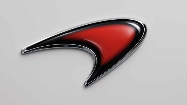
Taking the logo on its own for a second, I don't mind it. However you could quite easily put it above the name of any investment bank in the world and have it mean just as much.
As a brand, it doesn't 'say' anything about Mclaren and what they do. IIRC it's an evolution of the Marlboro chevron that appeared on their logo up to the end of '96, then was given a rounded edge so it maintained some of the link to their 'red and white' identity when they switched to West (who I'm still somewhat surprised allowed it given it's obvious historical reference to a competitor).
The Kiwi logo, a stylised M, anything would represent the company better in my view. Having said that, there are some far worse ones out there... Caterham's is abysmal for example.
I used to work at RML in the marketing team, and their logo was incredibly difficult to work with because of the way it had been laid out... look
here. A unwieldy font next to the Mallock family shield. A couple of simple switches could have made all the difference, say moving the letters RML above to sit on top of the shield, or even just using the shield on it's own. Ray (justifiably) is very proud of the logo and is hugely resistant to making changes, but from a design pov again it doesn't really 'say' anything about the company does.
I actually have some mock ups on my home PC of some proposed edits to the logo a designer produced that would've brought it a little more up to date, such as adding an edge of carbon fibre to reflect the cutting edge engineering RML do etc, but they weren't accepted. I think when people like Ray and Ron Dennis have invested their heavily in their businesses, the logo can be a prickly subject, particularly if they're fond of it...


