Wow. Great to see. Thanks BRG 
Back on track as it were, was the M16 set up with "offset suspension" for the Oval courses? I can't remember, although I am fairly certain the M15 was.


Member
Posted 13 October 2016 - 20:44
Wow. Great to see. Thanks BRG
Back on track as it were, was the M16 set up with "offset suspension" for the Oval courses? I can't remember, although I am fairly certain the M15 was.
Advertisement

Member
Posted 14 October 2016 - 09:21
I personally viewed the Lotus cars in the garage at Long Beach in 1983, and was thrilled to see it was still hand-done! (though in a non-metallic gold, which surprised me) I asked a crew member who knew the Lotus sign man, and sure enough, he used pounce patterns with chalk powder on the JPS art. I then lettered a car for John Andretti, right there in the convention center, gathering a viewer for close to an hour. Turned out he was a Manager for Toleman F1, and he asked if I'd consider moving to Europe in 1984... but I had a girlfriend (now wife) and a thriving business across the pond, so I never called. It was just too big for my 22-year-old imagination, I guess. I don't recall his name but would if I heard ...

Member
Posted 14 October 2016 - 09:29
Rob, hand-done sign work on race cars is the thread topic… certainly more than many posts here you didn't call out. And I'm confused how you can tell any sign artist how it's done when you say yourself you're not sure… when you were "across the shop and busy…"
If I'm correct, the T260 was lettered in Chicago at Carl Haas' shop.
E1pix, you signwrite your way and let Doug Eyre do it his, I was only reporting what I'd witnessed first hand many years ago in the McLaren factory. Maybe you didn't notice that my post that you went back three years to criticise was "liked" by Doug himself, if there was anything I'd got wrong, he'd have told us, and I think most would agree that ends this discussion.
You're also wrong about the Lola T260 signwriting. The car was signwritten in Lola's factory in Huntingdon, I saw and worked on that car before it left the UK, before it had turned a wheel in fact. I don't know what happened to it after it arrived in the US, but the photo I originally posted showed the car as built. That front panel was a flat sheet Dzus-fastened between the front wheels, and the car was never damaged, so I doubt if that panel ever altered or got worked on.

Member
Posted 14 October 2016 - 18:56
Alex Hawkridge? A bearded chap with glasses, as I recall.
I've pondered this all day, Michael, but don't think that's the name.
Thanks for the effort, though! If my files weren't 2,000 miles away, I could look in a jiffy. He tore the logo off a letterhead with a blue header and Toleman Group (IIRC) across the top and wrote his name on it, perhaps business cards were really expensive at the time. 

Member
Posted 16 October 2016 - 13:59
It's script type, not script font. And it matters.
When printers assembled plates or blocks from lead pieces, script type defined the style or the design. The physical bit of lead represented a font or fond at a size, of a type design. Compositors wouldn't assemble the story from any bunch of letters. It looks daft.
When Adobe and Apple created desktop publishing, they made a huge mistake. They reckoned that lads and lasses understood the difference between script and font (or fond).
Member
Posted 16 October 2016 - 14:08
Member
Posted 16 October 2016 - 14:44
I *think* it is vernacular language from the print trade. Font is equivalent to Fond for lead type printers -- except when they disagree. Inside Apple software, Font and Fond were used for different type resources.
When the industry moved to offset litho printing, the fount tray (which fed slightly acidic fountain water into the press) became known as font tray.

Administrator
Posted 16 October 2016 - 15:10
The OED gives 'fond' as an archaic and obsolete version of 'font' - which evolved via 'fount'. Possibly adapted from another early noun usage of 'fond' which evolved into 'fund'. So you could have a fond of type or a fond of money ...
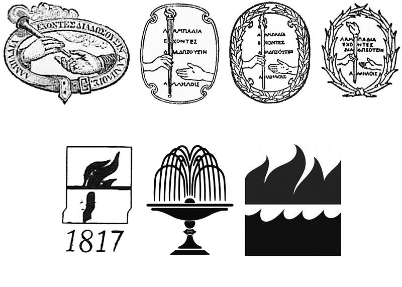
The publisher William Collins (now part of HarperCollins) acknowledged this by using a fountain as his colophon and even named his religious imprint Fount. Their paperback imprint was named Fontana - Italian for fountain.  This graphic shows the evolution of Harper & Row's colophon, but we see the Collins fountain in the middle of the lower row - the two companies were amalgamated in 1990 and the final colophon is HarperCollins - the flame from Harper and the water from Collins.
Member
Posted 16 October 2016 - 15:42


© MOTORSPORT NETWORK 2024. All rights reserved. Community Forum Software by IP.Board
