
 3 votes
Member
Posted 25 March 2013 - 16:04
Advertisement

Member
Posted 25 March 2013 - 16:37

Member
Posted 25 March 2013 - 16:57

Edited by DrProzac, 25 March 2013 - 16:58.

Member
Posted 25 March 2013 - 16:59

Member
Posted 25 March 2013 - 17:05

Member
Posted 25 March 2013 - 18:27
 great post, hope you're going to continue for the rest of the season. Most of the teams seem to have quite evenly matched drivers except sauber and torro rosso.

Member
Posted 25 March 2013 - 19:46

Edited by tabovilla, 25 March 2013 - 19:49.
Member
Posted 25 March 2013 - 20:02

Member
Posted 25 March 2013 - 20:31
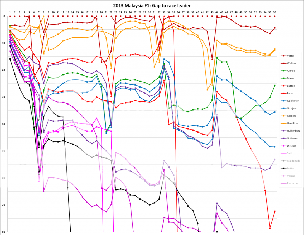
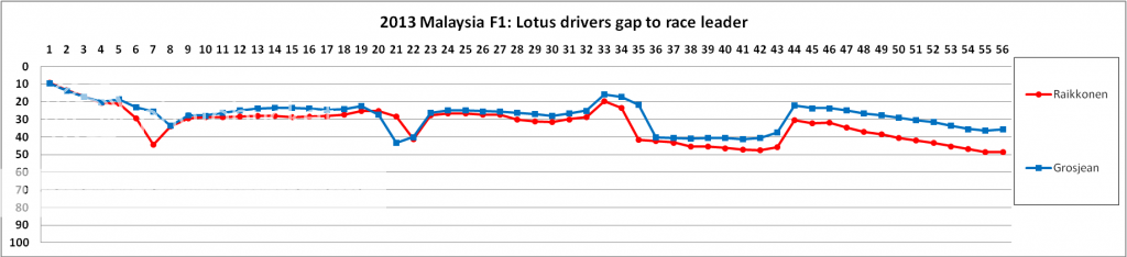
Gro vs Kimi - they were blocked quite a lot, especially Raikkonen, so this chart may not be the best indicator of their relative pace.

Member
Posted 25 March 2013 - 20:34

Member
Posted 25 March 2013 - 20:51
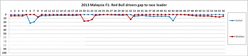
Webber leaded the race the most, deserved victory.

Member
Posted 25 March 2013 - 22:56
Member
Posted 26 March 2013 - 09:41
Member
Posted 26 March 2013 - 09:42
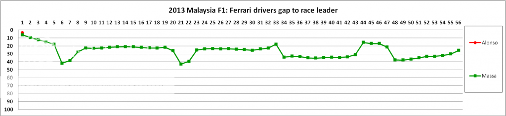
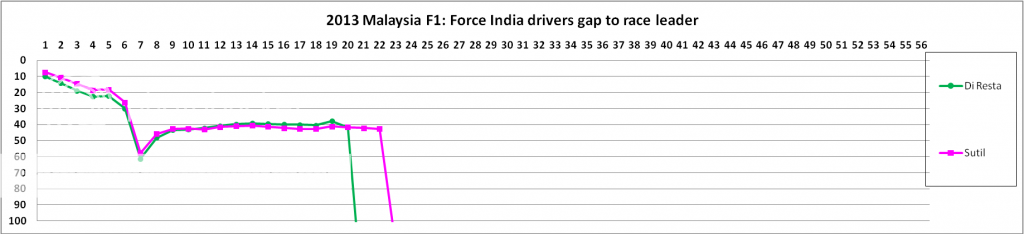
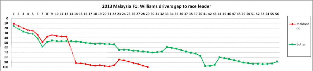
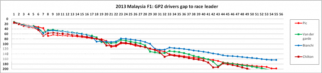
Bianchi has done exceedingly well in the last 2 races. If he continues at this rate, I am pretty sure his progress to a better team would come sooner than later.Meh, didn't really like the last chart, but well, I guess there aren't many Marussia fans like me around! ;P

Member
Posted 26 March 2013 - 09:43
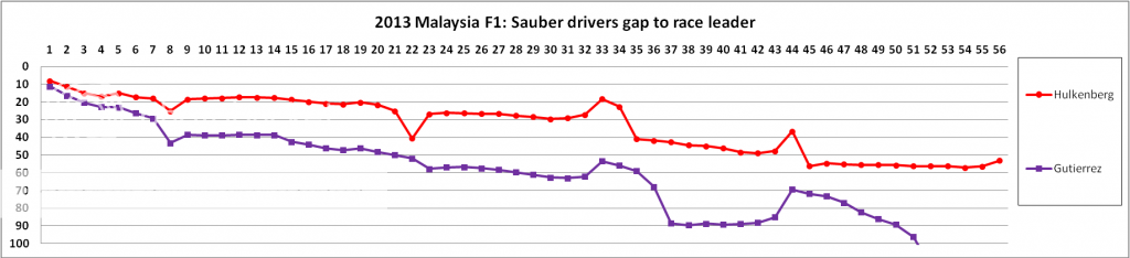
Kimi is a rally driver so is used to a bit of off road action!Yep, remember also that Kimi went off twice and that could have damaged the car and reduced pace. On the other hand Kimi had the newer parts on the car.

New Member
Posted 26 March 2013 - 09:52
Member
Posted 26 March 2013 - 10:02
Advertisement
Member
Posted 26 March 2013 - 12:35

Member
Posted 26 March 2013 - 12:49
Member
Posted 28 March 2013 - 11:40
If I do the winner's avg lap time as reference, then I would either have to plot everyone else's avg lap time too (which would be meaningless since we know the race result) or I will plot actual lap times against this avg lap time and I would have a sea of points above and below this.Could you change the graphs to use winners average lap time as the reference? Because I hate it when all the cars jump up and down when the leader pits. Also, the evolution of lap times during the race cannot be seen from your graphs.
Thank you.

Member
Posted 28 March 2013 - 11:58
Not sure if I am visualizing it clearly but would appreciate if you could expand on your comments. I can surely plot any graph since all the data is already present.

Member
Posted 28 March 2013 - 12:21

Member
Posted 28 March 2013 - 18:09

Member
Posted 28 March 2013 - 18:23

Member
Posted 28 March 2013 - 19:58
There is already a website that provides exactly what is shown in this thread!
http://en.mclarenf-1.com/
Select the race you want to analyse, then choose "history graph" and select the drivers, laps and the "compare to" selection.
The "head to head" analysis is also very interesting!

Member
Posted 29 March 2013 - 19:26
Graph history race Malaysia GP 2013 (link)I find the graphs in this thread a little more readable, although the main graph could be improved.
On the McLaren fansite you mentioned, the black background makes some of the traces hard to see, but otherwise it's good.

Member
Posted 29 March 2013 - 22:42
Member
Posted 29 March 2013 - 22:55
Graph history race Malaysia GP 2013 (link)
compared to driver #1 Sebastian Vettel
- Sebastian Vettel
- Mark Webber
- Nico Rosberg
- Lewis Hamilton

Member
Posted 29 March 2013 - 23:03
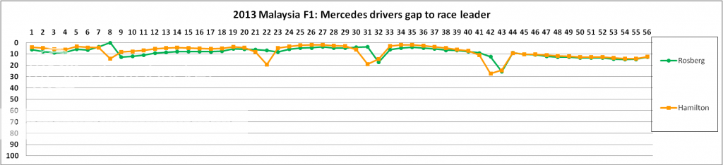
That's because Nico was stuck behind Lewis for god knows how long. His pace was much better though.Mercedes pilots on extremely similar pace :-)

Member
Posted 30 March 2013 - 00:16
Edited by AlexS, 30 March 2013 - 00:17.

New Member
Posted 14 April 2013 - 10:51


© MOTORSPORT NETWORK 2024. All rights reserved. Community Forum Software by IP.Board


