Jump to content


Photo
* * * * * 2 votes

McLaren livery


  • Please log in to reply
627 replies to this topic

Poll: McLaren livery (327 member(s) have cast votes)

What should McLaren's livery be?

  1. Orange (103 votes [31.50%] - View)

    Percentage of vote: 31.50%

  2. White/red (131 votes [40.06%] - View)

    Percentage of vote: 40.06%

  3. Stick with the chrome (35 votes [10.70%] - View)

    Percentage of vote: 10.70%

  4. White/black (aka team clothing) (28 votes [8.56%] - View)

    Percentage of vote: 8.56%

  5. Any colour of a new sponsor (30 votes [9.17%] - View)

    Percentage of vote: 9.17%

Vote Guests cannot vote

#1 Christophe77

Christophe77
  • Member

  • 995 posts
  • Joined: December 13

Posted 03 February 2015 - 11:25

OK, so basically nobody's happy with the McLaren livery. I also do not understand Ron Dennis position on this. He doesn't see the point in making the car "more aesthetically pleasing". Well, I'm surprised to hear that marketing/PR is lost to Ron. This is a classic case of how not to run your marketing.

Let's us look at how this story has developed and the mistakes that were made:

1. Mclaren launch a series of teasers, hailing the new Honda era and making quite a lot of reference to the Marlboro red and white theme.

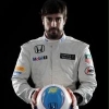
2. when the car is eventually launched, it is done very low key. If I were Honda I would not be pleased. I mean this is their Big Return

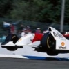
3. The car is launched with almost the exact same livery as last year. Fans are not pleased

4. Mclaren reassures fans and quickly launches a poll to apparently decide on a new livery. Red/white wins.

5. Immediately after the poll, Ron Dennis states their will be no livery change (at least not untill a new sponsor is found). Worse, he even doesn't see the point.


Mclaren is always looking to be the class of the field. So why ignore something important as your livery because this translates into your whole corporate image. No wonder that Boss has left. Look at how classy the Merc looks. If I were Boss I would rather liked to be associated with Merc. If I were Honda I wouldn't be impressed by the way my brand is represented in F1. It looks like cheap, uninspired cut and paste work. What message is send to potential new sponsors? And what message is send to fans? Mclaren should be a 'love brand' and care a lot about it's fans...


I also included a poll, just for fun. I don't think the results will surprise...      


Edited by Christophe77, 03 February 2015 - 12:58.


Advertisement

#2 pikamoku

pikamoku
  • Member

  • 440 posts
  • Joined: December 07

Posted 03 February 2015 - 11:33

Ron Dennis will keep an eye on this thread, for sure :stoned:


He rates highly internet opinions, as Mr.E


Orange FTW!


Edited by pikamoku, 03 February 2015 - 11:34.


#3 DampMongoose

DampMongoose
  • Member

  • 2,258 posts
  • Joined: February 12

Posted 03 February 2015 - 11:36

I was hoping for a black, white and chrome car.  It would match the kit the drivers are wearing.  Chrome at the bottom, black stripe, white engine cover.


#4 Rinehart

Rinehart
  • Member

  • 15,144 posts
  • Joined: February 07

Posted 03 February 2015 - 11:40

Of the options Red and White (not Marlboro rip-off though, that would be cheesy).

But I'd be quite happy for a major sponsor to come along with their own brand colours and change the game completely. 


#5 Christbiscuit

Christbiscuit
  • Member

  • 354 posts
  • Joined: November 14

Posted 03 February 2015 - 11:41

I quite lke the current livery. The red really pops on track. All it needs is a couple of logos on the sidepods and rear wing to give it some zazz. I appreciate I may be the only one who thinks this, however.


Edited by Christbiscuit, 03 February 2015 - 11:41.


#6 Disgrace

Disgrace
  • Member

  • 31,347 posts
  • Joined: January 10

Posted 03 February 2015 - 11:48

I really don't understand the idea that sponsor logos improve a livery. Does street advertising improve the look of our cities?


#7 EndlessMotion

EndlessMotion
  • Member

  • 3,639 posts
  • Joined: December 13

Posted 03 February 2015 - 11:52

Anything but what they're currently running. It's not so much the colours as they've run them for the best part of 20 years now with the black coming and going. For me it's just the way they've applied the colours that looks all wrong. It's really a bad take on what they've done so well with those colours over the years. The use of red is really poor looking especially on the mirrors. Small details but easy to get wrong. Doesn't help that the nose is so long and looks like a boxers broken nose from a lot of angles.


Simple black and white would look really nice with the sponsors and logos in black. I'd like them to use a little McLaren orange here and there too, maybe to separate the main colours whatever they may be. Either way it'd be nice to see them move away from the black, chrome and red in this new era with Honda.


We're not all going to agree though, each to their own.


#8 Christbiscuit

Christbiscuit
  • Member

  • 354 posts
  • Joined: November 14

Posted 03 February 2015 - 11:52

A splash of colour to an otherwise plain car seldom hurts.


#9 pacificquay

pacificquay
  • Member

  • 6,267 posts
  • Joined: March 07

Posted 03 February 2015 - 11:59

Er, Ronald Dennis has said the livery will change, not that it won't


#10 steferrari

steferrari
  • Member

  • 1,582 posts
  • Joined: October 09

Posted 03 February 2015 - 12:05

B8xc3mnCYAEO9U0.jpg


#11 Christbiscuit

Christbiscuit
  • Member

  • 354 posts
  • Joined: November 14

Posted 03 February 2015 - 12:06

Ron Dennis says a lot of things, many of which don't happen.


The chrome livery is understandable. If they haven't sealed the deal with a new title sponsor then why would they corner themselves into a new livery when there's a good chance a new sponsor might not want to be associated with the colours or design? If they do sign a new sponsor then they get to make a big hoo-ha over a new livery. A new sticker on a familiar design is less of a story. The current design is crying out for something new to be added, it looks incomplete and intentionally so, albeit not as desperately as the old HRT.


#12 Laura23

Laura23
  • Member

  • 825 posts
  • Joined: July 10

Posted 03 February 2015 - 12:09

Lets' look at it another way,


The low key launch could have been quite clever. Keep it simple, keep it dull because they knew the first test was going to be a hard one. People will associate the struggles with the older chrome livery. When they've got on top of it by Melbourne launch a brand new and permanent livery that'll go with the new brand and positive future. If they turn up to Melbourne with a new livery and a fast car then everyone would forget about the struggles of testing rather quickly. 


To put it simply I don't think they want the new brand to be ready until the car is ready for it. 


#13 Lights

Lights
  • Member

  • 17,876 posts
  • Joined: February 10

Posted 03 February 2015 - 12:26

Voted 'stick with the chrome' but not because I would want them to stick with the current livery. The colors aren't necessarily the problem, it's how they are used. But ideally, perhaps I would like a black/white/chrome livery the most. I like their current team clothing, it's very McLaren-like.


#14 Nonesuch

Nonesuch
  • Member

  • 15,870 posts
  • Joined: October 08

Posted 03 February 2015 - 12:38

StatsF1 has a nice list of all McLaren cars to look and and compare. :up:


I wouldn't have been surprised to see McLaren bring back a sort of late-90s car, with Honda taking the white-ish grey that West used to occupy. The later mix of darkish chrome worked reasonably well with the bright red of Emirates/Vodafone, but without it the livery has taken on a sort of second tier feel.


I'm sure Dennis is more savvy than I am when it comes to such matters, but I'd have thought attracting a sponsor is also in part about inviting them to be part of something exciting. The latest two McLarens don't look exciting at all - to me, anyway.


I voted for White/Red. Not because I'd like to see McLaren come up with a cheap 1980s knockoff, but because there are enough dark and grey cars on the grid. :p


Edited by Nonesuch, 03 February 2015 - 12:39.


#15 tifosiMac

tifosiMac
  • Member

  • 7,360 posts
  • Joined: January 10

Posted 03 February 2015 - 12:43

I've lost interest in the livery now to be honest.


I thought the #MakeHistory #NewEra marketing campaign was McLaren hinting strongly that they were bringing something new or perhaps a loved livery from the distant past considering it carried a very 1980's feel about it. I was quite excited at the prospect of a red and white livery to coincide with Honda's return to the McLaren team. I know the media and fans across the internet were excited by the prospect and the anticlimactic launch reintroducing a livery that has only been vacant for the past 18 months was disappointing to say the least.


Having said that the car being fast is the main concern and I really hope it is. I want to see Fernando fighting again at the front and giving Mercedes a run for the championship. The livery is a small detail, but a detail that can be important for the memories of this era. McLaren missed a trick on this one and even if they introduce a stunning orange or red and white car at the start of the season, I think the attention will have shifted away some what. It would be a bit like jumping out and shouting 'SURPRISE' at somebody's birthday party 10 minutes after they have arrived.  :p


#16 Kristian

Kristian
  • Member

  • 4,365 posts
  • Joined: June 05

Posted 03 February 2015 - 12:47

I don't understand why people want the white/red? Its synonymous with Marlboro, which sponsor a direct rival, and people usually moan about too much reds and whites on the grid already. 


Orange for me! Even more of a  historical reference than the red/white, and a welcome spash of colour. 


#17 tifosiMac

tifosiMac
  • Member

  • 7,360 posts
  • Joined: January 10

Posted 03 February 2015 - 12:53

I don't understand why people want the white/red? Its synonymous with Marlboro, which sponsor a direct rival, and people usually moan about too much reds and whites on the grid already. 


Orange for me! Even more of a  historical reference than the red/white, and a welcome spash of colour. 

Its simply for nostalgia and when I think of a McLaren I still think of red and white all these years later.


Black and Gold on a Lotus was synonymous with 'John Player Special' yet was chosen for the same reasons as outlined here with McLaren. It wouldn't have to have the Marlboro arrow cut outs in the livery, and as long as they made it look very different to the Toyota we saw until a few years ago I think it could work. Having said that again I think its all a bit of an anti climax now and they should stick with the synonymous Mercedes chrome and Vodafone red.  :)


#18 ninetyzero

ninetyzero
  • Member

  • 706 posts
  • Joined: November 14

Posted 03 February 2015 - 13:03

B8xc3mnCYAEO9U0.jpg


That's such an over-rated livery *takes cover* Why do you want McLaren to run in the old Penske colours anyway?


#19 ANF

ANF
  • Member

  • 29,378 posts
  • Joined: April 12

Posted 03 February 2015 - 13:06

2sY3a_Nh_400x400.jpeg

Just a reminder that red and chrome is part of the McLaren logo. :wave:


Advertisement

#20 DampMongoose

DampMongoose
  • Member

  • 2,258 posts
  • Joined: February 12

Posted 03 February 2015 - 13:08

I don't understand why people want the white/red? Its synonymous with Marlboro, which sponsor a direct rival, and people usually moan about too much reds and whites on the grid already. 


Orange for me! Even more of a  historical reference than the red/white, and a welcome spash of colour. 


White and Green for the win then.


#21 taran

taran
  • Member

  • 4,464 posts
  • Joined: April 01

Posted 03 February 2015 - 13:20

2sY3a_Nh_400x400.jpeg

Just a reminder that red and chrome is part of the McLaren logo. :wave:


Nope, its part of their current logo. An important distinction IMO.


#22 Lights

Lights
  • Member

  • 17,876 posts
  • Joined: February 10

Posted 03 February 2015 - 13:21

The red only since 1991 and the 'chrome' since 1997.


#23 ZuTiMa

ZuTiMa
  • Member

  • 431 posts
  • Joined: October 10

Posted 03 February 2015 - 13:23

B8xc3mnCYAEO9U0.jpg


Must say .... I voted orange .... but hell this is sexy!!!


Can always replace the Red with "McLaren Orange!"


Edited by ZuTiMa, 03 February 2015 - 13:28.


#24 Christophe77

Christophe77
  • Member

  • 995 posts
  • Joined: December 13

Posted 03 February 2015 - 13:30

mclaren_logo-3d-model-25762-238063.jpg


Chrome and red indeed, I just noticed...


#25 Christophe77

Christophe77
  • Member

  • 995 posts
  • Joined: December 13

Posted 03 February 2015 - 13:39

Must say .... I voted orange .... but hell this is sexy!!!


Can always replace the Red with "McLaren Orange!"

B8xc3mnCYAEO9U0.jpg

Is it white in this picture? Looks chromisch to me...but a different more light version, less grey. That could be nice to!


Edited by Christophe77, 03 February 2015 - 13:40.


#26 Christophe77

Christophe77
  • Member

  • 995 posts
  • Joined: December 13

Posted 03 February 2015 - 14:28

1422904442.jpg


White and red...


#27 Sukhoi

Sukhoi
  • Member

  • 328 posts
  • Joined: April 10

Posted 03 February 2015 - 14:38

I bet it will be overall white with black/red additions, paint can make up to 50 degrees Celsius difference, and with that packaging they will need every single celsius they can get.  :wave: 


Edited by Sukhoi, 03 February 2015 - 14:38.


#28 MikeV1987

MikeV1987
  • Member

  • 6,371 posts
  • Joined: July 12

Posted 03 February 2015 - 14:42

Honda Championship white as base with some fluorescent red stripping, maybe a bit of black stripping thrown in there as well. The chrome/polished silver makes it tacky imo, orange doens't fit well with me either.


edit: something like this, there was another pshop I really liked that was similar to this as well but I cannot find it. edit 2: nvm here it is  :p

mclaren-honda.jpg


Edited by MikeV1987, 03 February 2015 - 15:44.


#29 03011969

03011969
  • Member

  • 656 posts
  • Joined: September 12

Posted 03 February 2015 - 14:44

Perhaps they should go back to the grey livery they used for years?


#30 Lemans

Lemans
  • Member

  • 2,739 posts
  • Joined: March 02

Posted 03 February 2015 - 15:32

Perhaps they should go back to the grey livery they used for years?


No. People on this forum demand something new so that in a year from now when they become bored of it as well, they can bitch about wanting something new, again.


#31 rjsports

rjsports
  • Member

  • 573 posts
  • Joined: December 12

Posted 03 February 2015 - 15:36

Orange, back to the roots. Red and white was purely for the sponsor which is sponsoring Ferrari (are they still doing that?) So that doesn't make sense anymore. They celebrated 50 years last year, so why not go back how they started? Probably because no one wants to pay them to do it. :p  But for the love of god ditch the chrome.


Edited by rjsports, 03 February 2015 - 15:36.


#32 ninetyzero

ninetyzero
  • Member

  • 706 posts
  • Joined: November 14

Posted 03 February 2015 - 15:40

Honda Championship white as base with some red stripping, maybe a bit of black stripping thrown in there as well. The chrome/polished silver makes it tacky imo. 


edit: something like this, there was another pshop I really liked that was similar to this as well but I cannot find it. edit 2: nvm here it is  :p

mclaren-honda.jpg


That's much better.


#33 ZuTiMa

ZuTiMa
  • Member

  • 431 posts
  • Joined: October 10

Posted 03 February 2015 - 15:44

Honda Championship white as base with some fluorescent red stripping, maybe a bit of black stripping thrown in there as well. The chrome/polished silver makes it tacky imo, orange doens't fit well with me either.


edit: something like this, there was another pshop I really liked that was similar to this as well but I cannot find it. edit 2: nvm here it is  :p

mclaren-honda.jpg


Please Ron see this!!! :clap:  :clap:  :clap:  :clap:


#34 andrewf1

andrewf1
  • Member

  • 2,775 posts
  • Joined: September 12

Posted 03 February 2015 - 15:46

I really don't understand the idea that sponsor logos improve a livery. Does street advertising improve the look of our cities?


Sponsor logos improve a livery because they make it less plain/boring and can give it a general design identity and direction.


As for your analogy, sorry, but it's extremely bad. Cities have buildings, windows, materials, textures, trees, cars, people, lamp posts, sidewalks, stairs, ramps, lawns and so on. They have enough diversity going on.


#35 Balnazzard

Balnazzard
  • Member

  • 2,038 posts
  • Joined: January 13

Posted 03 February 2015 - 15:52

Honda Championship white as base with some fluorescent red stripping, maybe a bit of black stripping thrown in there as well. The chrome/polished silver makes it tacky imo, orange doens't fit well with me either.


edit: something like this, there was another pshop I really liked that was similar to this as well but I cannot find it. edit 2: nvm here it is  :p

mclaren-honda.jpg

Yeap, this would be great livery!


But I wouldnt mind orange either as long as it would be something like this:

380457-svetik.jpg


And NOT like this (or chrome orange)

f1_mc1.jpg


The orange livery would have to to be just right, or else its looks sickening imo.


#36 Scudetto

Scudetto
  • Member

  • 8,226 posts
  • Joined: May 01

Posted 03 February 2015 - 16:13

That's such an over-rated livery *takes cover* Why do you want McLaren to run in the old Penske colours anyway?


That's Marlboro, not Penske (which ran that livery under Marlboro sponsorship).  And over rated or not, it's iconic.  In fact too iconic under our nanny state of banned tobacco sponsorship.  Besides, Phillip Morris' affiliation with Ferrari's branding would render this livery all the more unlikely.  Admittedly though, I'd absolutely love to see McLaren adopt this or something akin to it.


Honda Championship white as base with some fluorescent red stripping, maybe a bit of black stripping thrown in there as well. The chrome/polished silver makes it tacky imo, orange doens't fit well with me either.


edit: something like this, there was another pshop I really liked that was similar to this as well but I cannot find it. edit 2: nvm here it is  :p

mclaren-honda.jpg


This, on the other hand, is not iconic enough.  McLaren had lightening strike twice when they moved from the Marlboro livery to the West inspired livery and to what it has evolved into today.  This is too mid-field looking and unworthy to grace a McLaren.


Edited by Scudetto, 03 February 2015 - 16:14.


#37 ninetyzero

ninetyzero
  • Member

  • 706 posts
  • Joined: November 14

Posted 03 February 2015 - 16:27

That's Marlboro, not Penske (which ran that livery under Marlboro sponsorship).  And over rated or not, it's iconic.  In fact too iconic under our nanny state of banned tobacco sponsorship.  Besides, Phillip Morris' affiliation with Ferrari's branding would render this livery all the more unlikely.  Admittedly though, I'd absolutely love to see McLaren adopt this or something akin to it.


This, on the other hand, is not iconic enough.  McLaren had lightening strike twice when they moved from the Marlboro livery to the West inspired livery and to what it has evolved into today.  This is too mid-field looking and unworthy to grace a McLaren.


*Sigh* yes I know that, I was trying to make the point that it's not specifically a McLaren livery, but one that has been used by various teams in various championships (Alfa Romeo ran a virtually identical livery in the early 80's). It's only iconic because of Senna/Prost, if the MP4-4 had been painted purple with red spots I guess that would be iconic now? Besides, I'd much rather they did something fresh and new instead of rehashing old Marlboro/West colours. Senna and Prost aren't racing for McLaren any more, Alonso and Button are. I'd rather F1 looked forwards instead of backwards. How can a brand new livery be iconic when it's never been raced? What if Mclaren adopted that Livery and won the championship 10 times in a row? It'd be iconic no?


Edited by ninetyzero, 03 February 2015 - 16:30.


#38 Donkey

Donkey
  • Member

  • 947 posts
  • Joined: June 11

Posted 03 February 2015 - 16:59

B8xc3mnCYAEO9U0.jpg

It's nice, but I suspect that it is too close to the Marlboro livery for the team to feel comfortable because, let's be honest, it does look like a fag packet and might put other potential new sponsors off.


Considering that Ferrari ditched its barcode on the cars a few years ago and came under considerable scrutiny for its new logo. Ferrari can make it work though because they are attached at the hip to Philip Morris (I know the deal ends at the end of 2015 but I am sure both parties will find a way to extend it).


#39 John Player

John Player
  • Member

  • 600 posts
  • Joined: October 09

Posted 03 February 2015 - 17:13

Anything other than white/red will disappoint


Advertisement

#40 Balnazzard

Balnazzard
  • Member

  • 2,038 posts
  • Joined: January 13

Posted 03 February 2015 - 17:14

It's nice, but I suspect that it is too close to the Marlboro livery for the team to feel comfortable because, let's be honest, it does look like a fag packet and might put other potential new sponsors off.


Yeap and since tobacco-marketing is completely banned, this kind of livery and shapes that represent too closely Marlboro would NOT get through anyway...so people can just write the old Marlboro livery or anything even closely resembling it right off, its NOT gonna happen....Imo the livery posted by Mike would be great and in the end, just like "ninetyzero" said anykind of livery can be made iconic as long as the car wins.


#41 Scudetto

Scudetto
  • Member

  • 8,226 posts
  • Joined: May 01

Posted 03 February 2015 - 17:26

*Sigh* yes I know that, I was trying to make the point that it's not specifically a McLaren livery, but one that has been used by various teams in various championships (Alfa Romeo ran a virtually identical livery in the early 80's). It's only iconic because of Senna/Prost, if the MP4-4 had been painted purple with red spots I guess that would be iconic now? Besides, I'd much rather they did something fresh and new instead of rehashing old Marlboro/West colours. Senna and Prost aren't racing for McLaren any more, Alonso and Button are. I'd rather F1 looked forwards instead of backwards. How can a brand new livery be iconic when it's never been raced? What if Mclaren adopted that Livery and won the championship 10 times in a row? It'd be iconic no?


It's not iconic because of Prost or Senna.  Or Watson.  Or Lauda.  Or Hunt.  Or Rosberg.  Or Hakkinen.  It's iconic because it is beautiful, elegant and distictive.  It has nothing to do with a team's success.  Marlboro, Gulf and Martini branding has been seen on many marques over the years, but not every car so branded has won races or champtionships.  Regardless of success, we tend to emote over the cars running those liveries because they are visually visceral.  And it's not about looking backwards or rehashing what's been done before.  I see it as taking inspiration from heritage.  When I look at a modern Lotus, I think "Lotus" not "John Player Special" although the branding tie-in is undeniable.


In my opinion, the example above just doesn't have that gravitas.  I look at it and think "Marrusia."


Edited by Scudetto, 03 February 2015 - 17:29.


#42 Donkey

Donkey
  • Member

  • 947 posts
  • Joined: June 11

Posted 03 February 2015 - 17:45


Yeap and since tobacco-marketing is completely banned, this kind of livery and shapes that represent too closely Marlboro would NOT get through anyway...so people can just write the old Marlboro livery or anything even closely resembling it right off, its NOT gonna happen....Imo the livery posted by Mike would be great and in the end, just like "ninetyzero" said anykind of livery can be made iconic as long as the car wins.


Well Ferrari have got away with their new stylised logo which just happens to look a bit similar to the Marlboro logo.....although that only appears on the engine cover of the car whereas the Marlboro branding on the Mclaren was basically the whole car livery.


#43 bub

bub
  • Member

  • 2,722 posts
  • Joined: July 11

Posted 03 February 2015 - 18:02

The colour isn't really that important to me as long as the livery looks nice. I voted for white/black though because it was my favourite out of the poll options but I also think it would make sense to have some red and white on the car but not necessarily be predominantly red and white like it was in the past.


#44 ninetyzero

ninetyzero
  • Member

  • 706 posts
  • Joined: November 14

Posted 03 February 2015 - 18:13

It's not iconic because of Prost or Senna.  Or Watson.  Or Lauda.  Or Hunt.  Or Rosberg.  Or Hakkinen.  It's iconic because it is beautiful, elegant and distictive.  It has nothing to do with a team's success.  Marlboro, Gulf and Martini branding has been seen on many marques over the years, but not every car so branded has won races or champtionships.  Regardless of success, we tend to emote over the cars running those liveries because they are visually visceral.  And it's not about looking backwards or rehashing what's been done before.  I see it as taking inspiration from heritage.  When I look at a modern Lotus, I think "Lotus" not "John Player Special" although the branding tie-in is undeniable.


In my opinion, the example above just doesn't have that gravitas.  I look at it and think "Marrusia."


The Marlboro livery is iconic for two reasons; 1) It's association with past success gives it positive connotations and your much desired 'gravitas' (if I were to ask you to think of a red and white McLaren I'm guessing that the MP4-11 won't be the car that immediately springs to mind), and 2) It was a staple of various forms of motor racing for many years,  much like the Martini stripes. Did the Marlboro colours have 'gravitas' when they were first used? No, it was just a livery. Any livery could become iconic if it is around for long enough.


#45 TheRacingElf

TheRacingElf
  • Member

  • 2,267 posts
  • Joined: April 14

Posted 03 February 2015 - 18:18

I think the current livery just needs some red accents at the back as well, ditch the red mirrors and add a red stripe on the engine cover and it looks ten times better.


Would love a (rocket)red/white McLaren btw but I don't see Ron doing that


#46 Lennat

Lennat
  • Member

  • 2,058 posts
  • Joined: July 09

Posted 03 February 2015 - 18:30

The car doesn't look like crap now, but silver is Mercedes's color. I would love an orange car. Red and white would be fine as long as it wasn't a wannabe Marlboro retro kind of thing.


#47 ButtonForEver

ButtonForEver
  • Member

  • 369 posts
  • Joined: October 14

Posted 03 February 2015 - 18:36

Fluorescent Red and White, similar to Button's Helmet (not a case, if it's of those colors).


#48 Scudetto

Scudetto
  • Member

  • 8,226 posts
  • Joined: May 01

Posted 03 February 2015 - 18:49

The Marlboro livery is iconic for two reasons; 1) It's association with past success gives it positive connotations and your much desired 'gravitas' (if I were to ask you to think of a red and white McLaren I'm guessing that the MP4-11 won't be the car that immediately springs to mind), and 2) It was a staple of various forms of motor racing for many years,  much like the Martini stripes. Did the Marlboro colours have 'gravitas' when they were first used? No, it was just a livery. Any livery could become iconic if it is around for long enough.


On that question my answer would be yes.  McLarens were still running those colors when I started watching F1, and I thought they were the most beautiful things on the track while knowing nothing about about McLaren's history.  So, yeah, it had that gravitas for me.  But we're arguing asthetics, which as a matter of personal taste is as fruitless as clapping with one hand.  And to your point, yes, even the most inane color palettes can be "iconic" enough with time.  Perhaps my use of use of the phrase "not iconic enough" has taken us down the wrong path, whereas "too generic" better expresses my feelings on the example livery above.


In any event, if the reuniting of McLaren and Honda is the start of a new livery direction for them, then I'd like to see something more visually distinctive and, preferrably, something that draws from their respective heritages in motorsport.


#49 morrino

morrino
  • Member

  • 240 posts
  • Joined: January 11

Posted 03 February 2015 - 18:51

It needs to be something fresh and new to be reminded as the begiing of a new era.


Going to Marlboro livery again would be stupid and most people would be bored quickly as it happened with Lotus JPS.


#50 Mc_Silver

Mc_Silver
  • Member

  • 5,373 posts
  • Joined: May 09

Posted 03 February 2015 - 18:53

I like the current livery really and it looks very McLaren. Red & White looks old fashioned to my eyes but still there are some interesting livery photos (red&white)  above  :up: