http://formula1.ferr...-gp-lap-by-lap/


Cool graphics!
Started by
RCRC
, Mar 30 2015 21:30
25 replies to this topic
Advertisement
#2

jonpollak
-

- 44,195 posts
- Joined: March 00
Member
Posted 30 March 2015 - 22:39
Golly that IS neat !!
Jp
#3
as65p
-

- 26,207 posts
- Joined: June 04
Member
Posted 30 March 2015 - 22:42
I remain stunned how much Windows 8 has managed to turn peoples perception of "cool graphics" around. 5 years ago most folks would have puked at the looks of that.


#5
noikeee
-

- 23,218 posts
- Joined: February 06
Member
Posted 30 March 2015 - 23:15
Throw your iPad away and get a proper computer. 
#6
RCRC
-
- 38 posts
- Joined: October 13
Member
Posted 30 March 2015 - 23:31
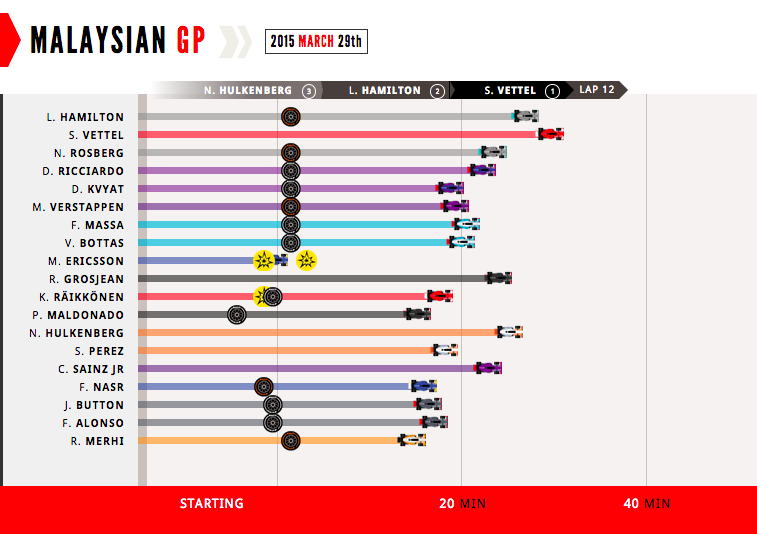
@sheepmachine, it should look like below:
#7
Exb
-
- 3,961 posts
- Joined: March 12
Member
Posted 31 March 2015 - 00:23
Oh my god that is amazing (OK I may still be a little sleep deprived and drunk) but that is ace - the cars move and get tyres and there is cheering at the end  lol.
lol. 
Edit:  Wait a minute - I just went to watch again (because it was so cool) and just realised it is a Ferrari thing - It is so not cool anymore
  I was tricked onto the Ferrari website against my will
Edited by Exb, 31 March 2015 - 00:29.
#8
nicholasc
-

- 329 posts
- Joined: October 01
Member
Posted 31 March 2015 - 00:34
can anyone remember the site that that has the line graphs?
I think it's Russian and has Maclaren in the name but my google-fu is letting me down.
#9
Exb
-
- 3,961 posts
- Joined: March 12
Member
Posted 31 March 2015 - 00:46
can anyone remember the site that that has the line graphs?
I think it's Russian and has Maclaren in the name but my google-fu is letting me down.
It is in the race thread - I will go look
Edit Found it 
Race: :: Pit :: Sector times :: Max speeds :: Best lap :: Lap Chart :: History graph
Edited by Exb, 31 March 2015 - 00:49.
#10
nicholasc
-
- 329 posts
- Joined: October 01
Member
Posted 31 March 2015 - 02:31
It is in the race thread - I will go look
Edit Found it
Cheers Exb.
The "History graph" is generally the one that best tells the story of the race for me.
#11
Afterburner
-

- 9,204 posts
- Joined: January 11
RC Forum Host
Posted 31 March 2015 - 03:08
I wasn't the only one who noticed, then.I remain stunned how much Windows 8 has managed to turn peoples perception of "cool graphics" around. 5 years ago most folks would have puked at the looks of that.
Though I have to admit I like the flat colors on the desktop side of 8. Much preferred to the disorienting aeroglass look of Windows 7, in my opinion.
#12
GoldenColt
-

- 6,254 posts
- Joined: December 13
Member
Posted 31 March 2015 - 07:53
Am I the only one who tried to change the race result with my mouse?
#13
Nonesuch
-
- 15,870 posts
- Joined: October 08
Member
Posted 31 March 2015 - 08:10
My poor middle finger. What a terrible case of tablet-webdesign.
I'll stick with boring graphs and tables.
#14
Diablobb81
-

- 8,738 posts
- Joined: August 09
Member
Posted 31 March 2015 - 08:17
Nice and all that but nothing beats the Indy "Which manufacturer has lost the most wing(lets)" graphic.
#15
andrewf1
-

- 2,775 posts
- Joined: September 12
Member
Posted 31 March 2015 - 09:03
I remain stunned how much Windows 8 has managed to turn peoples perception of "cool graphics" around. 5 years ago most folks would have puked at the looks of that.
It's called flat design. It's much more elegant and functional than skeuomorphic design. Every up-to-date company relies on it nowadays and nobody with a minimal understanding of design would have ever puked at the looks of that.
#16
ensign14
-

- 61,933 posts
- Joined: December 01
Member
Posted 31 March 2015 - 09:11
The downside of the rise of infographics. People go berserk with trying to represent things in a way that looks cool, but instead positively interferes with understanding. Try working out who came 8th looking at that for instance.
#17
jcbc3
-

- 12,925 posts
- Joined: November 04
RC Forum Host
Posted 31 March 2015 - 09:17
You mean apart from the table showing it and/or the order they cross the finish line?
#18
ensign14
-
- 61,933 posts
- Joined: December 01
Member
Posted 31 March 2015 - 09:26
QED. It comes from the table.
#19
Lotus53B
-

- 4,163 posts
- Joined: March 10
Member
Posted 31 March 2015 - 09:33
I think it's about the clearest graphic I've seen showing the ebb and flow of the race. I do miss the "waterfall" display that GaleForce F1 used to have before FOM jumped up and down on them.
#21
as65p
-
- 26,207 posts
- Joined: June 04
Member
Posted 31 March 2015 - 10:58
It's called flat design. It's much more elegant and functional than skeuomorphic design. Every up-to-date company relies on it nowadays and nobody with a minimal understanding of design would have ever puked at the looks of that.
Sounds cool. I just wonder why apparently nobody knew about what you now present as self evident until lately.

#23
andrewf1
-
- 2,775 posts
- Joined: September 12
Member
Posted 31 March 2015 - 12:39
Sounds cool. I just wonder why apparently nobody knew about what you now present as self evident until lately.
Not quite sure what you're arguing against there. 
It's a new trend in user-interface design, but with roots/inspiration dating as far back as the 1930s with the Bauhaus Movement from Germany. I said it would have been appreciated by anyone with a minimal knowledge of good design, no matter when it was launched.
Google, Apple, Facebook & co. all use it, but I guess they have no idea what they're doing.
#24
Nonesuch
-
- 15,870 posts
- Joined: October 08
Member
Posted 31 March 2015 - 12:48
Google, Apple, Facebook & co. all use it, but I guess they have no idea what they're doing.
Big corporations are just as susceptible to trends as anyone, in fact their fear of looking outdated and irrelevant in the eyes of a fickle public probably makes them more likely to follow the latest trends. As long as these trends aren't actively hurting people's interaction with the site, it's probably not a bad idea to keep up with what the public is told is modern.
I'm also not sure that endless scrolling and wasting a ton of screen space on huge pictures and big fonts is necessarily related to flat design. You can have flat design without these 'features', as many other sites or user interfaces show.
Edited by Nonesuch, 31 March 2015 - 12:50.
#25
andrewf1
-
- 2,775 posts
- Joined: September 12
Member
Posted 31 March 2015 - 13:01
Big corporations are just as susceptible to trends as anyone, in fact their fear of looking outdated and irrelevant in the eyes of a fickle public probably makes them more likely to follow the latest trends. As long as these trends aren't actively hurting people's interaction with the site, it's probably not a bad idea to keep up with what the public is told is modern.
I'm also not sure that endless scrolling and wasting a ton of screen space on huge pictures and big fonts is necessarily related to flat design. You can have flat design without these 'features', as many other sites or user interfaces show.
Well in this case it's the other way around - those big corporations actually launched the trend and told the public it is modern.
Endless scrolling is not definitory of flat design. As with every trend, you can argue there are good and bad implementations.
#26
ANF
-
- 29,327 posts
- Joined: April 12
Member
Posted 31 March 2015 - 14:38
@sheepmachine, it should look like below:
Wow! I had already forgotten that Kimi was twelve minutes behind Vettel.


