About as inspired as an Adele album.
What's that saying? Oh yes, 'No turn unstoned'


Member
Posted 21 January 2016 - 20:58
About as inspired as an Adele album.
What's that saying? Oh yes, 'No turn unstoned'
Advertisement

Member
Posted 21 January 2016 - 23:25
ssSwoooshhh


Let's Do It

swhoops!


Member
Posted 22 January 2016 - 00:51

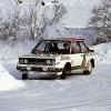
That's the new Manor logo. Yes, that's an M.

Member
Posted 22 January 2016 - 10:13

UOP Shadow logos roxx.. 

Member
Posted 22 January 2016 - 12:58
This thread proves this is really a slow off-season...
To be honest from every logo posted I think there's very very few of them that are any iconic at all, which is a little surprising. I think the only one that immediately recalls memories is the Lotus one. F1 teams seem to change logos all the time together with sponsorship so I think that's why they're not all that memorable.

Member
Posted 22 January 2016 - 15:20
This thread proves this is really a slow off-season...
The absence of a livery competition thread hasn't helped. It used to be a shining beacon in the desolate gloom of January and Tax Return deadline.
Member
Posted 22 January 2016 - 19:35
Yeah that one. I really like it.
Current one is quite nice too tho, fitting current livery and sponsor.
Not a patch on the old one.
Nice but not sold on that.
Feels more outdated rather than classic. Also I can origami that.
Edited by muramasa, 22 January 2016 - 19:35.
Member
Posted 22 January 2016 - 19:39
Member
Advertisement
Member
Posted 22 January 2016 - 21:42
We seem to have gone from "best F1 team logos" to "any old team logo you can find". BAR's for example isn't even a logo, it is just the Lucky Strike colours in a rectangle.
Interesting point.
Naturally some represent logos of owners rather than the team itself - ie. BAR or Red Bull. Heck even Ferrari and the Team Lotus roundel and Mercedes (amongst others) do represent car manufacturers. OK, so you can't ignore those as being iconic in the sport, perhaps there has to be two categories; those with 'preexisting logos' and those who are totally original to F1.

Member
Posted 23 January 2016 - 01:35
The absence of a livery competition thread hasn't helped. It used to be a shining beacon in the desolate gloom of January and Tax Return deadline.
What happened to the livery competition thread?.

Member
Posted 23 January 2016 - 09:56
That's the new Manor logo. Yes, that's an M.
![]()
Member
Member
Posted 24 January 2016 - 11:22
Good call. Between that, LWT and the Woolmark, all instantly recognisable in their fields, surely Manor's design team are on the right track? (if you pardon the pun).

Member
Posted 24 January 2016 - 13:25
Not a patch on the old one.
This looks so 90s.
Member
Posted 24 January 2016 - 13:40
![]()

Undoubtedly the best logo.
![]()
Member
Posted 24 January 2016 - 13:46

Some nub changed it to this, which is a nice logo but nothing on the original.
![]()


© MOTORSPORT NETWORK 2024. All rights reserved. Community Forum Software by IP.Board


