Jump to content


Photo
* * * - - 4 votes

The Boring Liveries Thread


  • Please log in to reply
100 replies to this topic

Poll: Who has the most boring liveries? (106 member(s) have cast votes)

As above

  1. McLaren (41 votes [38.68%])

    Percentage of vote: 38.68%

  2. Renault (6 votes [5.66%])

    Percentage of vote: 5.66%

  3. Sauber (33 votes [31.13%])

    Percentage of vote: 31.13%

  4. Williams (7 votes [6.60%])

    Percentage of vote: 6.60%

  5. HRT (RIP) (4 votes [3.77%])

    Percentage of vote: 3.77%

  6. Audi (5 votes [4.72%])

    Percentage of vote: 4.72%

  7. Porsche (7 votes [6.60%])

    Percentage of vote: 6.60%

  8. Another (not included) (3 votes [2.83%])

    Percentage of vote: 2.83%

Vote Guests cannot vote

#1 JHSingo

JHSingo
  • Member

  • 8,930 posts
  • Joined: June 13

Posted 03 February 2016 - 15:12

Now, I am aware that such is the incompetent manner in which F1 is run, there are far more pressing issues than what colour teams choose to paint their cars. But on the basis that there is really precious little else to talk about right now, I thought I'd compile a list of the most boring F1 liveries of recent years, for your viewing pleasure. Plus, there is a point to this at the end. I promise.


So, with that, I present to you The Official Boring Liveries Contest - That's What I Call Colourless!


There are several candidates hoping to impress you (or should that be, depress you?) enough to crown them the champion of boring livery design. It's sure to be a closer run contest than the forthcoming Formula One season, so let's meet the contestants. Starting with:
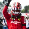
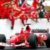
 

McLaren


This legendary team has a lot going for it in this competition. After realising that their evocative Malboro colours, and then the West livery, were just too colourful to succeed in this contest, they've really stepped their game up in recent seasons. They began with this sterling effort in 2014, in a colour that is commonly known as 'Woking' - for it reflects the dullness of the place they call home.*


mclarenmp429-001.jpg

(Wait, who's that chap stood on the left?)


But then, with their new partnership with Honda on the horizon, they decided to up the dullness stakes even further. McLaren and Honda, how could they possibly come up with a livery dull and boring with two legendary names like that working together once more? Well, we should never have doubted them, because as 2015 began, they presented this.


AU1269751.jpg


But then they gave it some thought. What's wrong with this livery? As it turns out, there were far too many colours present on the car for their liking, so they changed it to this.
1430910467.jpg


So, there we are, McLaren. A very strong candidate, and this contest is almost certainly the best chance they've had at winning something in several years.


Lotus Renault


As you're probably aware, there has been plenty of speculation about what Renault's livery would be. With a manufacturer like Renault coming back into the sport as a full works entry, you'd be forgiven for having high hopes for something spectacular. Well, sure enough, they've produced something quite spectacular...I mean spectacularly bland.

renaultlaunch.jpg?w=600&h=343&crop=1

Ah yes, that evocative colour that springs immediately to mind when you think of Renault...black. I can only presume that Renault's deal to take over the Lotus F1 team was concluded so late that they had little time to paint the car a different colour. "But wait!" someone must have said. "We're Renault now, surely we must have some yellow on the car somewhere!" And so they thought long and hard, and in a "that'll do" manner, included the least amount of yellow that they could get away with, in an attempt to please the fans. Don't get too excited.

Sauber


Those perennial midfielders from Switzerland are on something of a role, constantly knocking out exceptionally boring liveries over the last few seasons. They are surely one of the favourites for this title. Let's reminds ourselves of some of their best efforts from recent years.


1328522870.jpg

Sauber-C32-launch-2013_2894382.jpg

sauber-C33-1_3073016.jpg


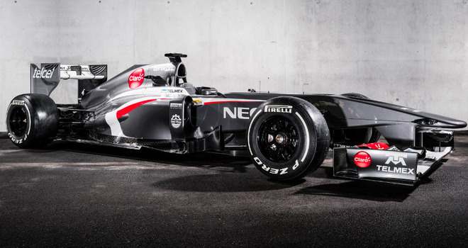
As colourless as Ron Dennis' office. But then, bizarrely, at the start of last season they had a bit of a change of heart. They decided to use some colours that weren't grey or white or red. Surely this would mean they were no longer in contention for this prestigious title? Think again.


1422608661.jpg


It must take some serious effort to keep producing these marvelously dull liveries. So well done Sauber.

HRT


Do you remember HRT? I don't really, either to be honest. But over their all too brief time in F1, they provided us with three utterly forgettable liveries. But long before 'your sponsor here' and whatever it was they ran in 2012, there was this very strong effort from their debut in 2010.

HRT-F1.jpg


I honestly can't think of anything to say about this, so perhaps we better move on to the next candidate.


Williams


When it was rumoured at the start of 2014 that Williams would be sponsored by Martini, understandably there was a lot of excitement. Surely they couldn't possibly go wrong with such a legendary sponsor?


239294.jpg


Now I understand this is a controversial one. But despite the Martini colours, it fails to get a great deal of people excited. What they've managed to do is come up with the seemingly impossible - a rather bland, unimaginative design for a legendary sponsor. Top marks, Williams.


Of course, boring liveries aren't just exclusive to Formula One. The WEC has attracted a lot of attention, but the liveries...haven't.
 

Audi


With LMP1 in rude health, you'd imagine manufacturers would be keen to come up with something eye-catching, something memorable. There have been plenty of famous liveries in sportscar racing over the years, from the Silk Cut Jaguars to the Gulf Porsches, Fords and Aston Martins. So what did Audi, the second most successful manufacturer in the history of Le Mans come up with? This.
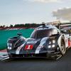
wec-spa-francorchamps-2015-7-audi-sport-


Porsche


Ah, but you're not going to take boring livery honors off us quite so easily, Porsche must've said. Audi and Porsche's on track battles have been pretty spectacular, and their rivalry has got to such a level that the two are now trying to out do each other in a fantastic dull livery competition. 

1427382873.jpg


For the last two seasons, Porsche has stuck with the "something written on the car that you can't read, particularly when it's doing 200mph and you don't have a bird's-eye view of the car" livery. In an unusual move, Porsche produced a red and black version of the livery for Le Mans, which were admittedly pretty nice. But the German manufacturer soon realised that these were far too colourful, and stuck with the white one for the rest of the WEC season. I still have no idea what it is supposed to say on the car, by the way.

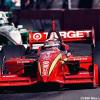
*Meanwhile, over in IndyCar*


ganassi-indycar-e1454454903548.png


No, no, no. Such a garish and colourful scheme will not succeed here. Do carry on.


So there we have it. Who do you think has produced the most boring livery? Or have I left any off this list that you think are even worse?

Waiting for the inevitable "Actually, I quite like the..." :p

Anyway, the serious point I have is why do racing teams have such a habit of producing such boring, unimaginative liveries? I'm sure I won't be alone here, but when I was a kid and first started watching motorsport, I was attracted to the cars that looked cool. Part of that was to do with the livery. When you're young, and you're deciding who to support, that kind of thing can make all the difference - which car looks the best or has the nicest livery. So, while on the face of it, it is a very small issue, do you think that teams should do more to come up with designs that are a bit more imaginative, colourful and eye-catching?


* - No offense intended to anyone on these forums from Woking.


Edited by JHSingo, 03 February 2016 - 15:19.


Advertisement

#2 Ross Stonefeld

Ross Stonefeld
  • Member

  • 70,106 posts
  • Joined: August 99

Posted 03 February 2016 - 15:17

Well, yeah, most of those are pretty good. Even more so considering what they had to work with.

I'm guessing most of your favourite liveries are sponsor themed. Probably one major sponsor taking over the identity of the car. Most likely a tobacco company.

#3 RedBaron

RedBaron
  • Member

  • 8,584 posts
  • Joined: March 01

Posted 03 February 2016 - 15:17

I really like the new Renault, the more I look at it the more I like it. I'm puzzled that it (I assume) inspired this topic.


(Just make sure it always runs those yellow striped tyres)


My vote goes to McLaren for boring liveries. Williams close behind.


Sauber and HRT liveries are just ****, not boring.


#4 ConsiderAndGo

ConsiderAndGo
  • Member

  • 9,683 posts
  • Joined: May 09

Posted 03 February 2016 - 15:18

Mclaren really have had rubbish liveries the past couple of seasons. The grey and white Saubers were proper eye sores, too.


#5 Anja

Anja
  • Member

  • 10,257 posts
  • Joined: November 09

Posted 03 February 2016 - 15:21

Waiting for the inevitable "Actually, I quite like the..." :p


Actually, I quite like the last McLaren livery.


My vote goes to Audi for somehow making decent color scheme combined with sharp, "modern" shapes utterly dull. Porsche didn't even try.


#6 Marklar

Marklar
  • Member

  • 44,257 posts
  • Joined: May 15

Posted 03 February 2016 - 15:21

Just to add that not Williams designed the livery, but Martini themselves.


Worst of the selection above for me the Sauber and HRT. Just grey.


#7 Lemans

Lemans
  • Member

  • 2,739 posts
  • Joined: March 02

Posted 03 February 2016 - 15:31

Bright colors, lots of shapes and shiny things = Excitement.


Welcome to the lowest common denominator. Sad.


#8 jonpollak

jonpollak
  • Member

  • 43,954 posts
  • Joined: March 00

Posted 03 February 2016 - 15:31

Is this the Livery thread this year?


Here's my entry.

KF1


0e408fc1253c03ac97d93e1a4d29ef62.jpeg


Jp


#9 JeePee

JeePee
  • Member

  • 5,907 posts
  • Joined: December 11

Posted 03 February 2016 - 15:34

^ That would look even better on the Ultra Softs


#10 Marklar

Marklar
  • Member

  • 44,257 posts
  • Joined: May 15

Posted 03 February 2016 - 15:36

Is this the Livery thread this year?


Here's my entry.

KF1


0e408fc1253c03ac97d93e1a4d29ef62.jpeg


Jp

You won.


#11 jonpollak

jonpollak
  • Member

  • 43,954 posts
  • Joined: March 00

Posted 03 February 2016 - 15:38

You won.

It doesn't work like that...

NONE of this works like that.


Jp


#12 Boing 2

Boing 2
  • Member

  • 4,766 posts
  • Joined: June 08

Posted 03 February 2016 - 15:42

I like the Williams livery, looks really clean. If in doubt just paint the whole car a nice bright colour, eg Jordan, Leyton House, Ferrari, Simtek.


Edited by Boing 2, 03 February 2016 - 15:44.


#13 Alfisti

Alfisti
  • Member

  • 39,658 posts
  • Joined: December 99

Posted 03 February 2016 - 15:43

I am not a very smart man and i am sure F1 marketing folk are very clever. however, i cannot FATHOM this trend to grey on grey on blackish on matt grey. I just DO NOT GET IT. It's meant to be a spectacle, a colourful sport and you are meant to promote your sponsor's product, how on EARTH did half the grid deck themselves out in tarmac grey? 


#14 Jimisgod

Jimisgod
  • Member

  • 4,954 posts
  • Joined: July 09

Posted 03 February 2016 - 15:51

The 2016 Renault is sexy. The Martini Williams are very nice. Simple is way better than failed attempts like...


363.jpg


Minardi_M196.jpg


BAR1999.jpg


24060_si_ripesca_la_hrt_con_il_nome_brab


Honda2008.jpg


22509.3.jpg


So messy and therefore, apparently, not boring!


Also, way to conveniently ignore the team that has been pretty much only a boring shade of red for 50 years. :rolleyes:


#15 jonpollak

jonpollak
  • Member

  • 43,954 posts
  • Joined: March 00

Posted 03 February 2016 - 16:01

This isn't the livery thread is it?


Where's the God Damn livery thread?


Jp


#16 Ross Stonefeld

Ross Stonefeld
  • Member

  • 70,106 posts
  • Joined: August 99

Posted 03 February 2016 - 16:02

It's funny how much the car shape affects the livery. So the 2008 Honda and 2009 Renaults cant be saved.

#17 ConsiderAndGo

ConsiderAndGo
  • Member

  • 9,683 posts
  • Joined: May 09

Posted 03 February 2016 - 16:03

The 2016 Renault is sexy. The Martini Williams are very nice. Simple is way better than failed attempts like...


363.jpg


Minardi_M196.jpg


BAR1999.jpg


24060_si_ripesca_la_hrt_con_il_nome_brab


Honda2008.jpg


22509.3.jpg


So messy and therefore, apparently, not boring!


Also, way to conveniently ignore the team that has been pretty much only a boring shade of red for 50 years. :rolleyes:


Christ, I forgot how utterly hideous that Renault was. Livery really wasn't helped by the god awful chassis shape and simple wings. That nose!  :eek:


#18 muramasa

muramasa
  • Member

  • 8,479 posts
  • Joined: November 08

Posted 03 February 2016 - 16:17


24060_si_ripesca_la_hrt_con_il_nome_brab


whoa :eek: :eek: :eek:


I didnt know Yamazen (that Y mark on sidepods, Japanese mechanics and home goods company, but not high brand) and madras (Japanese footwear maker, high price range but not so big) used to sponsor F1 team. 

Also, just did some image-searching about that car and found that thing on monocoque is "seikima-II" which is Japanese goth rock band lol  :eek: :rotfl: 


I knew this hideous looking car of Damon Hill but didnt know about or pay attention to sponsors until now.


wow something mad indeed must have been going on with F1-Japan back then

:eek: :eek: :eek:

:eek:  :eek:  :eek: 


#19 senna da silva

senna da silva
  • Member

  • 5,750 posts
  • Joined: March 03

Posted 03 February 2016 - 16:32

Is this the Livery thread this year?


Here's my entry.

KF1


0e408fc1253c03ac97d93e1a4d29ef62.jpeg


Jp


That touches me in all the wrong places.


Advertisement

#20 RainyAfterlifeDaylight

RainyAfterlifeDaylight
  • Member

  • 4,684 posts
  • Joined: February 15

Posted 03 February 2016 - 16:43

There were lots of beautiful liveries scheme provided by fans for Renault livery but based on Renault's new livery I guess there was no attention to those at all.


As most of us know and Renault 's new livery proved it again, Formula1 Teams don't really care about the liveries that fans send to them as examples.


Although I think I understand Formula1 teams too  :rolleyes:


#21 Ross Stonefeld

Ross Stonefeld
  • Member

  • 70,106 posts
  • Joined: August 99

Posted 03 February 2016 - 16:57

Weird. I bet they don't listen to our ideas on engineering or driver selection either.

#22 thegamer23

thegamer23
  • Member

  • 17,863 posts
  • Joined: November 13

Posted 03 February 2016 - 17:03

Were's Red Bull?

I hate those liveries


Edited by thegamer23, 03 February 2016 - 17:03.


#23 JHSingo

JHSingo
  • Member

  • 8,930 posts
  • Joined: June 13

Posted 03 February 2016 - 17:35

Were's Red Bull?

I hate those liveries


I like them. They've not changed a whole lot over the years, and as such the logo and branding is very recognisable.


I spoke to Andy Blackmore a while ago for a university project I was involved with, and he basically said he thinks the Red Bull livery is something of a modern day classic. But I'm sure not everyone will agree. :lol:


#24 RainyAfterlifeDaylight

RainyAfterlifeDaylight
  • Member

  • 4,684 posts
  • Joined: February 15

Posted 03 February 2016 - 17:43

Weird. I bet they don't listen to our ideas on engineering or driver selection either.

Do they want bankruptcy?


#25 thegamer23

thegamer23
  • Member

  • 17,863 posts
  • Joined: November 13

Posted 03 February 2016 - 17:59

I like them. They've not changed a whole lot over the years, and as such the logo and branding is very recognisable.


I spoke to Andy Blackmore a while ago for a university project I was involved with, and he basically said he thinks the Red Bull livery is something of a modern day classic. But I'm sure not everyone will agree. :lol:

redbull.jpg


f1redbull.jpg


I find last year's just messy, while the first models were pretty ok. 


Edited by thegamer23, 03 February 2016 - 17:59.


#26 aportinga

aportinga
  • Member

  • 10,567 posts
  • Joined: November 01

Posted 03 February 2016 - 18:18

Renault was painful!


The host (woman) clearly had no idea of the topic - stalled and had to hit the queue card over and over.


probably a couple hundred thousand fans could have done better.


Paint scheme is lame - another black.


I'm rooting against them this season!


:cool:   ;)  :well:


#27 mclarensmps

mclarensmps
  • Member

  • 8,597 posts
  • Joined: February 02

Posted 03 February 2016 - 18:35

If anything, I hope this prompts McLaren to change theirs up. 


#28 BullHead

BullHead
  • Member

  • 7,934 posts
  • Joined: May 08

Posted 03 February 2016 - 19:03

The Honda 07 livery was nice and... Interesting. Some might say that was boring... Horses for courses....

#29 Risil

Risil
  • Administrator

  • 61,331 posts
  • Joined: February 07

Posted 03 February 2016 - 19:32

I spoke to Andy Blackmore a while ago for a university project I was involved with, and he basically said he thinks the Red Bull livery is something of a modern day classic. But I'm sure not everyone will agree. :lol:


Did you ask him about the Rainbow Trout?


Edited by Risil, 03 February 2016 - 19:32.


#30 JHSingo

JHSingo
  • Member

  • 8,930 posts
  • Joined: June 13

Posted 03 February 2016 - 19:36

Did you ask him about the Rainbow Trout?


Alas, no. I'm sure it'd get his approval though. :p


#31 SirVanhan

SirVanhan
  • Member

  • 155 posts
  • Joined: November 05

Posted 03 February 2016 - 19:43

The Footwork and that Minardi were good compared to today standards (maybe the shapes help a bit). Also, am I really the only one in the universe to appreciate the 99 BAR livery?


Edited by SirVanhan, 03 February 2016 - 19:43.


#32 swintex

swintex
  • Member

  • 542 posts
  • Joined: February 04

Posted 03 February 2016 - 19:48


I knew this hideous looking car of Damon Hill but didnt know about or pay attention to sponsors until now.

I seem to remember it went about as as it looked.


#33 Lipp

Lipp
  • Member

  • 2,038 posts
  • Joined: October 00

Posted 03 February 2016 - 19:57

2dc0852e03.jpg=borat-mankini_big.jpg


#34 Denaris

Denaris
  • Member

  • 317 posts
  • Joined: December 14

Posted 03 February 2016 - 20:24

This isn't the livery thread is it?


Where's the God Damn livery thread?


Jp

Umm, I think I agreed to do the livery threat last year, but to be honest I just don't have the time to manage it. Anyone fancy starting one?....  :well:


#35 Spillage

Spillage
  • Member

  • 10,251 posts
  • Joined: May 09

Posted 03 February 2016 - 20:37

Mclaren. I'd contend that even their orange-and-white Marlboro livery was pretty dull, and more fondly remembered for how great the team and its drivers were than because it was beautiful.


#36 messy

messy
  • Member

  • 7,438 posts
  • Joined: October 15

Posted 03 February 2016 - 20:48

Most of the ones listed in the OP are actually really good!! I find those a really, really odd selection.

McLaren - responsible for some of the best liveries in modern F1. The West livery was a classic, the Vodafone one was classy and since then they've come up with two relative duds - the 2014 one and the launch 2015 one, which was quickly replaced by the pretty smart black and red one.

Sauber - yeah, 2011/12 were dull, but I like the dark grey one and in 2015 at least they came up with something distinctive.

Renault - the blue and yellow was a great livery, 2010 was lovely.

HRT - their 2011 livery in particular was really, really nice.

Williams? Martini?!!!!

Etc etc etc. nah.

Red Bull by a distance for me - because they make all their cars, in F1, GP2, FR3.5, DTM, NASCAR, etc etc, look exactly the same and it's not even a very good design. They splatter it across everything they do with only relatively minor alterations and we're 'treated' to not two cars on the grid but four wrapped in the same branding. I remember their first test cars in early 2005 looked quite nice, but anything with Red Bull splattered all over it just makes my eyes bleed with total boredom these days. Yawn.

#37 ardbeg

ardbeg
  • Member

  • 2,876 posts
  • Joined: March 13

Posted 03 February 2016 - 20:58

Well, of the choices in the poll I went for Audi. They have managed to highlight everything that is ugly on their car.


#38 DampMongoose

DampMongoose
  • Member

  • 2,258 posts
  • Joined: February 12

Posted 03 February 2016 - 21:02

Difficult topic. Most people rave about a Jordan that Eddie did a basic sticker deal on and without being paid to, he chose to paint it green. Epic livery apparently.

#39 Volcano70

Volcano70
  • Member

  • 871 posts
  • Joined: August 15

Posted 03 February 2016 - 22:25

Am I the only one who doesn't hate the ING Renault's?

1MCQ0543.jpg

^^ Yes, this is Sato, The scheme was too dull with only green and yellow, which I enjoyed the car below.

Honda+Indy+Edmonton+jAKhOMew02Wl.jpg


Anyway, this is about boring liveries

Onyx1989_thumb.jpg

Also, I enjoyed the Original Red Bull testing and the Spyker testing liveries 


Advertisement

#40 SimeonSasparella

SimeonSasparella
  • Member

  • 124 posts
  • Joined: November 15

Posted 04 February 2016 - 00:41

I think DTM cars two or three years ago were 70% of grey colour, lol

#41 jonpollak

jonpollak
  • Member

  • 43,954 posts
  • Joined: March 00

Posted 04 February 2016 - 00:55

Did you ask him about the Rainbow Trout?

 cut it the **** out pal...ya'll is only as good as your last race.

:up:

Jp


#42 Rob G

Rob G
  • Member

  • 11,609 posts
  • Joined: April 01

Posted 04 February 2016 - 04:12

Arrows A19, 1998. White lettering on a plain black car doth not a livery make.


#43 Lemans

Lemans
  • Member

  • 2,739 posts
  • Joined: March 02

Posted 04 February 2016 - 05:01

Arrows A19, 1998. White lettering on a plain black car doth not a livery make.


Fighting words!  I love that livery.


#44 AustinF1

AustinF1
  • Member

  • 20,436 posts
  • Joined: November 10

Posted 04 February 2016 - 06:40

Personally, I love the new Renault testing livery. Wouldn't bother me in the least if they used it for the whole season. Hope they don't stray too far from the current look.


#45 Wheels23

Wheels23
  • Member

  • 575 posts
  • Joined: November 09

Posted 04 February 2016 - 06:58

I like all those liveries....


:(


#46 ensign14

ensign14
  • Member

  • 61,701 posts
  • Joined: December 01

Posted 04 February 2016 - 07:41

Pretty much every Benetton livery was gash, other than the green Tyrrell ones.  And those mid-00s Renaults were an unholy mess.  Like someone vomited in a wind tunnel.


The biggest travesty was when Lotus changed from the sumptuous JPS black-and-gold to the Camel seasick-yellow.  Had it not been for the fact that I never started smoking as I don't want to die in painful agony drowning in my own tortured sputum, I would have given up in protest.


#47 messy

messy
  • Member

  • 7,438 posts
  • Joined: October 15

Posted 04 February 2016 - 07:48

I liked the Benetton liveries from 1998 on, they were really distinctive and made the cars really stand out on the grid. Those and the Jordans from the same era (particularly 2000 and 2001 when the yellow got almost flourescent) represent to me the absolute best of contemporary F1 liveries. Those were good years - the West McLarens, those two, the blue and turquoise Saubers, the Orange Arrows. Back then F1 seemed so vivid, so colourful and every team had a distinct identity. It's been going more and more over the last few seasons to which shade of grey you like best, even the helmet designs have got pretty drab. 


#48 RedBaron

RedBaron
  • Member

  • 8,584 posts
  • Joined: March 01

Posted 04 February 2016 - 07:51

To be fair to BAR in 1999, their cars would have looked petty nice had the rules been different on running different liveries on each car...


99jv014.jpg


It was whoever thought a zip down the centre of both on each car was a good idea that needs a punch in the face


BAR001edit.jpg


Again, bad livery but crucially not boring.


#49 messy

messy
  • Member

  • 7,438 posts
  • Joined: October 15

Posted 04 February 2016 - 07:56

I just wish they'd decided to go down the 555 route instead of Lucky Strike for 2000 and beyond. That launch car looks amazing. 


#50 P123

P123
  • Member

  • 23,842 posts
  • Joined: February 09

Posted 04 February 2016 - 08:25

The new Toyota LMP1 livery fits with this topic. Surely must be the same designer doing the Porsche, Audi and Toyota. They are all terrible, and Toyota now seems to imitate Audi colours, like it previously imitated Peugeot.