I don't think so
http://www.autoguide...ogo--maybe.html


 3 votes
Is it time for a new F1 logo?
Started by
jimjimjeroo
, Nov 17 2017 21:54
913 replies to this topic
Advertisement
#2

f1paul
-

- 8,276 posts
- Joined: April 16
Member
Posted 17 November 2017 - 21:56
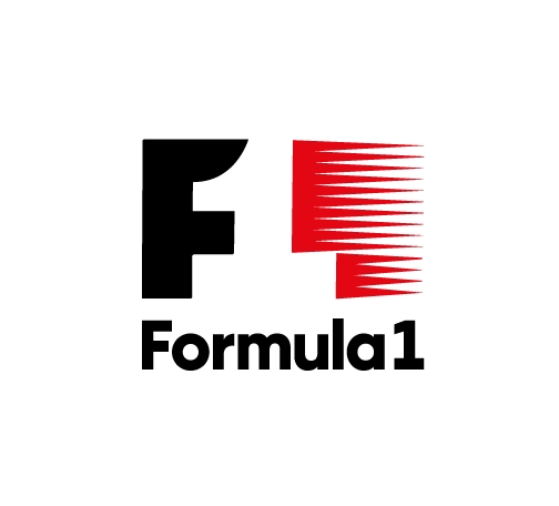
It was only a few days ago when someone pointed out to me the 1 in the middle of the logo. 
![]()
#3
PayasYouRace
-

- 46,552 posts
- Joined: January 10
Racing Sims Forum Host
Posted 17 November 2017 - 21:56
The first one looks like they were building a scalextric track and ran out of track pieces.
The square one is just ugly.
The last one looks like the Forza Motorspot logo.
The square one is just ugly.
The last one looks like the Forza Motorspot logo.
#4
Myrvold
-

- 16,014 posts
- Joined: December 10
Member
Posted 17 November 2017 - 21:57
It was only a few days ago when someone pointed out to me the 1 in the middle of the logo.
Which none of the new ones have, this actually looks like it's had some thought in to it at least.
Right focus from Liberty there...
#5
Nonesuch
-

- 15,870 posts
- Joined: October 08
Member
Posted 17 November 2017 - 22:07
That first one looks a bit like something you'd see alongside a text on How To Reverse Out of Dead-Ends.
The second would seem like the monitor showing it has interlacing issues.
The third one is pretty decent. But no red? No deal. 
Edited by Nonesuch, 17 November 2017 - 22:07.
#6
bogi
-

- 4,105 posts
- Joined: October 07
Member
Posted 17 November 2017 - 22:11
Herman Tilke should design F1 logo.
#7
jimjimjeroo
-
- 2,731 posts
- Joined: December 08
Member
Posted 17 November 2017 - 22:13
I don't get how people don't see the 1. I saw it over 20 years ago
#8
ArchieTech
-

- 3,354 posts
- Joined: May 15
Member
Posted 17 November 2017 - 22:16
Don't mess with a classic... the current logo is great.
#9
RECKLESS
-

- 2,821 posts
- Joined: April 16
Member
Posted 17 November 2017 - 22:18
Don't fix what doesn't need to be fixed.
But this being Formula 1 I bet they'll fix it.
#10
Tenmantaylor
-

- 18,126 posts
- Joined: July 01
Member
Posted 17 November 2017 - 22:18
It was only a few days ago when someone pointed out to me the 1 in the middle of the logo.
Surely not, fpaul! Why are you called that BTW?
The FedEx logo is going to do this to you:
https://media.giphy....dbrwY/giphy.gif
#11
Maustinsj
-

- 4,915 posts
- Joined: February 12
Member
Posted 17 November 2017 - 22:22
Back to this one, I say!
![]()
#12
f1paul
-
- 8,276 posts
- Joined: April 16
Member
Posted 17 November 2017 - 22:22
Surely not, fpaul! Why are you called that BTW?
The FedEx logo is going to do this to you:
https://media.giphy....dbrwY/giphy.gif
Clever. I really should've called myself V8paul tbh.
#13
ANF
-

- 29,535 posts
- Joined: April 12
Member
Posted 17 November 2017 - 22:24
At least you could spot the car in that one...Back to this one, I say!
#14
Disgrace
-

- 31,453 posts
- Joined: January 10
Member
Posted 17 November 2017 - 22:24
Herman Tilke should design F1 logo.
Looks like he has:

#15
f1paul
-
- 8,276 posts
- Joined: April 16
Member
Posted 17 November 2017 - 22:25
I don't get how people don't see the 1. I saw it over 20 years ago
Idiots right!

#17
DaytimeUTT
-

- 299 posts
- Joined: September 17
Member
Posted 17 November 2017 - 22:30
OMG I never saw the 1 until now. Even then I had to look really closely to find it 
#18
pdac
-
- 17,285 posts
- Joined: February 10
Member
Posted 17 November 2017 - 22:41
The current one is awful and should be replaced. But the proposed contenders are an order of magnitude worse.


Advertisement
#20
Maustinsj
-
- 4,915 posts
- Joined: February 12
Member
Posted 17 November 2017 - 22:54
Thongula 1, perhaps?
#21
Marklar
-

- 44,289 posts
- Joined: May 15
Member
Posted 17 November 2017 - 22:54
Fits to the new halo I guess
#22
V8 Fireworks
-

- 10,824 posts
- Joined: June 06
Member
Posted 17 November 2017 - 23:01
Those logos are terrible, there is nothing wrong with the current logo.  But change for change's sake I suppose.
Maybe Liberty will settle on a more subtle change, like just changing the typeface slightly. Renault did that a couple of times, as did Alfa Romeo IIRC... It's just subtle and not quite so drastic.
#23
turssi
-

- 3,368 posts
- Joined: October 10
Member
Posted 17 November 2017 - 23:03
At least you could spot the car in that one...
What car ?
#24
Anja
-

- 10,353 posts
- Joined: November 09
Member
Posted 17 November 2017 - 23:19
The current one, while really, really good is starting to show its age a bit. I can understand the desire for change, but a slight redesign would be a better way to go about it in my opinion.
Those proposed logos are just plain awful.
Edited by Anja, 17 November 2017 - 23:19.
#26
AustinF1
-

- 20,689 posts
- Joined: November 10
Member
Posted 17 November 2017 - 23:25
None of those is better than what they already have. Just leave it be...
#27
Afterburner
-

- 9,235 posts
- Joined: January 11
RC Forum Host
Posted 17 November 2017 - 23:32
My honest reaction when seeing those was... not positive. They look like the sort of logo you see on a cheap knockoff product from Amazon. There’s probably something profound in that...
#28
SPBHM
-

- 1,068 posts
- Joined: August 09
Member
Posted 17 November 2017 - 23:35
current logo is fine, very recognizable, with other changes going on I think it's best to keep it.
#29
TomNokoe
-

- 33,682 posts
- Joined: July 11
Member
Posted 18 November 2017 - 00:03
Liberty are spending too much time trying to change things that nobody has ever shown any discontent towards.
Today alone they are testing the waters to see if safety car restarts could become 2x2 rolling restarts and now these dumb logos. Dare I say they are out of touch!!
Today alone they are testing the waters to see if safety car restarts could become 2x2 rolling restarts and now these dumb logos. Dare I say they are out of touch!!
#30
Rob G
-

- 11,615 posts
- Joined: April 01
Member
Posted 18 November 2017 - 00:25
I think it needs to be updated, but not totally redesigned. A negative-space 1 is worthy of being kept, but I think the current logo looks a little amateurish. Maybe it's all the triangles.
#31
PayasYouRace
-
- 46,552 posts
- Joined: January 10
Racing Sims Forum Host
Posted 18 November 2017 - 00:35
I think the F1 brand has reached a stage where their logo should remain virtually the same, with slight updates to proportions and styling to keep it fresh.
#32
Vielleicht
-

- 5,961 posts
- Joined: June 16
Member
Posted 18 November 2017 - 00:46
Totally up for an update, the current one is good but feels dated. Complete redesign seems kind of unnecessary.
#33
johnmhinds
-

- 7,292 posts
- Joined: July 09
Member
Posted 18 November 2017 - 00:49
Surprised nobody has mentioned the subliminal Marlboro in the current F1 logo.
#34
Clatter
-

- 44,754 posts
- Joined: February 00
Member
Posted 18 November 2017 - 00:51
With all the stuff that is wrong with F1, the last possible thing on that list would be the logo. The only people who would gain from a change are the marketing team paid to do it. It would add zero to sport.
#35
Swck81
-

- 784 posts
- Joined: May 16
Member
Posted 18 November 2017 - 00:56
The FedEx logo is going to do this to you:
https://media.giphy....dbrwY/giphy.gif
Ehhh... FedEx? --> How on earth I never saw THAT in THERE!!! 😂
Edited by Swck81, 18 November 2017 - 00:57.

#37
BalanceUT
-

- 2,318 posts
- Joined: February 16
Member
Posted 18 November 2017 - 01:34
Logos with hidden images. There are lots and some of them are quite fun. logos with hidden images
#38
BalanceUT
-
- 2,318 posts
- Joined: February 16
Member
Posted 18 November 2017 - 01:42
Oh... and who knows with these alternative logos. Maybe they are looking at marketing some products for which the classic logo is unsuitable but that these would be. Don't read too much into it. We are not talking about Bernie messing with the qualifying format here.
#39
oetzi
-

- 6,829 posts
- Joined: April 10
Member
Posted 18 November 2017 - 02:45
I thought the page wasn't working. Then I realised that was what I was meant to be looking at.I don't think so
http://www.autoguide...ogo--maybe.html
Advertisement
#40
maximilian
-

- 8,119 posts
- Joined: February 10
Member
Posted 18 November 2017 - 02:49
Maybe not necessarily a "new" logo, but the somewhat cheesy tilt and obsolete font of the old logo can be remedied for a more updated look that would have brand continuity.
#41
SKL
-

- 1,415 posts
- Joined: August 99
Member
Posted 18 November 2017 - 02:55
I too would go with the old FIA F1 logo video posted above.... sure brings back a lot of memories.
#42
CoolBreeze
-

- 2,458 posts
- Joined: January 12
Member
Posted 18 November 2017 - 04:30
Nope. The current logo is perfectly fine. There's other bigger problems in F1 than the logo.
#43
RacingGreen
-

- 3,527 posts
- Joined: March 17
Member
Posted 18 November 2017 - 05:53
Looks like a classic case of new management not knowing what to do the improve the product so so trying to improve the branding to me.
#45
SpaceHorseParty
-

- 1,600 posts
- Joined: September 12
Member
Posted 18 November 2017 - 06:40
Maybe not necessarily a "new" logo, but the somewhat cheesy tilt and obsolete font of the old logo can be remedied for a more updated look that would have brand continuity.
Also, it fits with how FOM abandoned the slanted world feed graphics in favor of the boxy graphics two years ago.
#46
V8 Fireworks
-
- 10,824 posts
- Joined: June 06
Member
Posted 18 November 2017 - 06:55
Also, it fits with how FOM abandoned the slanted world feed graphics in favor of the boxy graphics two years ago.
Good job by maximillian 
#47
tmekt
-

- 1,254 posts
- Joined: October 12
Member
Posted 18 November 2017 - 07:18
A new logo?? That's it, I'm voting for Trump.
#48
GrumpyYoungMan
-
- 7,007 posts
- Joined: July 12
Member
Posted 18 November 2017 - 08:24
No and all the other designs in that link are awful!
The logo isn’t the problem with F1...
The logo isn’t the problem with F1...
#49
F1matt
-

- 3,291 posts
- Joined: June 11
Member
Posted 18 November 2017 - 08:44
Looking at all the problems in F1, engine penalties, new engine regulations, halo, driver penalties, teams struggling with finances, I am glad Liberty have recognised the real issue and discovered we need a new logo. Bravo.
#50
NixxxoN
-

- 4,149 posts
- Joined: June 17
Member
Posted 18 November 2017 - 09:11
Let me guess, they want to replace it with a very simiple and minimalistic piece of crap... The trendy thing nowadays.
Edited by NixxxoN, 18 November 2017 - 09:12.


