Helmet liveries in F1
#1

Posted 09 August 2008 - 12:00
For me, too many modern F1 helmets range between boring and hideous (although better than their counterparts in motorcycling) but there are a few worth a second look eg. the simple, striking crosses of Massa and DC, Jenson's stylised JB, Piquet's orange and white version of his dad's helmet (for me a great improvement over the silver version he wore in lower formulae), Fisi's light and clean yellow and green on white. I like Alonso's for the pale blue, too, although I'd like to tidy up the design, and Bourdais' is attractive and tasteful.
The worst? Well, Vettel's advert probably edges out the various, barely recognizable, awkward splashes and lines sported by about half the grid.
Advertisement
#2

Posted 09 August 2008 - 12:14
None of them stand out or have any real design or significance to them.
Piquet's helmet would be fine if he didn't have to sponsor it up.
#3

Posted 09 August 2008 - 12:24
Originally posted by Ross Stonefeld
Bourdais helmet is nothing and I couldn't re-draw Massa's helmet if I had to. I know its a combo of neon greens and yellows, but I have no idea what the design is.
None of them stand out or have any real design or significance to them.
Piquet's helmet would be fine if he didn't have to sponsor it up.
Not that I disagree, but what would your choices be, or even what does your lid look like? you used to race didn't you?
Personally, I like to see Kimi's updates. They are not always attractive, but at least some thought goes into them.
The drivers that have had the same style since they were a kid are the best ones. My fave is Hamilton's. Not because I am a fanboy, as I am certainly not that, but because it stands out.
#4

Posted 09 August 2008 - 12:45
Originally posted by Ross Stonefeld
(...)Piquet's helmet would be fine if he didn't have to sponsor it up.
Yeah.
#5

Posted 09 August 2008 - 12:48
This one is especially cool, Robert was wearing it at Brazil GP 2007:

#6

Posted 09 August 2008 - 12:52
I enjoyed Davidson's helmet because it was a non-standard layout and he always raced/tested for teams that didn't put a lot of stickers on their driver helmets.
Eliteboy I never bothered to paint my helmet because I only had one and it was pretty ratty. I wasn't going to do anything more complicated than American racing blue and twin white stripes running front to back. No chrome, no textures, just two solid colors.
I reckon it'd work in modern F1 with high cockpit sides and long camera shots favoring head-on angles.
#7

Posted 09 August 2008 - 12:57
Originally posted by Ross Stonefeld
Bourdais helmet is nothing and I couldn't re-draw Massa's helmet if I had to. I know its a combo of neon greens and yellows, but I have no idea what the design is.
None of them stand out or have any real design or significance to them.
I disagree. I think Massa's is quite distinctive with the twin yellow stripes moving across the top and meeting on the chinbar.
The thing I like the most about Bourdais is that he hasn't folded to his paymaster and given up the helmet design he's been using for years.
I think Red Bull take away part of their drivers individuality by making them wear the Red Bull helmet design.
Of the current bunch I think JB's helmet is a great design. Hamilton's is very distinctive too. Mansell had a design which was really identifiable.
Call me old fashioned but I think a driver should stick with their design for life. It's part of them.
#8

Posted 09 August 2008 - 13:04
Originally posted by Ross Stonefeld
I enjoyed Davidson's helmet because it was a non-standard layout and he always raced/tested for teams that didn't put a lot of stickers on their driver helmets.
I agree, Davidson has a really cool design which is quite unique. He'd run into problems at teams like Ferrari which have that 'sponsor halo' around the top.
Originally posted by Ross Stonefeld
I reckon it'd work in modern F1 with high cockpit sides and long camera shots favoring head-on angles.
That's true. I thought Monterio had a lovely design with those twin stripes.
Also, the Andrettis have a great design with the red stripe down the top (in Marco's case blue) and the American flag on the chin bar. Simple, visible and effective.
#9

Posted 09 August 2008 - 13:09
#10

Posted 09 August 2008 - 16:36
Originally posted by potmotr
Call me old fashioned but I think a driver should stick with their design for life. It's part of them.
Me too, That's something I like about Lewis, although he hasn't been too long in F1 look like he's gonna keep the design.
Of all liveries I think I like most Raikkonnen's, Heidfeld also has a cool one in white, the one I really hate is Sutil's, with all the stickers and the design

#11

Posted 09 August 2008 - 17:03
I like the Hill family Henley rowing club design.
Some current designs not in order:
Nakajima; Simple and effective
DC: loved it when I first saw it.
Davidson; Very cool
Trulli: I love the JT design its original
Piquet; Iconic
Rosberg: Crap
LH: Senna inspired so I find it cool
Rubens: Original if uninteresting
Wurz: Sh*t
I love the colours that drives run on the helmets. I am always designing my own colours for myself and the family to run at events.
#12

Posted 09 August 2008 - 17:19
Originally posted by thuGG
I really like Kubica's helmet, also Kimi's.
This one is especially cool, Robert was wearing it at Brazil GP 2007:
That does look good. I like how Heidfeld, Kubica and Raikkonen use matt blacks. They look very cool.
#13

Posted 09 August 2008 - 17:21
So, my position on helmets would be this: they're great when you dive head first into something hard but I don't really care what they look like.
#14

Posted 09 August 2008 - 17:30
#15

Posted 09 August 2008 - 17:38
He painted a Lewis Hamilton helmet in testing early last year. It looked great. A much lighter shade of almost lemon yellow, and a quite funky interpretation of his red green and blue flashes down the side.
You can see it here, left hand column, third from the bottom.
http://www.autosport...ndex.php/id/755
#16

Posted 09 August 2008 - 17:45
Graham was a member, and entitled to use the design, Damon asked, and was granted, permission to carry it on. IIRC Graham's was a darker blue.
I liked Jackie Stewart's, then used by Paul. Classy and understated, not as gaudy as possible...
#17

Posted 09 August 2008 - 18:13
Originally posted by Smudger
I liked Jackie Stewart's, then used by Paul. Classy and understated, not as gaudy as possible...
Allan McNish adopted a similar theme which looks great. A kind of pearl white with the family colours around the top.
#18

Posted 09 August 2008 - 18:32
Originally posted by potmotr
Allan McNish adopted a similar theme which looks great. A kind of pearl white with the family colours around the top.
The helmets of McNish and Heinz-Harald Frentzen are probably my favourite recent ones.
#19

Posted 09 August 2008 - 18:37

Advertisement
#20

Posted 09 August 2008 - 19:17
Best designs are the easy ones with an individual twist to them. Not necessarily big name drivers. Jo Vonlanthen. David Purley. Roger Williamson
And in this day and age with identification more difficult because the sides of the helmet are hidden, so many have the sort of Schumacher blue-top design...Barrichello, Button, Heidfeld (till recently), Fisichella, Webber (who probably has the best, but he should go back to yellow on top, although Piquet's works better in Renault colours than that garish chrome)...jeez.
#21

Posted 09 August 2008 - 19:46
Kimi's newest helmet though I have mistaken a couple of times, for schumi's testing helmet, with the ferrari red split by the white band.
Do any of the drivers still use the heat activated paint helmets like Heidfeld did last season?
#22

Posted 09 August 2008 - 20:17
Best designs are the easy ones with an individual twist to them. Not necessarily big name drivers. Jo Vonlanthen. David Purley. Roger Williamson . Elio de Angelis . Jean-Pierre Beltoise. Slim Borgudd. Just plain blocks of colour with distinctive shapes and/or designs. No need to be poncey about the whole thing.
couldn't agree more. simple is best: jacky ickx, david coulthard, tom pryce, jody scheckter, ayrton senna,...
best recognizable? henri pescarolo. not a fancy design, just a fancy colour.
#23

Posted 09 August 2008 - 20:32
Funny how I've never seen that both Kubica and Glock have Dell and Credit Suisse on their helmets on the race coverage.
They don't wear their helmets at the press conference (nice to have seen both of them there this year!) -so what's the point? Same goes for all the "artwork" - you only see it if you're a helmet fetishist and download pictures of helmets.
#24

Posted 09 August 2008 - 20:42


#25

Posted 09 August 2008 - 20:47
Mike Hailwood, Marco Lucchinelli, Giacomo Agostini, Randy Mamola...much better. It's a lost art.
And that Finnish painter needs his brushes broken. How to wreck simple designs in one easy method.
#26

Posted 09 August 2008 - 20:49
#27

Posted 09 August 2008 - 20:50
Damon's eyes in that helmet just looked evil!
#28

Posted 09 August 2008 - 20:51
#29

Posted 09 August 2008 - 20:57
Originally posted by BT44/45
henri pescarolo. not a fancy design, just a fancy colour.
Rene Arnoux! I wouldn't want a whole field like that (although I suppose there was) but as one of a variety it worked very well. Ronnie Petersen and Michele Alboreto. Francois Cevert. Martin Brundle (especially the wavy version).
Some images of helmets from the last couple of years (including a thermochromic helmet one for Rubens from 2007. I don't think anyone's used one this year).
I like helmet design. If you make it all the way to F1 you might as well put a little thought into it.
#30

Posted 09 August 2008 - 21:02
#31

Posted 09 August 2008 - 21:18
Originally posted by H0R
I still like Barrichello's helmet. It is a classic and distinctive design, not a mess like most modern drivers' lids. I think they should basically stick to a chosen design. Radical changes like Irvine from his classic red and green design to the Jaguar design is usually the worst idea. Similarly bad: Kimi Raikkonen. Does he have a basic idea for his helmet's design at all?
I think it's one of the most stupid designs.
#32

Posted 09 August 2008 - 21:24
Originally posted by Mika Mika
I think Damon and Graham Hill's design was the best!
Damon's eyes in that helmet just looked evil!
On the actual grid, i like Button's design. Coulthard and Davidson are great too (and I'm not english!)
On motorbikes I like Simoncelli's and last year's Pedrosa.
Some pics
http://www.f1wolf.co...rs-helmets.html
#33

Posted 09 August 2008 - 21:25
Originally posted by BunnyK
Me too, That's something I like about Lewis, although he hasn't been too long in F1 look like he's gonna keep the design.
Of all liveries I think I like most Raikkonnen's, Heidfeld also has a cool one in white, the one I really hate is Sutil's, with all the stickers and the design

That design looks gay ;)
#34

Posted 09 August 2008 - 22:16
Massa's helmet design looks good too the sweeping yellow coming down to the chin bar, I think mostly the color combination is what strikes me.
Alonso's helmet works well, not too busy, as far as symbology is concerned I think its the best. His 2006 Renault helmet was the best though.

Heidfeld's White/Gold helmet for German GP looked very slick too.

#35

Posted 09 August 2008 - 23:25
Originally posted by potmotr
I agree, Davidson has a really cool design which is quite unique.
Not that unique. Very close to Eddie Cheever's helmet.
http://i72.photobuck...chevsmhelml.jpg
http://www.f1wolf.co...ny-davidson.jpg
I always liked Piquet's helmet, but Jr's is a bit too busy to emulate his Dad's
Of the current crop I liked Alonso's McLaren helmet, Kubica's red version as well as Lewis'.
#36

Posted 09 August 2008 - 23:49

#37

Posted 10 August 2008 - 01:02
i liked johnny rea's old helmet

#42

Posted 10 August 2008 - 02:50
I can't believe you took me seriously. Look at the pics he has his face plasted on the top of his own helmet while he is making a stupid clown expression. How much more vain can you get.Originally posted by ensign14
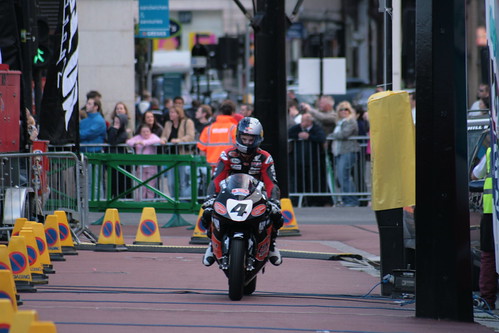
Rossi's, like almost all bikers' designs, are even worse than the F1 guys. Impossible to work out what the design actually is most of the time.
They are just helmets. I can't talk seriously about them like you guys are, as if they are the latest from Versace's fall collection. They all look a blur at speed anyway. Unlike your latest Victoria Secret Miranda Kerr collection. Now that's something worth obsessing about.
#43

Posted 10 August 2008 - 04:38
Troy lee galleries
He's done, amongst many others, Greg Moores, Paul Tracys, Juan Montoyas, Max Papis' and I believe he's done some Formula 1 drivers as well.
I just got done cruising his site. I had no idea but it seems he does most of the NASCAR over the wall crews helmets as well with team/sponsor themes.
Franchitti's by Troy Lee

#44

Posted 10 August 2008 - 10:26
I really like
I don't know why Jaques never used it. It was better than his garish design. He wore it once at the Festival of speed I believe.
#45

Posted 10 August 2008 - 11:20
Originally posted by F1Johnny
Not that unique. Very close to Eddie Cheever's helmet.
Actually, you're right. I had noticed that once. Was there any connection between the two to your knowledge?
I know Jean Alesi took his design from his hero Elio De Angelis.
Equally, Michele Alboreto modeled his lid on his favorite driver when growing up, Ronnie Peterson.
I have a few of those Minichamps half-scale helmets at home. They're a little pricey but look awesome and the detailing is fantastic. I have a Ralf Schumacher from 1999 and Felipe Massa from 1992. One sits on top of the telly, the other beside the bed... I don't think Minichamps makes the half scale anymore.
#46

Posted 10 August 2008 - 11:44
Yes, Davidson always liked it so copied it. Laurent Redon did something similar as well.Originally posted by potmotr
Actually, you're right. I had noticed that once. Was there any connection between the two to your knowledge?
#47

Posted 10 August 2008 - 13:20
Originally posted by Lazy Prodigy
Raikkonens helmet this year looks cool. It would look better if it said Marlboro instead of those stupid barcodes. I always liked his viking logo thing on his helmet. But that Kubica helmet is sleek and cool.
can you explain that...what is the viking logo? thanks
#48

Posted 10 August 2008 - 13:21
Originally posted by NineOneSeven
I like Rossi's Sun and Moon theamed helmets. They are fantastic.
I really like
I don't know why Jaques never used it. It was better than his garish design. He wore it once at the Festival of speed I believe.
JV rainbow colors is the gay version
#49

Posted 10 August 2008 - 13:22
Originally posted by glorius&victorius
can you explain that...what is the viking logo? thanks
The horns on top of the helmet.
http://www.f1wolf.co...helmet-2008.jpg


