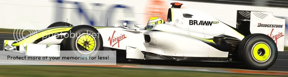
OK - Ross - You've been vindicated - you have a legal car and are likely to be leading and winning races for a while yet. That being the case, how about getting a decent livery????
That putrid florescent lemon yellow set off by - white - ! with the wee black stripes and the hastily pasted on Virgin logo is, not to put too fine a point on it - AWFUL.
If I get the time in the next couple of days, I'll photoshop a suggestion up - in the meantime - any colour suggestions? (And please - let Jenson and Rubens go back to their original helmet colours....)

Brawn livery
Started by
Bruce
, Apr 15 2009 13:27
71 replies to this topic
Advertisement
#2

Direct Drive
-

- 408 posts
- Joined: February 09
Member
Posted 15 April 2009 - 13:29
I truly like the simplicity of it all.
And the fact its winning.
And the fact its winning.
#3
le chat noir
-

- 4,848 posts
- Joined: June 05
Member
Posted 15 April 2009 - 13:33
its my favourite livery
i like the altered helmets - individuality + team spirit
virgin stickers don't suit though.
and i like the fact bbc pitcrew is similar
i like the altered helmets - individuality + team spirit
virgin stickers don't suit though.
and i like the fact bbc pitcrew is similar
#4
Cplus
-

- 566 posts
- Joined: September 05
Member
Posted 15 April 2009 - 13:34
the wheelcovers are the worst bit.
fixed wheel cover look crap generally, but when they're made bright friggen yellow/green/zombie vomit colour they are just plain WRONG.
fixed wheel cover look crap generally, but when they're made bright friggen yellow/green/zombie vomit colour they are just plain WRONG.
#5
Boing 2
-

- 4,971 posts
- Joined: June 08
Member
Posted 15 April 2009 - 13:35
screw the white, day-glo the whole car!!! 
#6
Timstr11
-

- 11,162 posts
- Joined: May 02
Member
Posted 15 April 2009 - 13:35
Hope they ditch the yellow on the wheelcovers. Don't know who dreamed that up. It's hideous.
#7
RoutariEnjinu
-

- 2,442 posts
- Joined: March 09
Member
Posted 15 April 2009 - 13:40
I think they are quite iconic.
Then again, isn't that what dictates fashion to a degree? Due to the success of the Brawns, and a kind of short term nostalgia, they could be starting something.
There have been ugly F1 cars, but for me it's been the shape that's been ugly.
I think the Brawns are better looking than the unimaginative Toyotas.
That said, considering the lack of busy and distracting decals, they have missed a trick in my opinion as it would have looked deadly in jet black. Not even gloss black but radar absorbing stealth black.
HOW immense would that have looked?
A couple of sinister looking black widows up front.
It would have been EVIL, and also would have kept their aero a bit more of a secret as it's harder to see what ends and starts where, and where things curve etc.
#8
Chubby_Deuce
-

- 6,990 posts
- Joined: July 04
Member
Posted 15 April 2009 - 13:40
I enjoy the neon. It's much like the color that's on my leathers and old helmet. 
#9
Owen
-

- 13,192 posts
- Joined: September 06
Member
Posted 15 April 2009 - 13:47
Originally posted by Timstr11
Hope they ditch the yellow on the wheelcovers. Don't know who dreamed that up. It's hideous.
Yep. It all looks a bit amateur to me. They need to look at the bigger picture of what they're offering sponsors (as well as tackling the livery asap). It's about the only area on the car where there is room for serious improvement. Well, that and the gearbox.
#10
senna da silva
-
- 5,750 posts
- Joined: March 03
Member
Posted 15 April 2009 - 13:49
Originally posted by Bruce
OK - Ross - You've been vindicated - you have a legal car and are likely to be leading and winning races for a while yet. That being the case, how about getting a decent livery????
That putrid florescent lemon yellow set off by - white - ! with the wee black stripes and the hastily pasted on Virgin logo is, not to put too fine a point on it - AWFUL.
If I get the time in the next couple of days, I'll photoshop a suggestion up - in the meantime - any colour suggestions? (And please - let Jenson and Rubens go back to their original helmet colours....)
Agreed.

#11
glorius&victorius
-

- 4,327 posts
- Joined: June 02
Member
Posted 15 April 2009 - 13:50
I love the livery as it is....
I was more wondering about their website... that looks like its from the late nineties...
I can understand that BrawnGP was born very last minute and the team put together a website in all haste... but with several weeks into its existence...and with the availability of sexy and free content management platforms... they must be able to put something more decent...
#12
engel
-

- 5,037 posts
- Joined: November 08
Member
Posted 15 April 2009 - 13:51
I wish somebody would make an all black car ... I miss those JPS lotus cars
#13
Andy Donovan
-

- 1,015 posts
- Joined: January 06
Member
Posted 15 April 2009 - 13:53
And a row of red lights on the nose like Knight Rider?Originally posted by RoutariEnjinu
That said, considering the lack of busy and distracting decals, they have missed a trick in my opinion as it would have looked deadly in jet black. Not even gloss black but radar absorbing stealth black.
HOW immense would that have looked?
A couple of sinister looking black widows up front.
It would have been EVIL, and also would have kept their aero a bit more of a secret as it's harder to see what ends and starts where, and where things curve etc.
I like the day-glo, anything to stop the whole grid becoming red/white.
#14
ForeverF1
-

- 6,580 posts
- Joined: February 09
RC Forum Host
Posted 15 April 2009 - 13:55
I suppose they could always go back to the Earthworks livery, in loving memory of Honda..... ;)
;)
;)
#15
RedBaron
-

- 8,584 posts
- Joined: March 01
Member
Posted 15 April 2009 - 13:57
You think they'll get some more sponsors now (which might lead to livery adjustments), maybe they were waiting to confirm contracts based on the hearing and thefore future performance?
#16
RoutariEnjinu
-
- 2,442 posts
- Joined: March 09
Member
Posted 15 April 2009 - 13:58
Originally posted by ForeverF1
I suppose they could always go back to the Earthworks livery, in loving memory of Honda.....
Or they could marker pen some craters on and have MoonDreams livery.

#17
werks prototype
-

- 7,220 posts
- Joined: January 09
Member
Posted 15 April 2009 - 14:07
A nice retro Tyrrell blue.
They will ultimately put whatever they are paid to put on. Anybody remember the shock of the Winfield Williams.
They will ultimately put whatever they are paid to put on. Anybody remember the shock of the Winfield Williams.
#18
potmotr
-

- 12,995 posts
- Joined: January 08
Member
Posted 15 April 2009 - 14:08
Originally posted by Timstr11
Hope they ditch the yellow on the wheelcovers. Don't know who dreamed that up. It's hideous.
I think the wheel covers should be banned from the sport completely.
Ferrari's are just as bad IMO, as they also feature that awful spoke arrangement.
#19
Blythy
-

- 960 posts
- Joined: February 07
Member
Posted 15 April 2009 - 14:12
Originally posted by ForeverF1
I suppose they could always go back to the Earthworks livery, in loving memory of Honda.....
I say having the world on their back was slowing them down.
It's fine the way it is, it's far better than the renault livery. And, at least it's original, and not dominated by the major sponsor.
Bruce, when can we see more cartoons?
Advertisement
#20
djellison
-

- 1,726 posts
- Joined: September 04
Member
Posted 15 April 2009 - 14:13
Originally posted by le chat noir
its my favourite livery
i like the altered helmets - individuality + team spirit
Agreed - I actually quite like it! (Although I don't like the shop available team merchandise much)
#21
aportinga
-

- 10,998 posts
- Joined: November 01
Member
Posted 15 April 2009 - 14:16
Originally posted by engel
I wish somebody would make an all black car ... I miss those JPS lotus cars
Agreed - when Minardi USA entered in ChampCar I thought they looked fantastic.
I always wondered why more teams do not use darker colors - certainly that would make it more difficult for their opponents to figure out the design.
#22
potmotr
-
- 12,995 posts
- Joined: January 08
Member
Posted 15 April 2009 - 14:19
Originally posted by aportinga
I always wondered why more teams do not use darker colors - certainly that would make it more difficult for their opponents to figure out the design.
I think I read somewhere that dark colours don't appear that well on television.
Apparently the best is blue on white (ie: Williams, BMW-Sauber) for televisual recognition.
#23
niallmckiernan
-

- 346 posts
- Joined: October 07
Member
Posted 15 April 2009 - 14:20
cover it in tinfoil and blind the opposition 
#24
RoutariEnjinu
-
- 2,442 posts
- Joined: March 09
Member
Posted 15 April 2009 - 14:33
I want to see an F1 car in Chocolate Brown with Baby Blue bands running down it.
Would be ace.
F1 Trivia: Has there ever been a brown based F1 car?
Would be ace.
F1 Trivia: Has there ever been a brown based F1 car?
#25
inaki
-

- 2,422 posts
- Joined: September 03
Member
Posted 15 April 2009 - 14:33
I do not have a special problem with Brawn cars livery.
But what I can barely stand is the yellow fluo color in the wheel rim covers.
I think rims can be either natural alloy plated, gold color or even black, but the yellow fluo is disgusting.
I find these ones acceptable, look at this beauties:
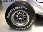
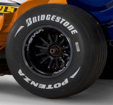
But this ones are horrible:
But what I can barely stand is the yellow fluo color in the wheel rim covers.
I think rims can be either natural alloy plated, gold color or even black, but the yellow fluo is disgusting.
I find these ones acceptable, look at this beauties:
But this ones are horrible:
#26
Blythy
-
- 960 posts
- Joined: February 07
Member
Posted 15 April 2009 - 14:34
Originally posted by potmotr
I think I read somewhere that dark colours don't appear that well on television.
Apparently the best is blue on white (ie: Williams, BMW-Sauber) for televisual recognition.
the best is the one at the front
#27
Scotracer
-

- 5,855 posts
- Joined: June 08
RC Forum Host
Posted 15 April 2009 - 14:34
I wish they would use their Honda test livery (all-black). It was awesome
#28
Cplus
-
- 566 posts
- Joined: September 05
Member
Posted 15 April 2009 - 14:37
reminds me of the Losi XXX I had when I was 15 

#29
Buttoneer
-

- 19,094 posts
- Joined: May 04
Admin
Posted 15 April 2009 - 14:39
It's fine as it is. Never been seen before, never to be seen again. Brawn is a brilliant man, he's definitely no aesthete.
#30
barnardferrari
-

- 387 posts
- Joined: May 03
Member
Posted 15 April 2009 - 14:45
Originally posted by RoutariEnjinu
I want to see an F1 car in Chocolate Brown with Baby Blue bands running down it.
Would be ace.
F1 Trivia: Has there ever been a brown based F1 car?

#31
ForeverF1
-
- 6,580 posts
- Joined: February 09
RC Forum Host
Posted 15 April 2009 - 14:53
It would be cool if they could use an adaptation based on this theme....

#32
NineOneSeven
-

- 283 posts
- Joined: September 05
Member
Posted 15 April 2009 - 15:35
I like it.. and I like the drives changing their colours t suit. I would like the wheels to be black though.
#33
RedBaron
-
- 8,584 posts
- Joined: March 01
Member
Posted 15 April 2009 - 15:40
Speaking of rims... here's some we should forget, along with the rest of the car.

Blue rims one side... red rims the other... at least BrawnGP is fast.
Blue rims one side... red rims the other... at least BrawnGP is fast.

#35
tidytracks
-

- 1,569 posts
- Joined: September 05
Member
Posted 15 April 2009 - 16:26
Agreed - all black with the flouro yellow and thin white flashes would look epic.
#36
stevvy1986
-

- 3,168 posts
- Joined: October 07
Member
Posted 15 April 2009 - 16:39
i'd imagine once they get a load of sponsors for the cars it'll change a fair bit (especially if they get a title sponsor who wants the car painted in a specific way (eg virgin would likely want a red car as their main colour is red) so i wouldn't worry about it too much, the livery was probably 1 of the last things they were bothered about coming into the start of the season
#37
giltkid
-

- 234 posts
- Joined: March 09
Member
Posted 15 April 2009 - 16:42
Originally posted by RoutariEnjinu
I want to see an F1 car in Chocolate Brown with Baby Blue bands running down it.
Would be ace.
F1 Trivia: Has there ever been a brown based F1 car?
The Rebacque team circa 1979 was brown. Ironically they were also ****.
#38
Dolph
-

- 12,584 posts
- Joined: March 01
Member
Posted 15 April 2009 - 16:47
I still can't imagine that the best team in F1 does not have a half-decent sponsorship package.
#39
giltkid
-
- 234 posts
- Joined: March 09
Member
Posted 15 April 2009 - 16:49

Rebaque in brown with yellow stripes.
Advertisement
#40
Barramut
-

- 930 posts
- Joined: December 08
Member
Posted 15 April 2009 - 16:53
Mankind tends to customize its personal objects according to their preferences, like the color of the things he likes the most. 
So its only natural that Ross Brawn chose the banana livery to his cars.
Go Brawnanas
[I just dislike the yellow callots, but must recognize that it was usefull in the heavy rain of Sepang].
So its only natural that Ross Brawn chose the banana livery to his cars.
Go Brawnanas
[I just dislike the yellow callots, but must recognize that it was usefull in the heavy rain of Sepang].
#41
TickTickBooom
-

- 1,043 posts
- Joined: February 06
Member
Posted 15 April 2009 - 17:01
I reckon the design of the livery was a lot like the design of the Virgin logo.
"I see the livery as something like this...*scribbles with black pen*...oh, hand me that marker pen, will you?"
"I see the livery as something like this...*scribbles with black pen*...oh, hand me that marker pen, will you?"
#42
bobcat
-

- 63 posts
- Joined: March 09
Member
Posted 15 April 2009 - 17:11
As someone else said here, the Brawn looks like it's dressed in a cheap shell-suit.
Adding to the black car ideas, the Arrows A19 looked pretty good IMHO.

Adding to the black car ideas, the Arrows A19 looked pretty good IMHO.
#43
BWL
-

- 276 posts
- Joined: October 03
Member
Posted 15 April 2009 - 17:27
I think the Brawn livery is just fine until they bring additional sponsors on board. The neon yellow is distinctive and adds a different look to the grid. I had feared that with the Virgin sponsorship we would have yet another red and white car ...
#44
Bruce
-
- 8,357 posts
- Joined: December 98
Member
Posted 15 April 2009 - 17:50
Good responses guys- I agree - you'd have to go a long way to beat the JPS lotus... though I did like the dark green essex lotus too... I have always thought that a matte black car would be dead cool too...
As to White - this is what I keep hearing - that the white is best for telly. Apparently Stewart Grand Prix spent a sh#tload of money researching this and got a very specific type of white for their cars to make them read right on telly.... and if you ask me, in spite of the money spent, they still looked awful.
From a graphic design perspective, I'd have to say that I think the best car on the grid is the McLaren at present. I did like the Lucky Strike Honda's of about 4 years ago too....
#45
Bruce
-
- 8,357 posts
- Joined: December 98
Member
Posted 15 April 2009 - 17:52
Oh - and one of the best looking recent sponsorship liveries? Repsol Honda in MotoGP - not sure if they still look great, but they were fantastic looking the midnight blue set off by the orange and red - fantastic.
#46
917k
-

- 3,157 posts
- Joined: April 01
Member
Posted 15 April 2009 - 17:55
Car looks bare and cheap, especially in mostly white.
Embarassing for F1 for a winning car to be so short of sponsorship.
Embarassing for F1 for a winning car to be so short of sponsorship.
#47
Bruce
-
- 8,357 posts
- Joined: December 98
Member
Posted 15 April 2009 - 18:01
Originally posted by 917k
Car looks bare and cheap, especially in mostly white.
Embarassing for F1 for a winning car to be so short of sponsorship.
It won't be for long....
#48
pongkai
-

- 302 posts
- Joined: September 04
Member
Posted 15 April 2009 - 18:03
I love the livery. It reminds me of the fluorescents used in MotoGP, which I've always liked.
I hate the wheel covers though. Those got to go.
I hate the wheel covers though. Those got to go.
#49
Lopek
-

- 271 posts
- Joined: October 07
Member
Posted 15 April 2009 - 18:04
I actually like the simplicity, and it compliments the engineering led nature of the team. Shows that the focus is in the right place.
#50
917k
-
- 3,157 posts
- Joined: April 01
Member
Posted 15 April 2009 - 18:10
Originally posted by Bruce
It won't be for long....
Given the performance advantage, and the likelihood the car would be at the front [esp. at Sepang], I think a lot of advertisers missed the opportunity of a lifetime.
Considering the cost / exposure ratio for Virgin, it seems stupid for someone else NOT to step up, even on a race-by-race basis.


