


Edited by fer312t, 17 October 2009 - 04:32.
Member
Posted 17 October 2009 - 01:04
Edited by fer312t, 17 October 2009 - 04:32.
Advertisement

Member
Posted 17 October 2009 - 01:06
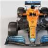
The team is leading both Championships and yet their running two opposing shades of yellow on the car. Completely UNACCEPTABLE...

Member
Posted 17 October 2009 - 01:07
The team is leading both Championships and yet their running two opposing shades of yellow on the car. Completely UNACCEPTABLE...

Member
Posted 17 October 2009 - 01:07
THAT'S what you're caring about!?Completely UNACCEPTABLE...

Member
Posted 17 October 2009 - 01:08


Posted 17 October 2009 - 01:12


Member
Posted 17 October 2009 - 01:14


Member
Posted 17 October 2009 - 01:29
Member
Posted 17 October 2009 - 02:41
Edited by Captain Tightpants, 17 October 2009 - 02:43.
Member
Posted 17 October 2009 - 02:47

Member
Posted 17 October 2009 - 02:54
Edited by Flyhigh, 17 October 2009 - 03:05.

Member
Posted 17 October 2009 - 03:33
What can you expect. These are the people responsible for this:

Member
Posted 17 October 2009 - 03:39
It is the Banco do Brasil sponshorship `bank of Brazil` although I am not sure they are getting the money`s worth. Since the slogan is being covered by those winlets.
Brawn` s getting a lot of brazilian race sponsors this week, which are capitalizing on the major ad marketing opportunity presented. I don`t understand why only in Brazil companies are doing this. Since I don`t recall seeing it on other countries, seems to me like such a wasted opportunity for great publicity. Some people were saying that Brawn wasn`t accepting extra sponsors or something because of Honda, but this shows it is not really the case. I am not sure why they didn`t get more sponsor early on and permanent ones. These which I believe are only for this race.
Maybe there were no other companies interested in it, but how could it be possible. F1 in my view is one of the most global popularized sports in the world, as far as I know.
Member
Posted 17 October 2009 - 05:17
Member
Posted 17 October 2009 - 06:06

Member
Posted 17 October 2009 - 06:13
Member
Posted 17 October 2009 - 06:22
Again, it's not lime green. It's yellow.
Brawn never intorduced sponsors because their priority was in making the grid. And then they got a deal wth Virgin, which injected a little more cash into the fold. They were in talks to increase Virgin's sponsorship around the Spanish Grand Prix and maybe upgrade them to major sponsors, but where Richard Branson wanted to introduce the Virgin name into's the teams, Ross Brawn apparently wanted to keep the team as Brawn GP, not Virgin-Brawn, and the deal fell through.
And then there was the whole Formula Elaborate Bluff at the British Grand Prix. They were talking with other sponsors, but when the rogue faction emerged, it really threw a spanner in the works. No-one wanted to commit to any team with the entire future of the sport in doubt; Brawn were the only ones who felt the crunch because they didn't have any sponsors. By the time everything got sorted out and everyone was agreeing on a new Concorde, it was the Hungarian Grand Prix. Brawn was able to enter negotiations with sponsors, but these things hardly take a day to work out, and at the same time they were still trying to work out what had gone wrong with the upgrade, how they could find a way around it, and there was a mandatory two-week shut-down in the middle of it all. By the time an arrangement could be worked out, sponsors wouldn't be getting that much out of it, and so they decided to put it off until 2010. In the meantime, Brawn picked up all these other minor sponsors for single events.
Edited by Flyhigh, 17 October 2009 - 06:30.

Member
Posted 17 October 2009 - 06:24

Member
Posted 17 October 2009 - 07:23
That really is a bad use of font. Why have 'AWN' like that? It makes no sense and disrupts the flow of the word 'BRAWN'. It now looks like 'BR AWN'.
Advertisement

Member
Posted 17 October 2009 - 07:53
The team is leading both Championships and yet they're running two opposing shades of yellow on the car. Completely UNACCEPTABLE...

Member
Posted 17 October 2009 - 07:57
That really is a bad use of font. Why have 'AWN' like that? It makes no sense and disrupts the flow of the word 'BRAWN'. It now looks like 'BR AWN'.

Member
Posted 17 October 2009 - 08:09

Member
Posted 17 October 2009 - 08:52
Two?
I see one shade of green, and one shade of yellow.
Member
Posted 17 October 2009 - 09:38
The team is leading both Championships and yet they're running two opposing shades of yellow on the car. Completely UNACCEPTABLE...


Member
Posted 17 October 2009 - 09:53

Edited by Bouncing Pink Ball, 17 October 2009 - 13:36.

Member
Posted 17 October 2009 - 10:00
What can you expect. These are the people responsible for this:
It's like they thought, hmm, we've already thourougly raped this typeface. What else can we do? I know, let's cram in an uppercase A from a totally different typeface (Avant Garde) and commit the very deed Herb Lubalin regrets releasing this typeface to the public for (abuse the alternates in the most amateurish way possible). Herb would roll over in his grave if he saw this.
This is how the A is supposed to be used. No ****ing spaces/pauses in the middle of a word!
I don't understand what's so hard to understand about this.

Paddock Club Host
Posted 17 October 2009 - 10:06
The team is leading both Championships and yet they're running two opposing shades of yellow on the car. Completely UNACCEPTABLE...

Member
Posted 17 October 2009 - 10:10
Don't forget BRackly, the teams base.BR: Brawn, Ross
I like their logo, it's interesting and play with the characters.
Edited by Brawn BGP 001, 17 October 2009 - 10:10.

Member
Posted 17 October 2009 - 10:12

Member
Posted 17 October 2009 - 10:14
Member
Posted 17 October 2009 - 10:19
I've learnt colour theory and graphics art.Get an eye test then they are both yellow.
Member
Posted 17 October 2009 - 10:20
Well, they could have chosen the other route to not rape the font...I'm sure the typeface of their logo was a massive priority during the winter.


New Member
Posted 17 October 2009 - 10:22
What can you expect. These are the people responsible for this:
It's like they thought, hmm, we've already thourougly raped this typeface. What else can we do? I know, let's cram in an uppercase A from a totally different typeface (Avant Garde) and commit the very deed Herb Lubalin regrets releasing this typeface to the public for (abuse the alternates in the most amateurish way possible). Herb would roll over in his grave if he saw this.
This is how the A is supposed to be used. No ****ing spaces/pauses in the middle of a word!
I don't understand what's so hard to understand about this.

Member
Posted 17 October 2009 - 10:25
Barrichello, Rubens and Branson, Richard as well. JB is the only one who misses out ...Don't forget BRackly, the teams base.
Member
Posted 17 October 2009 - 10:32


Member
Posted 17 October 2009 - 10:47
This has bothered me ever since I first saw it in Melbourne. Maybe it has something to do with being a graphic designer, it hurts my eyes.


Member
Posted 17 October 2009 - 11:03

Edited by johnmhinds, 17 October 2009 - 11:03.
Member
Posted 17 October 2009 - 11:25
Member
Posted 17 October 2009 - 11:30
Colours picked from a photo of the car.
Brawn-green vs. Banco do Brasil-yellow
Advertisement
Member
Posted 17 October 2009 - 11:34
Brawn has been a great example of viral marketing.
1, Make ugly car
2, People complain that it looks awful
3, People show the car off to their friends, internet forums, etc...
4, Sponsors get more people looking at their logos
5, $$$
You don't see anyone talking about the sponsors on the BMW, Toyota or Williams.
You all fell for their marketing trap and you didn't even know it.
Member
Posted 17 October 2009 - 11:35
They just warming the yellow to heat the airflow through Jensons front weels.Colours picked from a photo of the car.
Brawn-green vs. Banco do Brasil-yellow

Member
Posted 17 October 2009 - 11:56
I've learnt colour theory and graphics art.
It's not about eye tests, it's about definitions and broadly and subjectively usable names. Colours can have plenty of different names, even the same colour. Greens are transition between yellow and blue. You can call the same shade yellowish green of greenish yellow, it doesn't matter, the shade of a coluor remains the same regardless how you call it.
Edited by Madras, 17 October 2009 - 11:58.

Member
Posted 17 October 2009 - 12:09
Member
Posted 17 October 2009 - 12:13
So sponsors want to be associated with the ugly? It's publicity, true...
Posted 17 October 2009 - 12:22

Member
Posted 17 October 2009 - 12:31
Whilst you are right in what you say there, if you look at the Brawn "green" it is clearly more yellow than green. And if you are so proficient with colours you would have known not to take the colour from a photo of the car which would be affected by light conditions as your example clearly is.
Their website: http://www.brawngp.com/
Member
Posted 17 October 2009 - 12:57
You see colours because of light. When no light, no colours. 'Without light everything is black.' I took average shades from the photo, and when you look at the car in real or on a photo it has plenty shades of the specific colour code paint, because of light. Light or dark, it's still a shade of that specific paint (apart from possible influence of coloured reflections). So I took average.Whilst you are right in what you say there, if you look at the Brawn "green" it is clearly more yellow than green. And if you are so proficient with colours you would have known not to take the colour from a photo of the car which would be affected by light conditions as your example clearly is.
Their website: http://www.brawngp.com/
Edited by hunnylander, 17 October 2009 - 13:03.
Member
Posted 17 October 2009 - 13:02
I disagree.It doesn't matter what is on their website - that's the problem. They're employing someone to do the graphics and that person is apparently sh*t.

Member
Posted 17 October 2009 - 13:05
Member
Posted 17 October 2009 - 13:05
You see colours because of light. When no light, no colours. 'Without light everything is black.' I took average shades from the photo, and when you look at the car in real or on a photo it has plenty shades of the specific colour code paint, because of light. Light or dark, it's still a shade of that specific paint (apart from possible influence of coloured reflections). So I took average.
If you'd need to mix out these colours with the main colours (yellow, blue and red), you'd need yellow and (a little) red to the Banco do Brasil-yellow. For the Brawn-green you'd mix yellow and blue. So even in their components they are different, so I won't call both yellow.
Describing shades is relative also. When these two colours are put together I may call the yellow+blue one green, yellowish green. Butif the same colour would be alongside of a very dark green having minimal yellow in it, the I may call it light greenish yellow.
Regarding the matter of the topic, discussing the relativeness of colour describing is quite irrelevant.
The real questions are:
Should Banco do Brasil change its colour because of the taste of the topic starter and for the fact they put their colour onto a BGP 001 having its Brawn GP colours? NO!
Should Brawn GP change its original colours just because Banco do Brasil has a different colour and wants to identify and advertise itself with it being on the BGP 001? NO!
Edited by Madras, 17 October 2009 - 13:07.


© MOTORSPORT NETWORK 2025. All rights reserved. Community Forum Software by IP.Board
