

What? If anything I noticed the H before the W.lol, vulnerable to subliminal advertising because you happened to learn about negative space in art class.
One clever one I never noticed until it was pointed out to me, years after the first time I saw it was the old Hartford Whalers hockey team logo. The W is obvious, the H not as much.


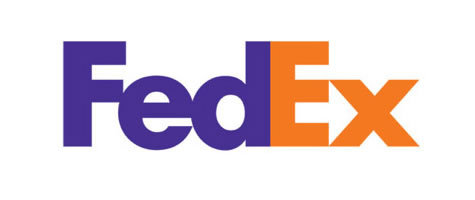
 Just in case you aren't look at the space between the F and the Red part


%20[Front].jpg)


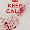


 . Whoever designed the one below was just asking to have it vandalized.


