Chevy Gen V Small-block - LT1
#51

Posted 05 November 2012 - 14:56
Advertisement
#52

Posted 05 November 2012 - 16:26
#53

Posted 05 November 2012 - 16:46
I feel a lttle awkward about it, too. However, as David Kimble was uneccessarily dismissive of my work some time ago, I can live with it. What goes round, comes round, and I don't have to nice all the time, do I?
Well......nah, of course you don't!
Juanito
#54

Posted 05 November 2012 - 18:24
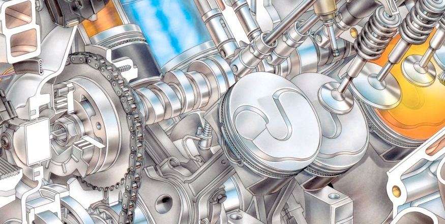
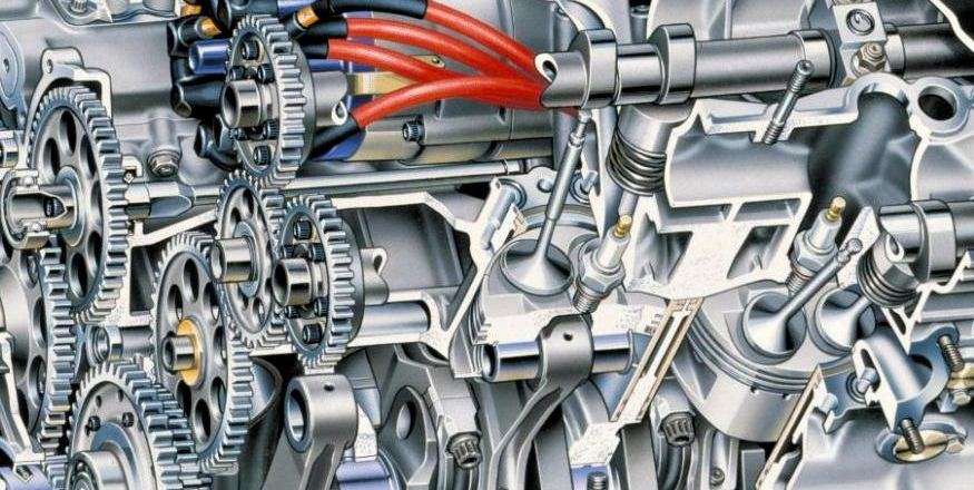
One is sort of cartoonish or schematic while the other borders on photorealism, has the look and feel of metal. It's a machine. You want to oil it.
EDIT: I'm not saying they're not both really, really good. I am saying that one is objectively better.


Edited by Magoo, 05 November 2012 - 18:33.
#55

Posted 05 November 2012 - 20:24
Edited by Grumbles, 05 November 2012 - 20:25.
#56

Posted 06 November 2012 - 03:08
#57

Posted 06 November 2012 - 07:45
that said the LT1 drawing is sharp, bright and crisp who i am a sucker for but its not as realistic.
LT1 the picture is in 2048 x 1638 pixels.
Tonys Ilmore is 1457 × 1428
Tony do you have a good scanner? i struggle to find a really high res picture of your drawings. bigger than 1600 x 1200.
I think this scan/picture looks to be better than most of the ones i find.
http://www.marchives... March Alfa.jpg
#58

Posted 06 November 2012 - 08:26
Quite right, Mat - I don't want to turn this into thread about technical illustration, but briefly, it is a case of two very different techniques. One is drawn in ink line on film, then airbrushed on the back so the lines take precedence, the other is drawn on water-colour board then painted, so all the lines are hidden. GM are obviously happy with the former, I couldn't stand doing it that way, but there isn't a best way, just different ways.Kimble has a line around most of the things, it makes the countours simpler to see. Its a sort of simplification for illustrative purposes. Or a time saver.. i found the valves to be odd looking.
that said the LT1 drawing is sharp, bright and crisp who i am a sucker for but its not as realistic.
There is a difference in resolution because the LT1 engine illustration was commissioned by GM to be used as advertising material - they paid for it and can/should use it as much as possible to get 'value' from it. Mine, apart from those that are not my copyright, should be bringing in some little extra income. Obviously, if everyone just downloads hi-res images and prints them, I lose out. The resolution chosen for Mac's Motor City Garage (say it loud and say it proud) is a compromise between what people want, and what we think they should get! The commercial scans that I have are nearly 300MB, reduced to about 100 MB when the background is removed.LT1 the picture is in 2048 x 1638 pixels.
Tonys Ilmore is 1457 × 1428
Tony do you have a good scanner? i struggle to find a really high res picture of your drawings. bigger than 1600 x 1200.
I think this scan/picture looks to be better than most of the ones i find.
http://www.marchives... March Alfa.jpg
Edited by Tony Matthews, 06 November 2012 - 08:27.
#59

Posted 06 November 2012 - 09:29
The assembly video of the LT1 had a few CAD bugs. most noticable was a pin in the bottom doing some dancing.
The motor seems to have been made completely with Autodesk products.
Advertisement
#60

Posted 06 November 2012 - 11:32
#61

Posted 06 November 2012 - 12:00
Tonys Ilmore is 1457 × 1428
Tony do you have a good scanner? i struggle to find a really high res picture of your drawings. bigger than 1600 x 1200.
For the images at Mac's Motor City Garage, that's all me. Tony provides fairly enormous files and I scale them down.
I've selected the resolution to be large enough for folks online to be able to take everything in, but too small to be downloaded and commercially pirated by unscrupulous paper printing houses. The resolution we use still produces a larger image than could be found in a paper magazine double-trucked (opened two pages wide) and is more than sufficient for use as wallpaper/screensaver.
File size for speedy browsing is also a consideration. We also try to keep in mind that the story is viewed on everything from smartphones to 40-inch flat panel monitors... and one can easily adjust the image/page size in one's browser as well. You don't have to look at it in the size we gave you, whatever that is.
#62

Posted 06 November 2012 - 12:36
Edited by Tony Matthews, 06 November 2012 - 12:36.
#63

Posted 06 November 2012 - 13:00
#64

Posted 07 November 2012 - 09:23
I don't wish any credit, only the blame.
I am sure you will be very happy.
If helps, I could get you to carry the can for a couple of my stuff-ups ...
#65

Posted 07 November 2012 - 12:32
I am sure you will be very happy.

If helps, I could get you to carry the can for a couple of my stuff-ups ...
Happy to. It's what I do, essentially... seek out colossal ****-ups and run directly into the middle of them.
#66

Posted 09 November 2012 - 13:27
#67

Posted 10 November 2012 - 02:40
#68

Posted 12 November 2012 - 03:39
I don't want to sound dismissive because I'm a huge fan when it comes to (our) Tony's (our Tony - I like that - we claim this Tony in the name of sarcasm, wit and talent, go find your own) work. Having said that, I agree that his methods are unlikely to survive the passage of time if for no other reason than the demand for product right now. There is no reason though that an equally talented CAD / rendering monkey cannot create a virtual duplicate of his style. To write them all off as talentless hacks seems both presumptuous and somewhat Luddite. I'm not certain how one would imbue it with art and passion, but then I don't claim to be even a poorly talented CAD monkey.
Tony - is there somewhere that you offer your art to buyers today?
#69

Posted 12 November 2012 - 07:16
Yes - tea and sympathy. Oops, I read that as 'something'! Print sales is a minefield, no-one has made a fortune out of marketing my work as prints, and on the two occasions that I was persuaded to do it myself, I lost money. But you never know...Tony - is there somewhere that you offer your art to buyers today?
There is a lot of work in a Dave Kimble illustration, the line art has to be drawn (there may be some CAD help, but there used not to be, and still may not be) and the colour has to be airbrushed. I am unworthy of most of the kindness shown here, and one thing I learned A Long Time Ago is that when it comes to technical illustration, or automotive and aviation art, some people's judgement is clouded by their love for the subject. However, I hope my passion for the vehicles and engines that I've cut away, and my admiration for the engineers, shines through.
#70

Posted 13 November 2012 - 10:43
Ahh Tony - you are too modest...Yes - tea and sympathy. Oops, I read that as 'something'! Print sales is a minefield, no-one has made a fortune out of marketing my work as prints, and on the two occasions that I was persuaded to do it myself, I lost money. But you never know...
There is a lot of work in a Dave Kimble illustration, the line art has to be drawn (there may be some CAD help, but there used not to be, and still may not be) and the colour has to be airbrushed. I am unworthy of most of the kindness shown here, and one thing I learned A Long Time Ago is that when it comes to technical illustration, or automotive and aviation art, some people's judgement is clouded by their love for the subject. However, I hope my passion for the vehicles and engines that I've cut away, and my admiration for the engineers, shines through.
#71

Posted 15 November 2012 - 02:06
Hardly!I am unworthy of most of the kindness shown here,...
#72

Posted 15 November 2012 - 05:59
#73

Posted 15 November 2012 - 16:04
Whoever did that drawing could not get the piston top angles correct
Is it kinda leaning towards us too much?
You can prove this?
#74

Posted 15 November 2012 - 17:03
#75

Posted 15 November 2012 - 17:12
Kimble sharp with a lot of lines, Matthew's smooth. There is feel to Matthew's work. Kimble's sharpness also exaggerate his mistakes. I'd say I would have Matthews work on a hard back but Kimble certain good for a 'basic' book, bling! bling!
#76

Posted 16 November 2012 - 14:05
#77

Posted 16 November 2012 - 14:16
#78

Posted 16 November 2012 - 18:06
#79

Posted 16 November 2012 - 20:38
Advertisement
#80

Posted 17 November 2012 - 03:58
Are you seeing the pocket as a dome or the dome as a dome? Personally I see the pocket as a pocket and the dome as a dome.Where the valves seat on the pistons, on Kimble's drawing looks more like a dome than a pocket and I doubt that exhaust intake valve ratio is acceptable unless they want to run longer lift duration exhaust.

Edited by gruntguru, 17 November 2012 - 04:05.
#81

Posted 17 November 2012 - 04:28

#82

Posted 17 November 2012 - 05:07
#83

Posted 17 November 2012 - 12:53
i feel silly. But now the shape makes more sense.
But could someone tell me why they still angle the valves? surely they could have made them straighter?
Angling towards center is easier to understand because it leaves more space towards the wall when the valve goes. but not sideways.
Edited by MatsNorway, 17 November 2012 - 17:48.
#84

Posted 17 November 2012 - 13:33
#85

Posted 18 November 2012 - 02:58
To make the ports straighter while keeping the intake manifold low I guess. Also allows a more compact rocker since it is only turning the force 160 odd degrees rather than 180.But could someone tell me why they still angle the valves?
#86

Posted 18 November 2012 - 10:33
we couldn't stand the constant whining from the coloniesRoughly speaking, a U.S. gallon is a so-called wine gallon while an Imperial gallon is a so-called ale gallon. Both countries were once on the wine gallon but in the early 19th century Britain adopted the ale gallon, as I understand it.
#87

Posted 18 November 2012 - 13:31
I too had the shape wrong.
i feel silly. But now the shape makes more sense.
But could someone tell me why they still angle the valves? surely they could have made them straighter?
Angling towards center is easier to understand because it leaves more space towards the wall when the valve goes. but not sideways.
Is there a particular benefit to making the valve parallel to the bore?
#88

Posted 18 November 2012 - 13:34
I have to agree that it is not as clear as it should be. It isn't always easy to show exact contours, but it isn't helped by the technique used, where both internal and external edges/corners are shown as a black line.
Even in the photo above, I tweaked the contrast way up to make the reliefs more evident. Depending on the angle, the relief can turn inside out and look like a bas relief. Another photographic illusion.


