Thanks for looking in


Member
Posted 20 January 2013 - 23:34
Advertisement

Member
Posted 21 January 2013 - 00:06
Speaking of the stylized-script driver names on the early McLarens through the Yardley era - Anyone know if this was a commercial script font (if so, which?) If been trying to recreate it, but have yet to find a perfect match...
Thanks for looking in

Member
Posted 21 January 2013 - 09:54
I think you'll find it was the work of a signwriter & really nice - in my 30 year experience I've never seen a typeface like it, so I suspect it was an elaboration
Member
Posted 21 January 2013 - 10:46
Edited by Nigel Beresford, 21 January 2013 - 10:48.
Member
Posted 21 January 2013 - 11:18
Member
Posted 21 January 2013 - 11:20
Thanks Rob, I thought it was. IIRC he was also responsible for the look of the original Wolf WR1, but generally more known (by me) for his work on helmetsIt was Doug Eyre, a real craftsman, I stood and watched him a couple of times. He brought a case with outlines on tracing paper. He taped the paper in position on the car, a few quick strokes with a pencil, and then he took away the paper and filled everything in freehand with those lovely long coachpainters' brushes. Excellent work and he did all the sponsor ads the same way, Goodyear, Reynolds Aluminum etc. It was lovely work and a pleasure to watch him (when I should have been doing something else), every bit as good as the decals that most others used. When I was at Lotus, the JPS cars were done with gold paint on the black cars in just the same way, though I can't remember who the artist was.

Member
Posted 21 January 2013 - 11:31
Paul Shakespear? And not always gold, on the later cars he used a light tan.When I was at Lotus, the JPS cars were done with gold paint on the black cars in just the same way, though I can't remember who the artist was.
Edited by Tony Matthews, 21 January 2013 - 15:32.
Member
Posted 21 January 2013 - 11:37
It was Doug Eyre that featured in the Motor Sport article. My recollection of that kind of story was about Brian Henton, blue to green or thereabouts & the season ending badly with a swift about turn on colour choice. The article would have been around 1983-4He advertised as a helmet painter as well. Was there a Motor Sport interview with him? I recall a long and interesting article about one helmet painter. Said a driver asked for something in dayglo and went ahead despite advice to the contrary - and dropped it after one race. Wonder who that was.
Member
Posted 21 January 2013 - 11:38

Edited by Nigel Beresford, 21 January 2013 - 11:49.
Member
Posted 21 January 2013 - 11:58
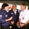
Those were the days! Not very "Ron Dennis" is it?As I say, there were times when he was virtually living at Colnbrook (Doug is in the middle, with a tie). Not a sticker in sight...
Member
Posted 21 January 2013 - 12:25
Member
Posted 21 January 2013 - 14:17
Those were the days! Not very "Ron Dennis" is it?
Edited by Nigel Beresford, 21 January 2013 - 14:19.
Member
Posted 21 January 2013 - 17:24
Member
Posted 21 January 2013 - 18:02
Is it just me, or does anyone else think that McLaren M23 would have looked really good painted in the Gulf colors?

Member
Posted 21 January 2013 - 18:11

Member
Posted 21 January 2013 - 18:37
I was a sign painter for 15 years, much of it on race cars, and your description understandably leaves out how the pencil got onto the car.It was Doug Eyre, a real craftsman, I stood and watched him a couple of times. He brought a case with outlines on tracing paper. He taped the paper in position on the car, a few quick strokes with a pencil, and then he took away the paper and filled everything in freehand with those lovely long coachpainters' brushes. Excellent work and he did all the sponsor ads the same way, Goodyear, Reynolds Aluminum etc. It was lovely work and a pleasure to watch him (when I should have been doing something else), every bit as good as the decals that most others used. When I was at Lotus, the JPS cars were done with gold paint on the black cars in just the same way, though I can't remember who the artist was.
Edited by E1pix, 21 January 2013 - 18:39.
Member
Posted 21 January 2013 - 18:41

Member
Posted 21 January 2013 - 18:54
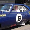
"Cheating"?! On the contrary, things like this are precisely why I keep coming back here!Okay, I know it's cheating because the 14 year old me is in the pic, but here goes:

Member
Posted 21 January 2013 - 19:20
Okay, I know it's cheating because the 14 year old me is in the pic, but here goes:
Rod ??
??
Advertisement
Member
Posted 21 January 2013 - 19:37
Absolutely, that is really cool, Nigel!"Cheating"?! On the contrary, things like this are precisely why I keep coming back here!
Member
Posted 21 January 2013 - 20:03
As pointed out, the orange was on the cars before Gulf. If you look at a 1968 F1 M7A you'll see it has Shell logosIs it just me, or does anyone else think that McLaren M23 would have looked really good painted in the Gulf colors?

Member
Posted 21 January 2013 - 20:40
Edited by Doug Nye, 21 January 2013 - 20:42.
Member
Posted 21 January 2013 - 21:17
Member
Posted 21 January 2013 - 21:56
I remember Teddy Mayer claiming the credit for the 'Gulf orange' papaya colour. He said he'd seen how well it showed up on US colour TV when applied to "a CanAm car" - I assume the aforementioned Lola - and he pushed Bruce into adopting it for their 1967 CanAm M6As. Bruce had to agree that it showed up far better on TV than his preferred brick red.
DCN
Member
Posted 21 January 2013 - 22:02

Member
Posted 22 January 2013 - 01:27
"Cheating"?! On the contrary, things like this are precisely why I keep coming back here!

Member
Posted 22 January 2013 - 02:21
Fascinating photo and discussion.

Member
Posted 22 January 2013 - 03:30
I remember Teddy Mayer claiming the credit for the 'Gulf orange' papaya colour. He said he'd seen how well it showed up on US colour TV when applied to "a CanAm car" - I assume the aforementioned Lola - and he pushed Bruce into adopting it for their 1967 CanAm M6As. Bruce had to agree that it showed up far better on TV than his preferred brick red.
DCN
The way I heard it, things happened the other way around, Bruce saw the orange Lola, Hugh Dibleys car which as far as I know never left this island, and suggested the change to Teddy Mayer, but mainly because he just liked the colour. Teddy agreed, but was convinced when he saw how much better a lighter shade would come across in print and on TV.
Member
Posted 22 January 2013 - 05:00
Member
Posted 22 January 2013 - 12:16
Member
Posted 22 January 2013 - 12:36
Member
Posted 22 January 2013 - 12:45
Member
Posted 22 January 2013 - 12:59
Edited by Nigel Beresford, 22 January 2013 - 13:01.
Member
Posted 22 January 2013 - 13:26
I think there was another thread on this subject on TNF - doubtless someone will point it out.
Member
Posted 22 January 2013 - 17:11
Thanks for your answers!
I´ve read the other threads but the problem is it´s always
named as Belvedere Works, Feltham and apparently those
buildings are demolished by now.
I found a report in London Gazette dated August 1964 which
said that B. F. Coolridge Ltd went into liquidation. The adress
was given as Belvedere Works and the date coincides to the
move from New Malden to Feltham. Perhaps McLaren took
over their lease.
Christer
Edited by Nigel Beresford, 22 January 2013 - 17:14.
Member
Posted 22 January 2013 - 17:56
Even after moving, the team kept 5 David Road for a long time for storage. For example, the M6GT was parked in there for quite a while.
Member
Posted 22 January 2013 - 18:08
I was a sign painter for 15 years, much of it on race cars, and your description understandably leaves out how the pencil got onto the car.
For those interested in this process, here's three ways this is done...

Edited by kayemod, 23 January 2013 - 11:15.
Member
Posted 22 January 2013 - 18:18
Member
Posted 22 January 2013 - 18:35
I would respect Mr. Ganley's recollection. I guess my assumption would have been that Trojan would have been more likely to handle any M6GT production, but that's not based on any insider knowledge.
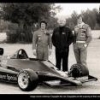
Bear in mind that in 1971 McLaren were making, racing and developing F1, Can Am and Indy cars (and supplying the Penske Indy team too), and preparing for / designing an F2 car for 1972 - plenty on their plates without adding the people and infrastructure in order to build road cars too. You've seen the photo showing the existing production staffing levels in that era (though there are at least half a dozen people missing from that photo). No wonder they had to work all hours to support those programs. As I recall, the M6GT wasn't "production engineered" at all - there was no concession to making it quick and easy to make and assemble. It was a road going adaptation of a race car. It wasn't going to be particularly quick or easy to make in any quantity, but clearly Trojan had mastered that art.
As I say, in the early/mid Seventies any trip back down the road to no.5 was like going in to an Aladdin's Cave.
Advertisement

Moderator
Posted 22 January 2013 - 19:00
This is the main thread on the M6GT:I'm sure we had a thread on this a year or two back, maybe someone cleverer with the ways of TNF can find it for us.
Member
Posted 22 January 2013 - 19:33
This is the main thread on the M6GT:
McLaren M6GT and M6Bs
More recently, the M6GT featured strongly in this thread:
What if... Bruce McLaren/McLaren
Edited by kayemod, 22 January 2013 - 19:34.

Nostalgia Host
Posted 23 January 2013 - 11:05
It was Doug Eyre that featured in the Motor Sport article. My recollection of that kind of story was about Brian Henton, blue to green or thereabouts & the season ending badly with a swift about turn on colour choice. The article would have been around 1983-4
Member
Posted 23 January 2013 - 11:43
Morning Mr Helmet
...and the rest, as they say, is history.
At risk of deviating from the topic (helmet thread - where is it guys?) but as it's you 
Member
Posted 23 January 2013 - 16:24
Edited by Cirrus, 23 January 2013 - 16:26.

Member
Posted 23 January 2013 - 17:46
I've told this story before on another thread but it's probably worth repeating here...
In 1974 I helped Token Racing as an unpaid gofer. At the British GP the Token had been repainted in Bob Harper's white livery for David Purley to drive. After first practice on the Friday Ian Flux and I took the bodywork to Doug Eyre's studio in Egham to have the signwriting and logos done. We collected the bodywork early Saturday morning and headed off to Brands in the wheezing Token Racing VW Kombi. At the circuit before practice Neil Trundle told me to give the bodywork a bit of a polish. Having done the cockpit surround I stood back to admire my work. To my horror, the beautifully painted Token Racing logo was no longer there. Looking at my polishing cloth I noticed a red smear... Doug's artistry had been obliterated by an 18 year-old with a cloth and a tin of Dyna Glaze.
Neil didn't find out until years later...

New Member
Posted 13 October 2016 - 17:05
Member
Posted 13 October 2016 - 17:52
Speaking of the stylized-script driver names on the early McLarens through the Yardley era - Anyone know if this was a commercial script font (if so, which?) If been trying to recreate it, but have yet to find a perfect match...
Thanks for looking in
Did you ever solve your search?
Edit: Welcome, BarryW!
Edited by E1pix, 13 October 2016 - 19:20.

Member
Posted 13 October 2016 - 19:21
I use to work above Bruce Mclaren at the Feltham belverdere works.I was a 15 year old apprentice engineer at RE CROSS Engineering. The site was demolished that was why we all had to move. It was demolished for blocks of flats.It was behind the feltham shoping centre between the shopping centre and railway line.My brother also worked at RE Cross as a turner he macined some of Bruce Mclarens Wheels for him.
I don't remember this thread, but great reading it now.
Welcome Barryw ! Feltham continues to change. I strongly suspect that Frank Bradley (erstwhile fish seller - mainly whelks - and Swift Racing Cars owner) has also gone elsewhere.
Member
Posted 13 October 2016 - 20:44
Back to the original thread topic, Doug was a true professional, but I don't think he used any of those methods. I was trying to follow what he was doing while signwriting an M8D from my position several feet away across the workshop while I was altering seats for Peter Gethin and Denny, but the full-size tracings had obviously been done with great care, and although he must have already used them quite a few times, they looked clean and uncreased, no sign of Stabilo, charcoal marks or anything like that. He taped the paper in position, I didn't see what he did next but it didn't take very long, I'd guess that he only marked a few reference points such as corners etc, he certainly didn't draw all over them. One I watched him painting was for Coca Cola, he'd obviously transferred some points from his tracing, but I watched him painting all the curves, he did everything freehand, he wasn't following lines with that one, and he didn't when he was painting 'Denny Hulme' in the script either, again he did it freehand, though he must have transferred something from his tracing to keep the proportions correct. I also watched him painting a coachline down each side of the car, and he did that without any marks at all, just a long floppy brush as he went along the length of the car. As happens so often on TNF, I wish I'd paid more attention at the time, but I was quite young, and still star-struck after meeting Denny to speak to for the first time. On that photo of the McLaren workforce, I thought I was doing quite well to put a name just to Teddy Mayer and Nigel's dad!
Going back to an earlier post, this is a pic of the Lola T260, not mine of course, it's from one of Pete Lyons' masterworks on CanAm, but that L & M signwriting on the front was impeccably done, anyone who'd tried anything like that as it had to be done in olden times with paintbrushes would have been impressed, I certainly was. That's the Lola as it first appeared, it later sprouted all kinds of aerodynamic afterthoughts, and you should have seen the ones that never made it any further than a windtunnel model. You'll all notice how comfortable and relaxed Jackie and Denny appear in their perfectly fitted and wonderfully supportive seats. Denny's car is the very same vehicle that I watched Doug Eyre signwriting only a couple of weeks earlier.
Rob, hand-done sign work on race cars is the thread topic… certainly more than many posts here you didn't call out. And I'm confused how you can tell any sign artist how it's done when you say yourself you're not sure… when you were "across the shop and busy…"
I lettered well over 500 race cars for many known drivers and teams. All was "freehand," though for some things I'd use a pounce pattern as described, and/or a tape line top and bottom for perfectly-sharp edges on sans serif fonts — as is standard, at least in the late-'70s onward when I did it. It's faster, cleaner, leaves far less brush strokes, and is nearly-indecipherable from a vinyl decal when done correctly and with the right, slow-drying thinners. I only got out of this as my primary business when vinyl came out and I tired of watching years of work going to a computer operator with little knowledge of the craft, and of design, but continued to hand-pinstripe concourse cars until a decade ago, for 28 years total — and will again. I have scored perfect 10s on my stripes at Pebble Beach all three times a car was entered, which is extremely rare, as well as at many more national Model A Ford shows. Much of the work was done for Clayton Restorations, now RestoreCars.com, a top restorer in the States and beyond.
I personally viewed the Lotus cars in the garage at Long Beach in 1983, and was thrilled to see it was still hand-done! (though in a non-metallic gold, which surprised me) I asked a crew member who knew the Lotus sign man, and sure enough, he used pounce patterns with chalk powder on the JPS art. I then lettered a car for John Andretti, right there in the convention center, gathering a viewer for close to an hour. Turned out he was a Manager for Toleman F1, and he asked if I'd consider moving to Europe in 1984... but I had a girlfriend (now wife) and a thriving business across the pond, so I never called. It was just too big for my 22-year-old imagination, I guess. I don't recall his name but would if I heard it, and as we live on the road all that's in storage. Turns out I'd have been Ayrton's first sign man in F1... Damn. But I have all my sign tools on the road should inspiration occur.
I say none of this to brag (what would I get from that?), but once again you have put me into a defensive position — as with the photo threads from Day One. Bottom line for me is if any burgeoning sign painter were to read this, I don't want them set astray — as with photographers on the photo threads. It's my way of giving back.
If I'm correct, the T260 was lettered in Chicago at Carl Haas' shop. I think their sign painter went by "Gibson" or something like that, he for sure did Brian Redman's F5000 cars and Eddie Miller's Super Vee, and surely many more I'm unaware of, by repeating a pounce pattern stencil or perhaps two for the mule-team horses and wagons for the iconic Boraxo "string" — and used the same technique for the numbers on both Brian's and Eddie's cars. I know this because I asked Carl when I was just getting into the art (after deciding race reporting wasn't my long-term goal, and he was to be an advertiser in my rag). This was about the time a Super Vee and Indy racer-friend named Herm Johnson inspired me when seeing him hand-stripe a Ford van at Watkins Glen in 1976, shortly after I was donated a few sign brushes by a friend's dad in my little town in Wisconsin.
You are correct that most script lettering uses no patterns, though when a design needs repeating it's paramount. I suspect in the case of the McLaren lettering, perhaps the artist only positioned a few of the vertical strokes and maybe the top and bottom to be "reasonably consistent" from car to car. I personally would have traced it all to be indecipherable from car to car, but that's just me — and the fact is, few would notice the difference… but I would. The charcoal or Stabilo method on patterns I mentioned was applied to the backside, so it would be quickly and lightly traced over in entirety, or in whatever bits one needs to reproduce it, so being on the backside one would never see the charcoal swath or grease pencil lines.
The below link isn't particularly clean work, but for those wondering about hand-painted script, here you go. It's massively sped up to be a brief demonstration. The reason the artist likely used a pounce pattern here was to make it fit within the panel, and to maintain the original script's design. If you look closely, you'll see a fine outline of chalk the artist is "filling in," per my method "#2" in post #16 above, it's still freehand and the chalk wouldn't be visible from any real distance. It is done lightly to avoid dust in the paint, and sometimes is even hard to see for the brushman! For my scripts, all I did was draw two parallel lines with a very sharp Stabilo pencil — very lightly — to keep the lower-case lettering the same height, if desired, unless very large for a panel like this:
(Edited to drop the deleted, quoted photo box)
Edited by E1pix, 13 October 2016 - 21:29.


© MOTORSPORT NETWORK 2025. All rights reserved. Community Forum Software by IP.Board