Looking at the "Best looking GP car" thread has got
me to start a new thread, namely unusual colour
schemes/liveries.
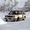
My favourite was the livery used by the Schnitzer
team for their BMW 635's in the ETCC during the
mid 1980's. The cars had blueprints of the internal
parts, such as the engine block, suspension and
seats reproduced on the body.
One of the other unusual liveries was an XD Ford
Falcon in the Bathurst 1000 in either 1980 or 1981.
The car was sponsored by the Australian Army Reserve,
so the paint scheme was "mottled" army camouflage of
different shades of green.
I have also seen pictures of cars that raced
at Brooklands in the 1920's that had the body
covered in zig-zag lines.
What was the reason behind this?
Have their been cars that have used other
combinations of lines, dots and other symbols to
"stand" out from other competitors?
I remember a stock saloon driver driver at Liverpool
Speedway here in Sydney in the late 70's who painted
his car to look like a huge American flag. ( I think he
came from the USA).
The front mudguards and bonnet had the white stars
on a blue background, while the body had the alternating
red and white stripes for the full length. You had no
problems picking the car out!
The black and gold JPS livery for Lotus in the 1970's
and 1980's was probably my favourite F1 livery - simple
and understated.
Unusual colour schemes/liveries
Started by
Graham Clayton
, Mar 23 2001 03:13
347 replies to this topic
Advertisement
#2

MattFoster
-

- 4,833 posts
- Joined: May 00
Member
Posted 23 March 2001 - 03:30
The ALMS Audi with the crocodile livery was certainly distinctive.
#3
Keir
-

- 5,241 posts
- Joined: February 00
Member
Posted 23 March 2001 - 03:33
Ligier did a "cow scheme" a few years back for Martin Brundle or Mark Blundel, I can't remember which. Does anyone have a pic of that one??
#4
FLB
-

- 34,959 posts
- Joined: February 01
Member
Posted 23 March 2001 - 03:44
Keir, that was Brundle, Japan 1993.
Here are my picks for unusual:
Lammers's Samson Shag Shadow DS9 (1979)
The Penthouse Hesketh 308D
Emerson Fittipaldi's March 84C at the 1984 Indy 500 (bright pink)
The Foo Dragon Rondeau M379 (1983?)
Here are my picks for unusual:
Lammers's Samson Shag Shadow DS9 (1979)
The Penthouse Hesketh 308D
Emerson Fittipaldi's March 84C at the 1984 Indy 500 (bright pink)
The Foo Dragon Rondeau M379 (1983?)
#5
MattFoster
-
- 4,833 posts
- Joined: May 00
Member
Posted 23 March 2001 - 03:59
The Tea Kettle Ligier's livery was pretty cool too
#6
Graham Clayton
-
- 1,377 posts
- Joined: January 01
Member
Posted 23 March 2001 - 04:01
Having a further think about liveries reminds me of
the times when each country had its own identifying
colour for their GP cars, eg Germany - Silver, Great
Britain - Green, France - Blue, Italy - Red, etc.
Would anybody be able to give the colours for some
of the lesser known countries, eg was the USA white?
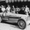
Jimmy Murphy's Duesenberg that won the 1921 French
GP was certainly all white.
the times when each country had its own identifying
colour for their GP cars, eg Germany - Silver, Great
Britain - Green, France - Blue, Italy - Red, etc.
Would anybody be able to give the colours for some
of the lesser known countries, eg was the USA white?
Jimmy Murphy's Duesenberg that won the 1921 French
GP was certainly all white.
#7
Option1
-
- 14,892 posts
- Joined: February 01
Member
Posted 23 March 2001 - 04:50
The most unusual colour schemes I can remember are the Andy Warhol et al BMW M1 procars (?) that ran in the 80s as support to GPs. I seem to remember that some of the artists involved didn't quite understand the concept of automotive body paints and hence there was the sight of the paint schemes peeling off during the races.
Two examples at (as usual with geocities sites, you'll need to open a new browser window and then copy and paste the URLs to see the pictures): http://www.geocities...eM1_art_car.jpg
and http://www.geocities...ar/GreenRed.jpg
Graham, if memory serves the US colour is white or white with blue stripes.
regards
Neil
#8
Falcadore
-

- 1,637 posts
- Joined: April 99
Member
Posted 23 March 2001 - 05:06
The Rod Smith Racing Commdore used to have sponsorship from Playboy for a very interesting colour scheme.. in fact here's a pic..

An eye catching scheme. The image appears in larger form on the bonnet. There was also a BMW 3 series in similar colours. Of the current Ozzie aTouring Car set the M3 Motorsport Commodore in the Gatorade colours looks the best. Always liked a green car.
Lowndes looks great in black & gun metal sitting still but the subtleties of the colours scheme is lost at speed.
Alf Barbagallo's cars were always striking. From the last of the black Castrol Commodores, the Pink & Black TWR VL's and the Pink & Green Rover.
The first Green & Blue Jordan 191 was satrtling and gorgeous when it appeared.
The last Toleman - green flanks, with a white engine cover with the colours of Benetton on paint swipes.
#9
Mike Argetsinger
-

- 948 posts
- Joined: April 00
Member
Posted 23 March 2001 - 05:07
At the time the Ninja Turtles were popular there was a team in the Firestone Firehawk series sponsored by their marketing group. They had a four car team (or was it 5? - however many Turtles there were - they had a car for each) and each car was painted to look like a particular turtle. It was said that the cost of the paint job on each car exceeded the season budget for some teams. My brother Peter drove for them on a few occasions and I remember at the Watkins Glen 24-Hour race he drove the Michelangelo car. I was with his son who was about 5 at the time - I don't believe he was ever more excited or impressed with anything his father drove!
#10
Darren Galpin
-

- 2,331 posts
- Joined: April 00
Member
Posted 23 March 2001 - 08:17
A couple of years ago there was the Mercedes CLK-GTR sportscar with the picture of a woman on the front (Autosport gave away an A4 sized sticker of it at the time). I also quite liked the colour scheme where they painted the engine and internals onto the bonnet, and painted it so that it looked like the bonnet had been ripped out. I don't have pictures of either to post though....
#11
Patrick Italiano
-

- 412 posts
- Joined: December 00
Member
Posted 23 March 2001 - 15:38
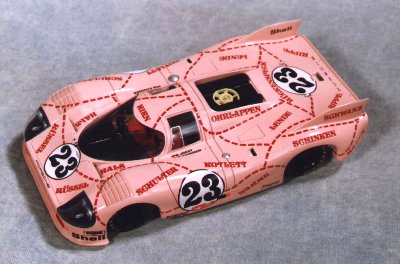
I vote for the 1971 Porsche 917/20 'pink pig'.

#12
king_crud
-
- 8,922 posts
- Joined: March 01
Member
Posted 23 March 2001 - 16:27
********Ligier did a "cow scheme" a few years back for Martin Brundle or Mark Blundel, I can't remember which. Does anyone have a pic of that one?? ***********
I've got a pic at home that i took of Brundle at Adelaide 93 with the paint job, i'll try and get a copy
I've got a pic at home that i took of Brundle at Adelaide 93 with the paint job, i'll try and get a copy
#13
BRG
-
- 27,700 posts
- Joined: September 99
Member
Posted 23 March 2001 - 17:36
Originally posted by Patrick Italiano
I vote for the 1971 Porsche 917/20 'pink pig'
That gets my vote too!
#14
Gary Grant
-

- 660 posts
- Joined: November 00
Member
Posted 23 March 2001 - 19:35
Amazed no-one has mentioned the most recent example - the godawful BAR 'zip' car with Lucky Strike on one side, and 555 on the other.
And on a 'Playboy' related theme ;) howabout the Durex sponsored Surtees of the 70s? Weren't they banned by the BBC or some such nonsense?
And on a 'Playboy' related theme ;) howabout the Durex sponsored Surtees of the 70s? Weren't they banned by the BBC or some such nonsense?
#15
Wolf
-

- 7,883 posts
- Joined: June 00
Member
Posted 23 March 2001 - 21:32
Graham, to answer Your question about colours (fear not- I'll not answer, but give You a link to a thread on it ;)
http://www.atlasf1.c...&threadid=10224
http://www.atlasf1.c...&threadid=10224
#16
Zawed
-

- 4,500 posts
- Joined: February 99
Member
Posted 23 March 2001 - 23:09
Always liked the B'n'H Snake livery on the Jordan in '97 myself. I remember seeing a picture of 97' McLaren (before it was unveiled with West sponsorship) in Orange and black, that was eyecatching.
#17
Gary C
-

- 5,602 posts
- Joined: January 01
Member
Posted 24 March 2001 - 03:39
These days McLaren always test their new cars in the original McLaren livery of Kiwi orange. Saying that, I didn't see a picture of this years' car decked out like that.
#18
Barry Boor
-

- 11,557 posts
- Joined: October 00
Member
Posted 24 March 2001 - 08:09
If ever a thread was designed to make some of us look like old fuddy, and indeed, duddies, this is THE one.
I have read carefully through all the posts above and I think I can say, without exception that I do not like ANY of the liveries quoted. (Especially that BAR shambles.)
How about the livery on any mid-1950's Grand Prix car? Now there were tasteful colour schemes!
I have read carefully through all the posts above and I think I can say, without exception that I do not like ANY of the liveries quoted.
(Especially that BAR shambles.)How about the livery on any mid-1950's Grand Prix car? Now there were tasteful colour schemes!
#19
Rob29
-

- 3,582 posts
- Joined: January 01
Member
Posted 24 March 2001 - 08:23
Never heard that before-what evidence do you have?Originally posted by Gary C
These days McLaren always test their new cars in the original McLaren livery of Kiwi orange. Saying that, I didn't see a picture of this years' car decked out like that.
Also the original McLaren F1 colour was White with Green stripe (1966) followed by Red in 67.Are Kiwis orange? I always thought the orange came with Gulf sponsorship in 68.
Advertisement
#20
Option1
-
- 14,892 posts
- Joined: February 01
Member
Posted 24 March 2001 - 08:38
Originally posted by Barry Boor
If ever a thread was designed to make some of us look like old fuddy, and indeed, duddies, this is THE one.
I have read carefully through all the posts above and I think I can say, without exception that I do not like ANY of the liveries quoted...
I must admit Barry that when I read the thread's title and made my post I was thinking "unusual = ugly, bad taste, different"

Hence, my post suggesting the BMW M1 Procars did indeed have an "unusual" colour scheme.
If we were going for "unusual = exceptionally beautiful" then I'd have to go with the Lotuses (Lotii?) pre-1968. Oh and any and all Ferraris.
regards
Neil
#21
Rob Ryder
-

- 2,652 posts
- Joined: June 00
Member
Posted 24 March 2001 - 09:23
Rob29
Just for you (from another Rob)
1998 McLaren MP4-13

Rob
Just for you (from another Rob)
1998 McLaren MP4-13
Rob
#22
Flicker
-

- 194 posts
- Joined: August 00
Member
Posted 24 March 2001 - 11:23
to follow BMW M1 theme...
Option1-ly:)

BMW M1 painted by Walter Maurer for Hans Stuck and Nelson Piquet...
Option1-ly:)
BMW M1 painted by Walter Maurer for Hans Stuck and Nelson Piquet...
#23
Rob29
-
- 3,582 posts
- Joined: January 01
Member
Posted 24 March 2001 - 11:41
Thanks Rob for that picture.My memory must be fading,I do now remember seing it.. Must have been before Mercedes decided they wanted it in their colours-I belive they are the primary sponor not West who's colours are Red & White anyway.
Point I was making was I don't believe Gary C coment that they test the cars Orange every year.
It looks nice anyway.
Point I was making was I don't believe Gary C coment that they test the cars Orange every year.
It looks nice anyway.
#24
William Dale Jr
-

- 405 posts
- Joined: April 00
Member
Posted 24 March 2001 - 15:11
I don't know about West's colour being red and white in sponsorship - it was with Zakspeed - but I think that black to white with a small amount of fluorescent red are their colours now. I say that because West are sponsoring the Honda Pons 500cc MotoGP team this year and those are their colours.
I'm not really sure what my favourite colour scheme is, I'll have a think about it. Watch this space!
I'm not really sure what my favourite colour scheme is, I'll have a think about it. Watch this space!
#25
Frank de Jong
-

- 1,830 posts
- Joined: February 01
Member
Posted 24 March 2001 - 16:10
I believe the livery of the '98 McLaren was made in orange as a tribute to McLaren's history (the cars raced from 68 to 71 in Orange, as well as the CanAm cars). They were probably well aware of their final colour scheme, but now had 2 moments to gain press attention: the new car and the new livery.
#26
Wolf
-
- 7,883 posts
- Joined: June 00
Member
Posted 24 March 2001 - 16:19
Neither a colour-scheme nor livery; nevertheless interesting:

#27
Mike Argetsinger
-
- 948 posts
- Joined: April 00
Member
Posted 24 March 2001 - 17:58
The story behind the picture is a good one - although likely well known by readers of this forum. Stirling was still in the hunt for the championship going in to Monza. In practice the new Climax V-8 just wasn't sorted well enough to the Walker Lotus and Moss decided to run the four cylinder car (in which he had won the previous round at the Nurburgring ). But Monza was horsepower and the Walker Lotus was pretty tired at that point in the season. Innes Ireland, as Team Lotus number one, gallantly suggested that he and Moss switch cars. That is why the car Moss drove at Monza that fated day was the Team Lotus green on the bottom half with the upper body work in the Rob Walker blue. The wheels were the Team Lotus yellow. Stirling was in 2nd place late in the race when he retired with a collapsed front wheel bearing. Innes (with the Walker car clad in the bodywork of the spare UDT/Laystall Lotus) lasted only 6 laps when the chassis cracked. Thanks Wolf for posting the photo.
#28
Roger Clark
-

- 7,570 posts
- Joined: February 00
Member
Posted 24 March 2001 - 18:39
The contemorary Motor Sport report, and Moss in "My Cars and My Career", say that the body work of the Walker 18/21 was fitted to the works car. Yet looking at wolf's picture this seems unlikely. The car that Moss used in the German Grand Prix had the mirrors mounted lower on the screen and the bodywork was swept up to merge with the lower part of the screen. Wolf's picture, and other's I have seen, suggest that Moss' Monza car had standard 21 bodywork, repainted overnight.
#29
Mike Argetsinger
-
- 948 posts
- Joined: April 00
Member
Posted 24 March 2001 - 20:59
Roger - interesting point. I agree from the photos at my disposal of the placement of the mirrors. Certainly lower at all the earlier races including the Nurburgring. On the other hand it would not have been a major job to raise the mirrors at Monza - for whatever reason. Repainting the Team Lotus body seems the more difficult option to just fitting the pieces from the Walker car. Furthermore, why go to the trouble of fitting the Walker car for Ireland with the UDT/Laystall spare bodywork - if the panels from that car hadn't been removed to put on the car Moss drove? It's a fascinating point (at least to me).
I think I understand what you are referring to about "the bodywork being swept up to merge with the lower part of the screen." I can clearly see that in the Nurburgring photos - but the angle of Wolf's photo obscures this detail (at least if I am understanding you correctly) behind the front wheels. You may have other Monza photos that show this more clearly. And of course it is possible that between the Ring and Monza the Walker team modified or otherwise changed their own bodywork.
Another point to ponder here - and it may argue more to your point of view - is that the Team Lotus cars were far from identical to the Walker car. The Walker car started life as a Mk18 and was updated - between Zandvoort and Spa I believe - to 21 specs. It was sometimes referred to as an 18/21. Perhaps the Walker body just didn't fit right on the works car - which would make your point!
#30
Wolf
-
- 7,883 posts
- Joined: June 00
Member
Posted 24 March 2001 - 21:12
OK, I'll post a 'Ring Photo from his collection, just to give some reference:

And while I'm at it, here's Reims photo as well.

And while I'm at it, here's Reims photo as well.
#31
Roger Clark
-
- 7,570 posts
- Joined: February 00
Member
Posted 24 March 2001 - 21:41
Here's another Monza picture to illustrate the point I was trying to make.

The term 18/21 was really a bit of a misnomer. They changed the bodywork at the front to make it more rounded like the 21 and they fitted the 21 rear suspension with a top link taking the loads formerly carried by the drive shaft. The real 21s had an all new frame with water carried in the chassis tubes and an inclined engine.
It wsa said that the reason Ireland raced the Walker 18/21 with UDT/Laystall bodywork was that the works body wouldn't fit; at least he had a green car, even if it was the wrong shade!
And, not just to please Mike, here's the Walker Lotus later in the season.

.JPG)
The term 18/21 was really a bit of a misnomer. They changed the bodywork at the front to make it more rounded like the 21 and they fitted the 21 rear suspension with a top link taking the loads formerly carried by the drive shaft. The real 21s had an all new frame with water carried in the chassis tubes and an inclined engine.
It wsa said that the reason Ireland raced the Walker 18/21 with UDT/Laystall bodywork was that the works body wouldn't fit; at least he had a green car, even if it was the wrong shade!
And, not just to please Mike, here's the Walker Lotus later in the season.
#32
Mike Argetsinger
-
- 948 posts
- Joined: April 00
Member
Posted 24 March 2001 - 22:27
Great pictures. Thank you. The one at the start is particulary interesting to me as the start has already been given and about half the field has passed the starter (Tex Hopkins). I have a Ron Nelson photo taken about 5 seconds later from the top of the hill. Moss is tucked right up in Brabhams's gearbox and virtually the entire field of cars is visible. A day I will never forget!
#33
Megatron
-

- 3,688 posts
- Joined: January 99
Member
Posted 25 March 2001 - 11:45
Some unusual ones off the top of my head.
1979 Shawdow
1995 Walker/Christian Fittapaldi
1994 Lotus Mugen
2000 Audi Aus version
1999 Williams Supertec
1986 Benetton BMW
1992 Brabham Judd
1993 Ligier Renault Japan/Aus version
1996 Green Bosel Brahma
2001 Customer Audi Champion
1994 Pacific Ilmor
1979 Shawdow
1995 Walker/Christian Fittapaldi
1994 Lotus Mugen
2000 Audi Aus version
1999 Williams Supertec
1986 Benetton BMW
1992 Brabham Judd
1993 Ligier Renault Japan/Aus version
1996 Green Bosel Brahma
2001 Customer Audi Champion
1994 Pacific Ilmor
#34
Jeroen Brink
-

- 171 posts
- Joined: March 01
Member
Posted 25 March 2001 - 14:38
Originally posted by FLB
Here are my picks for unusual:
Lammers's Samson Shag Shadow DS9 (1979)
The Penthouse Hesketh 308D
Emerson Fittipaldi's March 84C at the 1984 Indy 500 (bright pink)
The Foo Dragon Rondeau M379 (1983?)
The Penthouse Hesketh was also sponsored by an airline on the air-intake. ("Fly BAF") Appropriate with Rupert Keegan ("Super Ruper") in the driver seat as he got sometimes airborne (e.g. in Zandvoort) in the crashes he regularly made.
As for the unusual, he Surtees of Alan Jones with Durex as sponsor may be worth mentioning as well. (He did collect some points in 1976 with it) .
#35
Jeroen Brink
-
- 171 posts
- Joined: March 01
Member
Posted 25 March 2001 - 15:32
he creation of the the "silver arrows" by removing the paint from the white Mercedes to meet the weight requirements was also unusual. (attributed to Von Brauchitsch/Neubauer).
#36
fines
-

- 9,647 posts
- Joined: September 00
Member
Posted 25 March 2001 - 15:33
Mike Keegan, father of Rupert, was chairman of British Air Ferries, hence the sponsorship.
#37
coyoteBR
-

- 4,085 posts
- Joined: January 99
Member
Posted 25 March 2001 - 16:57
Originally posted by Megatron
Some unusual ones off the top of my head.
...
1995 Walker/Christian Fittapaldi
...
That design was suposedelly to look like the Brazilian Flag. Now, I imagine there's at least 57 ways to put it in a race car... and they managed to choose the worst of all. Good idea, hideous result
Keke Roseberg once drove an yellow and white McLaren - the sponsor wanted some exposure for Marlboro Lights brand. The idea only lasted one race, lucky Keke.
No one will mention the Nascar Cartoon Network car?

(BTW, Cartoon Network was on last year Arrows, am I wrong?)
#38
Rainer Nyberg
-

- 1,768 posts
- Joined: October 00
Member
Posted 25 March 2001 - 17:24
Here is the car Graham refered to, here seen with Swedish Titles at Anderstorp. Gerhard Berger is driving.

#39
Frank de Jong
-
- 1,830 posts
- Joined: February 01
Member
Posted 25 March 2001 - 18:08
Anyone liked the Löwenbräu McLatens, Long Beach 1979?
Advertisement
#40
Graham Clayton
-
- 1,377 posts
- Joined: January 01
Member
Posted 26 March 2001 - 05:36
Originally posted by Rainer Nyberg
Here is the car Graham refered to, here seen with Swedish Titles at Anderstorp. Gerhard Berger is driving.
Rainer,
Thank you very much!
One wonders how long it would have taken for
each 635 to receive it's paint job!
Here is the car Graham refered to, here seen with Swedish Titles at Anderstorp. Gerhard Berger is driving.
Rainer,
Thank you very much!
One wonders how long it would have taken for
each 635 to receive it's paint job!
#41
Rainer Nyberg
-
- 1,768 posts
- Joined: October 00
Member
Posted 26 March 2001 - 17:25
Yes, but I wonder if it isn´t decals...
Most liveries at least today comes with the help of 3M and such.
Most liveries at least today comes with the help of 3M and such.
#42
Racer.Demon
-

- 1,722 posts
- Joined: November 99
Member
Posted 24 January 2007 - 15:44
*bump*
Having seen the new Renault R27 I wonder whether there's a case for re-opening this thread with a slight tangent called 'ugliest colour schemes/liveries ever'...
IMO, the ones presented in this thread don't succeed in topping the ugliness of Renault's new paint job. Any others from history that do?
Having seen the new Renault R27 I wonder whether there's a case for re-opening this thread with a slight tangent called 'ugliest colour schemes/liveries ever'...
IMO, the ones presented in this thread don't succeed in topping the ugliness of Renault's new paint job. Any others from history that do?
#43
ensign14
-

- 64,991 posts
- Joined: December 01
Member
Posted 24 January 2007 - 15:57
Since the green Alfa Romeos, anything to do with Benetton or its successors in title has been beyond hideous.Originally posted by Racer.Demon
Having seen the new Renault R27 I wonder whether there's a case for re-opening this thread with a slight tangent called 'ugliest colour schemes/liveries ever'...
Then again, the snot green BRP colours were not particularly appealing. Looked like they were painted with the leftover Dulux from my primary school bogs.
#44
Barry Boor
-
- 11,557 posts
- Joined: October 00
Member
Posted 24 January 2007 - 20:09
B.R.P British Grazing Green - lovely colour!
As to the new Renault livery - I say without fear of contraception, that it is absolutely the worst, messiest, ugliest hotch-potch of dis-associated colours I have EVER seen on any racing car.
Sorry if I am fence-sitting on this one...
As to the new Renault livery - I say without fear of contraception, that it is absolutely the worst, messiest, ugliest hotch-potch of dis-associated colours I have EVER seen on any racing car.
Sorry if I am fence-sitting on this one...
#45
Twin Window
-

- 6,611 posts
- Joined: May 04
Nostalgia Host
Posted 24 January 2007 - 20:32
Originally posted by Barry Boor
Sorry if I am fence-sitting on this one...

Oh gawd it's dreadful, isn't it! Mind you, the Winfield livery on the Willies wasn't much better.
Then again, to create an *artwork* I guess you need to start with a decent canvas...
#46
fpbecker
-

- 56 posts
- Joined: April 04
Member
Posted 24 January 2007 - 21:44
Originally posted by Barry Boor
B.R.P British Grazing Green - lovely colour!
As to the new Renault livery - I say without fear of contraception, that it is absolutely the worst, messiest, ugliest hotch-potch of dis-associated colours I have EVER seen on any racing car.
Sorry if I am fence-sitting on this one...
It's truly hideous. Yet I fear we haven't seen the worst of the 2007 liveries yet - Scuderia Toro Rosso and Spyker in particular are also candidates for the 'ugliest F1 car ever' award if they 'improve' their 2006 liveries.
#47
Simpson RX1
-

- 300 posts
- Joined: October 02
Member
Posted 24 January 2007 - 21:48
That Renault really is repellant!
I seem to remember some of the lower order F1 teams of the 80s had some fairly 'busy' colour schemes, with different parts of the car given over to various sponsor's colour schemes; I was involved in a 1/32 scale F1 slot car championship in the early 80s, and I got a reputation as a dab hand at painting the bodies, often made of clear lexan that you painted from the inside and hence, inside out and back to front!
I seem to remember two that gave me particular headaches, the Tyrrell sponsored by Rainbow jeans, predominantly black but with rainbow stripes over the tops of the sidepods, and the Arrows A3 sponsored by Beta tools (so a plain orange cockpit) but with white sidepods crisscrossed with orange lines to represent the tiles made by main sponsor Ragno Ceramica; needless to say, despite representing Arrows in the championship, I only did one of those
I also recall a sportscar (Group C at this time?) that was painted to look like it had a giant lobster draped along it's whole length.
#48
2F-001
-
- 4,310 posts
- Joined: November 01
Member
Posted 24 January 2007 - 22:14
As I have, of late, been falling ever further out-of-touch with the minutiae of modern "F1", I had to log onto the Renault team's website to check out their livery and see what the fuss was about. Well, now I know: repellant is a good word for it Simpson.
A truly ugly machine, with a colour scheme that could scarcely be more effective in highlighting that lack of pulchritude.
What did impress me though, is that their website declares the car to be 48000mm in length - so that's plenty of space to get lots more colours in there if they wish. Mind you, get that thing a little bit sideways in the corners and nothing will get past it... Monaco could be tricky.
#49
Twin Window
-
- 6,611 posts
- Joined: May 04
Nostalgia Host
Posted 24 January 2007 - 22:21
I think you're referring to the Red Lobster entries (March-BMW M1s and the like) as seen in IMSA races during the 1980s, Red Lobster being a chain of seafood eateries in the US.Originally posted by Simpson RX1
I also recall a sportscar (Group C at this time?) that was painted to look like it had a giant lobster draped along it's whole length.
(NB: citizens of North America need not use this as a signal to vent their disapproval of the aforementioned establishments!)
#50
Simpson RX1
-
- 300 posts
- Joined: October 02
Member
Posted 24 January 2007 - 22:41
Originally posted by Twin Window
I think you're referring to the Red Lobster entries (March-BMW M1s and the like) as seen in IMSA races during the 1980s, Red Lobster being a chain of seafood eateries in the US.
(NB: citizens of North America need not use this as a signal to vent their disapproval of the aforementioned establishments!)
I presume they had very Group C'esque bodywork, as I definitely remember something akin to contemporary entries for Le Mans.


