So which is your favourite lookin car? I'm aware that it been here already, but after watchin them in TV we can rate it more accuretly I believe
I would go with the Lotus, both color scheme and the look of the car is best imo. Ferrari and Marussia are pretty beauties as well.
Sauber looks horryfing though, new HRT. And Caterham has beautiful color scheme but ugly car. Mercedes would look way better in different color scheme. McLaren is probably cool looking as well but I'm a bit bored with their color scheme (and 2x silver on grid is meh)


Best lookin car on the grid
Started by
Shiroo
, Apr 22 2013 06:27
40 replies to this topic
Advertisement
#2

Sin
-

- 2,042 posts
- Joined: December 12
Member
Posted 22 April 2013 - 07:04
Sauber is hot... got it on desktop.... besides of that I like F-I and Red Bull
Williams is pretty boring, Ferrari red too..
McLaren is well quite okay...
Mercedes is the most fugly car ever
Torro Rosso is meh I dont like the Rosso on it
on it
Caterham looks pretty Slimer I like that
Marussia is ... meh
Lotus is.... well okay
Williams is pretty boring, Ferrari red too..
McLaren is well quite okay...
Mercedes is the most fugly car ever
Torro Rosso is meh I dont like the Rosso
on itCaterham looks pretty Slimer
I like thatMarussia is ... meh
Lotus is.... well okay
#3
Woody3says
-

- 426 posts
- Joined: January 11
Member
Posted 22 April 2013 - 07:10
Medical car............... 
#4
SCEPurple
-

- 326 posts
- Joined: March 12
Member
Posted 22 April 2013 - 07:10
Mclaren and Sauber surely nicest.
Shout out to Red Bull probably, the shape and colour scheme do work well
If the Caterham had an attractive nose i would think them too.. The black wheels and british racing green-ish colour remind me of the Bentley Speed 8
Shout out to Red Bull probably, the shape and colour scheme do work well
If the Caterham had an attractive nose i would think them too.. The black wheels and british racing green-ish colour remind me of the Bentley Speed 8
Edited by SCEPurple, 22 April 2013 - 07:11.
#5
bullystoke
-

- 37 posts
- Joined: May 12
Member
Posted 22 April 2013 - 07:15
its gotta be the caterham, everytime i see a picture of that car on track it just makes me look that lil bit longer
whereas the sauber is just so dull in real life, and how similar the livery looks to the 2010 HRT model, didnt see many people saying how great that livery was....
whereas the sauber is just so dull in real life, and how similar the livery looks to the 2010 HRT model, didnt see many people saying how great that livery was....
#6
bourbon
-

- 7,265 posts
- Joined: February 10
Member
Posted 22 April 2013 - 07:27
Red Bull
Ferrari
Force India
Lotus
Ferrari
Force India
Lotus
#7
klyster
-

- 5,738 posts
- Joined: October 08
Member
Posted 22 April 2013 - 07:36
Sauber, Marussia, Ferrari and Lotus and Caterham and McLaren are my favourite looking cars. (I'm not a Ferrari fan at all either...)
The Merc needs to lose the green/teal accents and go all silver.
The Red Bull/Torro Rosso's are just a big clashy mess, simple them up and they'd look good.
Williams is very conservative and boring.
Force India has the most disgusting colour grouping out of them all, their original colour scheme looked better, and that's not saying much.
#8
P123
-

- 23,959 posts
- Joined: February 09
Member
Posted 22 April 2013 - 07:38
The Force India, McLaren, Ferrari and Red Bull look not too bad- all stand out quite well.
By far the worst is the Lotus. Terrible colour scheme (poor attempt to rip off the JPS scheme), ugly stepped nose and two bulbous inlets at each side of the airbox.
By far the worst is the Lotus. Terrible colour scheme (poor attempt to rip off the JPS scheme), ugly stepped nose and two bulbous inlets at each side of the airbox.
Edited by P123, 22 April 2013 - 07:39.
#9
apexpredator
-
- 242 posts
- Joined: February 13
Member
Posted 22 April 2013 - 07:46
Depends on the viewing angle in my opinion.
The Merc from a side view looks immense because of its nose, concorde on wheels. From other angles doesn't look so good.
Sauber looked pretty amazing in the unveiling pictures but on track it just looks bland. I don't think the colour compliments the lines of the car, hides a lot of the definition.
Ferrari also from certain angles looks pretty great.
#10
awizul
-

- 64 posts
- Joined: March 11
Member
Posted 22 April 2013 - 07:47
The Fizzy-Green-Car of coz, so refreshing! 
#11
superdelphinus
-

- 3,175 posts
- Joined: July 12
Member
Posted 22 April 2013 - 08:12
Ferrari by miles, closely followed by Williams. Lotus would be alright if it didn't have the duck face
#12
Realyn
-

- 558 posts
- Joined: April 09
Member
Posted 22 April 2013 - 08:13
For a winning car the last 3 years the RB sure isn't ugly as some WCC cars have been before.
#14
superdelphinus
-
- 3,175 posts
- Joined: July 12
Member
Posted 22 April 2013 - 08:24
The mclaren is for people who like saabs, dreary grey weather and tofu
#15
GSiebert
-

- 2,206 posts
- Joined: November 07
Member
Posted 22 April 2013 - 08:27
Ferrari by miles, closely followed by Williams

They all look terrible imo. Too narrow, duck face, and the wings dimensions are just wrong.
#17
Lotusseven
-

- 2,196 posts
- Joined: July 09
Member
Posted 22 April 2013 - 08:35
Jules Bianch´s I think...
#18
Tenmantaylor
-

- 18,126 posts
- Joined: July 01
Member
Posted 22 April 2013 - 08:42
It's tough to choose as the rules force them all to be uggers these days. Like they require reconstructive surgery on their noses. This was the last good looking F1 car:

#19
Ravenak
-

- 939 posts
- Joined: September 12
Member
Posted 22 April 2013 - 08:45
The Marussia is the less ugly one.
Advertisement
#20
The Kanisteri
-

- 11,192 posts
- Joined: August 99
Member
Posted 22 April 2013 - 08:45
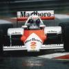
McLaren has been best looking car since 80's (hence Marlboro as tobacco brand back then but simple red and white did work) and still is.
#21
Massa
-

- 10,112 posts
- Joined: February 10
Member
Posted 22 April 2013 - 09:09
Ferrari. With the red and the high nose, it's looks like a beast. You would be afraid to had this car in your mirror.
#22
Ben Wilson
-

- 138 posts
- Joined: August 06
Member
Posted 22 April 2013 - 09:25
I really like the look of the Marussia this year but I will admit that it's the colour scheme which does it for me, I do like the bluff nose of the Ferrari as well.
Realistically, they are all kind of ugly though...
Realistically, they are all kind of ugly though...
#23
Jon83
-

- 5,341 posts
- Joined: November 11
Member
Posted 22 April 2013 - 10:01
Lotus (livery wise - still don't like the nose) and Ferrari for me. Mercedes is quite nice too.
McLaren are badly in need of a change in my opinion. I thought the Sauber looked good when it was unveiled under the lights but not so good on track.
McLaren are badly in need of a change in my opinion. I thought the Sauber looked good when it was unveiled under the lights but not so good on track.
#24
chumma
-
- 1,346 posts
- Joined: January 13
Member
Posted 22 April 2013 - 10:14
I don't like Saabs.The mclaren is for people who like saabs, dreary grey weather and tofu
#25
03011969
-

- 656 posts
- Joined: September 12
Member
Posted 22 April 2013 - 10:34
Not with those hideous looking horns it isn't. Ah well, beauty is in the eye of the beholder, as they say...It's tough to choose as the rules force them all to be uggers these days. Like they require reconstructive surgery on their noses. This was the last good looking F1 car:
For this year, from certain angles I rather like the Mercedes, the Ferrari and the Sauber.
#26
MP422
-
- 2,157 posts
- Joined: November 11
Member
Posted 22 April 2013 - 11:11
Ferrari and Merc. They look pretty good.
#27
muramasa
-

- 8,479 posts
- Joined: November 08
Member
Posted 22 April 2013 - 11:28
Maybe Merc and Ferrari, altho each of them have their own flaws.
Merc car looks somehow tidy and livery is coordinated well.
As for Ferrari, i dont like how white/black stripe goes down at the nose part but still quite nice sporty touch.
Macca is nice but worrying how its livery is losing unity and gets eroded recently, first by lucozade and zain @bahrain.
Lotus is just meh with those red parts but ironically it proves how effective red is.
RBR, that Infiniti ad is just too obvious and cheeky but it's just ok to me.
Sauber wouldve looked alot better imo if it was more aggressive gun-metal, rear wing painted in gunmetal or red not white, and abit more white lines across the car.
#28
Tenmantaylor
-
- 18,126 posts
- Joined: July 01
Member
Posted 22 April 2013 - 15:11
Not with those hideous looking horns it isn't.
I'll give you that. By 08 the cars looked ridiculous with the amount of winglets. In this respect they have been better since the 09 rules came in but the disproportional wings have ruined them ever since and the recent ugly mandated nose heights and steps.
#29
SpaMaster
-

- 5,856 posts
- Joined: October 08
Member
Posted 22 April 2013 - 15:37
I have to go with Lotus as well. The cars don't look that beautiful these days. Red Bull couple of years back was great. This year's Lotus could also look great only if they have just black and gold. But still the best looking car.
Mercedes and Ferrari look okay.
Never liked McLaren's chrome scheme.
Sauber looks horrible.
Mercedes and Ferrari look okay.
Never liked McLaren's chrome scheme.
Sauber looks horrible.
#30
mclarensmps
-

- 8,643 posts
- Joined: February 02
Member
Posted 22 April 2013 - 16:34
Medical car...............
I actually agree with this!
The mclaren is for people who like saabs, dreary grey weather and tofu
Last I checked, SAAB built wicked fighter jets. Also, last I checked, dreary grey doesn't shine and Shimmer like a mirror! ALSO, Last I checked, tofu was awesome

#31
Disgrace
-

- 31,441 posts
- Joined: January 10
Member
Posted 22 April 2013 - 16:40
Sauber by far, if we're judging the looks of the chassis rather than paint job.
#32
RealRacing
-

- 2,541 posts
- Joined: February 12
Member
Posted 22 April 2013 - 17:30
Least ugly would be proper title. But anyway, there was a thread with just the chassis of the cars. If we would go by that only, I'd vote Sauber, McLaren, Ferrari and possibly Williams as the best. None of the stepped nose cars would qualify here.
Livery only: Catterham, Marussia maybe, Ferrari not that bad although boring, Sauber, Lotus, nothing really nice since it's basically company logos and colors of the main sponsors.
Complete package: Sauber, Ferrari, Mac.
Livery only: Catterham, Marussia maybe, Ferrari not that bad although boring, Sauber, Lotus, nothing really nice since it's basically company logos and colors of the main sponsors.
Complete package: Sauber, Ferrari, Mac.
#33
SRK
-

- 220 posts
- Joined: September 10
Member
#34
rasul
-
- 1,952 posts
- Joined: October 12
Member
Posted 22 April 2013 - 18:05
Ferrari for me, but I might be a bit biased.
#35
MaxisOne
-

- 2,342 posts
- Joined: February 10
Member
Posted 22 April 2013 - 18:07
Ferrari, Mercedes and Red Bull.. special note to Caterham for their Green
#36
crooky369
-

- 635 posts
- Joined: August 09
Member
Posted 22 April 2013 - 18:09
Anyone else like the Toro Rosso?

#37
Jovanotti
-

- 8,255 posts
- Joined: October 11
Member
Posted 22 April 2013 - 18:12
Williams, Lotus and Caterham for me.
#38
Brandz07
-
- 3,500 posts
- Joined: February 10
Member
Posted 22 April 2013 - 20:56
The mclaren is for people who like saabs, dreary grey weather and tofu
What's the Sauber for then?
#39
Afterburner
-
- 9,226 posts
- Joined: January 11
RC Forum Host
Posted 22 April 2013 - 21:08
I count the livery as part of the car, so for me it's got to be Ferrari, RBR, and McLaren, maybe in that order. Of course, I also subscribe to the 'fast cars are automatically beautiful' philosophy as well, so the Lotus is threatening the McLaren's spot at the moment.
Advertisement
#40
BigCHrome
-

- 4,049 posts
- Joined: July 10
Member
Posted 23 April 2013 - 02:02
Red Bull is the best this year.
McLaren looks bad with that nose, Ferrari has a nice chassis but the black on the bottom is awful, Lotus is ugly all around.
McLaren looks bad with that nose, Ferrari has a nice chassis but the black on the bottom is awful, Lotus is ugly all around.
#41
DILLIGAF
-

- 4,459 posts
- Joined: July 10
Member
Posted 23 April 2013 - 02:26
Ferrari, Lotus & Mercedes for mine.


