I always thought that Emerson Fittipaldi's original helmet was fantastic in its simplicity;

Posted 16 March 2015 - 17:08
I always thought that Emerson Fittipaldi's original helmet was fantastic in its simplicity;

Advertisement
Posted 16 March 2015 - 17:24
Ronnie Peterson:

For car, helmets and livery it doesn't get any better than Lotus in 1973.
Posted 16 March 2015 - 17:30

Posted 16 March 2015 - 17:31
Really liked Schumacher's Mercedes one.
Actually really like Rosberg's current number aswell.
Doubt either will be considered the coolest but hey ho.
Posted 16 March 2015 - 17:32
Anything from late 70s through to late 90s, when they all started to become a bit of a mess. Senna, Mansell, Piquet, Hill, Schumacher (original), Patrese, Boutsen, ....take your pick but I think they all had distinctive and relatively simple schemes. Today's designs are a total mess of colours, angles and "brands" (I don't mean sponsors).
Posted 16 March 2015 - 17:45
Edited by slideways, 16 March 2015 - 17:46.
Posted 16 March 2015 - 17:52
Posted 16 March 2015 - 17:53

All the rest are second best.
Posted 16 March 2015 - 17:55
I like a lot of the older helmets with solid colours. I'm not a huge fan of gradients and shadows of the modern helmets, they look messy.
Posted 16 March 2015 - 17:55
Sebs with the LEDs in the helmet in Singapur that one year
Posted 16 March 2015 - 17:56
I liked Kimi's in his prev Ferrari era, around 2008

Edited by muramasa, 16 March 2015 - 17:57.
Posted 16 March 2015 - 18:01
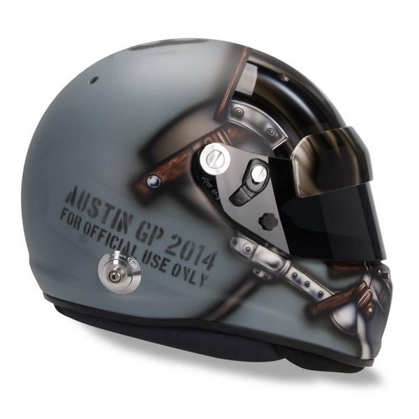
Adrian Sutil's US GP helmet was brilliant
Posted 16 March 2015 - 18:34
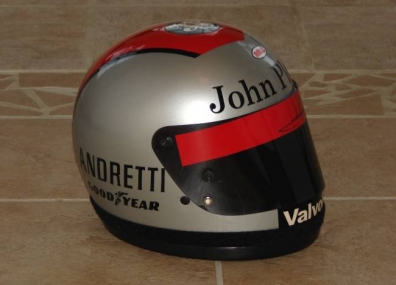
Mario Andretti managed to keep his obvious "Viceroy" red stripe, even when driving for John Player, amazing;
Posted 16 March 2015 - 18:38
All the rest are second best.

Posted 16 March 2015 - 18:43

I've always liked Davidson's
He should get a shout out for keeping it very consisted throughout his career too
Posted 16 March 2015 - 18:48
Hands down this:
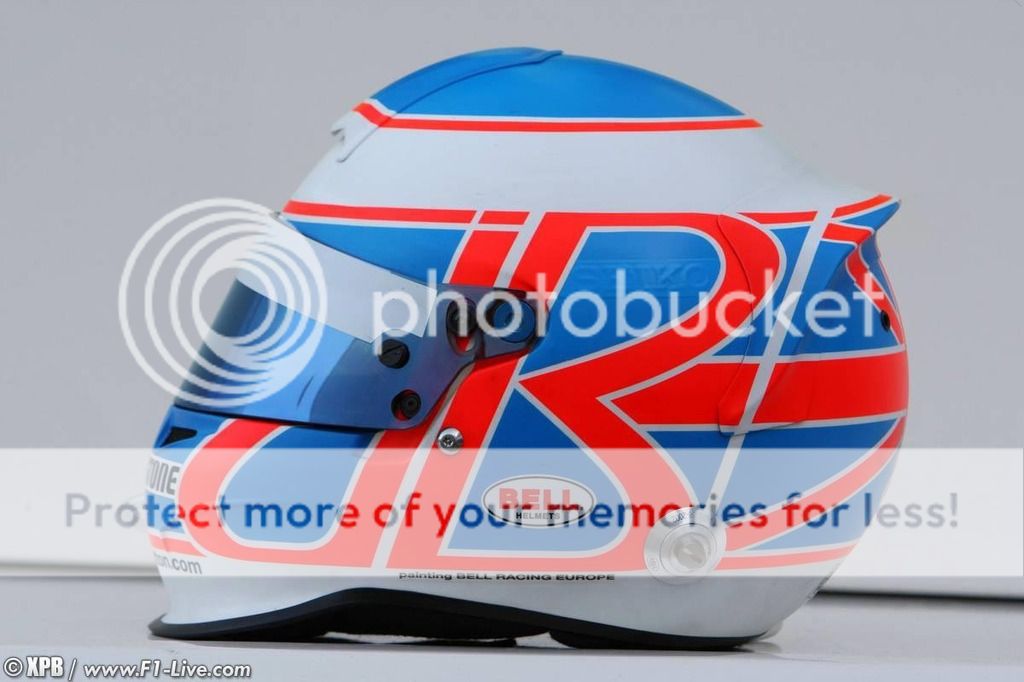
Looked amazing in the Brawn in pre-season testing. I hated the yellow one he used all season, really wish he'd kept with these colours.
Posted 16 March 2015 - 18:48
I like a lot of the older helmets with solid colours. I'm not a huge fan of gradients and shadows of the modern helmets, they look messy.
This. Car liveries are the same.
Posted 16 March 2015 - 18:53
In terms of 'coolness' Rossi's are the best! no point posting any more lol
Edited by Denaris, 16 March 2015 - 18:54.
Posted 16 March 2015 - 19:03
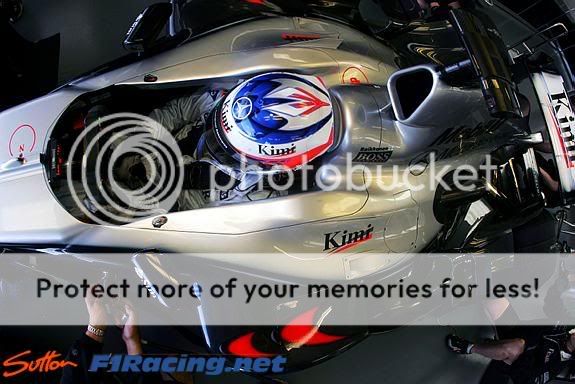
still the best ![]()
Posted 16 March 2015 - 19:27

I really like Lewis's older helmets
Posted 16 March 2015 - 19:35

https://s-media-cach...aafa8c2ee82.jpg
Jody´s was simple but nice as was Hunt´s. And, of course, there´s Senna´s one, iconic maybe more for the driver than the design itself.
Edited by RealRacing, 16 March 2015 - 19:38.
Posted 16 March 2015 - 19:58
Posted 16 March 2015 - 20:01
Now, as always, there should be a worst helmet thread. Soon to follow.
Posted 16 March 2015 - 20:04
Must be a love hate thing. I think Rossi's helmets are appalling, tacky ****.
Posted 16 March 2015 - 20:49
I've always liked Davidson's
He should get a shout out for keeping it very consisted throughout his career too
It was modelled on Eddie Cheever's design:

Posted 16 March 2015 - 20:56
Posted 16 March 2015 - 21:04
Probably not the coolest ever but I always loved this one
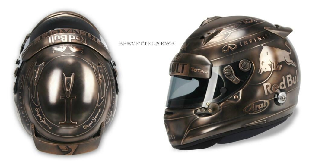
Posted 16 March 2015 - 21:06
I've always been fond of Johnny Herbert's old lid.
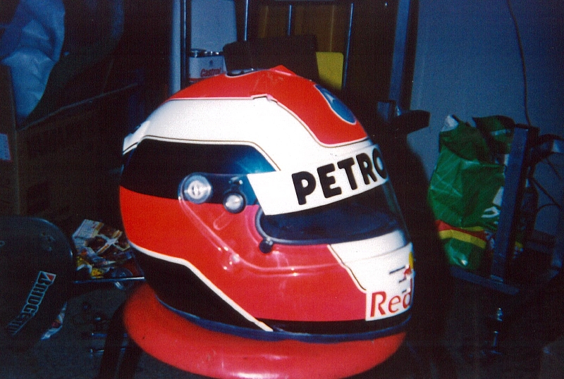
Posted 16 March 2015 - 21:08
I liked Kimi's in his prev Ferrari era, around 2008
I like a lot of his helmets too, I always liked how the rune symbol was always integrated within the design.

the rune symbol means protection iirc.
Edited by MikeV1987, 16 March 2015 - 21:09.
Posted 16 March 2015 - 21:12

Posted 16 March 2015 - 21:14
Posted 16 March 2015 - 21:15
For car, helmets and livery it doesn't get any better than Lotus in 1973.
Posted 16 March 2015 - 21:24
Posted 16 March 2015 - 21:29

Always liked Mika's helmet.
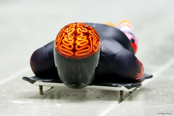
If we go outside of Motor racing, this one seems cool
Posted 16 March 2015 - 21:35
I meant this one btw
Edited by Sin, 16 March 2015 - 21:36.
Posted 16 March 2015 - 21:38
Always liked Mika's helmet.
If we go outside of Motor racing, this one seems cool
Yep, Mika's was cool, one of the best modern ones.
Posted 16 March 2015 - 21:42
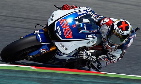
Even though motorcycle helmets tend to be messy i think there are currently some good ones. Already mentioned Lorenzos' X in a circle I also like Marquez's Ant symbol, Rossi's moon and sun motive makes for great helmets too but his recent helmets are too overloaden I think The one he used in 2006/2007 and in 2012 testing are examples how a helmet design with one simple theme simply works (one side the moon on the other side the sun).


Edited by registered, 16 March 2015 - 21:47.
Posted 16 March 2015 - 21:44
Not a single of the current designs are cool - I do not actually keen on 'cool' being a qualifier, since what is cool to one person is anything but to another - looking for appealing or at least most appealing I am in the camp of 1970ies and early 1980ies being much better.
Even then there were slight changes to the designs, and some I may remember incorrectly.
Clay Regazzoni
![]()
Advertisement
Posted 16 March 2015 - 21:54
For car drivers, I always liked Mika's
Damon Hill in the modern era. And for some reason Stafan Johansson! And Keke Rosberg!
I would say my fave is Prosts though, a little complex but still simple
As for bikes, Ago wins hands down, but the Roberts yellow is a fave as was Luca Cadalora's
Posted 16 March 2015 - 22:04
Marco Simoncelli's was great too

Posted 16 March 2015 - 22:11
It was modelled on Eddie Cheever's design:
I did know that. Prefer Davidson's.
Posted 16 March 2015 - 22:31
I always liked Marc Surer's.

Also, Giacomo Agostini.

Posted 16 March 2015 - 22:42
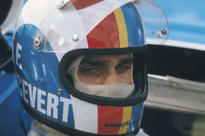
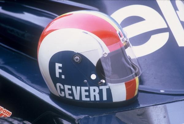
As previously mentioned, Cevert's was a beauty:
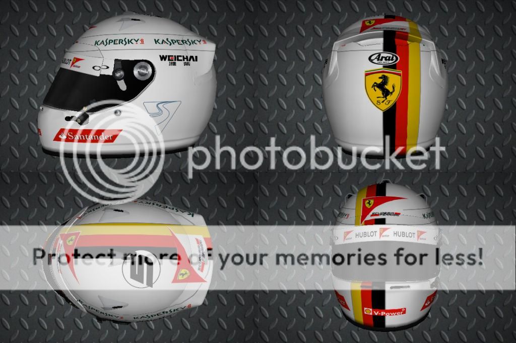
I like Vettel's this year as well. Were it not for the sodding sponsor logos it'd be fabulously simple, yet striking:
Posted 16 March 2015 - 22:58
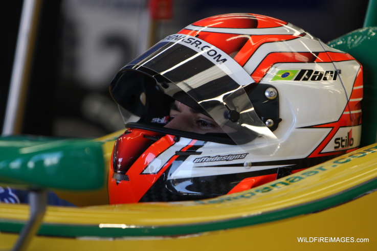
Of the current helmets, Nasr's is the best. A simple, clean design with no unnecessary flicks or swooshes. Looking at photos from earlier in his career, it also appears that the design used to be messier. It's refreshing to see a driver's helmet design become simpler without undergoing a complete change (like Rosberg).

Posted 16 March 2015 - 22:59
Just remembered another one I really liked. Alonso's original lid. Fernando, why did you change it?!

Posted 17 March 2015 - 00:00
I like Vettel's this year as well. Were it not for the sodding sponsor logos it'd be fabulously simple, yet striking:
I think thats a big reason why current helmets dont look great by comparison. Youve got to imagine it without those logos becuase thats not the drivers choice, just the way it is nowdays.
Having said that, the modern flicks, swooshes and fiddly crap is just awful.
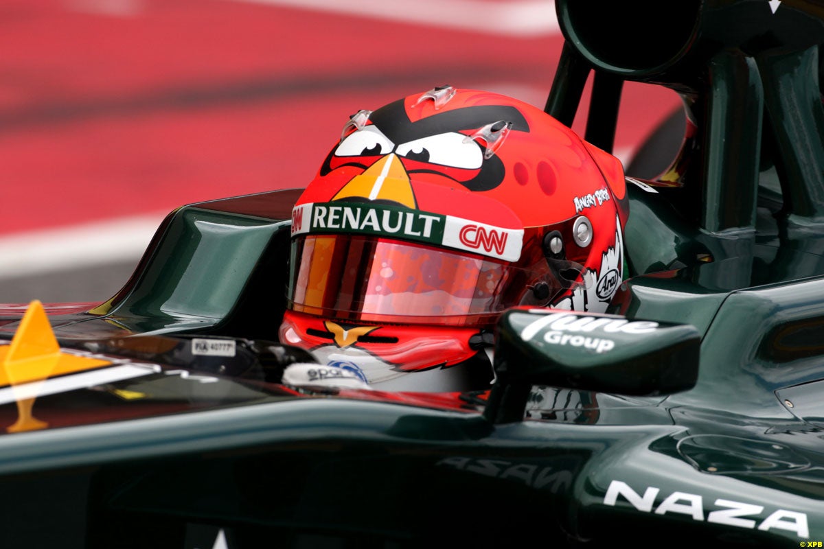
This one of Kobayashi's always annoyed me.
Because it could have been the best ive seen in 15 years if he didnt have all the grey crap covering the flower (ironically, a lotus isnt it?)
Black, with a little grey and that absolutely unique flower that relates to his background .... ![]()
Edited by Brother Fox, 17 March 2015 - 00:00.
Posted 17 March 2015 - 00:11
Cheever's, new Vettel's one and this:

Posted 17 March 2015 - 00:27
Helmets used to be so much better in the old days when they were much simpler and easier to recognise
François Cevert's helmet was really cool:
Edited by William Hunt, 17 March 2015 - 00:28.
Posted 17 March 2015 - 00:32
Mika Hakkinen.