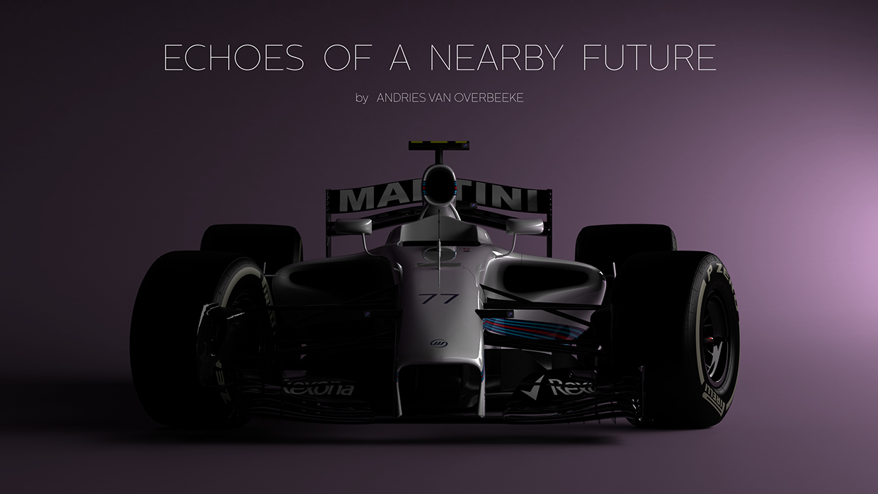
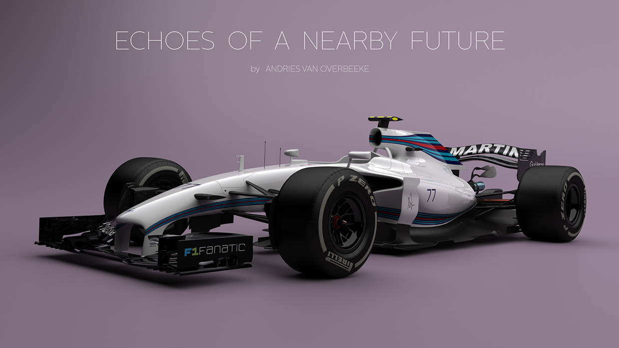
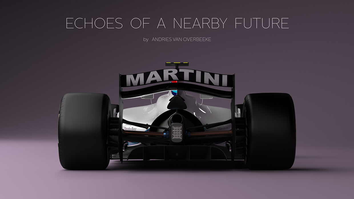
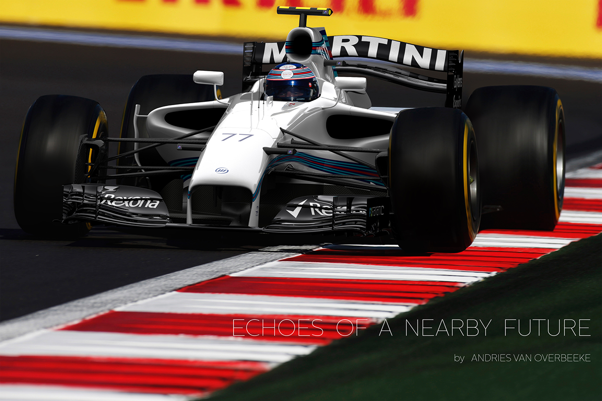
This appeared in AMUS today: http://www.auto-moto...gn-9422184.html
Looks beautiful ![]()
![]()
![]()

Posted 09 April 2015 - 08:20
Posted 09 April 2015 - 08:42
Posted 09 April 2015 - 08:46
Very ugly
Posted 09 April 2015 - 09:11
Every time you try to operate one of these weird black controls, which are labeled in black on a black background, a small black light lights up black to let you know you've done it. Hey, what is this, some kind of galactic hyper-hearse?
Edited by The Passenger, 09 April 2015 - 09:12.
Posted 09 April 2015 - 09:24
Posted 09 April 2015 - 12:43
Very ugly
Compared to what we have today, it's a Masterpiece.
Posted 09 April 2015 - 12:47
Fat rear tires, wide cars, oh please yes! ![]()
![]()
Posted 09 April 2015 - 12:47
They're persisting with the outdated wheel size/tyre profile then?
Posted 09 April 2015 - 13:08
You'll never please everybody but this is one of the best looking concepts I've seen in a long time personally. Love the lower rear wing and stealth fighter angles all over the car. Kind of looks like a Lamborghini inspired F1 car. Much better than what Ferrari came up with, even though I appreciate them sparking some more concept designs.
No doubt if new regulations are passed we'll all end up being disappointed with the end product and wonder what could have been. We need radical and exciting changes to F1 not conservative approaches that still end up costing teams too much cash.
Posted 09 April 2015 - 13:47
Posted 09 April 2015 - 13:49
Pass. Looks like it melted.
Posted 09 April 2015 - 13:50
Better looking than the Ferrari.
I liked it.
Edited by Atreiu, 09 April 2015 - 13:50.
Posted 09 April 2015 - 13:52
I don't like it too much.
Posted 09 April 2015 - 14:07
They're persisting with the outdated wheel size/tyre profile then?
Outdated from a styling/marketing perspective maybe.
Or have you been fooled into thinking more inches = more grip?
Posted 09 April 2015 - 14:09
Looks like something Batman would drive.
Posted 09 April 2015 - 14:18
Reminds me a little of a mid-nineties Schumacher Benetton. Sadly, that means it's too wide and it's nose is too high, and I don't like it much.
Posted 09 April 2015 - 14:47
I kinda like it, i think
Posted 09 April 2015 - 15:07
Looks fast.
Advertisement
Posted 09 April 2015 - 15:10
Outdated from a styling/marketing perspective maybe.
Or have you been fooled into thinking more inches = more grip?
Have you been fooled into thinking bigger wheels would mean more rubber?
The WEC seem to cope well enough with their purely style/marketable wheel and tyre sizes.
Posted 09 April 2015 - 15:12


Woooooaaaaah! ![]()
![]()
![]() Now that would get my juices flowing once again.
Now that would get my juices flowing once again.
Edited by BillyWhizz, 09 April 2015 - 15:13.
Posted 09 April 2015 - 15:20
Woooooaaaaah!


Now that would get my juices flowing once again.
Make sure they don't 'flow' onto your keyboard or monitor.
Posted 09 April 2015 - 15:31
Another melted pile of crap
Posted 09 April 2015 - 15:49
Why do people persist with these concept car fantasies? The only way you are going to get anything that looks like this, the Williams or the Ferrari design is with a spec series. Form follows function, and unless you heavily regulate bodywork profiles (much more so than now) teams will always find ugly solutions to go faster.
Posted 09 April 2015 - 15:54
Posted 09 April 2015 - 15:56
I'm not a huge fan of this kind of designs. Sure, they look interesting but I'd go for something less radical. Just bring get rid of the ugly noses and winglets and bring back the wing dimensions ike they were until 2008.
Posted 09 April 2015 - 16:11
In the murdered out black, yes please!
Posted 09 April 2015 - 16:16
Generally, any of the cars on the grid currently would instantly look much better with wider track. It would be nice to have cleaner noses and narrower front wings too if possible.
Posted 09 April 2015 - 16:37
I use to check Behance every week, more concept cars if you like to see. I love motorsport design and such a stuff. I also do graphic design myself. ![]() Great combination !
Great combination !
Posted 09 April 2015 - 17:02
it could have been uglier. ![]()
Posted 16 April 2015 - 14:37
I use this topic for concept cars if it´s ok ?
New Ferrari Forte Concept Car by Mohammad Hasani (Amin).


Posted 16 April 2015 - 14:42
Reminds me a little of a mid-nineties Schumacher Benetton. Sadly, that means it's too wide and it's nose is too high, and I don't like it much.
It's not too wide, current cars are too narrow.
Posted 16 April 2015 - 14:50
Posted 16 April 2015 - 15:02
These look like concept cars of the late 90s...