At the time, I hated the 2015 McLaren livery, now though....

I love it

Posted 01 April 2016 - 17:32
At the time, I hated the 2015 McLaren livery, now though....

I love it
Advertisement
Posted 01 April 2016 - 17:35
Edited by P123, 01 April 2016 - 17:35.
Posted 01 April 2016 - 18:15
Posted 01 April 2016 - 19:38
Posted 01 April 2016 - 19:41
Nissan Deltawing.
April fools!
Posted 01 April 2016 - 19:49
Edited by DampMongoose, 01 April 2016 - 19:50.
Posted 01 April 2016 - 19:52
^ yeah, my perception of that car changed for me too. During testing and up to today, I always thought how bland and backmarker looking. But the way the red embellishments stood out... Kind of looked classy...
Posted 01 April 2016 - 19:53
Posted 01 April 2016 - 20:02
It was much derided at the time but I think the FW26 is a modern classic.

Posted 01 April 2016 - 20:03
Have there been some livery tweeks on the McLaren? What's the starry night thing about? And.... Some of the red I was liking there was on Vandorne's car.... Around the air intake ... Only now im thinking perhaps it was just red flowviz?
Probably to do with not being allowed to advertise alcohol in Bahrain.
Posted 01 April 2016 - 20:13
The problem with the original 2015 McLaren livery as is it was half 2013 and half 2014 and just didn't work. The livery from Spain onwards was a massive improvement.
Posted 01 April 2016 - 20:19
Posted 01 April 2016 - 20:20
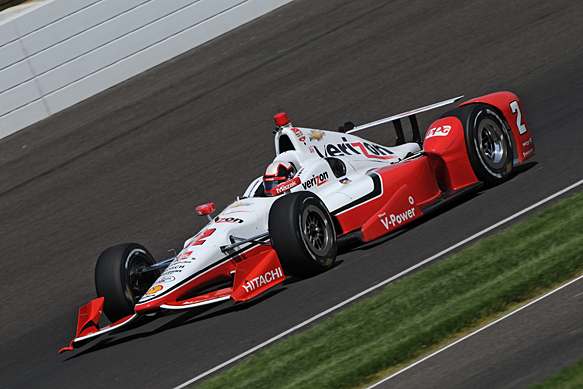
The Dallara DW12. Like a lot of people I found it ugly and a big step backwards for a series suffering an image problem after Vegas 2011, but since it was introduced the racing in both oval and road form has been fantastic and helped to get Indycar back on track these past few years.
Plus (minority opinion) in oval racing form and from the right angle it can look quite good.

Edited by karl100589, 01 April 2016 - 20:21.
Posted 01 April 2016 - 20:25
The Dallara DW12. Like a lot of people I found it ugly and a big step backwards for a series suffering an image problem after Vegas 2011, but since it was introduced the racing in both oval and road form has been fantastic and helped to get Indycar back on track these past few years.
Plus (minority opinion) in oval racing form and from the right angle it can look quite good.
Give these guys a call:

Posted 01 April 2016 - 20:40
Now this:

At first it looked to me like a tilted bathtub with some red car around it, but I grew to like it.
Posted 01 April 2016 - 20:46
I'm not attracted to things with a goiter
Posted 01 April 2016 - 20:48
Even girls with big necks need love ![]()
Posted 01 April 2016 - 20:50
Now this:
At first it looked to me like a tilted bathtub with some red car around it, but I grew to like it.
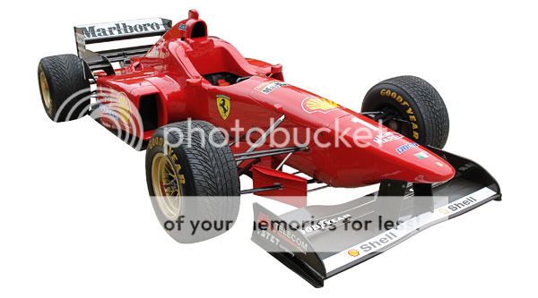
![]() My god that was one ugly Ferrari!! Especially when they changed to the higher nose like this one. That Schumacher won 3 races in this is a bloody miracle
My god that was one ugly Ferrari!! Especially when they changed to the higher nose like this one. That Schumacher won 3 races in this is a bloody miracle
Posted 01 April 2016 - 20:54
Another ugle Ferrari, but I got to like this one over time. It is so edgy looking it could have been designed by Bertone in the 70s

Edited by cyclist, 01 April 2016 - 20:55.
Advertisement
Posted 01 April 2016 - 20:55
Agreed about the F2012, I felt the same about the F60.
Initially I wasn't all that impressed by McLaren's livery, but it looks very menacing to me now. I love it.
Edited by MikeV1987, 01 April 2016 - 20:58.
Posted 01 April 2016 - 21:12
If we'd have won the title, the 2012 Ferrari would have been a jewel. But to be honest, the stepped noses we had were an insult to the eyes. Not as bad as what 2014 served up right enough and agree with the comment about the Lotus - it was horrendous and absolutely hopeless as well.
It also had one hopeless driver, which probably was quite befitting.
Post 2008, I really don't think there has been one car which is really plesant on the eye. The wings are just ridiculous.
Edited by Jon83, 01 April 2016 - 21:14.
Posted 01 April 2016 - 21:27
The Dallara DW12. Like a lot of people I found it ugly and a big step backwards for a series suffering an image problem after Vegas 2011, but since it was introduced the racing in both oval and road form has been fantastic and helped to get Indycar back on track these past few years.
Plus (minority opinion) in oval racing form and from the right angle it can look quite good.
Posted 01 April 2016 - 21:31
I cant think of any car I ahve grown to like in motorsport. I think most mdoern WEC F1 and the like look hideous!
I used to dislike the mid 70's cars,a nd also the 83/84 turbo era cars for their looks.
But something like a Spirit Honda now to me looks simply like a made to fit solution and engineering trying to harness brute power.
Far more real, interesting and cool than cretinous wings with about 15 elements and silly men cooling brakes with leaf blowers
Posted 01 April 2016 - 23:16
Posted 02 April 2016 - 00:31
I was never really a Porsche guy, and especially 911s I never liked at all. First time I went to Le Mans in 1998 I saw the 911 GT1 win and it's been one of my favorite cars of all time since.
Posted 02 April 2016 - 01:47
Nissan Deltawing.
Kill it with fire !
It was much derided at the time but I think the FW26 is a modern classic.
Personally, I love that car in the 'Walrus' iteration - but then again, I liked most of the 2012 Formula 1 field, especially the Sauber.
![]()
Posted 02 April 2016 - 03:41
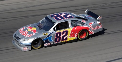
Didn't like the idea of wings and spliters on a stock car, but I think NASCAR missed the boat reverting back to tradition.

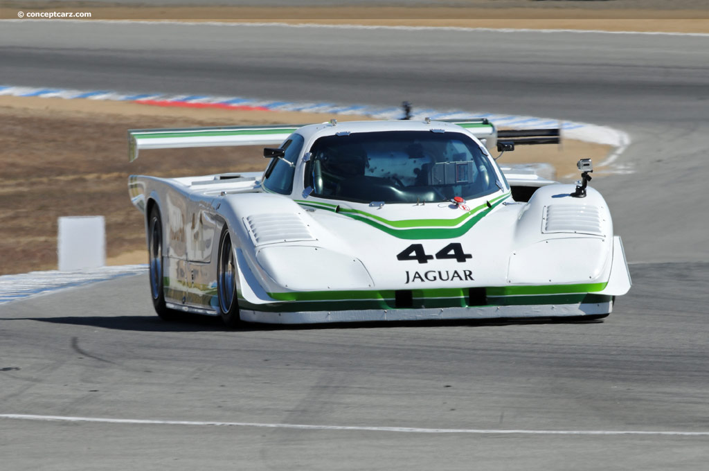
Maybe a generation thing, but the 962 is a bit bland compared to a few of the era (XJR-9 and 88C are beauties)

But ![]() , simplicity always seems to win races, and many times looks the best.
, simplicity always seems to win races, and many times looks the best.
Posted 02 April 2016 - 04:29
At first I did not like the GT2 Corvette, especially compared to it's GT1 big brother, but with time it's become my favorite GT2 car.
GT2 - 
GT1 - 
Posted 02 April 2016 - 04:29

Posted 02 April 2016 - 07:23
The Dallara DW12. Like a lot of people I found it ugly and a big step backwards for a series suffering an image problem after Vegas 2011, but since it was introduced the racing in both oval and road form has been fantastic and helped to get Indycar back on track these past few years.
Plus (minority opinion) in oval racing form and from the right angle it can look quite good.
I think the Dallara spec aero had too curvy buttocks. And the new aero kits are too bulky, expect for the simple-looking Chevy race aero at Indy last year, that was as beatiful as the DW12 can get.
