

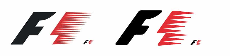
Both IndyCar and NASCAR have gone through recent corporate branding and logo redesigns, and with the new F4>F3>F2>F1 pyramid soon to be confirmed, when you look at this recent 'FIA pyramid' image (in image below), as iconic as it is, the official F1 logo does look decidedly dated and separated from the rest of the 'pyramid' (playing devil's advocate, maybe that's a desirable thing so that the F1 logo is different as so suggests the ultimate/pinnacle of the pyramid?...)


http://www.fia.com/n...yramid-goodwood
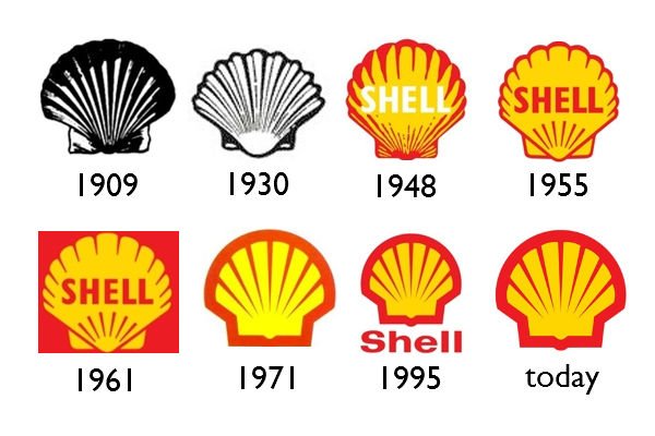
I see Liberty updating the F1 logo, keeping enough subtle cues to the past, yet with a gentle modernisation.
Think it will be controversial to the purists, yet even the largest most iconic of large brands (the McDonalds, Coca-Colas, Pepsis etc.), even those with 100+ year histories, even though there is a degree of risk/initial consumer backlash concern, look a brand 'refreshes', particularly during a period of new ownership....
Thoughts?
Edited by GeeVeeF1, 02 February 2017 - 16:22.


