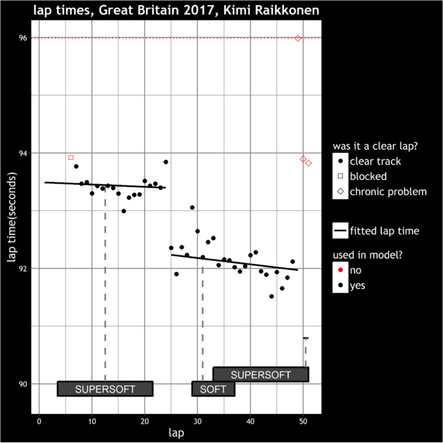
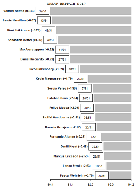
- in brackets, how far off the pace in seconds the driver was from the fastest driver
- in the box, how many laps out of the total race number of laps the model was able to use (labelled as 'clear track' laps in the graphs above)
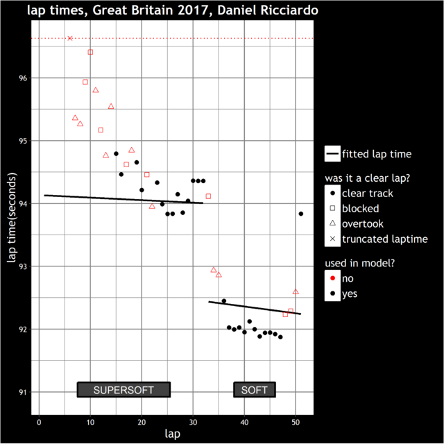
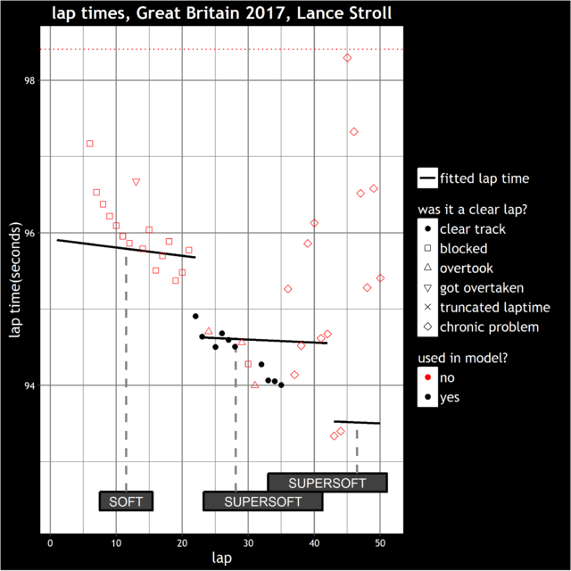

Posted 24 July 2017 - 20:56


Posted 25 July 2017 - 00:20
Posted 25 July 2017 - 00:54
Posted 25 July 2017 - 06:46
Awesome work indeed, just curious how you would account for a driver driving to a delta to extend tyre life and not really driving to his pace?
Posted 25 July 2017 - 06:48
Awesome work indeed, just curious how you would account for a driver driving to a delta to extend tyre life and not really driving to his pace?
That's the question.
Posted 25 July 2017 - 07:23
Posted 25 July 2017 - 16:03
Cheers for the comments (yes, even the sarcastic ones!), here's a couple of quick responses:
What i have to comment on, though, is that the determination of which laps count, and which don't, is probably a whole disputed process altogether
In terms of which laps are blocked, yes, it's a bit like the outlier situation, where something's either in or out. What would be better is if laps that were seriously obstructed, e.g <0.5 seconds to the car in front, had almost 0% weight on them, then you have increasing weight until completely clear laps e.g >3 seconds to the car in front, were included 100%. Obviously I'm guessing at those values at the moment, you would ideally optimise them in a sensible way. It would be a mighty coding job however, so it's just a simple cutoff for now.
just curious how you would account for a driver driving to a delta to extend tyre life and not really driving to his pace?
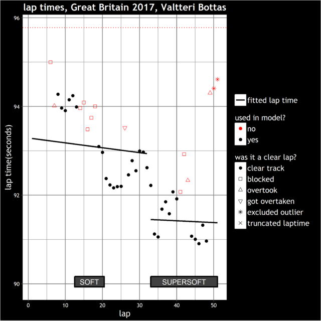
I'm not sure how you would do this, I don't think you can just with lap time data. You'd need some data that indicates the driver's been driving below the potential of the car e.g. tyre/brake temperatures or something like that maybe? Still, what I'm after is the average pace throughout the stint, whether it starts fast and ends slow or vice versa. So if we look at Bottas's first stint again:

He does seem to drive to a delta up to about lap 20, but then bangs in a set of hot laps in the ten laps after that, so overall the average ends up in about the right place. Meanwhile, if we look at Vettel's laps here:
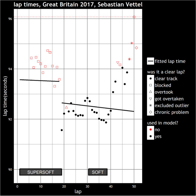
His second stint is the opposite of Bottas's first stint, his pace is pretty steady until about lap 40, then he runs into big trouble in the laps after that, which drags his estimate down. Of course, it might well be that we'd have estimated Vettel a tenth or two differently if he'd driven the way Bottas had, and vice versa, but I'm not sure if there's a way around that. These are two fairly extreme examples by the way, it was a bit of an unusual race in that it was a one stopper but with quite high tyre degradation, so there was a lot more scatter in the lap times within stints than normal.
There are some scenarios where the estimate could be slightly further out than that, e.g if Bottas had retired on lap 20 his estimate would have been very different from what it turned out to be, while Vettel's would have been a few tenths faster if he'd either retired or been blocked from lap 40 onwards. So there are a few situations which can catch the model out when looking at a single race, however, I tend to look more at trends over a season, and there's a post to follow on that soon.
Posted 25 July 2017 - 16:22
Awesome work. ![]() Even a bit too much for me to deepen into all the details right now.
Even a bit too much for me to deepen into all the details right now. ![]()
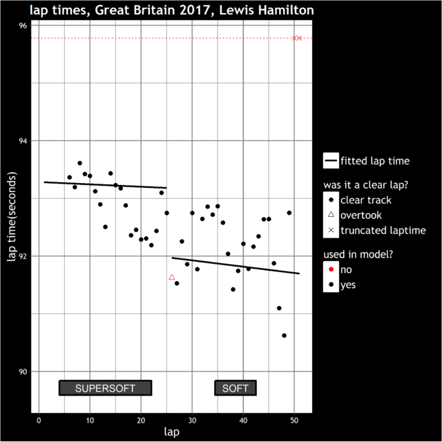
Bottas having slightly better pace than Hamilton probably sounds logical - HAM didn't need to push, was just conserving the car.
Posted 25 July 2017 - 17:57
Very nice analysis indeed. ![]() Thank you Moreland and welcome to the forum.
Thank you Moreland and welcome to the forum.
So, do we have a chance of getting an analysis using your method like this after each race? ![]()
Posted 25 July 2017 - 18:16
(OP)
Good work, thank you! You may be interested in this although the guy sadly hasn't posted in a long time: https://intelligentf...press.com/feed/
Posted 26 July 2017 - 10:25
What about brake degredation/wear? Could this be a factor over time to include? We hear a lot of the time that the drivers are complaining about fading brakes, and they need to adjust the balance. They adjust the brakes, but it is not optimal as from the beginning of the race. Even overheating the brakes and letting them cool down will have an impact on the lap time. It might be 1 or 2%, but it could be an interesting factor to include. It would be a lot of work to go through every drivers conversation and note all incidents.
The same goes for ERS overheating and reduced effect of this system. This will affect both acceleration and braking, maybe even the traction.
Posted 26 July 2017 - 17:02
So, do we have a chance of getting an analysis using your method like this after each race?
That's the plan ![]() , as long as the race is a dry or mostly dry race. The analysis doesn't work for laps when the track is wet or drying. Also, if the race turns into one long traffic jam as it can do at Monaco and possibly Singapore, then I can run the model and display the output but it might be a little wide of the mark.
, as long as the race is a dry or mostly dry race. The analysis doesn't work for laps when the track is wet or drying. Also, if the race turns into one long traffic jam as it can do at Monaco and possibly Singapore, then I can run the model and display the output but it might be a little wide of the mark.
Good work, thank you! You may be interested in this although the guy sadly hasn't posted in a long time: https://intelligentf...press.com/feed/
Yes, I have seen that site before but only since it stopped being updated. I've looked at the model section of that, it's not completely clear but I think he gets his numbers for each driver using a similar method to mine. It's hard to tell though, he covers that aspect very briefly in the 'model' section, then talks a lot about simulations, as far as I can tell they're just for checking the numbers he's calculated. Good site, shame it fizzled out for whatever reason.
What about brake degredation/wear? Could this be a factor over time to include? We hear a lot of the time that the drivers are complaining about fading brakes, and they need to adjust the balance. They adjust the brakes, but it is not optimal as from the beginning of the race. Even overheating the brakes and letting them cool down will have an impact on the lap time. It might be 1 or 2%, but it could be an interesting factor to include. It would be a lot of work to go through every drivers conversation and note all incidents.
The same goes for ERS overheating and reduced effect of this system. This will affect both acceleration and braking, maybe even the traction.
It could well be. It's a bit like driving to the delta though, we don't have the data to tell when a driver is doing these things. I believe that the cars do deteriorate generally throughout a race, e.g. if a driver puts on a new set of tyres for the last lap, I don't think they lap as quickly as they do in qualifying. In terms of measuring that, I don't think you can because at the same time, the fuel load is going down so all of these changes get combined into one inseparable block.
So, as mentioned above, it's possible to take the summaries for each race then combine them, to produce an overall ranking for the season. It's not a straight average, if a driver only completes a small part of the race, then that race contributes less to the average than if they'd done the entire race. This is the ranking so far.
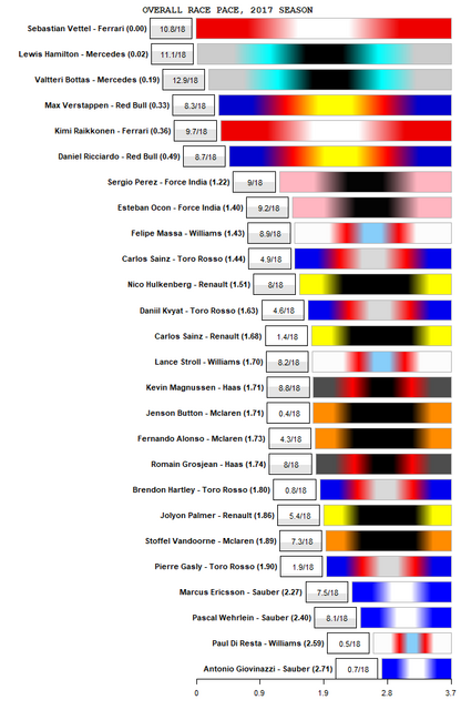
(NB updated to include Brazilian Grand Prix)
The number in brackets is the secs/lap away from the fastest driver, the box displays the proportion of races done. This factors in how many clear laps you had in the race, so if you completed a race but only half the laps were clear laps, this contributes 0.5 to the number.
One slight oddity is Button being the fastest Mclaren driver. This because he only did Monaco, which was probably Mclaren's best track, so it's not really a like for like comparison with their other two drivers.
This plot is a little vulnerable to occasional outlying bad performances however, so in order to compare team mates, which is what I suspect a lot of people want to do, I prefer to use this next set of graphs. The bar appears on the side of the driver who was calculated to be quicker in each race, the size of the bar indicates the size of the advantage.
I've highlighted a few issues too:
 , in which case it doesn't contribute to the overall average displayed in the plot above.
 to highlight that the estimate is a bit of a guess.
So, here is the complete set of team mate comparisons so far this year. I'm aware there are a few controversial ones, you're welcome to point them out! There's a variety of causes behind them, but the plot is actually quite useful for highlighting when the model does something a little odd. Enjoy!

Edited by moreland, 16 November 2017 - 19:28.
Posted 26 July 2017 - 17:25
This is really cool stuff. Very impressed by this analysis. Much enjoyed reading it.
Last post shows some interesting things between teammates. It's no surprise Vettel or Hulkenberg are dominating their teammates. I was surprised to see Ericsson with such a huge advantage over Wehrlein. Perez' advantage over Ocon looks bigger than I thought it would be. Assuming this model is correct and it seems to make sense even if it's maths at a much higher level than I'm used to this adds some good insight to the races.
Edited by derstatic, 26 July 2017 - 17:31.
Posted 26 July 2017 - 18:37
(...)
Yes, I have seen that site before but only since it stopped being updated. I've looked at the model section of that, it's not completely clear but I think he gets his numbers for each driver using a similar method to mine. It's hard to tell though, he covers that aspect very briefly in the 'model' section, then talks a lot about simulations, as far as I can tell they're just for checking the numbers he's calculated. Good site, shame it fizzled out for whatever reason.
(...)
I don't know why it stopped but as usual he attracted some insults when the numbers did not satisfy the needs of some people to have a particular team mate win. Or by people who had not read/understood the model or modeling as such. It will happen to you too, good luck ![]()
Edit: And the simulations part is there because he was trying to build a predictive model, similar to the race analysis tools used by teams during the live race to determine strategy
Edited by KnucklesAgain, 26 July 2017 - 18:59.
Posted 28 July 2017 - 08:53
Last post shows some interesting things between teammates. It's no surprise Vettel or Hulkenberg are dominating their teammates. I was surprised to see Ericsson with such a huge advantage over Wehrlein. Perez' advantage over Ocon looks bigger than I thought it would be. Assuming this model is correct and it seems to make sense even if it's maths at a much higher level than I'm used to this adds some good insight to the races.
Thanks ![]() The Ericsson/Wehrlein one is interesting, it's hard to pick up what's happening in the drivers further down the field just from watching a race live. But they seem pretty reliable, one way of checking them is to compare what my numbers say with the comments in the Autosport driver ratings article. Those comments are well researched and my numbers generally tally with what the comments say.
The Ericsson/Wehrlein one is interesting, it's hard to pick up what's happening in the drivers further down the field just from watching a race live. But they seem pretty reliable, one way of checking them is to compare what my numbers say with the comments in the Autosport driver ratings article. Those comments are well researched and my numbers generally tally with what the comments say.
I don't know why it stopped but as usual he attracted some insults when the numbers did not satisfy the needs of some people to have a particular team mate win. Or by people who had not read/understood the model or modeling as such. It will happen to you too, good luck
Cheers! One of the main inspirations behind doing this was reading the 'Moneyball' book, about the origins of baseball analytics. But I actually remember at one point in the book the main analyst throws in the towel, partly due to the amount of hostile mail he was getting, so we shall see how this goes...worth remembering that on the internet, negative feedback is generally over-represented.
Edit: And the simulations part is there because he was trying to build a predictive model, similar to the race analysis tools used by teams during the live race to determine strategy
Ah, that makes sense. I've thought before how that would be a handy thing to have. It would be good while watching a race to have forecasts such as 'Hamilton predicted to catch Vettel on lap 48', or 'projected advantage of making one more stop compared to making no more stops: + 5 seconds'.
Posted 03 August 2017 - 14:21
So, Hungary data is in and has been processed. I mentioned in an earlier post that the model struggles when faced with 'traffic jam' races, I cited Monaco and Singapore as circuits where this sometimes happens. Hungary 2017 featured several trains at several points of the race. While watching the race my impression was that drivers seemed to struggle to follow within 2 seconds of the driver in front. I mentioned in the first post that the model filters out laps where drivers are within 1.5 seconds of the driver in front. I thought that we might have a problem since drivers that were within e.g 2.5 seconds of the car in front might have their laps being included in the model, despite them being unable to demonstrate their pace. So I took all occasions where a driver was within 5 seconds of a driver in front (ignoring the laps behind the safety car), then created a histogram of the gaps to the driver ahead:
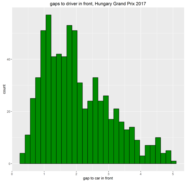
I was expecting to see a big peak around the 2 second mark, with a dramatic decline for gaps less than that. But we really don't see that at all, the drop off occurs for much smaller gaps, it seems like drivers could get to within about 1 second before struggling to get any closer.
This is relevant to deciding how reliable the driver estimates are, for example here are Hamilton's lap times from the race:
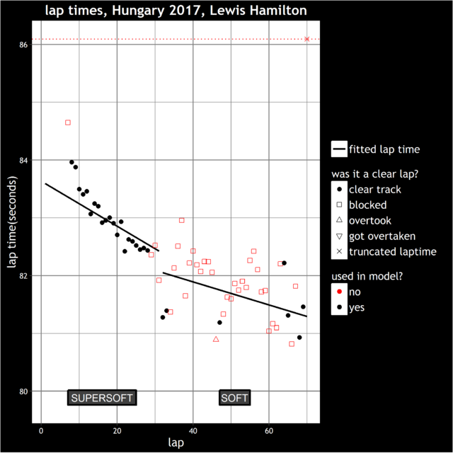
Hamilton was hovering around 2 seconds behind Verstappen during his first stint. These laps have all been included, however in his second stint his laps are almost all filtered out due to him following within 1.5 seconds of Raikkonen. I did wonder if his lap times behind Verstappen in stint 1 were unreliable due to being blocked behind Verstappen. The histogram above (and his second stint where he was able to maintain a smaller gap to Raikkonen) suggest that he wasn't actually being held back by Verstappen in stint 1 and that his estimate can be trusted. I believe we can generalise this conclusion to the field in general, so that the model has largely made sensible decisions about which laps to include for each driver.
With that digression out of the way, here are the pace rankings for the Hungarian Grand Prix:
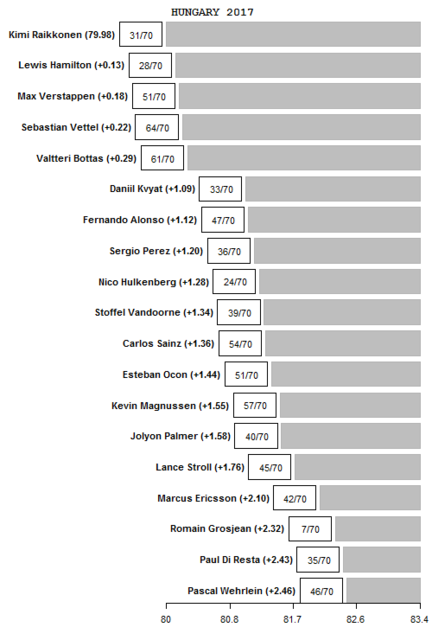
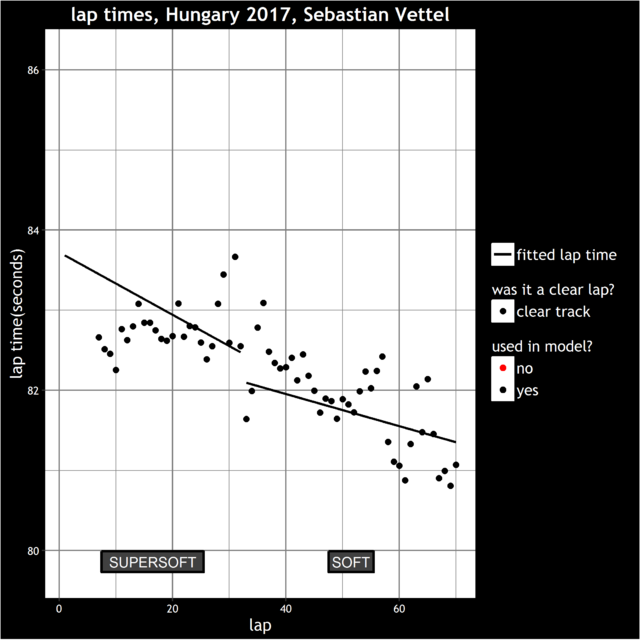
Obviously, there is the caveat that Vettel was driving with a dodgy steering wheel. We can't really say what his pace would have been, since there isn't an obvious point where he went from it not being a problem to it being a serious problem:
Alonso's pace in his second stint was a little unusual. Due to the huge gap in pace between the big 3 teams and the rest, Alonso had a fairly lonely second stint. It seems that he'd been planning his shot at fastest lap for some time and had several attempts at it:
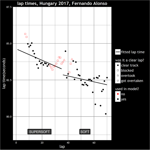
Obviously any questions about this race or the model in general are welcome. Incidentally, I've updated the season summary and team-mate comparison plots in the post earlier on in this thread.
Posted 07 August 2017 - 11:21
So, Hungary data is in and has been processed. I mentioned in an earlier post that the model struggles when faced with 'traffic jam' races, I cited Monaco and Singapore as circuits where this sometimes happens. Hungary 2017 featured several trains at several points of the race. While watching the race my impression was that drivers seemed to struggle to follow within 2 seconds of the driver in front. I mentioned in the first post that the model filters out laps where drivers are within 1.5 seconds of the driver in front. I thought that we might have a problem since drivers that were within e.g 2.5 seconds of the car in front might have their laps being included in the model, despite them being unable to demonstrate their pace. So I took all occasions where a driver was within 5 seconds of a driver in front (ignoring the laps behind the safety car), then created a histogram of the gaps to the driver ahead:
I was expecting to see a big peak around the 2 second mark, with a dramatic decline for gaps less than that. But we really don't see that at all, the drop off occurs for much smaller gaps, it seems like drivers could get to within about 1 second before struggling to get any closer.
This is a good way of looking at it, but I think you've missed one consideration here. You've got two distinct peaks on that graph - one at around 1 second back, and the second at (just under) 2 seconds.
The 1 second peak is significant because that's the DRS. If a driver is actively trying to overtake, they need to get within that 1 second.
The 2 second peak is significant for a different reason: it's because 2 seconds is what's generally become the accepted "I can't pass the guy on track, so I'm going to wait for the strategy to play out" distance. Ref Hamilton in Hungary, that's exactly what he was doing behind Verstappen. There was a radio call from Hamilton to the team early in the race that got broadcast where he essentially said exactly that: he wasn't going to be able to pass MV on track. At that point he backed off to 2s+ behind, because any closer risks unnecessary tyre deg.
The reason why Hamilton followed Raikkonen closer in stint 2 is because at that point there was no option to pass via strategy. His only option was to get it done on track, so he had to (try to) push up closer.
Edited by GhostR, 07 August 2017 - 11:21.
Posted 10 August 2017 - 11:09
Hi GhostR,
I see what you're saying. In fact if we look at these gaps again, but split between drivers in their first stint and their second stint, it does seem to reflect what you're suggesting: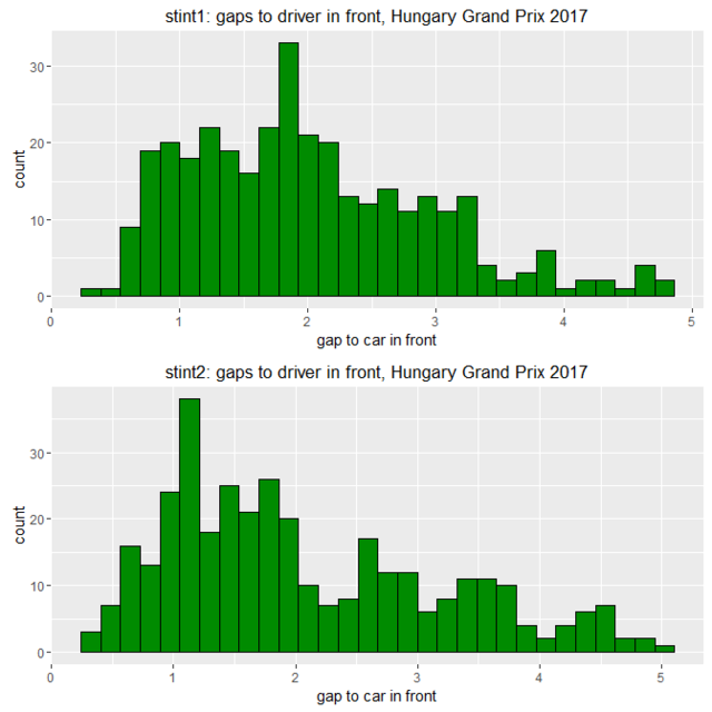
So the peak seems to be just over 1 second in the second stint, but slightly below 2 seconds in the first stint. This ties in with your suggestion that drivers might hold back in stint 1 knowing they've got a chance to pass people around the pit stop phase, whereas in stint 2 the only choice is to try to overtake.
Having said that we need to be a little careful with graphs like this. The shape of the graph is also heavily affected by race circumstances. I have looked at the equivalent graph for other races to see if we see the peak for a lower gap at races where overtaking in much easier e.g. Bahrain or Silverstone. Here is the graph for the British Grand Prix: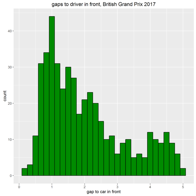
However this race featured two drivers (Bottas and Ricciardo) out of position working their way up the order so that is clearly going to contribute a lot to the huge peak near 1 second. Likewise in Hungary, the difference between the peak in the first and second stint is affected strongly by Raikkonen and Hamilton having caught the struggling Vettel by that stage of the race.
So in terms of what we can do with this, there's no quick solution but a possible avenue to improve the model would be to have a more sophisticated definition of when a driver is blocked, which takes into account how difficult it is to follow/overtake on the circuit in question. The way we'd assess that for each circuit would be to look at each occasion a driver is stuck behind another, then see how the gap varies depending on
(1) what the overall pace advantage of the following driver is - not always easy because in some cases there won't be many clear laps in the same race to know this
(2) how strong the incentive to overtake was - such as whether there are more pit stops to come in the race. There might be a few other scenarios, such as a championship decider where the driver needs to finish 1 place higher eg but I can't immediately think of any other common ones.
I can't say when I'll have time to investigate that, but I can add it to the (long) list of things to look at!
Edited by moreland, 10 August 2017 - 11:10.
Advertisement
Posted 28 August 2017 - 11:25
Belgian Grand Prix results are in, and for this race we have a more attractive display for the race pace estimates: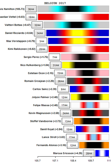
So more pleasing on the eye than before I would say, however, how happy can we be with the numbers? I did comment after the Hungarian Grand Prix that there were a lot of drivers stuck in traffic during the race, which is not ideal for pace estimation. Despite taking place on a circuit which is known for being far better for overtaking, the Belgian Grand Prix was in fact worse than Hungary from this point of view. In Hungary, 70% of the standard laps (ie not lap 1, inlaps/outlaps/safety car etc) were in fact run in clear air (ie >1.5 seconds gap to car in front). At Spa it was only 56%, which is the lowest in 2017 so far. There are a combination of factors to blame, the safety car at the end for example, as well as a large number of drivers being demoted due to penalties.
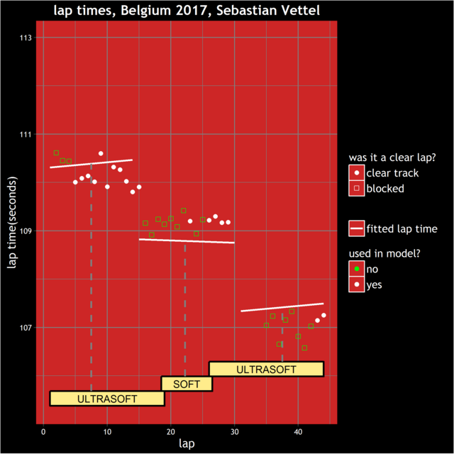
That said, the estimates for front running drivers look to be quite reliable. Vettel at times did seem to be bottled up behind Hamilton, however he did have a clear track at the important points, namely the laps leading up to the first pit stop, and the laps leading up to the possible second pit stop. There was a clear preference for ultrasofts over softs, but the lines look to be the right place on average:
Ricciardo ahead of Verstappen might look a little questionable, given that Verstappen was running ahead of Ricciardo before his retirement. The answer to that can be found by looking at Ricciardo's lap times:
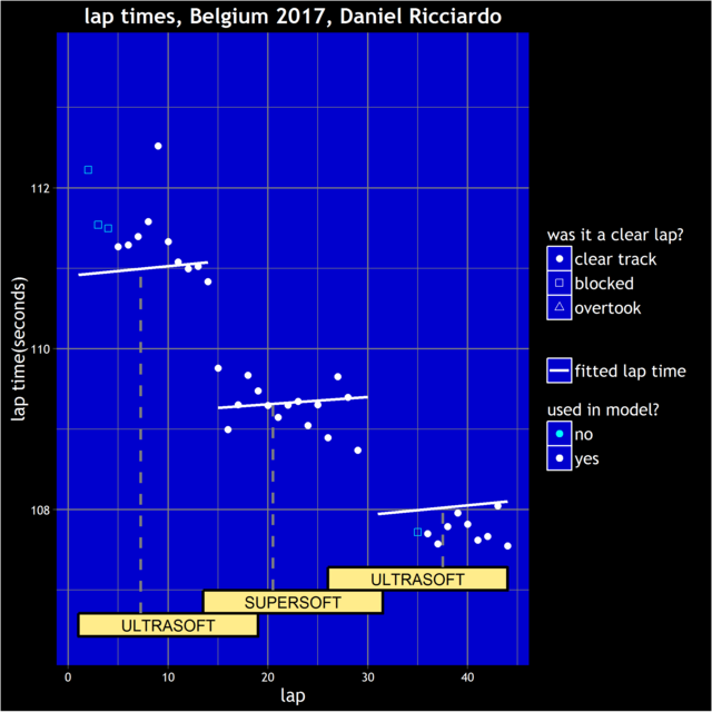
We see that relative to other drivers, his pace was better in the second half than the first half. We can see that by noticing that in the final stint his lap times are generally faster than the fitted line, which is calculated using all drivers' lap times for the race, while in the first stint they were slower. Ricciardo gets credit for these fast later lap times, whereas Verstappen obviously cannot because he wasn't in the race to do them. It's quite possible that the Red Bull improved during the race and that Verstappen would have also realised this improvement, however the model can only go on what actually happens.
Further down the field, lots of drivers have a low number of clear laps, although having looked at them in detail, the ones with at least 10 or so look reliable to me. The exception is Magnussen:
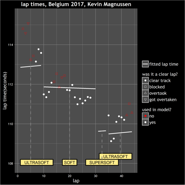
He damaged his tyres at the safety car restart, pitted for new tyres, but was a long way back in last position and appeared to coast to the finish. This has dragged his estimate down by a tenth or two, which has an impact on his ranking in the congested midfield.
There is one more observation to make. During the safety car period and after the race, the Sky coverage contained the comment that the soft compound that Mercedes had put on Hamilton's car was 1.4 seconds a lap slower than the ultra soft tyre that Vettel had taken. I don't know what the source of those numbers is but it's not the first time that the TV coverage has provided outlandish estimates for compound differences. Vettel was clearly not 1.4 seconds a lap quicker than Hamilton in that final stint, and in fact this graph displays the degradation curves calculated with the model for theoretical 30 lap stints on each of the three compounds: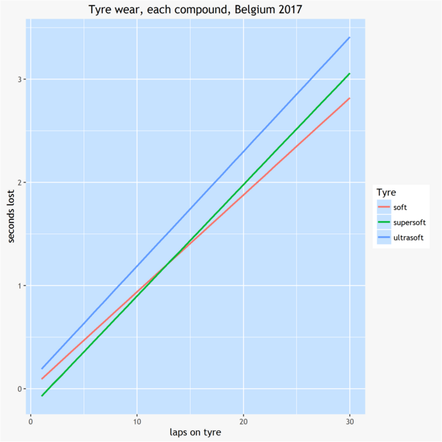
In fact the ultrasoft tyre is calculated to be the slowest of the three tyres. It's calculated to be about a tenth slower than the soft when new, and loses performance slightly faster too. There is an issue here in that the entire top ten started on used ultra soft tyres. My model doesn't adjust for whether tyres are new or used (have briefly tried but ran into complications - a subject for another day however), so that might account for a bit of a bias against the ultra soft, but we're looking at a few tenths here rather than whole seconds.
Edited by moreland, 08 September 2017 - 19:54.
Posted 08 September 2017 - 19:51
No surprises which team was fastest at the Italian Grand Prix, and Bottas clinched his third race-pace victory of the year (Azerbaijan and Great Britain were his other two). Lance Stroll's race pace is only based on six clear laps but it rates as his best race pace performance of the year. In the midfield, almost all team mates seemed to be very closely matched - it could well be nothing more than a coincidence, but it could suggest that Monza isn't a circuit that tests driver skill as much as others.
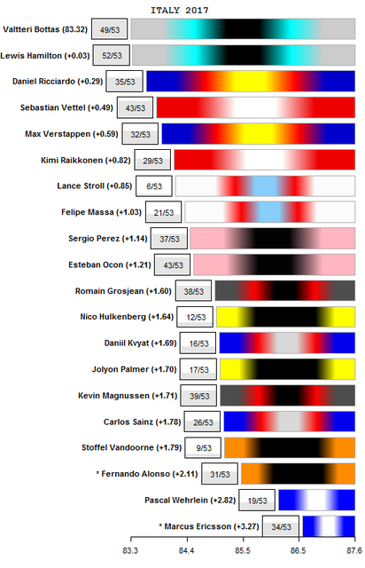
Both Mercedes effectively had quite comfortable drives in the race, so it's difficult to know how much faster they could have gone, or which of them actually had potentially the better pace. It is a little disappointing when this happens - it seemed to happen in almost every race in 2016 but it's fortunately not happened often in 2017.
While the Italian Grand Prix was not one of the more exciting races, it is generally the case that uneventful races are the ones that the race pace model performs best at. The estimates look reliable and fitted lines for drivers generally follow quite neatly through the lap times. There are a couple of drivers whose lap times didn't quite fit the profile suggested by the overall trend for tyres and fuel however.
Carlos Sainz seemed not to like the supersofts but improved at first on the softs. He spent the first laps on these catching then passing Wehrlein, but that seemed to take some life out of his tyres. He then spent some time getting back up to speed after that:
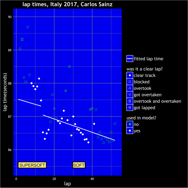
I'm not too concerned by this however. It's the average pace that we're interested in and I think the model has found that quite well.
Meanwhile Wehrlein himself seemed to have very erratic lap times in general:
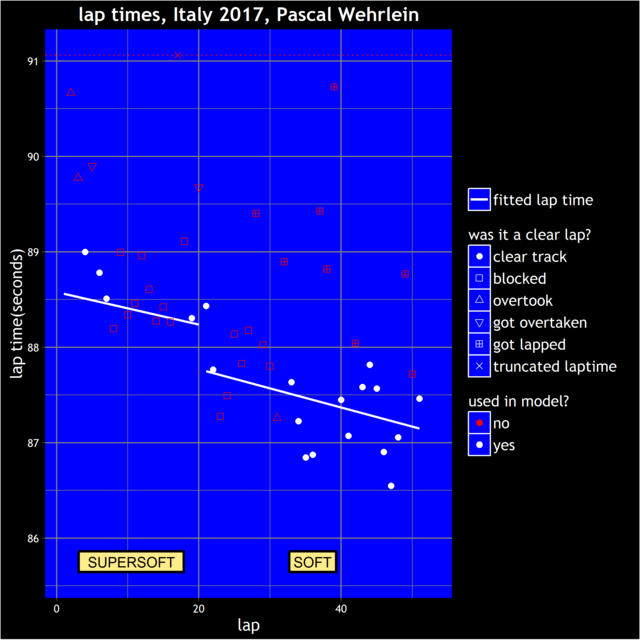
The race pace model discounts laps when a driver is lapped, however it's possible that drivers are still recovering from moving off-line and collecting dirt on the tyres on the following lap as well. Wehrlein posts slower lap times and seems to lose rhythm after each time he gets lapped.
Another driver whose race made me pause for thought was Hulkenberg's. While he's got 12 clear laps to base his estimate on, almost all of them come at the end of the race. As we have seen from some of the other examples I have displayed in this thread, drivers sometimes go through faster and slower phases during races. If all of a driver's clear laps are from the same part of the race, it's possible we're picking up a fast or slow phase, rather than a set of lap times that represent his average pace throughout the race. So 12 clear laps distributed evenly thoughout the race might be more accurate than a single block of 12 laps from one part of it.
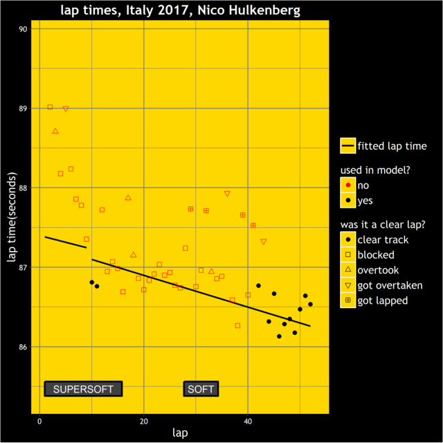
Another potential problem with blocks of laps at the end of the race is that drivers can slow down to protect the tyres and machinery if their position is locked in. It's not the case here, because Hulkenberg was being closely followed by Sainz during these laps, but is another thing to think about.
Posted 09 September 2017 - 10:11
So Wehrlein appears slower than Ericsson based on these charts? I haven't follow Sauber in that great detail to remember whether strategy has influenced it or is there any basis on assumptions Ericsson gets preferential treatment.
Posted 09 September 2017 - 15:29
So Wehrlein appears slower than Ericsson based on these charts? I haven't follow Sauber in that great detail to remember whether strategy has influenced it or is there any basis on assumptions Ericsson gets preferential treatment.
Sauber do tend to run very different strategies for their drivers. That might make a difference for the race finishing positions, but for the race pace model no one should be advantaged or disadvantaged, because it takes into account how good your tyres are and how long you've had them on for. That said, there's always a degree of estimation error with those adjustments so it's always more difficult to compare drivers on very different strategies. Also, Sauber have taken the tyre life to the extreme in a few races, Wehrlein did a longer stint than anyone else until retiring in Monaco for example, while Ericsson did about 20 laps more than anyone else did on the softs in Hungary. The more unusual a strategy is, the less sure we can be about our assumptions about the effect of tyre life. There have been a couple of queries about that team-mate match up, at some point in the future I might have time to do a more detailed look at their races and see how the model has reached the conclusion that it has.
Posted 21 September 2017 - 15:37
The 2017 Singapore Grand Prix was unfortunately a bit of a nightmare from the point of view of race pace analysis. The fact that it rained at the start and took so long for the track to dry out meant that there weren't many dry laps. In particular, there were not enough dry laps in order to observe a sufficient mixture of drivers running on different tyres on different ages, for the usual method to be able to assess the effect of fuel, tyre type and tyre age. In fact, the lap times didn't stabilise until about lap 37 (of 58) and given that a safety car appeared almost immediately after that, we only have laps 43-58 that are suitable for analysis. There were no pit stops from that point onwards, so we cannot separate the effect of the fuel load going down and the tyres getting older. Also Sainz used supersoft tyres, whereas every other driver used ultrasofts during that period, so there is no way to compare his pace to the other drivers.
There might be methods to deal with this. For example you could look at previous years' races at Singapore, see what the effect of the fuel load going down was in those races. You could then use that to make a reasonable guess what the fuel load effect was in this year's race, then subject to that, estimate the effect of the tyres aging. This would involve some work that I don't unfortunately have time to do however, and in any case we would still have the problem of there being very few clear laps for a lot of drivers.
However, one thing I was interested in was which team might have the advantage for the remaining races of the season. It seems to be the pattern that Ferrari prefer the slower, higher downforce circuits, while Mercedes prefer the faster tracks. I thought it would be good to investigate this. So the first step towards doing that is to find out how fast the remaining tracks this season are. By looking at qualifying and race pace coefficients over the last few seasons, taking into account the overall pace of cars in general for each season, here is the ranking of each circuit in the current calendar by average speed (remaining races are coloured in red):
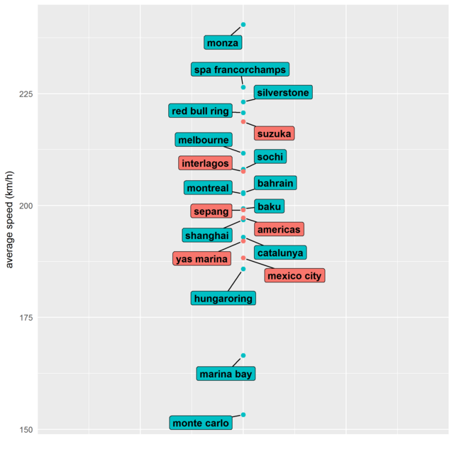
What is a bit of a surprise to me is that although the Hungaroring is the slowest of the non-street circuits, its average speed is much closer to that of the non-street circuits than it is to Singapore and Monaco. I also had no idea that Mexico City was such a slow circuit. It seems while Singapore was clearly a major missed opportunity for Ferrari, there are still some slower circuits remaining this year.
What naturally follows from this is, who is likely to have the advantage in these remaining races? To find that out, we can investigate how each team's pace varies according to the average speed of the circuit. So this next plot displays:
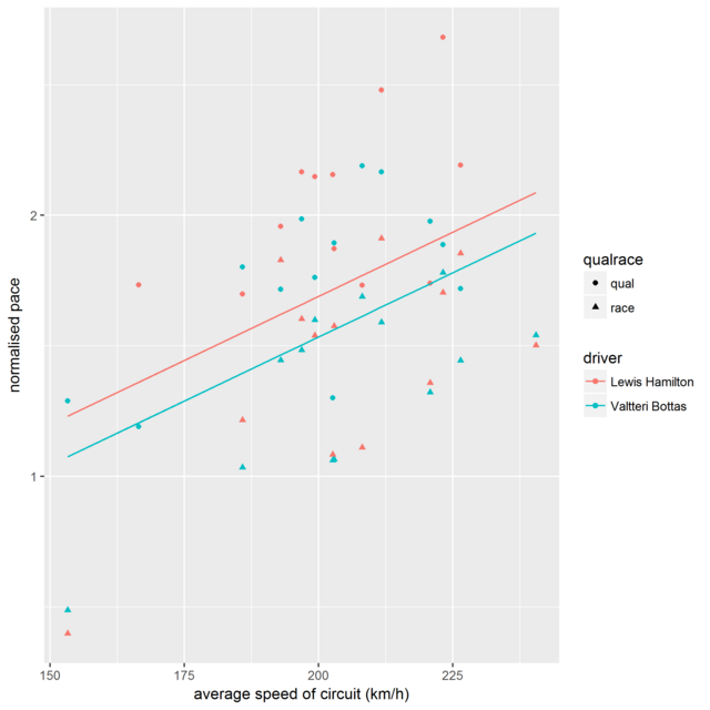
So we can see that at the slowest circuit this year (Monaco), both drivers had their slowest races, relative to the rest of the field. For the other races, there's a fair bit of scatter, but the overlaid lines of best fit indicate a clear trend that as the circuit gets faster, their pace gets better.
Meanwhile, if we look at the same plot but for the Ferrari drivers, we see a much flatter line. Ferrari don't actually do better at slower circuits, relative to the opposition overall, but their preference for faster circuits is noticeably milder than Mercedes'.
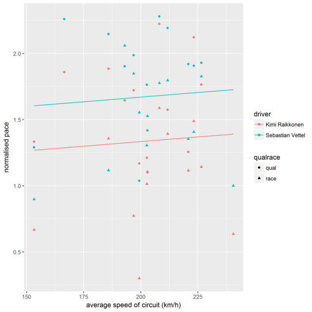
For Red Bull, the lines point slightly downwards, indicating a mild preference for the slower circuits:
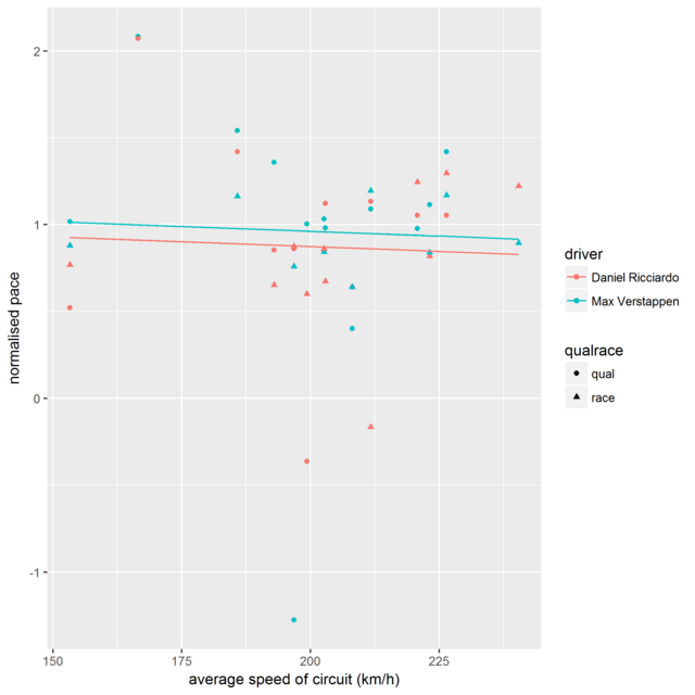
While for Mclaren, unsurprisingly they have a major preference for the slower circuits:
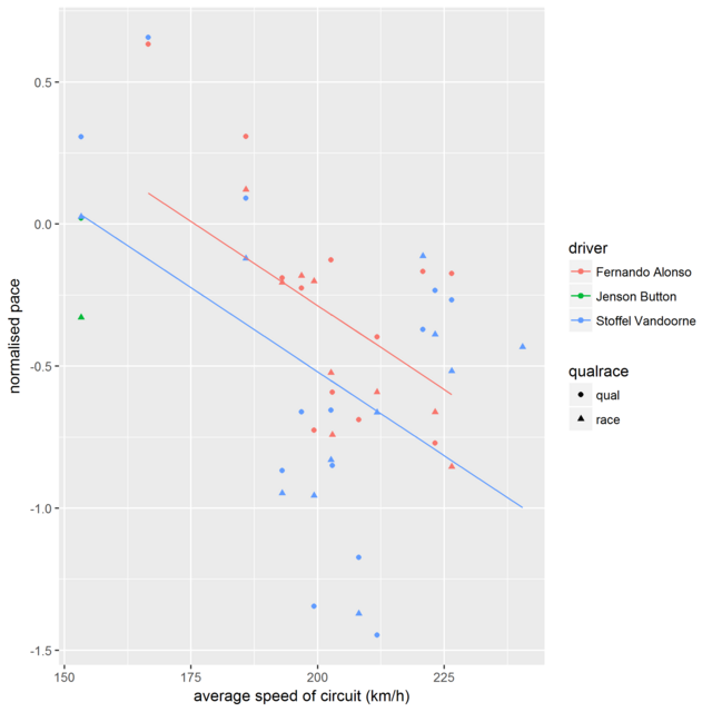
We can then take these lines and read the value of them associated with the average speed of each circuit remaining on the calendar. When we do that, we get the following predictions:
Malaysia: almost a dead heat
Japan: Hamilton +0.2 advantage over Vettel
USA: almost a dead heat
Mexico: Vettel +0.1 advantage over Hamilton
Brazil: Hamilton +0.1 advantage over Vettel
Abu Dhabi: Vettel +0.05 advantage over Hamilton
So although the worst circuits are out of the way for Ferrari, it still looks like Hamilton will have a very slight edge overall on the remaining races. On the other hand, this is based solely on the average speed of the circuit - there are clearly other factors at play, as we see from the large amount of scatter on the plots.
Edited by moreland, 21 September 2017 - 15:40.
Posted 05 October 2017 - 09:46
The Malaysian Grand Prix was pretty straightforward, with most drivers having fairly clean races and following similar strategies. Here are the race pace rankings based on the model: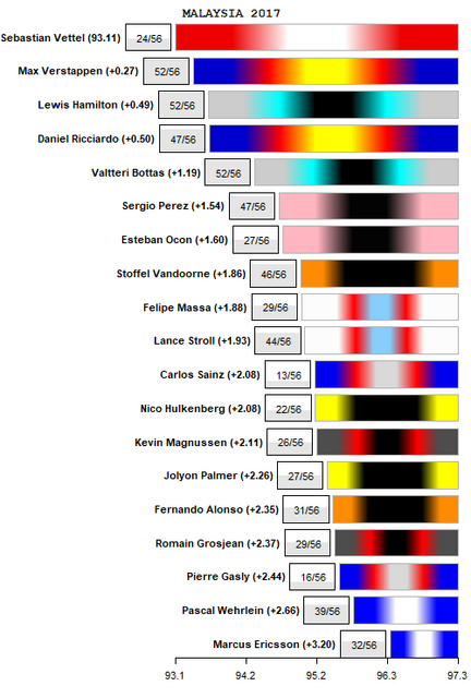
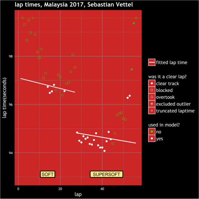
So Vettel is rated as the fastest driver, and his pace is likely slightly underestimated, given that his pace tailed off at the end and not all have been detected as outliers by the model:
However, Verstappen might have been a little faster than his estimate as well, given that his lap times were consistently faster in stint 1, when he was probably trying to build a gap, than in stint 2, when he probably wasn't.
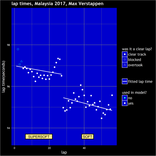
So I'd guess that Vettel was the more likely winner if everyone had had a clear race, but that it's not completely clear cut. While there was much talk over the weekend about Mercedes struggling, their pace compared to the field other than Ferrari and Red Bull was not that unusual. It was Red Bull having one of their best races, compared to the field as a whole, that made Mercedes look particularly slow.
Of the other drivers, there are a couple of question marks over a few drivers. Massa's floor was apparently damaged in the first lap collision, so his pace might well have been affected by that. Also, Ocon was marginally slower than his (ill) team mate, but did almost the entire race on the same set of softs, so might have been driving to conserve tyres more than other drivers.
On a slightly different note, due to the Toro Rosso driver swap, the points difference between Sainz and Kvyat so far this year (Sainz: 48, Kvyat: 4) has been mentioned a few times. This seems like a very large gap compared to the estimated race pace difference and made me wonder in general which drivers are ahead and behind the curve in the points table compared to their race pace.
So, this plot displays on the x-axis, each driver's average race pace throughout the year and on the y-axis, their points total. I've added on top of that a line of best fit. The aim of this is to pass as close as possible through all the points in the plot. Drivers lying above the line have got more points than their pace suggests they should, vice versa for drivers below the line.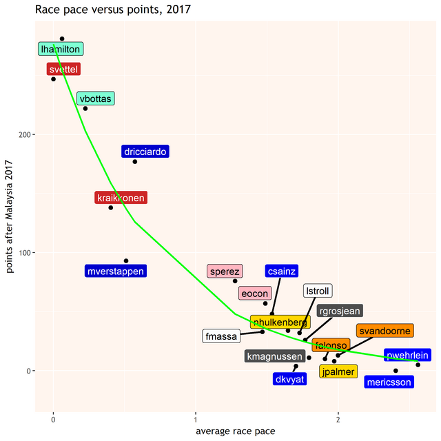
So, it's no surprise that Verstappen has scored about 45 fewer points than his pace warrants, but Ricciardo has scored about 50 points more! Meanwhile, as mentioned above, the Toro Rosso points gap is 48-4 in Sainz's favour, but judging by pace alone, it should be about 34-27. The biggest surprise to me looking at the plot was the two Force Indias being comfortably above the line. While they have had a couple of costly collisions with each other, they've actually been the most consistent points scorers in the midfield group.
Posted 05 October 2017 - 09:57
Interesting!
It rrflects a bit the feelings when watching the races; e.g RIC sometimes stay out of truble, get some 'luck', and go to the podium, while VER often got mechanical issues, or some other troubles, and thereby miss some good opportunities for points. Similar 'feeling' anbout GRO and MAG in the midfield. In the bottom end, it is also quite interseting that ALO and VAN are so close, and that ERI should have had more points than WEH.
Posted 05 October 2017 - 10:11
Thanks for that, interesting stuff. Racing is more than pace alone of course, but it shows to me that Max and Ric are actually very close, Max slightly better on pace, Ric slightly on calculating risks/reward in his actions.
Posted 05 October 2017 - 10:29
I understood Vettel had an underfueled car and would have never hold onto third, even if he had passed Ricciardo? It explains the last few laps in which he lost quite some time. It is tough to catch such a thing in a model.
Posted 05 October 2017 - 17:34
Interesting!
It rrflects a bit the feelings when watching the races; e.g RIC sometimes stay out of truble, get some 'luck', and go to the podium, while VER often got mechanical issues, or some other troubles, and thereby miss some good opportunities for points. Similar 'feeling' anbout GRO and MAG in the midfield. In the bottom end, it is also quite interseting that ALO and VAN are so close, and that ERI should have had more points than WEH.
Thanks for that, interesting stuff. Racing is more than pace alone of course, but it shows to me that Max and Ric are actually very close, Max slightly better on pace, Ric slightly on calculating risks/reward in his actions.
Yes, when a driver is below the line like Verstappen, it's easy to think of instances of bad luck that have put him there. If a driver is above the line it's much harder to know if it's through luck or skill. I think it is often just a lack of bad luck.
I understood Vettel had an underfueled car and would have never hold onto third, even if he had passed Ricciardo? It explains the last few laps in which he lost quite some time. It is tough to catch such a thing in a model.
It is indeed, the model relies on the fuel and tyre effects being linear. They are almost all the time, but occasionally, such as here, they're not. It would increase the complexity of the model hugely to correct for it, but fortunately it doesn't happen often and it only affects a small number of laps at the end when it does.
Posted 12 October 2017 - 09:13
The Japanese Grand Prix was a relatively easy one to analyse, with most drivers using similar strategies (more on that later) and while there were a few safety cars, they didn't happen at points which had much effect on the race. Hamilton and Verstappen finished the race almost neck a neck, which would suggest that their race pace estimates should be almost identical. As it happens, Verstappen had slightly more slower laps filtered out due to being them being counted as 'blocked' laps, that moves him slightly ahead of Hamilton overall.
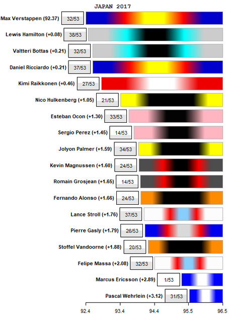
Most of the field had fairly clean races and enough opportunities to show their true pace. The ones that are possibly doubts are Grosjean, who spent a high proportion of laps in traffic, and especially Perez, whose clear laps mostly came after long stints being stuck behind other cars, which might have affected the subsequent lap times:
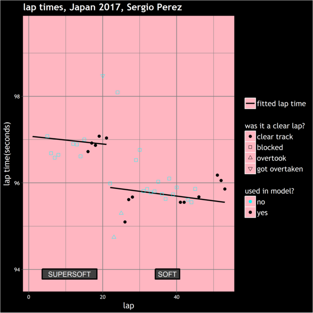
Massa's rating seems strangely slow, however there haven't been any comments I can find explaining that apart from 'our pace was bad', so it's treated as normal here, and in the average race pace ratings for the year and in the team mate comparisons (updated above)
Meanwhile, one other thought I had was that once again the race strategy was identical for almost everyone, with everybody starting on the softer tyre, then doing a single stop to switch to the harder tyre. This strategy has been prevalent throughout this year. Of the dry races, only Bahrain, Spain and, if we're being very generous, Belgium and Canada have deviated this (apart from Baku, but only due to a red flag). One way this has been avoided in the past is through Pirelli bringing softer tyres to races which lead to more stops and more stategic variety, however that has also brought criticism about drivers having to drive conservatively.
However, could more strategic variety arise through drivers being allowed to do zero-stop races? I'm not aware of the argument for why it is required for drivers to use at least two different tyres in a race. I'm assuming it's because of fears that everyone would do a zero-stop strategy otherwise, which could lead to processional races. I thought I would investigate how likely that is to be the case.
So for each race I've got estimates for how lap times are affected by tyre life for each tyre. Below is the plot of this for the Japanese Grand Prix for theoretical 30 lap stints, where we see the supersoft is consistently better than the soft by about 0.15 seconds/lap.
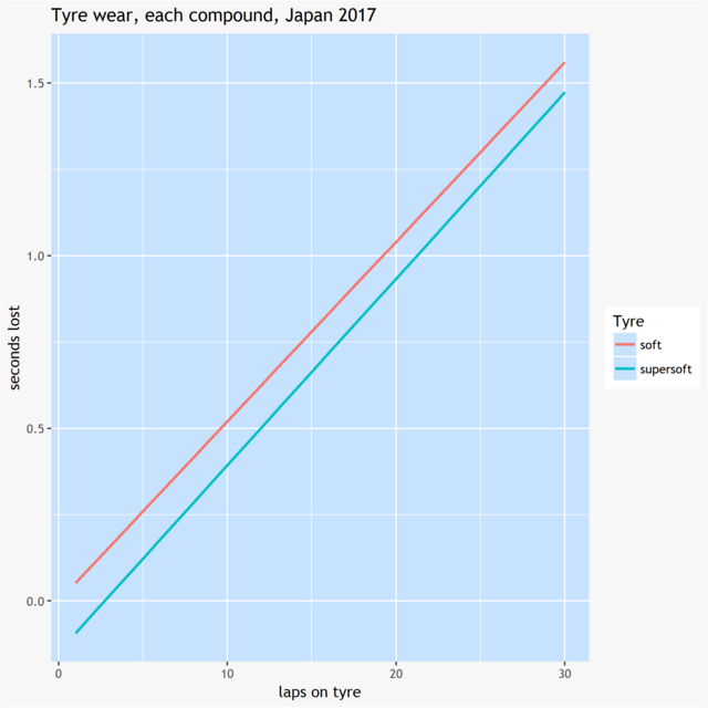
Using these lines, along with the average time lost due to a tyre stop for each race, I've worked out what the advantage would be of the fastest zero-stop strategy over the fastest one-stop strategy for each race this season. Here are the results:
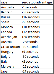
So, for example, in Australia, the best zero-stop strategy was 4 seconds slower than the best one-stop strategy. While in Azerbaijan, zero-stops was 24 seconds faster overall than the fastest possible one-stop strategy. This is all assuming running in clear air however. In practice, the one-stop strategies are more likely to lose out due to falling into traffic after their pitstops. On the other hand, zero-stops drivers are more likely to have to qualify on the slower tyre and therefore encounter traffic at the start of the race. However, using these numbers as a guide, it is likely that races such as Azerbaijan, Russia, Hungary, Monaco and Canada would involve everyone running a zero-stop strategy.
However, the interesting ones are the ones where it's close, such as Australia and Austria, or ones where one-stop has a reasonable advantage, such as Great Britain, Malaysia and Japan. If zero-stop races were allowed, the final stages of these races could involve a mix of drivers trying to survive on an old set of tyres being chased down by drivers who went for the (in clear air) faster one-stop strategy who have had to battle through traffic to catch up. In the days before refueling, there were a couple of thrillers like this, including France 1990 and Hungary 1990. If zero-stop races were allowed for certain races (i.e not the ones where it's hugely advantageous like Azerbaijan) could it be that some of the routine races we've had this year would have been nail-biters?
Edited by moreland, 12 October 2017 - 09:24.
Posted 24 October 2017 - 14:34
Here are the race pace estimates for the USA Grand Prix, with Max Verstappen taking his second successive race pace 'victory'. He won the actual race before that in Malaysia too, and with Mexico being one of the slowest circuits on the calendar, it might well suit Red Bull. The betting odds seem to have him as 3rd favourite to win there at 6/1. That sounds tempting, although of course you do have to factor in that he's unlikely to be leading the race out of turn 1.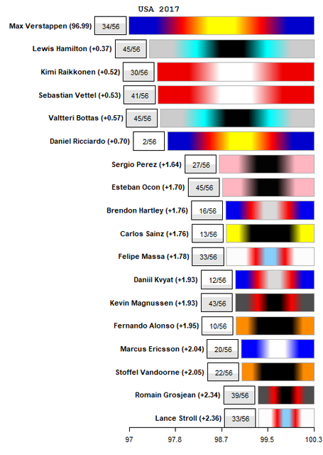
There is a possible caveat to Verstappen's rating this time however. Recall that he (and Vettel) followed two stop strategies, while Hamilton, Raikkonen and (effectively) Bottas followed one stop strategies. While the race pace model adjusts for how many laps have been done on a tyre, it doesn't adjust for how many laps are planned on the tyre. You might expect that driver will be pushing harder knowing that they've only got to do a 3rd of the race on his current set of tyres, compared to if he's got to cover 2/3rds of it.
On the other hand, that assumes that drivers actually know what their planned stint length is. I'm not sure they do a lot of the time. In the case of Vettel and Verstappen in Austin, I suspect that their second stops were not planned as soon as the second stints started, but were more likely reactions to the state of the race at the point when the second stops were made. These situations are difficult to analyse in any case, because we never have the 'alternate reality' of what pace they would have run at had they only done a single stop in the race.
Looking down the rankings, Perez is narrowly ahead of Ocon, as he often seems to be. The Force Indias were more prominent in the race coverage in the second half of the race when Perez was dropping gradually back from Ocon, so this was a bit of a surprise to me. Looking through all the lap times, it was the laps after the pit stops, which were not featured in the coverage, when Perez closed on Ocon with older tyres that earned him his slightly faster estimate.
Another interesting one is the Toro Rosso comparison, with Hartley coming out ahead, despite finishing 3 places and almost 30 seconds behind Kvyat. They ran totally different strategies, they were both stuck in traffic for many laps of the race and they were also stuck in traffic at different points of the race. The comparison is also distorted a little by Kvyat doing a couple of unrepresentative slow laps towards the end of the race once his position wasn't threatened. However it appears to have been a solid start for Hartley. Not only that, but Hartley's pace was actually in the faster half of all Toro Rosso's race pace ratings, relative to pace of the field in general, for the entire season. These little comparisons, and the Force India one, are why I do this!
(NB team mate comparisons and average pace over the entire season updated in post 13 as usual)
Edited by moreland, 24 October 2017 - 14:36.
Posted 30 October 2017 - 14:47
Here are the race pace estimates for the USA Grand Prix, with Max Verstappen taking his second successive race pace 'victory'. He won the actual race before that in Malaysia too, and with Mexico being one of the slowest circuits on the calendar, it might well suit Red Bull. The betting odds seem to have him as 3rd favourite to win there at 6/1. That sounds tempting, although of course you do have to factor in that he's unlikely to be leading the race out of turn 1.
He did. I didn't place a bet. Dammit Moreland.
Meanwhile, here are the pace ratings for Mexico: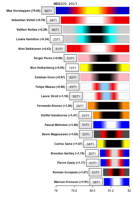
The pace ratings are interesting here because many drivers were out of position early on due either to grid penalties or incidents early in the race. As a result, there's quite a big discrepancy between some of the finishing positions and the race pace ratings.
The front runners' estimates all look reasonable compared to what I might have expected from watching the race. It is of course hard to judge when Vettel and Hamilton were effectively in completely different races from the other three however my non-scientific observation was that Vettel seemed to be slicing through the traffic more quickly than Hamilton so his faster pace estimate fits with that.
There are a few more surprising ones. Perez once again is rated slightly higher than Ocon despite being behind him throughout the entire race. This one might be a little unfair on Ocon, who did a very long second stint and might only have been driving to stay ahead of Stroll towards the end. Perez on the other hand had a newer set of tyres towards the end and was pushing as hard as possible to catch Stroll. With such different strategies, the difference in their pace ratings is almost certainly within the margin of estimation error.
Another comparison that looks odd at first glance is the one between the Sauber drivers, where Ericsson appeared to be having a competitive race yet has received a pace rating substantially slower than Wehrlein's. There are solid reasons behind this however. Firstly, Wehrlein pitted very early on for a one stop strategy. Throughout the race the two drivers actually set very similar lap times. However, Ericsson had the advantage of doing his first stint on ultrasofts, compared to Wehrlein's softs. That gave Ericsson an advantage worth about 0.2s on average throughout the stint according to the tyre effects from the model. Secondly, Ericsson made a pit stop on lap 28 but Wehrlein was still able to match Ericsson's lap times after that, despite still using that first set of softs compared to Ericsson's new supersofts.
The order among the lower half of the ratings is a little unusual in general. Wehrlein's pace rating was his best this year while Magnussen's wasn't as disastrous as Haas had been forecasting prior to the race. On the other hand, considering that Toro Rosso are normally better suited to slow circuits and that Mexico is a slow circuit, their pace estimates seem a bit disappointing. Their practice and qualifying, as well as Hartley's race, were heavily disrupted by unreliability so we maybe shouldn't read too much into this, however the new driver lineup's pace compared to the field will be interesting to watch as the season draws to a close.
Posted 16 November 2017 - 19:26
Here are the pace ratings for Brazil 2017:
(Note that Grosjean had a damaged car for the entire race, his pace is not considered representative and is not included in the graph)
It was a fairly straightforward race for the linear model. Notice that most drivers had a high number of laps included in the model (indicated by the grey/white box), because the field was largely strung out for large portions of the race. The drivers tended to follow similar strategies as well and on top of that, the softs and supersofts were quite similar in that both had low degradation.
Hamilton's comeback drive was spectacular, given that he started in the pit lane and finished only five seconds off the lead. So it's no surprise that he emerges as the fastest driver in the race, although the margin of about 0.3 seconds might not be quite as big as expected. He was very efficient in his overtaking in the early stages such that by lap 22, he had cleared all the non-big-6 cars, was in clear air and only 18 seconds behind Vettel. By lap 65 he had caught Raikkonen, 6 seconds behind Vettel, where he stayed. So the simple calculation is that he gained 12 seconds in 43 laps, which equates to approximately 0.28 seconds/lap, which ties in with what the model has estimated in the graph above. Normally that simple calculation isn't reliable because it's affected by which drivers were using what tyre and how long they used each tyre for. However, given that the two tyre types were so similar and degraded slowly, lap times were only mildly affected by these factors, therefore the simple calculation is good enough.
Elsewhere, the pace of the Red Bulls was a bit of a comedown following recent impressive races. Interlagos is a medium speed track and very short, so you would normally expect smaller than usual gaps to the leading pace. However, you have to go back to the high speed tracks of Monza and Spa to see the Red Bulls so far off the pace. The Renaults and Toro Rossos were also further back than they have generally been so it could be that Interlagos is not a good track for Renault engines.
As always, overall race pace for the year and team mate comparisons have been updated in post 13.
Posted 16 November 2017 - 20:54
Edited by Laster, 16 November 2017 - 20:55.
Posted 16 November 2017 - 21:42
Here are the pace ratings for Brazil 2017:
(Note that Grosjean had a damaged car for the entire race, his pace is not considered representative and is not included in the graph)
It was a fairly straightforward race for the linear model. Notice that most drivers had a high number of laps included in the model (indicated by the grey/white box), because the field was largely strung out for large portions of the race. The drivers tended to follow similar strategies as well and on top of that, the softs and supersofts were quite similar in that both had low degradation.
Hamilton's comeback drive was spectacular, given that he started in the pit lane and finished only five seconds off the lead. So it's no surprise that he emerges as the fastest driver in the race, although the margin of about 0.3 seconds might not be quite as big as expected. He was very efficient in his overtaking in the early stages such that by lap 22, he had cleared all the non-big-6 cars, was in clear air and only 18 seconds behind Vettel. By lap 65 he had caught Raikkonen, 6 seconds behind Vettel, where he stayed. So the simple calculation is that he gained 12 seconds in 43 laps, which equates to approximately 0.28 seconds/lap, which ties in with what the model has estimated in the graph above. Normally that simple calculation isn't reliable because it's affected by which drivers were using what tyre and how long they used each tyre for. However, given that the two tyre types were so similar and degraded slowly, lap times were only mildly affected by these factors, therefore the simple calculation is good enough.
Elsewhere, the pace of the Red Bulls was a bit of a comedown following recent impressive races. Interlagos is a medium speed track and very short, so you would normally expect smaller than usual gaps to the leading pace. However, you have to go back to the high speed tracks of Monza and Spa to see the Red Bulls so far off the pace. The Renaults and Toro Rossos were also further back than they have generally been so it could be that Interlagos is not a good track for Renault engines.
As always, overall race pace for the year and team mate comparisons have been updated in post 13.
Posted 17 November 2017 - 17:27
All the Renault engines had their turbos running more conservatively in Brazil after all their atrocious reliability - it was estimated to cost about 2-3 tenths of a second each lap. Would that estimaton add up with your models for how all Renault engined cars performed in previous races?
It's a bit tricky to say in terms of laps times, because they vary according to the length of the circuit and there is quite a bit of natural variation from circuit to circuit. But if we look at the average pace of every driver between Great Britain and Mexico, it turns out to be this:
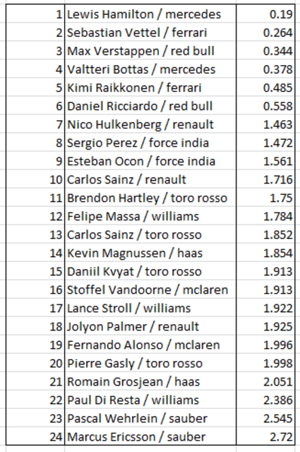
The Renault engined cars all just seemed to be further down the ranking than usual e.g. Toro Rossos running almost at Sauber's pace, Hulkenberg being behind Massa and Alonso, the Red Bulls slipping behind Mercedes/Ferrari. It doesn't really reflect in the lap times compared to the table above though, because the comparison is distorted by Interlagos being so short and that closes up the gap in times throughout the field.
The model seems to include too many laps for both Finns, or at least for Bottas? He was, for most part, just cruising behind Vettel. Thus, they have matched pace although one could reasonably assume that Bottas would have had easy win had he kept the lead through T1. (He was a lot faster in the only lap with proper free air, and had it not been for one of the fastest pit stops of the year..)
The model uses a cutoff of 1.5 seconds to decide if a driver is being help up by the driver in front. I've discussed earlier in the thread that this feels rather simplistic, in that a lap time goes from being 100% included to 0% included depending on whether the gap is just inside or outside this margin. However, I've tried to err towards keeping things as simple as possible so far. 1.5 seconds feels about right, I think if you are faster than the driver in front, it's worth trying to stay within that distance in order to take advantage of a mistake from the driver ahead and getting into the DRS zone. If you do that for too long of course though you damage the tyres, so it's not clear cut.
If we look at the gaps between Vettel/Bottas/Raikkonen, they look like this:
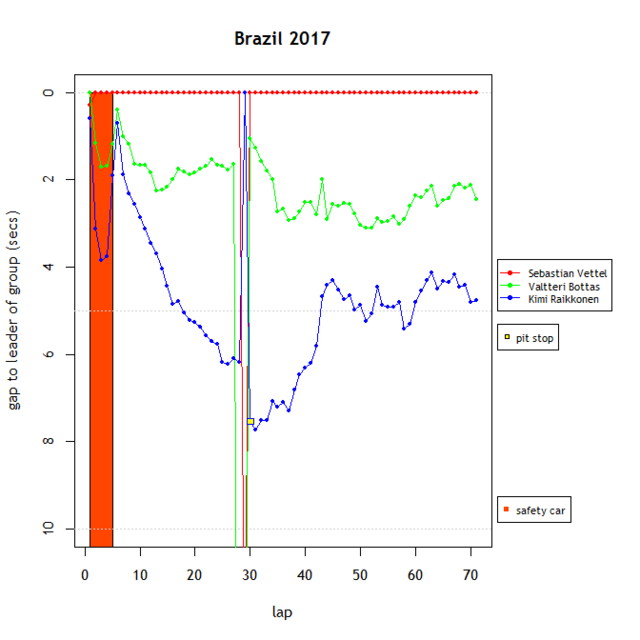
So Bottas was constantly hovering slightly further out than the 1.5 second cutoff, so a lot of his laps are included. If Vettel had made a minor mistake at some point or got held up by someone while lapping them, Bottas was probably a little too far back to take advantage. So I would guess that Bottas was able to run just about at Vettel's pace, but probably not faster. For Raikkonen it's a little harder to tell, He certainly looked happier in the second half of the race. But once he gets to within about 2 seconds of Bottas, he stops closing, which could mean he'd run out of tyres while closing up, or it could mean that that was how close it was possible to run in evenly matched cars. In which case maybe Raikkonen and Bottas did have more pace than they were able to show. It's hard to tell ![]()
Posted 30 November 2017 - 16:55
As you probably noticed, Abu Dhabi 2017 was not especially exciting. Uneventful races are usually good news for the model because the model likes uninterrupted tyre strategies and lots of laps running in clear air. However I think on this occasion the model has actually struggled a little, in a similar way to how it struggled with the Hungarian Grand Prix, due to the lack of overtaking. This resulted in lots of drivers running in traffic. While the model filters out laps where a driver is blocked behind another, it can be a grey area when trying to determine when a driver is being blocked. There were several drivers who have had a lot of laps included which possibly shouldn't have been, and are therefore potentially underrated, in particular Magnussen, Hamilton, Verstappen and the Toro Rosso drivers. This seems to have been one of the most common issues with the model this year so is high up the list in terms of things to try to improve.
However, here are model ratings for the race: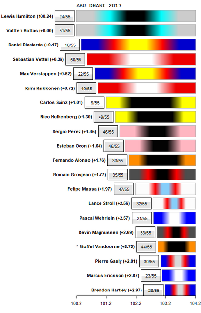
Apart from the drivers mentioned above, Carlos Sainz's pace is an interesting one to look at. He's received a high rating, yet if you look at his lap times compared to what the model has fitted, if anything his rating underestimates him: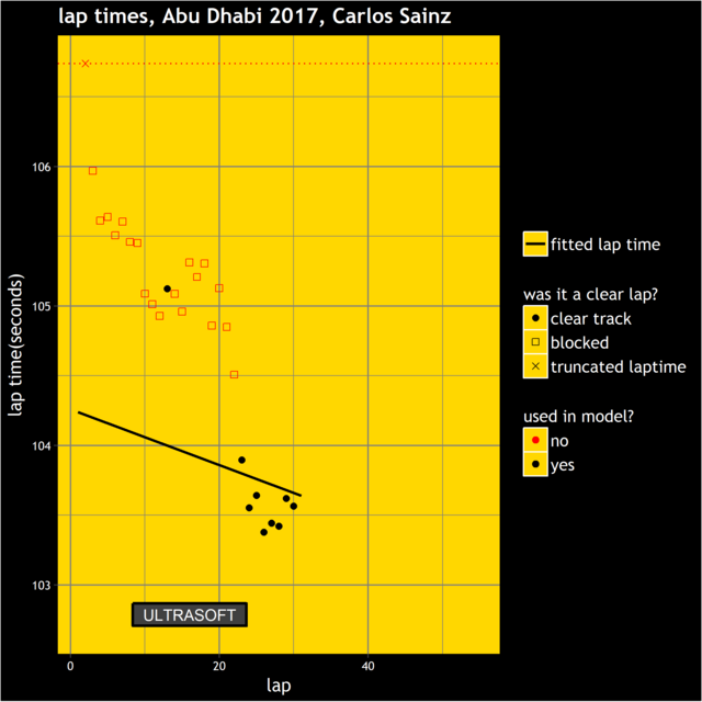
It is often said that running behind another car ruins the tyres, and Sainz had been running closely behind Massa and Alonso for the first 20 laps. However, after Massa and Alonso had made their pit stops, Sainz's lap times, on used ultrasofts, were faster even than the times Hulkenberg set at the same point in the race but with new supersofts. You can also see from the plot of Sainz's lap times that his estimate suffers excessively from an earlier slow lap time that has been included although it should surely have been counted as a blocked lap i.e the problem that I described in the opening paragraph.
Another one that might look a little odd is Ricciardo being ranked ahead of Vettel, despite running behind him from the start and setting slower lap times than Vettel until his retirement. The explanation for this is that Vettel's pace dropped off, relative to the rest of the field, in the second half of the race, so Vettel's estimate gets dragged down by this. Would Ricciardo's pace also have dropped off if he'd also had a lonely second half of the race? Possibly, but it didn't happen, and the model can only judge on what has happened.
Here are the final updates for the overall pace for the season and team mate comparisons. I'll make a few comments about those as well as post a couple of other thoughts about the season as a whole when I get a chance, hopefully before the end of the year.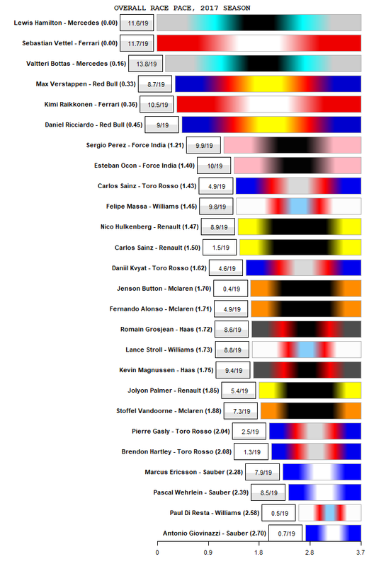

Posted 01 December 2017 - 00:13
Fantastic analysis. Impressive skills.
Hamilton & Vettel basically equal in the races across the season. It shows that Kimi has a massive gulf to Vettel in all aspects really. Perez very impressive too against Ocon.
Posted 26 December 2017 - 23:10
Registered and account here just to thank you for this brilliant thread Moreland ![]()
It's been very interesting to follow you analysis throughout the season and I hope you will continue for the next. Imo it's really worhty of a blog of it's own.
You manage to touch on one of the most difficult aspects of formula one compared to other open wheel racing series and that is to objectively compare both car, team and driver performance.
I think what your analysis ultimately shows is probably closer to how the teams evaluate drivers irl compared to most of media and fans who simply go by results and championship points.
Over a year it's for instance easy to see why FI would never second guess Perez's place in the team even tho Ocon gets a lot of hype, and even more interesting is of course Sauber where Ericsson is the one in the team showing both relative consistency and pace compared to the also very much hyped Wehrlein. Looking at the latter team's chart for the full season it should've been a seemingly easy decision which driver to keep for 2018.
I sincerely hope you keep it up for 2018, continue to improve the model and share your very interesting finds. Thank you!
Edited by Krumbukt, 26 December 2017 - 23:11.
Advertisement
Posted 19 January 2018 - 11:01
Thanks DrivenF1 and Krumbukt, glad you liked the thread!
I do plan to continue next year and am working on a few improvements. As mentioned above, I'd like to have a better way of treating blocked laps, so rather than having a single cut-off value (of 1.5 seconds) where laps are included/excluded, instead laps are gradually given less influence the more a driver is being blocked and therefore can't show his pace.
Another issue is that with Pirelli trying to encourage greater variety of tyre strategies, there could be occasions where a tyre is used by very few drivers and/or for very few laps. This could catch the model out in some situations and give misleading pace estimates for the drivers who use this tyre. The lack of strategic variety in terms of tyres in 2017 was very convenient for the model but it sounds like it will be more of a challenge in 2018.
The Force India graph is interesting to me, because what stands out is how rarely one driver has a big advantage over the other, particularly towards the end of the season. The same is also true of the Red Bull drivers. On the other hand, we see one driver having a big advantage over the other more often with Haas or Sauber in particular. There's a few possible explanations that spring to mind when trying to interpret that.