Jump to content


Photo
- - - - -

New F1 font


  • Please log in to reply
42 replies to this topic

#1 BCM

BCM
  • Member

  • 2,022 posts
  • Joined: July 10

Posted 25 March 2018 - 08:33

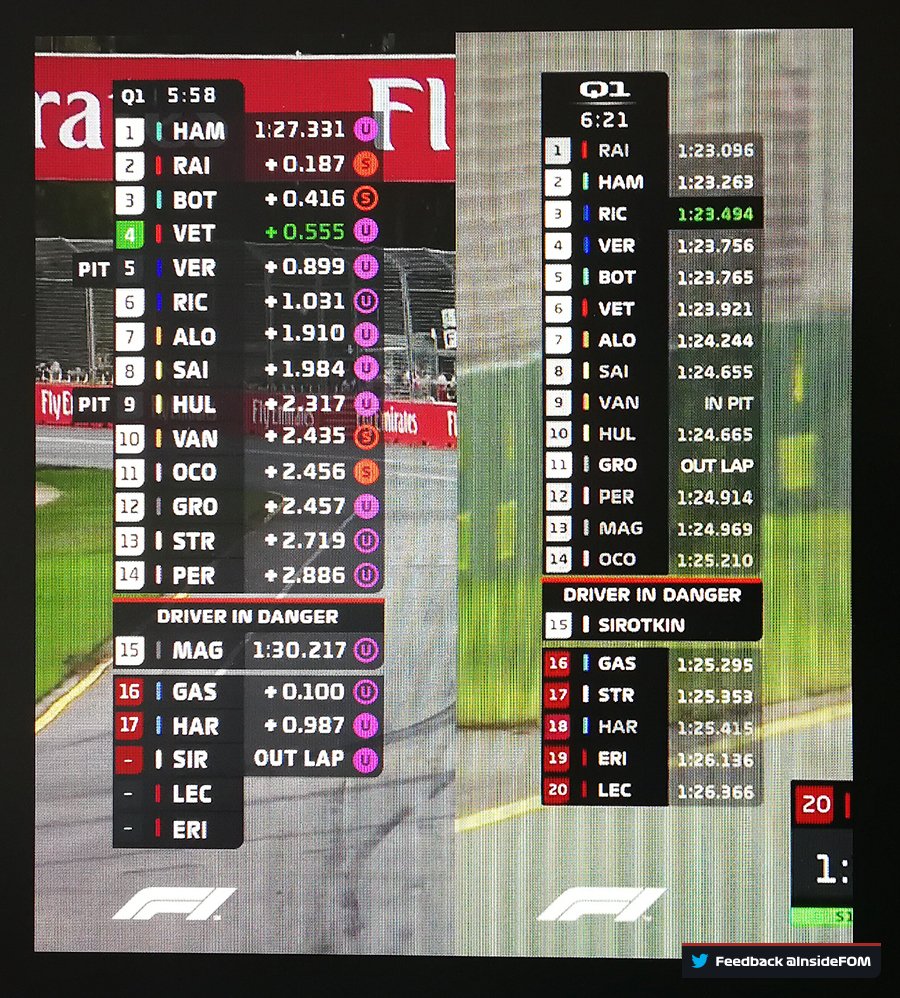
I'm not sure how this new font got past any sort of objective analysis on it's readability. Here's on of the headlines currently up on the F1 site. The capital E running into the R is rubbish. I'm finding myself having to interpret the font before being able to read the word. It's form over function. A font should be readable first and pretty second. And this font isn't even pretty. Likewise I like my g's to have the lower part of the letter visible. Call me a traditionalist.


i-dKJgj82.jpg


Advertisement

#2 RedBaron

RedBaron
  • Member

  • 8,584 posts
  • Joined: March 01

Posted 25 March 2018 - 09:38

The 'g' is not a font issue it's a website code issue. The container the font is in doesn't allow overflow of the 'g' / line-height isn't large enough.

The E and R are merely font variations and are not used during the broadcast (except on the word REPLAY')

This certainly didn't need it's own thread, it could have been added to any of the rebrand discussions already happening.

Edited by RedBaron, 25 March 2018 - 09:39.


#3 GrumpyYoungMan

GrumpyYoungMan
  • Member

  • 7,028 posts
  • Joined: July 12

Posted 25 March 2018 - 10:08

Awful. In one word.

#4 Jvr

Jvr
  • Member

  • 7,606 posts
  • Joined: August 13

Posted 25 March 2018 - 11:12

Horrible. I do not need glasses other than for reading in dim lights and I have hard time telling what it reads on the screen.


#5 ArchieTech

ArchieTech
  • Member

  • 4,082 posts
  • Joined: May 15

Posted 25 March 2018 - 11:14

It's made the timing tower so much harder for me to read on a TV:
 

https://twitter.com/...526093400883200

@InsideFOM

Altered based on feedback vs 2018 vs 2017 #F1

DZDeaoJU8AANgGh.jpg


This is a great demonstration that even with making the timing tower higher, the font is still much less legible than last year. On the 2017 version, all of the text is instantly more readable especially the numbers.

Edited by ArchieTech, 25 March 2018 - 11:31.


#6 ArchieTech

ArchieTech
  • Member

  • 4,082 posts
  • Joined: May 15

Posted 25 March 2018 - 11:25

Looking at it some more I'm trying to figure out if the new timing tower would work with larger text and the same font (larger than the amended version in the tweet above), but I think an issue is that the characters are relatively less tall than in other fonts which will make it difficult to scale up. Maybe it would work somewhat better with a taller version of the font, but whatever happens it needs to be focused on being visible for TV viewers watching from across the room.


Edited by ArchieTech, 25 March 2018 - 11:33.


#7 RedBaron

RedBaron
  • Member

  • 8,584 posts
  • Joined: March 01

Posted 25 March 2018 - 11:34

The new tower is definitely a big improvement in almost every way.

I agree with ArchieTech that making the font taller to match the '2017' fonts dimensions whilst keeping the new style would help to make it clearer.

It's better not displaying 'NO TIME' as well, which just adds to clutter and distracts from the actual information.The absence of a time is a better way of displaying that the driver has no time.

#8 ANF

ANF
  • Member

  • 32,011 posts
  • Joined: April 12

Posted 25 March 2018 - 12:10

DZDeaoJU8AANgGh.jpg

I think on average this weekend, compared to last year, it's taken me twice as long to read a time in the timing tower. Or, for that matter, to notice it's 15 minutes and 68 seconds left of Q1.

#9 SenorSjon

SenorSjon
  • Member

  • 18,309 posts
  • Joined: March 12

Posted 25 March 2018 - 12:25

It's made the timing tower so much harder for me to read on a TV:

This is a great demonstration that even with making the timing tower higher, the font is still much less legible than last year. On the 2017 version, all of the text is instantly more readable especially the numbers.


The tower is bigger because session indication and session timer are below each other now.

Edited by SenorSjon, 25 March 2018 - 12:26.


#10 BCM

BCM
  • Member

  • 2,022 posts
  • Joined: July 10

Posted 25 March 2018 - 15:02

The 'g' is not a font issue it's a website code issue. The container the font is in doesn't allow overflow of the 'g' / line-height isn't large enough.

The E and R are merely font variations and are not used during the broadcast (except on the word REPLAY')

This certainly didn't need it's own thread, it could have been added to any of the rebrand discussions already happening.


Excuses. F1 pulls in how much money and they can't code a basic wesbsite?


Whether or not the font is used in telecasts has zero to do with my post. I'm talking about the F1 website. The font just doesn't work.


Don't like the thread? Don't bother reading it!


#11 BalanceUT

BalanceUT
  • Member

  • 2,320 posts
  • Joined: February 16

Posted 25 March 2018 - 15:10

Notice how FOM is already adjusting based on feedback? But, some people can't help but kick and scream like babies who aren't having their nappies changed often enough. 


#12 RedBaron

RedBaron
  • Member

  • 8,584 posts
  • Joined: March 01

Posted 25 March 2018 - 15:16

Excuses. F1 pulls in how much money and they can't code a basic wesbsite?

Whether or not the font is used in telecasts has zero to do with my post. I'm talking about the F1 website. The font just doesn't work.

Don't like the thread? Don't bother reading it!


I like the thread just why do we need so many on basically the same subject, that being 'new look F1'.

Also it isn't an excuse, I gave the reason why the 'g' wasn't showing. It was code not the font. So your grip with the font was misplaced in that instance.

#13 RedBaron

RedBaron
  • Member

  • 8,584 posts
  • Joined: March 01

Posted 25 March 2018 - 15:17

Notice how FOM is already adjusting based on feedback? But, some people can't help but kick and scream like babies who aren't having their nappies changed often enough.


:up:

#14 Alburaq

Alburaq
  • Member

  • 3,317 posts
  • Joined: June 10

Posted 25 March 2018 - 16:05

Awful. In one word.

You mean i-dKJgj82.jpg?


#15 jonpollak

jonpollak
  • Member

  • 46,014 posts
  • Joined: March 00

Posted 25 March 2018 - 17:03

The new tower is definitely a big improvement in almost every way.

Yes sir...I thought it very readable and full of relevant information.

Jp


#16 RedBaron

RedBaron
  • Member

  • 8,584 posts
  • Joined: March 01

Posted 25 March 2018 - 17:39

Yes sir...I thought it very readable and full of relevant information.
Jp


Might I add I am talking about the new tower ArchieTech posted about vs the one shown during the broadcast.

Not the one shown in the broadcast vs 2017.

#17 Rob

Rob
  • Member

  • 9,223 posts
  • Joined: February 01

Posted 25 March 2018 - 18:16

The font looks dreadful on the screen. I struggled to read it at times.


The graphics are significantly worse than last year. They need to get UX designers in and do things properly.


#18 loki

loki
  • Member

  • 13,262 posts
  • Joined: May 02

Posted 25 March 2018 - 18:30

It's made the timing tower so much harder for me to read on a TV:
 

This is a great demonstration that even with making the timing tower higher, the font is still much less legible than last year. On the 2017 version, all of the text is instantly more readable especially the numbers.

The height might be a function of having to fit on an SD 480p screen.  There are still many markets where they either can't afford HD or like the UK where they don't know it exists...     :drunk:  :wave:


#19 Tiakumosan

Tiakumosan
  • Member

  • 1,380 posts
  • Joined: February 10

Posted 25 March 2018 - 18:34

I watch in SD and the font is bad to read. Also, the tyre information and the color next to the driver to identify the team are unreadable.

Advertisement

#20 oetzi

oetzi
  • Member

  • 6,829 posts
  • Joined: April 10

Posted 25 March 2018 - 20:27

It's made the timing tower so much harder for me to read on a TV:


This is a great demonstration that even with making the timing tower higher, the font is still much less legible than last year. On the 2017 version, all of the text is instantly more readable especially the numbers.

Why the shuddering **** have they kept transparency for the time but not the driver?

#21 oetzi

oetzi
  • Member

  • 6,829 posts
  • Joined: April 10

Posted 25 March 2018 - 20:29

Notice how FOM is already adjusting based on feedback? But, some people can't help but kick and scream like babies who aren't having their nappies changed often enough.

Anyone with basic competence wouldn't need to wait for feedback on a lot of this stuff

It's amateur hour

#22 oetzi

oetzi
  • Member

  • 6,829 posts
  • Joined: April 10

Posted 25 March 2018 - 20:30

The height might be a function of having to fit on an SD 480p screen. There are still many markets where they either can't afford HD or like the UK where they don't know it exists... :drunk: :wave:

Very easy to do variants

No excuse

#23 Tenmantaylor

Tenmantaylor
  • Member

  • 18,580 posts
  • Joined: July 01

Posted 25 March 2018 - 20:54

As with the cameras positioned behind the halo bars.... same ****, different owner.


Using a gimmick font for general use on screen is graphical ****wittery of the highest order. If they want a unique font create a custom readable onscreen version of it with different spacing and lineweights.


Graphic / typeface design - you're doing it wrong!


I also noticed the F1 logo on the podium was the initial thin clear space version, ie completely indecipherable rather than a little indecipherable. 


The only on screen plus I noticed was the use of team logos which made it easy to see which cars/teams were where in the running which in turn helps find drivers.


Edited by Tenmantaylor, 25 March 2018 - 20:55.


#24 Cacarella

Cacarella
  • Member

  • 1,112 posts
  • Joined: March 12

Posted 25 March 2018 - 21:01

Why the shuddering **** have they kept transparency for the time but not the driver?


This is probably the main reason I had difficulty reading the times. 


The only thing that bothers me about the font is the angle on the lower case 'a'.

Also, in qualifying the time remaining in the session is a little more important than the session number so should probably be bigger

or at least the same size as the 'Q1'


#25 l8apex

l8apex
  • Member

  • 561 posts
  • Joined: November 09

Posted 26 March 2018 - 13:39

The F1 font is terrible.  It is so bad that it does deserve it's own thread, I was going to start one but thankfully I did a search first.


I once had a boss that wanted to fire a graphics artist for using a terrible font.  I would support him in this example.


#26 HPT

HPT
  • Member

  • 2,189 posts
  • Joined: April 10

Posted 26 March 2018 - 14:39

I think on average this weekend, compared to last year, it's taken me twice as long to read a time in the timing tower. Or, for that matter, to notice it's 15 minutes and 68 seconds left of Q1.


I thought it's just me. Glad to know I'm not the only one. I had to use the pause button on more than one occasion because I was struggling to read the timings, gaps, etc. It used to be so much easier.


#27 RedBaron

RedBaron
  • Member

  • 8,584 posts
  • Joined: March 01

Posted 26 March 2018 - 14:48


Looking at it some more I'm trying to figure out if the new timing tower would work with larger text and the same font (larger than the amended version in the tweet above), but I think an issue is that the characters are relatively less tall than in other fonts which will make it difficult to scale up. Maybe it would work somewhat better with a taller version of the font, but whatever happens it needs to be focused on being visible for TV viewers watching from across the room.


Looks like they heard you ArchieTech... taller version of the font demoed here.


DZNtsq2UQAAOztM.jpg


https://twitter.com/...247423146340353


#28 NixxxoN

NixxxoN
  • Member

  • 4,149 posts
  • Joined: June 17

Posted 26 March 2018 - 15:13

Its terrible, they should change it back to the former one.

#29 ArchieTech

ArchieTech
  • Member

  • 4,082 posts
  • Joined: May 15

Posted 26 March 2018 - 17:33

That's really encouraging they're listening to specific feedback and putting new designs out there so quickly - that updated screenshot looks like a significant step forward with the taller font. I'll look forward to seeing it on TV at the next race....


#30 Nonesuch

Nonesuch
  • Member

  • 15,870 posts
  • Joined: October 08

Posted 26 March 2018 - 17:45

Looks like they heard you ArchieTech... taller version of the font demoed here.


https://twitter.com/...247423146340353


Driver in danger? From what? Kangaroos on the track? :lol:


I get that they want to note which drivers are going to be knocked out of qualifying, but why not do that? There's nothing special about P15. This is more confusing than illuminating.


#31 TomNokoe

TomNokoe
  • Member

  • 34,721 posts
  • Joined: July 11

Posted 26 March 2018 - 17:52

It's still not great. Looks like a cartoon.

#32 RedBaron

RedBaron
  • Member

  • 8,584 posts
  • Joined: March 01

Posted 26 March 2018 - 18:25

Driver in danger? From what? Kangaroos on the track? :lol:


I get that they want to note which drivers are going to be knocked out of qualifying, but why not do that? There's nothing special about P15. This is more confusing than illuminating.


Not sure I agree.


Arguably in Q1 P15 is where the action happens, especially when the clock gets closer to 0. Which is when the 'Driver in Danger' popped up in Australia.


It's who is in P15 that the commentators are mostly talking about in the final minutes. So highlighting it makes complete sense. "This" driver could fall into the knockout zone.


#33 empe

empe
  • Member

  • 174 posts
  • Joined: November 17

Posted 26 March 2018 - 20:37

Hmm. Considering numerous problems with the F1 nowadays, I'm pretty sure the font has to be waaaaay down problems list.

I'll be glad to bitch about it once some (ANY) proper racing is re-introduced, and I'll be a happy guy once I start noticing lousy fonts after a decent Grand Prix.


#34 Ellios

Ellios
  • Member

  • 3,078 posts
  • Joined: March 09

Posted 26 March 2018 - 20:54

Over at /r/formula1


fuuerujt25o01.png


#35 jules153

jules153
  • Member

  • 242 posts
  • Joined: August 15

Posted 27 March 2018 - 08:01

OK, glad it wasn't just me who had to get the binoculars out during quali to see the time!! :lol:


#36 MustangSally

MustangSally
  • Member

  • 1,151 posts
  • Joined: December 11

Posted 27 March 2018 - 12:40

Quite simply, it's a display font and not a text font. You would never set a book or even a paragraph in that font.


Many corporate style guides specify two fonts for that purpose.


The problem with the disappearing descenders is simply not setting enough leading, not the font itself.


Naff typography, basically.


#37 EndlessMotion

EndlessMotion
  • Member

  • 3,768 posts
  • Joined: December 13

Posted 27 March 2018 - 12:52

I still find it funny that in a time when logos and fonts are changing due to everything being so app and phone/tablet focused, they've picked a logo and font that are both more difficult to read. The old logo and graphics are so much more defined when viewed on a smaller screen than new counterparts.


Update things if you must as times change but if you're going to do so, do it right.


#38 Jon83

Jon83
  • Member

  • 5,341 posts
  • Joined: November 11

Posted 27 March 2018 - 13:01

More great stuff from Liverty Media.


#39 SenorSjon

SenorSjon
  • Member

  • 18,309 posts
  • Joined: March 12

Posted 27 March 2018 - 13:02

Well, to be honest. I see many a broadcasting make a mockery of this. Soccer standings? Tiny font, tiny time, white on yellow timing, etc. I own a 65" TV, but fonts are sometimes illegible. On an old TV, they would be a white line instead of text, especially viewed from 3-4m distance. A distance most designers forget when working at their 30" UHD screen 50cm from their nose.


Advertisement

#40 RedBaron

RedBaron
  • Member

  • 8,584 posts
  • Joined: March 01

Posted 27 March 2018 - 13:35

As usual, F1 fans come to the rescue with their ever helpful feedback...


"We want more info during races, data this, telemetry that!"


"Hey don't cover up the screen with all this info!"


"That fonts too small, I can't read all the data I demanded!"


"Change scares me :("


Like many of you I have a 65 inch TV, I sit 3-4 metres from the screen. I could read everything and I wasn't even watching in HD. I watched using SkyGo HDMI-ing to the TV from my MacBook and the SkyGo feed is pretty low quality in the grand scheme of things.


Edit: It is smaller than last season, that's a fact. It should and has been increased. However this drawers more attention to the fact people need to go for an eye test.


Edited by RedBaron, 27 March 2018 - 13:39.


#41 MustangSally

MustangSally
  • Member

  • 1,151 posts
  • Joined: December 11

Posted 27 March 2018 - 13:35

Well, to be honest. I see many a broadcasting make a mockery of this. Soccer standings? Tiny font, tiny time, white on yellow timing, etc. I own a 65" TV, but fonts are sometimes illegible. On an old TV, they would be a white line instead of text, especially viewed from 3-4m distance. A distance most designers forget when working at their 30" UHD screen 50cm from their nose.


Sure. There's a reason why industrial designers stick to classic fonts for motorway signs, number plates, tube maps and so on.


#42 goldenboy

goldenboy
  • Member

  • 8,183 posts
  • Joined: May 10

Posted 13 April 2018 - 10:04

Good Lord! I just looked at an article on the official app and that is some of the worst font I've ever seen.

I like the new logo, and don't pay attention to the tower as I use the app for live timing, so it actually doesn't affect me, but as I'm learning about font pairing and readability at the moment I was amused how that one crossed the line and got a green light.

#43 Nonesuch

Nonesuch
  • Member

  • 15,870 posts
  • Joined: October 08

Posted 13 April 2018 - 10:39

Like many of you I have a 65 inch TV


Things like >50" TVs with 3.8K resolutions are not the norm. The average screen size on TVs has been in the 40"-45" range for many years, and sales of new TVs aren't exactly amazing. The rush brands have to push huge screens on the public is largely driven by almost non-existent profit margins on <50" panels.


Anyway, as for the font, it strangely already looks dated. Like a late '00s video game built on '90s nostalgia. It looks over-designed, and the inconsistent application of certain letters is just odd. One time the P will have the line all the way up, and in other cases the P will stop halfway through, ending up with a rotated U on top of an I. It's not exactly the worst thing, but again, it feels over-designed.