Jump to content


Photo
* * * * * 2 votes

race pace 2018


  • Please log in to reply
128 replies to this topic

#1 moreland

moreland
  • Member

  • 198 posts
  • Joined: July 17

Posted 29 March 2018 - 10:20

Hi, welcome to the 2018 edition of the race pace thread. There was a thread dedicated to race pace analysis for 2017, you can find it here:


http://forums.autosp...tistical-model/


The method I use is unchanged since last season, however I'll be explaining it again using the 2018 Australian Grand Prix. Although the method is the same as for last season, I've described the way it works a little differently this season so that it's hopefully a little clearer.

So to summarise, we want to take the lap times for each driver in each race, and from them calculate what their outright pace was. Each lap time is affected by the amount of fuel on board, the tyres used and the age of the tyre, so we need to estimate the effects of those. In addition, lap times can frequently be affected by being stuck behind other cars, or being involved in overtaking battles, so we filter out these laps.

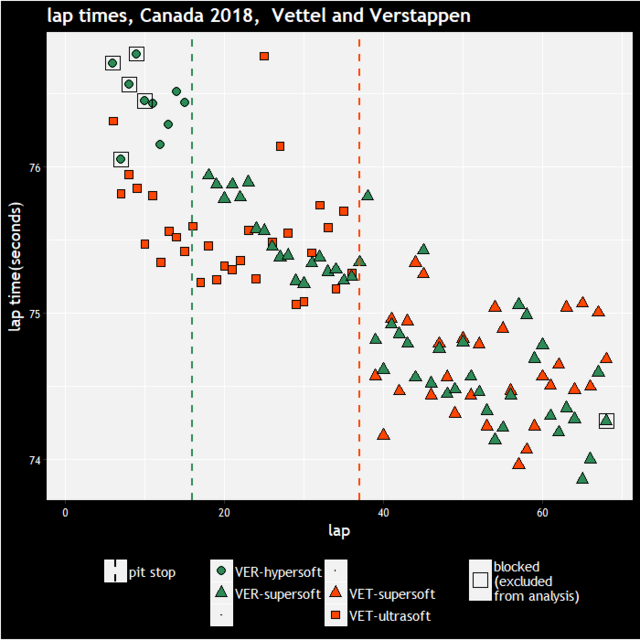
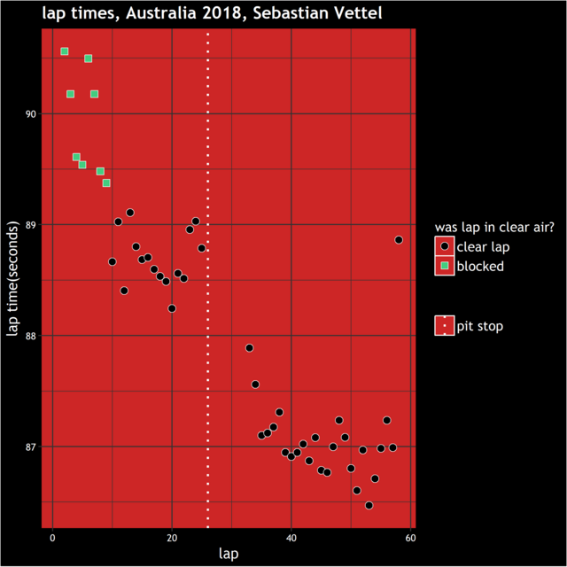
We'll do a worked example with one driver, I've chosen the the winner, Vettel, from the Australian Grand Prix. Here are all of his lap times

raw_Time.png

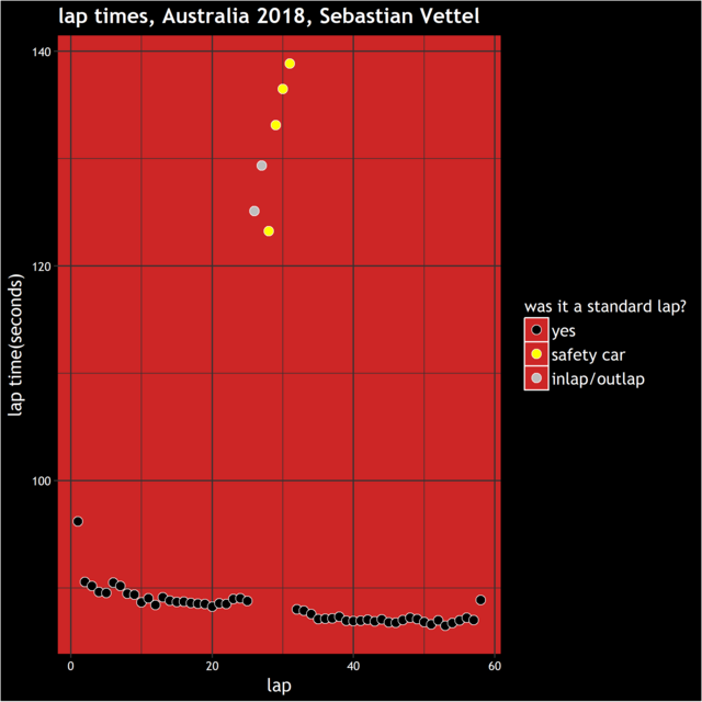
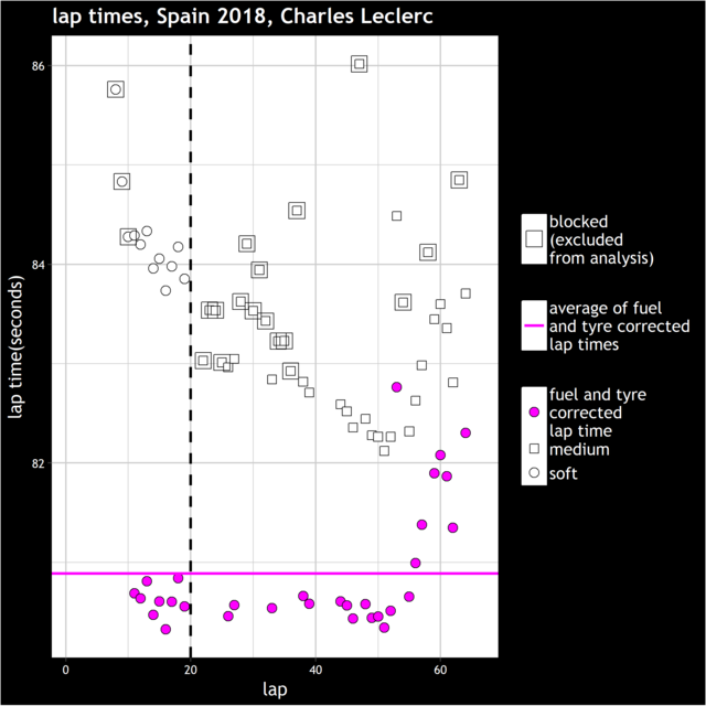
This plot is not great because the scale is dominated by the very slow laps around the pit stops and safety car period, so we'll remove these unrepresentative laps. In general we remove laps done behind the safety car, inlaps, outlaps, lap 1, safety car restart laps and obvious outliers. Next, we'll plot the remaining lap times, but we'll highlight when Vettel's lap times were affected by traffic, which were at the start of the race before Raikkonen had pulled out a bit of a gap. In general I remove any laps where they overtook someone, got overtaken, got lapped or were blocked. Having done various investigations, I use a definition of being within 1.5 seconds of the car ahead as being blocked.
 

blockot.png


So the 'clear lap's are the useful ones. However, there are factors that affect these lap times, most importantly the fuel load, which tyre was being used and how long it had been used for. So we'll start off by displaying the effect of the fuel load. Below is the plot of Vettel's 'clear lap' times, but with a line of best fit going through them - this has been obtained by finding the line that passes most closely through all of the lap times for the clear laps. It doesn't pass very closely between them, but we'll deal with that shortly.

fittedfuel.png


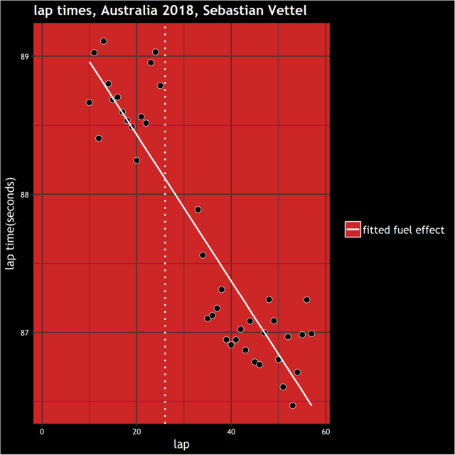
Using that line, we can display the lap times for Vettel correcting for the fuel load. These can be thought of as the lap times he would have set if the car had had only 1 lap of fuel in it, and are displayed with the blue points here:

fuel_Corrected.png


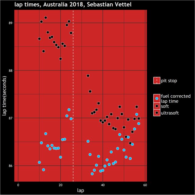
So the biggest trend i.e. lap times dropping throughout the race, has been accounted for. However we notice that the lap times get slower as he gets further into each stint. This is of course the effect of tyre wear. The tyre wear is generally more difficult to estimate accurately than the fuel load because there is quite a lot of variation in how drivers treat their tyres in the race, there are phases when they push and phases when they drop back etc.

There is also the question of whether the tyre wear is different for different cars. There might well be some variation but in this model we group all cars together when estimating the effect of tyres (and the fuel load for that matter). By doing this we get estimates that are certainly close to being accurate for every car and even in the cases where a car does use their tyres a little differently to others, it's rare that it has much of an impact on their final pace estimate because the effects of it tend to balance out over the course of the race.

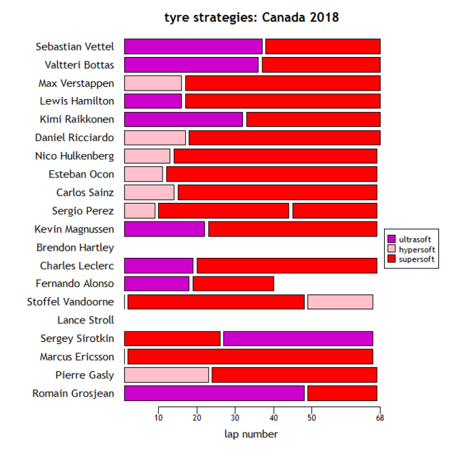
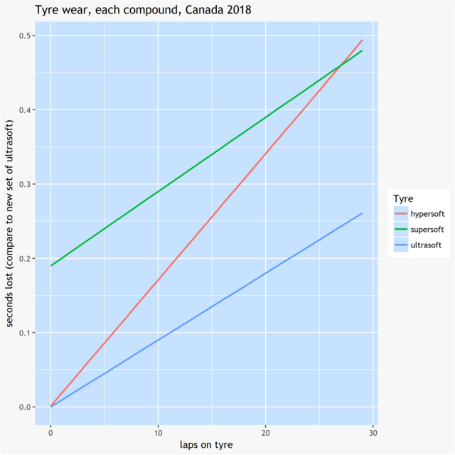
We'll discuss the tyre wear in more detail later on, but for now we'll display what the effect of the fuel and tyre was for every lap. However, when we say 'tyre effect', it's a bit ambiguous, the effect compared to what? We need to choose a 'reference state' and display how much time was lost compared to it. When we referred to the fuel effect, the reference state was 1 lap of fuel, i.e. we calculated what lap time would have been set with 1 lap of fuel. For tyre, the chosen reference state is a new set of the fastest tyre (when new). As it turns out, the soft tyre is calculated to be the fastest tyre when new.

So here is the display of how each of Vettel's lap times were affected by fuel, tyre choice and tyre wear on every lap:

fuel_Tyre_Effect.png


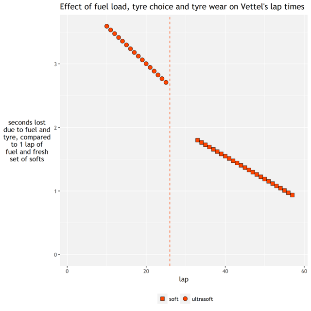
So we see that we take off less and less throughout the race, as his fuel load goes down. However at the end of the race we still take off almost a second: although he's only got 1 lap of fuel left, his softs have worn down so that's costing him about a second compared to a fresh set.

As before, we then take these numbers away from his actual times to get fuel and tyre corrected times:

fuel_Tyre_Corrected.png


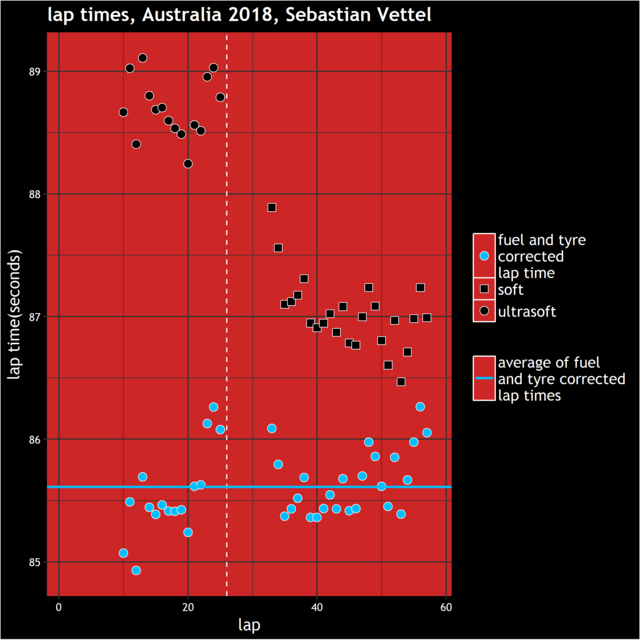
The blue line represents the average of all of Vettel's lap times, accounting for his fuel load and tyres. If Vettel had driven exactly the same way on every lap, and model was completely correct in estimating the way the Ferrari used its tyres and fuel loads, then all the blue points would lie exactly on the blue line. Obviously that isn't the case, so we see a certain amount of scatter. In particular there does seem to be a bit of a trend that he slowed down a bit more towards the end of his first stint that what we've accounted for, however, the fast laps at the start of stint 1 are balanced out by the slower ones at the end of it.

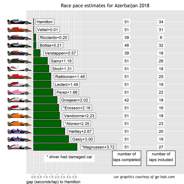
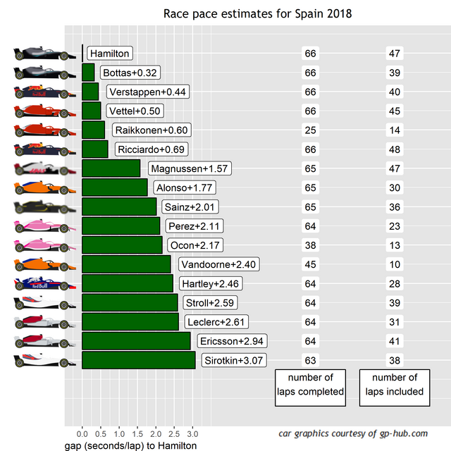
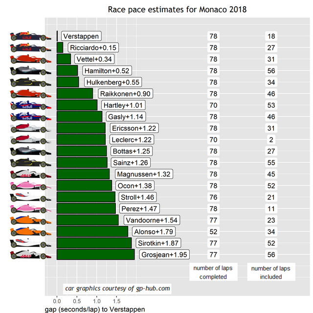
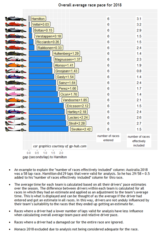
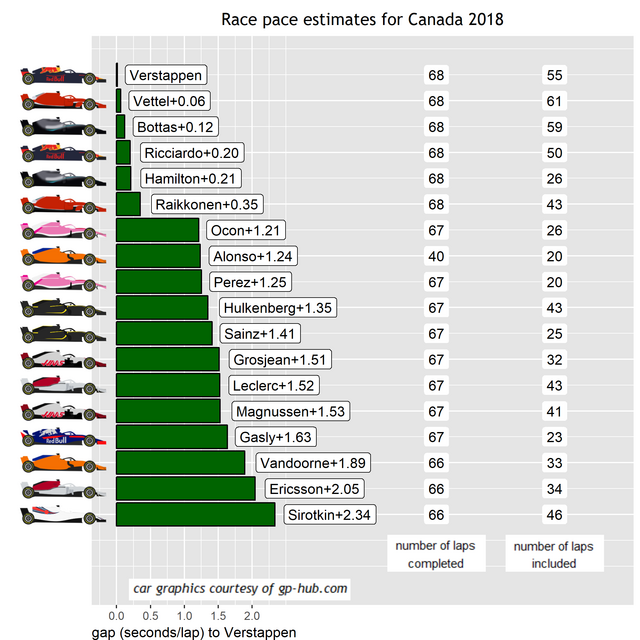
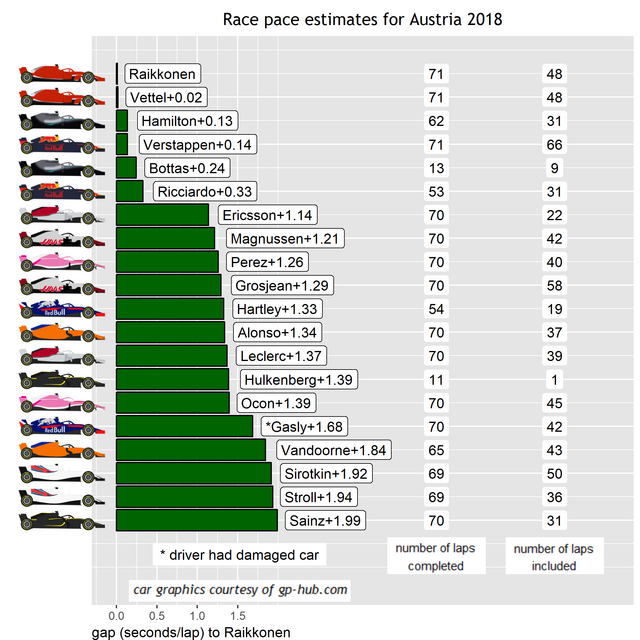
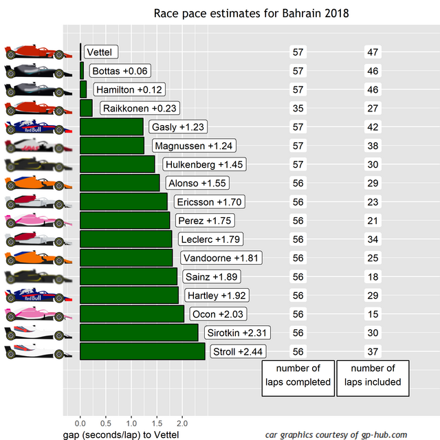
So we repeat this process for all drivers and we get that blue line for all of them, and these represent their race pace estimates. Here are how all the drivers are ranked:

2018australia_gg_Race_Pace.png


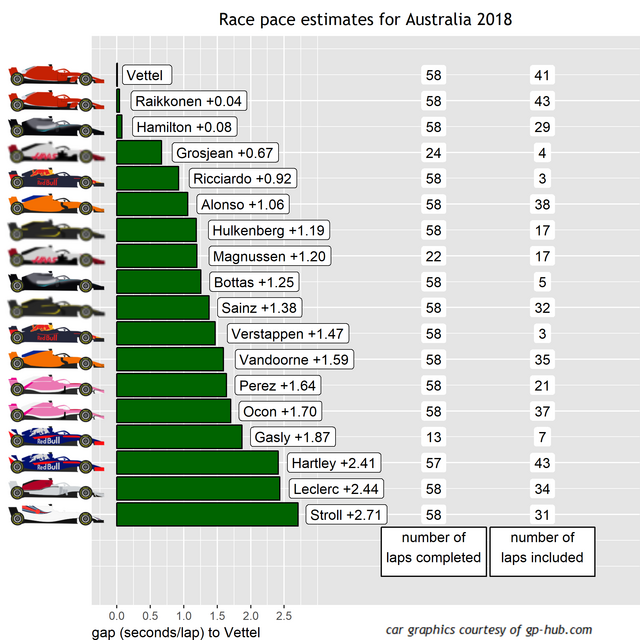
So, Vettel, Raikkonen and Hamilton are ranked more or less equally here. If anything I would guess that Hamilton probably had a bit more pace to spare, however the model can only go on what lap times a driver sets, not the lap time they could have set.

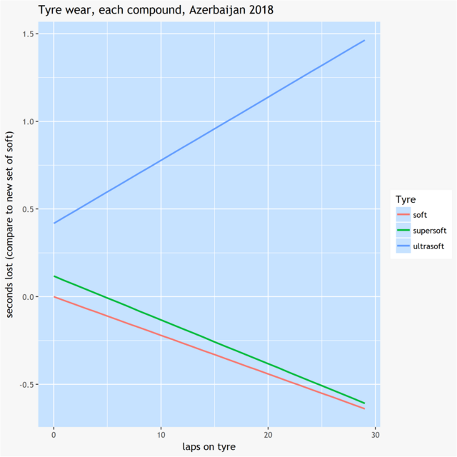
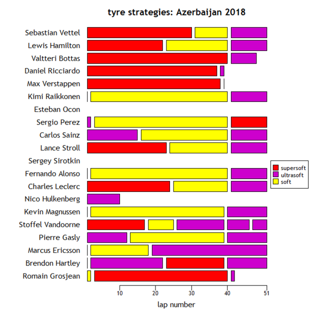
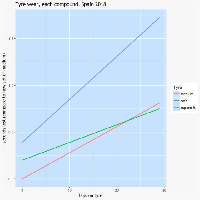
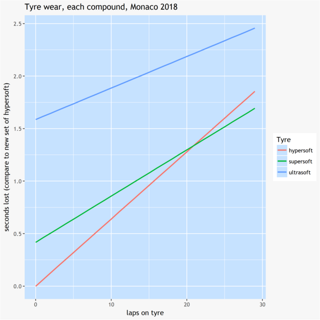
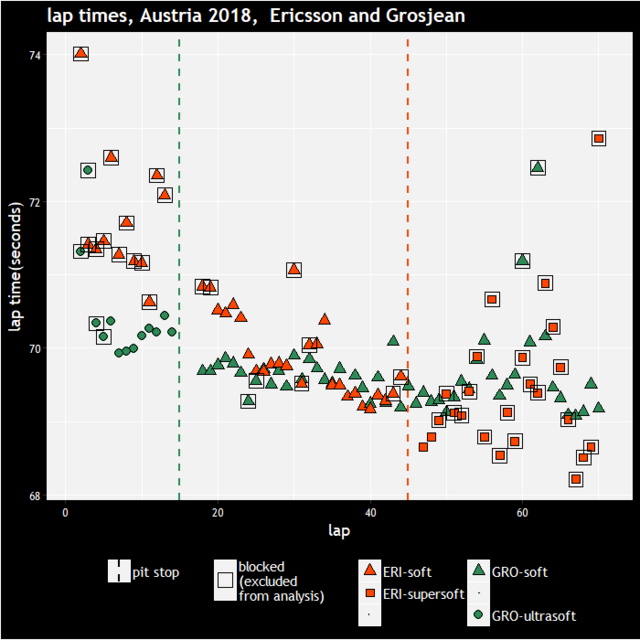
Now, some races are a handled better by the model than others and I was hoping that Australia would be nice one to start the season with. However it was actually a fairly horrible one to have to work with. There were several cars stuck in traffic almost throughout the entire race, which causes two problems, firstly we have hardly any laps to estimate those drivers (so Grosjean, Bottas and the Red Bulls have very dodgy estimates), secondly it means that we don't have as much data as we'd like to estimate tyre effects. Here are the estimated tyre effects:

tyredeg.png


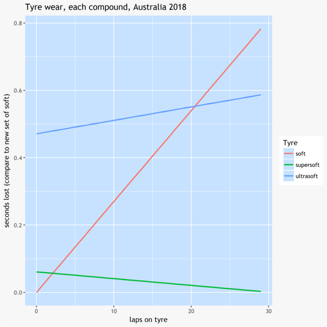
So the ultrasofts were estimated to be not as fast as the softs when new, but had lower degradation. This seems a little odd because we normally expect the softer compounds to be quicker initially but degrade more quickly. This is all relative however, in fact this was a very low degradation race in general. Despite the plan for less conservative tyres this year, last year's Australian Grand Prix actually had faster degradation on all compounds.

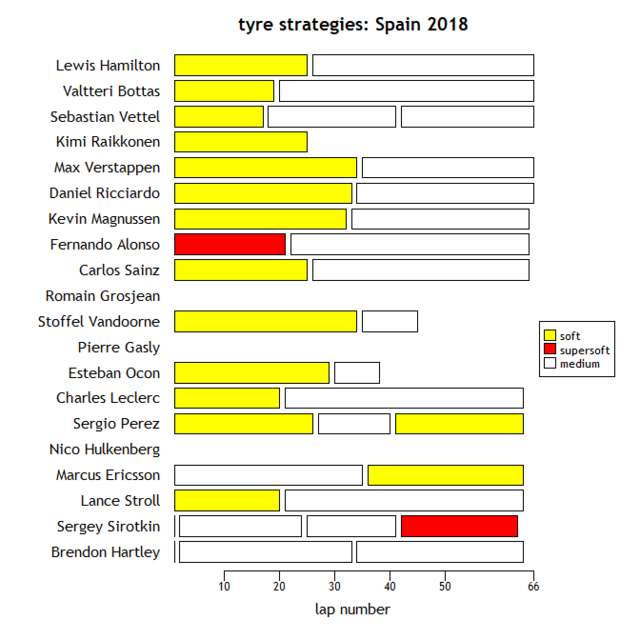
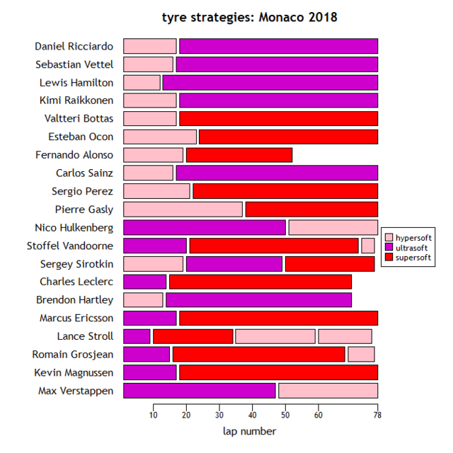
Meanwhile the supersofts were estimated to be comfortably the best tyre. There might be a lack of data here affecting things. Although several drivers used the supersoft, most of them were stuck in traffic almost the entire time while using it, so that only Leclerc and Stroll (stint 1) and Vandoorne (stint 2) give us decent data on it. But if you compare their times with and without it (relative to other drivers), they were certainly faster on it.


So that leads to the question, why didn't more drivers use the supersoft? The only comment I can find relevant to this is towards the end of James Allen's strategy review column, where it's stated that the tyres were very sensitive to the conditions. It could be that what worked for Leclerc, Stroll and Vandoorne wouldn't necessarily work for other cars, or it could be that picking the correct tyre is not an exact science with all the changing conditions in the race.

Anyway, that's all for this race, obviously comments/queries/criticisms all welcome. Bahrain is far easier circuit to overtake on, so I'm expecting a much easier race to deal with next time :D


Edited by moreland, 03 May 2018 - 12:45.


Advertisement

#2 noikeee

noikeee
  • Member

  • 24,321 posts
  • Joined: February 06

Posted 29 March 2018 - 10:38

Great work, the explanation makes sense. Obviously the results look a little nonsensical at first glance (ex the Ferraris quicker than Hamilton, Verstappen slower than so many of those drivers etc), but as you mentioned it was a "fairly horrible" race in terms of reliable data so it's understandable - you can only do so much from the data that you're given.
 
Hopefully you continue doing this, and hopefully the races in the future will give us a more reliable look at how the cars stack up. Specially because this will mean we won't have half the grid stuck in dirty air all race long. ;)


#3 CPR

CPR
  • Member

  • 6,045 posts
  • Joined: February 10

Posted 29 March 2018 - 11:04

This kind of analysis sure is tricky. I've come up with my own algorithms and it can be really frustrating trying to decide what to do. It's also really frustrating that the FIA still live in the 1990s and only bother to provide PDFs for the race laps - why can't they provide something simple like XML for this!? Would make life so much easier...
 
Essentially, there's no right answer to this sort of thing. It would be nice if the "noise" was consistent but unfortunately it's very unpredictable. After trying algorithms of various degrees of complexity I eventually settled on a very simple method:
 
Take the total race time (factoring in cars that finish a lap or more down by averaging it over the number of laps completed), remove the pit stop times, and ignore any "unrepresentative" laps (typically the first lap and any laps under VSC/SC).
 
I can't check my code at the moment, but I think what I actually did for pit stop times is to create an estimate of the "typical" pit stop time for all teams/drivers (the "mode" average) and then use that to normalise the pit stop times. In other words, in a race with no VSC/SC I will include all laps except the first, including in laps and out laps. The main reason for this is so that drivers on different strategies can be compared - consider a driver on a 1 stop strategy with one on a two stop strategy, and lets say that they're very close at the start, neither are held up at any point, they have identical pit stop times and the driver on the 1 stop strategy comes out ahead. Clearly the driver on the one stop strategy should be "faster" but if pit stops are ignored then the driver on the 2 stop strategy will typically have faster lap times.
 
This still leaves a certain amount of noise but I think ultimately we just have to take this on the chin and look at the trends across multiple races.


#4 Jerem

Jerem
  • Member

  • 2,213 posts
  • Joined: September 13

Posted 29 March 2018 - 11:23


This kind of analysis sure is tricky. I've come up with my own algorithms and it can be really frustrating trying to decide what to do. It's also really frustrating that the FIA still live in the 1990s and only bother to provide PDFs for the race laps - why can't they provide something simple like XML for this!? Would make life so much easier...
 

You can get the full race lap times in XML from https://ergast.com/mrd/


#5 Spillage

Spillage
  • Member

  • 11,141 posts
  • Joined: May 09

Posted 29 March 2018 - 11:29

Very interesting data with an excellent and informative OP. Kudos.


#6 GhostR

GhostR
  • Member

  • 3,965 posts
  • Joined: September 03

Posted 29 March 2018 - 11:39

Glad to see you continuing this for the new season - I find it fascinating


#7 CPR

CPR
  • Member

  • 6,045 posts
  • Joined: February 10

Posted 29 March 2018 - 11:56

You can get the full race lap times in XML from https://ergast.com/mrd/


I remember looking at that a long time ago but unfortunately it doesn't have all the data that the FIA does. For example, no sector times/speeds for qualifying. So I figured it would be better to go direct to the source.


#8 thegforcemaybewithyou

thegforcemaybewithyou
  • Member

  • 4,006 posts
  • Joined: April 12

Posted 29 March 2018 - 12:20

Thanks for post. What about adding a chart over the season that shows the pace development? For this race Vettel would get a rating of 100 as he's the best according to your analysis, the other drivers would get a rating of "pace_driver" / "pace_best" * 100.


Other thoughts. If you pick 5 random laps from those that you included in the calculations for Vettel for example, how much does the resulting estimated pace vary? Repeat it 20 times to get an idea how stable your analysis is for drivers that have few valid laps.


What would your model say if you compare two drivers on different strategies, let's say a one stopper against a stopper who never meet on the track. The two stopper should have faster times in your analysis, but still could end up behind the one stopper in the race result because of the additional time in the pits. Adjusting the times could make the estimated times more realistic. The adjustment could look like "pit stop time loss" * "pit stops" / "race laps" for drivers who complete the whole race.


#9 moreland

moreland
  • Member

  • 198 posts
  • Joined: July 17

Posted 30 March 2018 - 10:12

Cheers, for the comments, glad to see others find this stuff interesting as well :)


After trying algorithms of various degrees of complexity I eventually settled on a very simple method:

 
Take the total race time (factoring in cars that finish a lap or more down by averaging it over the number of laps completed), remove the pit stop times, and ignore any "unrepresentative" laps (typically the first lap and any laps under VSC/SC).
 
I can't check my code at the moment, but I think what I actually did for pit stop times is to create an estimate of the "typical" pit stop time for all teams/drivers (the "mode" average) and then use that to normalise the pit stop times. In other words, in a race with no VSC/SC I will include all laps except the first, including in laps and out laps. The main reason for this is so that drivers on different strategies can be compared - consider a driver on a 1 stop strategy with one on a two stop strategy, and lets say that they're very close at the start, neither are held up at any point, they have identical pit stop times and the driver on the 1 stop strategy comes out ahead. Clearly the driver on the one stop strategy should be "faster" but if pit stops are ignored then the driver on the 2 stop strategy will typically have faster lap times.
 
This still leaves a certain amount of noise but I think ultimately we just have to take this on the chin and look at the trends across multiple races.


The thing about 1 stops/2 stops I discuss a bit further down when replying to thegforcebewithyou. But it sounds like you rely on taking an average of all the laps, and don't make an adjustment for the fuel load. This would be ok if every driver completes every lap in clear air (and followed the same strategy), but if a driver retires halfway through, then you'd be comparing an average of lap times set with a car that was heavy throughout the race, with lap times that had been set with a car that was on average much lighter. You could of course restrict to drivers who finished the race. But I think it's important to filter out the blocked laps and when you do so, you get the same problem, e.g. if someone is in clear air for the first half of the race but blocked for the second half. Agree completely on the noise, one race is always going to have a certain amount of error associated with it, but over a season the trends start to show up.


Thanks for post. What about adding a chart over the season that shows the pace development? For this race Vettel would get a rating of 100 as he's the best according to your analysis, the other drivers would get a rating of "pace_driver" / "pace_best" * 100.

I actually did start making a graph like that a while ago, once the season's got underway I might well try to dig it out and see how things are developing.


Other thoughts. If you pick 5 random laps from those that you included in the calculations for Vettel for example, how much does the resulting estimated pace vary? Repeat it 20 times to get an idea how stable your analysis is for drivers that have few valid laps.

That's really quick to do. I've done just what you've suggested, and I've done it for 5, 10 and 20 random laps in fact. These (quickly made and not very attractive!) histograms is what you get:

resampling.png

For 5 laps there's a spread of almost a full second, 10 laps is a bit better, but with 20 laps it's got down to within about 0.3 tenths. I'd say the spread for 5 laps might even be an underestimate, because at least Vettel was in clean air for most of the race, Bottas e.g. was probably having to vary things to manage his tyres and temperatures since he was in traffic the entire time.


What would your model say if you compare two drivers on different strategies, let's say a one stopper against a stopper who never meet on the track. The two stopper should have faster times in your analysis, but still could end up behind the one stopper in the race result because of the additional time in the pits. Adjusting the times could make the estimated times more realistic. The adjustment could look like "pit stop time loss" * "pit stops" / "race laps" for drivers who complete the whole race.


The way I see it there are two separate issues with 1 stop versus 2 stop races (or 2 versus 3 etc). The first is (I think) the one that you're describing, that naturally a 2 stopper will have faster lap times on average, because he misses out the slow laps on worn tyres at the end of the stints that the one stopper does. However, the model knows that these laps were done on worn tyres and adjusts accordingly, so it should handle that aspect ok.


But there might be another issue, which is that it's possible the one stopper drives slower throughout his stints, knowing that he's got to make his tyres last longer. That's a trickier one to analyse and possibly adjust for, and I haven't looked into that yet.


Edited by moreland, 12 April 2018 - 11:07.


#10 moreland

moreland
  • Member

  • 198 posts
  • Joined: July 17

Posted 12 April 2018 - 10:59

Here are the race pace estimates for Bahrain:
2018bahrain_gg_Race_Pace.png


Not only was Bahrain a more enjoyable race than Australia, it was also a much nicer race to assess race pace for. Almost every driver did enough clear laps in order to be able to make a decent estimate for their pace. The only exceptions are the Red Bull drivers (who we also didn't really get a chance to see in race conditions in Australia) and Grosjean, who I've excluded due to obvious damage to his car.

At the front, it's another virtual dead heat between the top three. On the one hand, that might make sense since Vettel and Bottas started the race very close to each other and ended the racevery  close to each other. On the other hand, they used different strategies (Vettel did supersoft-soft, Bottas did supersoft-medium) so it's doesn't necessarily follow that they should have the same pace estimate. However, if we look at the graph displaying how the different tyres performed over their stints, we can see that both strategies looked much of a muchness:
 

tyredeg.png

The softs that Vettel used for stint 2 started off a little quicker but degraded slightly faster than the mediums that Bottas used, so that more or less evened out. Bahrain is traditionally one of the higher degradation races, for example if you look at the y-axis of the plot above, you'll see that 30 lap old tyres are over three seconds slower than new tyres, whereas if you look at the same plot for the Australian Grand Prix, the fastest degrading tyre is less than 1 second slower after 30 laps. But if drivers are able to complete half of this race with the soft tyre, it suggests that we might still be seeing a lot of 1 stop races this year.

While watching the race I was thinking that there seemed to be a lot of big differences between team mates, however looking at the estimates I think this was exaggerated a bit by how close the midfield are, with 5th to 15th covered by 0.8 seconds. There were still a few surprises though, with Gasly being the obvious one but also the two Saubers showing solid pace. Ericsson has received a lot of praise for his race but in fact in terms of pace, Leclerc was very close.


#11 Kegga2018

Kegga2018
  • Member

  • 31 posts
  • Joined: April 18

Posted 12 April 2018 - 11:47

I still don't understand Mercedes, Hamilton was safe from attack from behind so why didn't they just tell him to go flat out whilst on the medium tyre? It would have put Ferrari under more pressure and gathered some good data in the process.

#12 Jerem

Jerem
  • Member

  • 2,213 posts
  • Joined: September 13

Posted 12 April 2018 - 12:10

I still don't understand Mercedes, Hamilton was safe from attack from behind so why didn't they just tell him to go flat out whilst on the medium tyre? It would have put Ferrari under more pressure and gathered some good data in the process.

I think he had no hope of winning the race if Vettel didn't pit so they were saving the engine. It's a long championship and 3rd from 9th is already a great result, no need to risk everything with reliability...


#13 Kegga2018

Kegga2018
  • Member

  • 31 posts
  • Joined: April 18

Posted 12 April 2018 - 12:18

I think he had no hope of winning the race if Vettel didn't pit so they were saving the engine. It's a long championship and 3rd from 9th is already a great result, no need to risk everything with reliability...


I wasn't specific enough, I'm talking about pushing the tyres to the limit but obviously not pushing the engine to the edge.

#14 Jerem

Jerem
  • Member

  • 2,213 posts
  • Joined: September 13

Posted 12 April 2018 - 12:45

I wasn't specific enough, I'm talking about pushing the tyres to the limit but obviously not pushing the engine to the edge.

I realize you were talking about the tyres but I think it's a whole, it would be difficult to catch up without turning the engine up even by pushing the tyres more. But I agree they could have gotten valuable data by pushing only the tyres. On the radio they sounded really confused about the pace though.


#15 moreland

moreland
  • Member

  • 198 posts
  • Joined: July 17

Posted 19 April 2018 - 10:36

Here are the pace estimates for the Chinese Grand Prix:
2018china_gg_Race_Pace.png


It's once again very tight at the top, with two tenths covering the top five. This is the basically the first raced where we've actually seen Red Bull have any clear laps and it seems this could be a close season. I should point out that I've only included Vettel's lap times up to his collision with Verstappen. Following the collision, his lap times dropped rapidly so I think these can be assumed to be unrepresentative. The same issue occurred with Gasly following his collision with Hartley, I only include his laps up to that collision as well.

The usual question to ask after displaying the coefficients is, how reliable are they? There were a number of different strategies being used, which can make the analysis a little more complicated, however in this case I'd say that's not the case because most drivers used either the soft or the medium and these turned out to be similarly effective:
tyredeg.png

The ultrasoft is clearly the worst tyre, which might explain why it was only used by a handful of drivers:
2018china_stintsummary.png

Of the front runners, the aspect that maybe does surprise me is Hamilton being rated almost equally to Bottas. Hamilton was about 11 seconds behind Bottas before making his first stop. Obviously the safety car reset the gap, but Hamilton was 7 seconds behind Bottas by the end of the race. So, how has his rating been calculated to be equal to Bottas's? The reason is that in general, Hamilton was running within the 1.5 second window of the car in front on the laps when he was slower than Bottas. Only in the second stint did he get a consistent run of clean laps, and while there's a bit of scatter, their lap times were fairly similar when running in clear air.

Among the other drivers, Gasly's high ranking might be a surprise. He's only had seven laps included, having been blocked during the first stint and having a damaged car (and being blocked in any case) after the collision with Hartley. It's the set of lap times at the start of his second stint until the collision with Hartley that have been included here and while it's only a small set of laps, they were fast laps, so I'd say it's am accurate rating.

It's also worth mentioning Grosjean, who finished 17th, behind both Williamses and Ericsson, while Magnussen finished 10th. That doesn't look good and although he's been estimated to be a couple of tenths slower than Magnussen, it's mainly a consequence of the strategy not working than a lack of pace. His strategy was unusual in that he pitted early in the race, but didn't pit again when the safety car came out whereas most of the cars around him in the race did. It promoted him into the points but he gradually drifted back to 13th, then, with worn tyres and presumably thinking there was nothing to lose, made a very late pit stop which gave him too much ground to make up.

It's still early in the season, however here are the team mate comparisons. I also included an overall pace rating for the season last year, but I wasn't happy with the way it dealt with drivers missing races which lead to some odd rankings e.g. Button being the fastest Mclaren driver despite being slower than Vandoorne at the only race he did. I want to provide something that corrects for that, I just haven't quite finished it yet but it will appear in the coming races hopefully.
[Edit: have removed the team mate comparison graphs to avoid cluttering the thread, more up to date ones below]


Edited by moreland, 03 May 2018 - 12:44.


#16 apoka

apoka
  • Member

  • 5,878 posts
  • Joined: May 09

Posted 19 April 2018 - 11:30

The Hulk is doing great especially considering how well Sainz did against team mates previously.

#17 sopa

sopa
  • Member

  • 12,230 posts
  • Joined: April 07

Posted 19 April 2018 - 11:33

So... Toro Rosso in China was actually a fast car?


#18 vista

vista
  • Member

  • 1,376 posts
  • Joined: April 13

Posted 19 April 2018 - 17:50

So... Toro Rosso in China was actually a fast car?


But only for Gasly and only for 7 laps (those prior to colliding with Hartley) as far as I understand it from the analysis..


#19 moreland

moreland
  • Member

  • 198 posts
  • Joined: July 17

Posted 20 April 2018 - 08:19

But only for Gasly and only for 7 laps (those prior to colliding with Hartley) as far as I understand it from the analysis..


Yes, that's correct, shame we didn't get to see if he could keep it up. It will be interesting to see how Toro Rosso do in the coming races, they're the team that are most 'mysterious' pace-wise so far. The other one that I'm not sure about is Sauber, they were solid midfield in Bahrain but reverted towards the back of the pack in China. Sauber did occasionally show midfield pace in 2017 (including Bahrain) so I'd guess Bahrain this year was the exception rather than the rule for them but we shall see.


Advertisement

#20 joonz

joonz
  • Member

  • 224 posts
  • Joined: March 12

Posted 20 April 2018 - 13:40

I'd like to know how Kimi was filtered in China, gap seems way too big considering what really happened in the race


#21 Tenmantaylor

Tenmantaylor
  • Member

  • 19,202 posts
  • Joined: July 01

Posted 20 April 2018 - 14:05

Awesome work OP! After all these years watching F1 no broadcaster or F1 itself has attempted to do this kind of analysis which is so important for assessing a driver/car's race performance. James Allen shows a race history graph I believe after each race which overlays every drivers race performance, laptime and position relative to each other I find this the best way to see how each driver performed in the race. Often you can glean much more information from this than is possible to assess during the race itself even if you have the live data. Gasly's real race pace in clear air in China surprised me for e.g, the footage made it look like a terrible race from him.

There needs to be more structured and factual data analysis after the race by broadcasters. Yes we all want the interviews and who drank champagne out of their snap back but looking at line charts like these,as dull as the casual viewer may find them, is crucial to visualise the race story and strategies.

How Bottas overtook Vettel for e.g at China. I didn't see any footage that explained this or get an explanation from commentators. If the comms had access to race data expert they could put the data on screen PIP style. It's how the teams assess performance, viewers could benefit a lot too making the strategies more tangible.

The swing towards Bottas at Merc since Aus is so strange. Don't think Lewis has ever gone from being so strong to so weak like that. He's obviously on a personal downer at the mo.

Edited by Tenmantaylor, 20 April 2018 - 14:06.


#22 JoeDede

JoeDede
  • Member

  • 566 posts
  • Joined: March 18

Posted 21 April 2018 - 13:30

Moreland this is just so impressive work, or should I say fun?  :lol:  I guess you wouldn't do it if it wasn't fun.


Anyway, greatly appreciated  :up:


Edited by JoeDede, 24 April 2018 - 16:35.


#23 moreland

moreland
  • Member

  • 198 posts
  • Joined: July 17

Posted 23 April 2018 - 14:18

I'd like to know how Kimi was filtered in China, gap seems way too big considering what really happened in the race

No probs. For the first stint, these are the gaps between Raikkonen and the car ahead, along with whether it's been included, his lap time and Vettel's lap time.
china-vettel-v-kimi.png

So from laps 6 to 19 he was above the 1.5 second threshold, and Vettel was on average just under 0.4 seconds faster for those laps. It gets harder to compare them after that because their strategies diverged and then Vettel had his collision. Raikkonen certainly looked faster in the second stint, e.g. catching and tracking Bottas by the end, but his tyres were 8 laps younger, which, going by the graph above, was worth 0.4 seconds a lap.
 

Awesome work OP! After all these years watching F1 no broadcaster or F1 itself has attempted to do this kind of analysis which is so important for assessing a driver/car's race performance. James Allen shows a race history graph I believe after each race which overlays every drivers race performance, laptime and position relative to each other I find this the best way to see how each driver performed in the race. Often you can glean much more information from this than is possible to assess during the race itself even if you have the live data. Gasly's real race pace in clear air in China surprised me for e.g, the footage made it look like a terrible race from him.

There needs to be more structured and factual data analysis after the race by broadcasters. Yes we all want the interviews and who drank champagne out of their snap back but looking at line charts like these,as dull as the casual viewer may find them, is crucial to visualise the race story and strategies.

How Bottas overtook Vettel for e.g at China. I didn't see any footage that explained this or get an explanation from commentators. If the comms had access to race data expert they could put the data on screen PIP style. It's how the teams assess performance, viewers could benefit a lot too making the strategies more tangible.

The swing towards Bottas at Merc since Aus is so strange. Don't think Lewis has ever gone from being so strong to so weak like that. He's obviously on a personal downer at the mo.

Thanks! I know what you mean, there are some sports, with baseball being the obvious example, where there's been some great research to dig deeper into the results but with Formula 1, as far as mainstream coverage is concerned, it feels like everyone still talks about the points table and qualifying head-to-heads. James Allen's strategy report (which features that graph that you mentioned) normally gets several hundred comments which suggests there are surely a decent number of fans who would like more detailed analysis. I agree that there's a lot more potential for in-race coverage, with that undercut of Vettel by Bottas being a good example. We could have had an updating forecast as to how far ahead Vettel was likely to emerge as they went through the sectors, that would have been really tense, as it happens at one point during that lap the director started showing the Stroll/Vandoorne/Hulkenberg battle!


Moreland this is just so impressive work, or should I say fun?  :lol:  I guess you wouldn't do it if it wasn't fun.


Anywat, greatly appreciated  :up:

Cheers, yes I do enjoy doing this, it's like a big puzzle that I keep wanting to come back to. The process of watching the race, trying to guess in my head what the ratings will come out as, to the moment of pressing enter to see for the first time what the model has come up with is always a particular highlight!


#24 Nathan

Nathan
  • Member

  • 9,863 posts
  • Joined: February 00

Posted 25 April 2018 - 23:45

Bottas is actually pretty quick!  The Hulk must be making RBR push hard for retaining Ric.


#25 moreland

moreland
  • Member

  • 198 posts
  • Joined: July 17

Posted 03 May 2018 - 12:42

Here are the race pace estimates for the 2018 Azerbaijan Grand Prix:
2018azerbaijan_gg_Race_Pace.png


While it will probably be remembered as a bit of a crazy race, about three quarters of the race was actually quite stable and even had a large proportion of the field spaced out. These are ideal conditions for the race pace model because we get lots of clear laps.

There were a couple of niggling factors however. One is the large number of drivers who were likely driving compromised cars. Deciding what to do about each driver is I think my least favourite part of this process because I have to make subjective decisions and it's sometimes hard to be confident in my choices. It matters because I will hopefully soon be displaying the overall average pace for the field throughout the season, and deciding whether a driver's pace coefficient in a race should be included or not will affect that.

So, the drivers whose estimates I think are not representative are Alonso, Magnussen and Ericsson. In the case of Alonso it's a fairly easy choice based on what his car looked like at the end of lap 1, while Magnussen and Ericsson had a hefty looking collision and their lap times were consistently slower than what you would otherwise expect. I've also eliminated Gasly's final few laps following his collision with Magnussen, however this only ends up eliminates one clear lap.

The ones I'm not sure about are Perez and Raikkonen. Perez took a hit up the back on lap 1, but his lap times seem to be roughly in line with what we would expect from recent races. Raikkonen is very tricky. His lap times are a long way off what we would expect, however both his and the team's comments suggest there was no major problem, plus the collision with Ocon didn't look like the type of accident that does serious non-repairable damage. On balance I've decided not to discard his estimate.

The other complicating factor was the tyres, the degradation lines display an unusual pattern:

tyredeg.png

So for the soft and supersoft tyres, we actually see the tyres getting faster as they get older. It matches what we saw in the race, for example Bottas on old tyres managing to maintain the gap to Vettel and Hamilton who were both on new tyres, plus Verstappen managing to overcut Ricciardo. The ultrasoft looks like a terrible choice of tyre according to the graph, however it's not based on much data. Here are all the strategies:
2018azerbaijan_stintsummary.png

Once you remove stints that were largely in traffic or with damaged cars, it's only Vandoorne and Hartley who gave us any real data on the ultrasoft. They both lost time compared to their rivals while using it however, so what little data we have does suggest it was the worst tyre.

So, there are a few surprises, with Stroll and Leclerc being much higher than we've come to expect. Perez's pace is roughly in line with what we would expect from the season so far, but maybe surprisingly low considering he made the podium. The best strategy (in hindsight of course) was to make your only pit stop when the safety car came out. This is what Raikkonen and Perez (and Alonso) did, which is why these three finished higher in the race than they did in the pace rankings.


Edited by moreland, 17 May 2018 - 10:37.


#26 l2k2

l2k2
  • Member

  • 976 posts
  • Joined: September 09

Posted 03 May 2018 - 22:46

Here are the race pace estimates for the 2018 Azerbaijan Grand Prix:

SNIP...


I think the late safety car breaks the model, and bad... Most likely it's because of the fuel, I'd almost dare to say that most cars did finish with far more fuel than usual. And, as practically all ultrasoft-laps are from the end, it breaks the fit.. in addition, it might be the reason for the seemingly contradictory “tyres are getting faster but teams still want to change away as in reality the pace did drop at some point (except for Bottas)”.

A broken fit might partially explain the seemingly too large differences between some team mates.

What would the data look should you omit all laps after the late safety-car phase?

#27 A3

A3
  • Member

  • 32,375 posts
  • Joined: February 00

Posted 04 May 2018 - 06:53

18 laps included for Verstappen and 6 for Ricciardo. Can you explain the difference?


#28 Kalmake

Kalmake
  • Member

  • 4,492 posts
  • Joined: November 07

Posted 04 May 2018 - 07:50

18 laps included for Verstappen and 6 for Ricciardo. Can you explain the difference?

Ricciardo being held up more laps.


#29 A3

A3
  • Member

  • 32,375 posts
  • Joined: February 00

Posted 04 May 2018 - 07:58

Ricciardo being held up more laps.

By who?


#30 Jovanotti

Jovanotti
  • Member

  • 8,269 posts
  • Joined: October 11

Posted 04 May 2018 - 07:58

Pretty obvious that everyone with a long soft stint had shitty pace, especially Kimi and Magnussen. Alonso and Gasly as well with the first deficit to their teammates this season, probably because of their tyre choice.


Edited by Jovanotti, 04 May 2018 - 08:56.


#31 Kalmake

Kalmake
  • Member

  • 4,492 posts
  • Joined: November 07

Posted 04 May 2018 - 08:12

By who?

Did you watch the race? I don't have the stats but Max did lot of it.


#32 A3

A3
  • Member

  • 32,375 posts
  • Joined: February 00

Posted 04 May 2018 - 08:32

Did you watch the race? I don't have the stats but Max did lot of it.


I did watch the race, I saw Max and Daniel fighting with each other almost every lap, so that's why I asked about the difference. 


I don't think that driving defensive lines is the same as driving in clean air.


#33 Kalmake

Kalmake
  • Member

  • 4,492 posts
  • Joined: November 07

Posted 04 May 2018 - 09:59

I did watch the race, I saw Max and Daniel fighting with each other almost every lap, so that's why I asked about the difference. 


I don't think that driving defensive lines is the same as driving in clean air.

First post says defending is taken into account. I'll leave it to Moreland to explain how he decides that.


#34 moreland

moreland
  • Member

  • 198 posts
  • Joined: July 17

Posted 04 May 2018 - 14:55

@l2k2: it's a good question :)  I'll try get back to you on that when I've got a chance.


18 laps included for Verstappen and 6 for Ricciardo. Can you explain the difference?

Verstappen has some laps removed due to being blocked by Hulkenberg early on, then by Hamilton after Hamilton made his first stop. Ricciardo was stuck behind Verstappen throughout.


First post says defending is taken into account. I'll leave it to Moreland to explain how he decides that.

In fact I don't eliminate laps due to possible defensive driving, it's only if you overtake/get overtaken/get lapped/are within 1.5 seconds of the car ahead that I filter out laps. I agree that if a driver is taking defensive lines then of course their lap times are not representative, it's just that I can't really get that info from the data. But I'd say it's quite rare that someone drives defensive lines, without being overtaken, for more than a handful of laps in any race, that's just a hunch though.


#35 moreland

moreland
  • Member

  • 198 posts
  • Joined: July 17

Posted 07 May 2018 - 12:02

I think the late safety car breaks the model, and bad... Most likely it's because of the fuel, I'd almost dare to say that most cars did finish with far more fuel than usual. And, as practically all ultrasoft-laps are from the end, it breaks the fit.. in addition, it might be the reason for the seemingly contradictory “tyres are getting faster but teams still want to change away as in reality the pace did drop at some point (except for Bottas)”.

A broken fit might partially explain the seemingly too large differences between some team mates.

What would the data look should you omit all laps after the late safety-car phase?


I've had a quick look at that, where I've run the model but only using the data up to when that late safety car came out. I've plotted the estimates I get by doing that, against the estimates for the whole race and the results are interesting:

azerbaijan_lap40.png

It's not actually what they did after lap 40 that has caused these drivers to have the biggest movements, instead it's the fact that everyone switched to ultrasofts and changed the estimate of how effective the ultrasoft is, that causes drivers' estimates to change. So the ones who've had the biggest movement in terms of being esimated slower (Vandoorne, Ericsson, Hartley): all did a high proportion of clear laps on the ultrasoft.

Meanwhile, tyres are of course evaluated relative to each other, this means if we change our estimate of how good one tyre is, our opinion of the others are affected in turn. The supersoft isn't affected much because not many drivers had clear laps on both the supersoft and the ultrasoft. However the soft's estimate does get affected in response to the change in our estimate of the ultrasoft (hope this is all making sense!). So if you look at the drivers whose estimates have moved most in terms of being estimated faster, it's all drivers who did very long stints on the soft.


So, does this mean that the model was 'broken' by that late set of laps on ultra softs? It doesn't feel good to have such big movements, although it's fair to say that this is a bit of an unusual situation so I wouldn't say it's an issue that casts doubt on the ratings in the wider scheme of things. In terms of what can be done about it, the root cause I think is that the way that a driver uses a tyre, knowing they've only got to do four laps, is different compared to if they've got to cover a whole stint. The model doesn't take that into account and it's a bit of a tricky effect to try to measure, but it's on my list of potential future improvements.


Edited by moreland, 07 May 2018 - 12:03.


#36 moreland

moreland
  • Member

  • 198 posts
  • Joined: July 17

Posted 17 May 2018 - 10:37

Race pace ratings for Spanish Grand Prix:
2018spain_Race_Pace.png


The Spanish Grand Prix was the first race this season where a driver has won comfortably, and this is reflected in the pace rankings, with Hamilton three tenths clear at the front. In general there is quite a close correlation between the pace rankings and the final finishing positions, which is probably a sign of a rather dull race!

tyredeg.png


Degradation was low, with the medium losing about 0.03 seconds a lap and the soft about 0.02 seconds. The supersoft was only used by Alonso and Sirotkin, what little data we have on it supports it being an unpopular choice of tyre.
2018spain_stintsummary.png


Ferrari pitted Vettel under the safety car on lap 41 to replace 23 lap old mediums with new ones, according to my calculations that should have gained him about 0.03 * 23 = 0.69 seconds/lap. That's a similar amount to what I estimate Red Bull gained when they pitted their drivers behind the safety car in China, however, we didn't see a spectacular charge back up the order on this occasion. Part of the problem for Vettel was that Verstappen pitted late for his mediums on lap 34. So Vettel had a 7 lap tyre advantage over Verstappen, worth only 7 * 0.03 = 0.21 seconds/lap, which probably explains why Vettel was able to follow but not challenge Verstappen for the remaining 20 laps.


Looking further down the list, Leclerc is maybe a bit lower than we might expect, having looked quite competitive in the opening stage of the race. He was in fact fairly quick until the very late stages, but his fade in the last ten laps has dragged his pace estimate down:
cleclerc.png

These lap times were set just after he'd been overtaken by Perez, but was safe from being caught by Stroll. It feels as if we should maybe exclude those laps as not representative. It's tricky to produce hard and fast rules to cover every situation like this, but it's on my "things that sometimes cause a driver's estimate to be a few tenths out" list.


Edited by moreland, 01 June 2018 - 09:06.


#37 moreland

moreland
  • Member

  • 198 posts
  • Joined: July 17

Posted 01 June 2018 - 09:05

Some races are more suitable for the type of race pace analysis I do, and Monaco was just about as unsuitable as a race can be. For what it's worth, here are the pace estimates:
2018monaco_Race_Pace.png

(Ricciardo's lap times drop dramatically after about 30 laps, I've only counted the laps up until that point when producing his estimate)

Some drivers do not appear where we might have expected them to, however I'm afraid this is not as a result of any insight that I've gained by analysing the lap times. Instead they have arisen because the way drivers appeared to drive in Monaco is not the way the model assumes that they drive, or the way that they drive in 'normal' races.

In order to explain how the model has produced some of these ratings, it can mostly be explained by looking the the extreme view it has on the relative strength of each tyre:

tyredeg.png

So we see that the ultrasoft was estimated as being over a second a lap slower than both other tyres when new, and still over half a second slower after 30 laps. In fairness, if you look at the lap times of drivers with and without the ultrasoft, it was clearly an uncompetitive tyre. It was probably made to look a little worse than it actually was due the the first four drivers, who all used the ultrasoft, all seeming to go into cruise mode for the second half of the race. The consequence of this is that lap times set of ultrasofts are 'forgiven' due to it being rated as a bad tyre which means drivers who used it without going into cruise mode appear highly in the ranking e.g Verstappen, Hulkenberg and Hartley. The flip side of that is what has punished Bottas, who also seemed to go into cruise mode and wasn't forgiven for it because he wasn't using the ultrasoft.

2018monaco_stintsummary.png

Because I don't think these ratings are reliable, I've decided not to include them in the season averages (which I will present shortly) and have highlighted the race as invalid in the team mate comparison graphs. The question that follows is, can we see Monaco as a one-off, or is this type of issue present, albeit less severely, in other races and we need to try to fix it? Overtaking is difficult in other races e.g Singapore and Hungary, but I don't remember drivers simply giving up and cruising for 50 laps in any race at those tracks, so I'd say it's not a high priority concern.

Moving on, I've now managed to prepare the overall season average pace rankings. There were issues with how these rankings were calculated last season and I've made some fixes to that for this season. I'd like the graph to make sense on its own and not require finding a paragraph explaining it in the middle of a forum thread, so I've added some explanatory notes to the bottom of it. If they don't make sense or you think they could be explained better, let me know! (NB the image is smaller than intended, I've fiddled about with PostImage and the image settings but can't seem to fix it :-( )


(NB edited on 14/06/1: have moved average pace rankings graph described above, along with team mates comparisons, and replaced with more up to date versions further down, to avoid cluttering the thread)


Edited by moreland, 14 June 2018 - 08:12.


#38 GhostR

GhostR
  • Member

  • 3,965 posts
  • Joined: September 03

Posted 01 June 2018 - 12:08

Ricciardo's MGU-K issues at Monaco started around lap 18, based on the post-race reports. It's probably disguised somewhat in your data because in the first stint on the Hyper's, Dan wasn't pushing at all until the last few laps before the pitstops (something that Vettel commented on post-race). It's visible in the data too: in the first stint, DR's fastest lap in the first 12 laps was a 16.4 on lap 11. Lap 12 was a relatively slow 16.8, then Hamilton pitted. DR responded to that and immediately pumped in a 15.5 and a pair of 15.7's before his own stop. In that first stint, Vettel was faster than Ricciardo on only 4 laps. From the stops onwards, all of the top drivers on the similar strategy as DR were either just as fast post-stop as they were pre-stop, or quicker. DR was, conversely, slower by a couple of seconds per lap.


To be honest I think you can only include laps from DR from before the pit stop. Anything after that is tainted by the K failure.


#39 moreland

moreland
  • Member

  • 198 posts
  • Joined: July 17

Posted 02 June 2018 - 10:22

Ricciardo's MGU-K issues at Monaco started around lap 18, based on the post-race reports. It's probably disguised somewhat in your data because in the first stint on the Hyper's, Dan wasn't pushing at all until the last few laps before the pitstops (something that Vettel commented on post-race). It's visible in the data too: in the first stint, DR's fastest lap in the first 12 laps was a 16.4 on lap 11. Lap 12 was a relatively slow 16.8, then Hamilton pitted. DR responded to that and immediately pumped in a 15.5 and a pair of 15.7's before his own stop. In that first stint, Vettel was faster than Ricciardo on only 4 laps. From the stops onwards, all of the top drivers on the similar strategy as DR were either just as fast post-stop as they were pre-stop, or quicker. DR was, conversely, slower by a couple of seconds per lap.


To be honest I think you can only include laps from DR from before the pit stop. Anything after that is tainted by the K failure.


It's one of those grey areas, I was going by when the lap times drop off, which seemed to tie in with when we first started hearing radio messages in the coverage. Although as you say, if you look at Riccardo's times next to Vettel's, then it does look as he loses his advantage straight after the pit stop. As it happens, his estimate improves by 0.4 seconds when you only include his laps up to his pit stop. So he was certainly quite a bit slower for the ten laps after the pit stop, but that could also have been tactical since there were a lot of laps to cover on dodgy tyres.


Advertisement

#40 noikeee

noikeee
  • Member

  • 24,321 posts
  • Joined: February 06

Posted 02 June 2018 - 10:34


Absolutely fantastic job man, this is quite useful, please keep doing these. :up:

#41 OneLapWonder

OneLapWonder
  • Member

  • 75 posts
  • Joined: December 17

Posted 02 June 2018 - 12:37


2018-yearly-pace-plus-explanation.png


I think the results per GP are perhaps a little bit too much influenced by specific conditions and its hard to draw conclusions from them. However, the overall results (the picture I quoted) seem to visualize the current differences between teams pretty accurately I would say. What I find most noticeable is that Sauber has closed the gap to the pack and isn't the sole backmarker anymore, resulting in Williams - having two mediocre drivers at best - suddenly finding themselves at the back. Furthermore, Alonso and Gasly are outperforming Vandoorne and Hartley, respectively. 


Edited by OneLapWonder, 02 June 2018 - 12:37.


#42 moreland

moreland
  • Member

  • 198 posts
  • Joined: July 17

Posted 02 June 2018 - 13:45

Absolutely fantastic job man, this is quite useful, please keep doing these. :up:


Glad you like it, hopefully there will be better examples than Monaco of it being "useful"!


I think the results per GP are perhaps a little bit too much influenced by specific conditions and its hard to draw conclusions from them. However, the overall results (the picture I quoted) seem to visualize the current differences between teams pretty accurately I would say. What I find most noticeable is that Sauber has closed the gap to the pack and isn't the sole backmarker anymore, resulting in Williams - having two mediocre drivers at best - suddenly finding themselves at the back. Furthermore, Alonso and Gasly are outperforming Vandoorne and Hartley, respectively. 


Yes, I think you're right, individual GPs have a lot going on in them in terms of tyres, traffic and tactics, there are never enough lap times to be 100% confident in every driver's rating. They are useful to look at in detail in order to see what improvements might be possible though. However the overall results for the season are starting to even out and in fact the gaps between team mates are already looking very similar to how they did last year.


#43 GhostR

GhostR
  • Member

  • 3,965 posts
  • Joined: September 03

Posted 04 June 2018 - 12:20

It's one of those grey areas, I was going by when the lap times drop off, which seemed to tie in with when we first started hearing radio messages in the coverage. Although as you say, if you look at Riccardo's times next to Vettel's, then it does look as he loses his advantage straight after the pit stop. As it happens, his estimate improves by 0.4 seconds when you only include his laps up to his pit stop. So he was certainly quite a bit slower for the ten laps after the pit stop, but that could also have been tactical since there were a lot of laps to cover on dodgy tyres.


The radio calls in the coverage are always delayed. The team itself has been pretty clear the issues started from lap 18 onwards. Of the top drivers, Ricciardo was the only one to be so much slower after the pit stop than before. Quick scan through the other drivers it looks like Vettel was the "next worst" in terms of post-stop laptimes, while (without calculating) it looks like the average across all drivers on the similar strategy was for a noticeable improvement in lap times after the stops. I would think that if Ricciardo hadn't had issues he would have dropped a couple of low-15's after the stops to help establish an advantage over Vettel and then backed off to manage the gap. I suspect he could even have managed 14's for a few laps if he'd wanted.


So I think it's a safe assumption to make that he was hobbled already before the radio was broadcast. Any chance you could share the calcs with that taken into account?


On a similar note - the Channel 4 commentators picked up that Alonso appeared to have the same problem before his gearbox failed. Anyone picked up anything to indicate when that might have started for him? (Edit: looking at his lap times, might have only been the last few laps before the box went - he dropped from regular 1:18 bracket up to and including lap 49, to 1:21 / 1:22 for the next 3 laps before the box went.)


Edited by GhostR, 04 June 2018 - 12:23.


#44 moreland

moreland
  • Member

  • 198 posts
  • Joined: July 17

Posted 05 June 2018 - 20:50

The radio calls in the coverage are always delayed. The team itself has been pretty clear the issues started from lap 18 onwards. Of the top drivers, Ricciardo was the only one to be so much slower after the pit stop than before. Quick scan through the other drivers it looks like Vettel was the "next worst" in terms of post-stop laptimes, while (without calculating) it looks like the average across all drivers on the similar strategy was for a noticeable improvement in lap times after the stops. I would think that if Ricciardo hadn't had issues he would have dropped a couple of low-15's after the stops to help establish an advantage over Vettel and then backed off to manage the gap. I suspect he could even have managed 14's for a few laps if he'd wanted.


So I think it's a safe assumption to make that he was hobbled already before the radio was broadcast. Any chance you could share the calcs with that taken into account?


On a similar note - the Channel 4 commentators picked up that Alonso appeared to have the same problem before his gearbox failed. Anyone picked up anything to indicate when that might have started for him? (Edit: looking at his lap times, might have only been the last few laps before the box went - he dropped from regular 1:18 bracket up to and including lap 49, to 1:21 / 1:22 for the next 3 laps before the box went.)


It's tricky, there's several sources of information to weigh up, such as team radio, comments after the race and the lap times themselves, it's somewhere in that range of laps that it all started hampering him. In terms of how the calculations are affected by the choice, here's the plot of his lap times along with the calculated estimate with my original chosen lap:

dricciardo-default.png


Meanwhile if I designate all of stint 2 to have a car issue, the plot looks like this:


dricciardo.png


So, overall the line moves down i.e his pace estimate improves, by about 0.4 seconds.


One slightly different feature is highlighted by this plot actually. As I said in the opening post to this thread, ideally you want to see that the 'fuel and tyre correct lap times' lie on the 'average of fuel and tyre corrected lap times' line. If that happens then it means the driver's lap times are adjusting in line with the fitted tyre and fuel effects. We don't see that at all for Ricciardo here, we see his corrected lap times move sharply downwards compared to the line. This means that his lap times are improving much faster throughout the stint compared to what the model has fitted i.e compare to what other drivers did in general. It suggests Ricciardo had time in hand in that opening stint and was saving his tyres in order to make a gap before his pit stop. Which makes sense as a tactic, you don't want to use up tyres opening up a gap only to see it eliminated if a safety car comes out, then have less chance of opening the crucial gap in time for the pit stop.


#45 moreland

moreland
  • Member

  • 198 posts
  • Joined: July 17

Posted 14 June 2018 - 08:09

The Canadian Grand Prix was obviously a pretty straightforward victory for Vettel. The top spot in the race pace rankings is therefore a slight surprise:
2018canada_Race_Pace.png

So, how come Verstappen, despite finishing 8 seconds behind Vettel, is ranked as marginally the faster driver? They followed different strategies:
2018canada_stintsummary.png

Verstappen started with a short stint on the hypersofts while Vettel started with the slightly more durable ultrasofts. Verstappen stopped earlier and therefore spent longer on the less competitive supersofts than Vettel did.


tyredeg.png


In total, Verstappen's strategy is calculated to be about 9 seconds slower than Vettel's. Verstappen also had a few of his slower laps excluded due to being close to Bottas at the start of the race and all of this leads to him having a very small edge in the pace rankings. We can see, using this latest plotting tool, that their lap times in the second stint were much of a muchness:


svettel-mverstappen.png


As for the other drivers, it was a uneventful race, with the spread out field meaning most drivers had a decent number of laps included in their estimate. I'd say that a few drivers might have had a few too many laps included though. The model includes laps where the driver is more than 1.5 seconds behind the car in front but Hamilton, Sainz, Perez and Ocon all had a quite a lot of laps where they were between 1.5 and 2 seconds behind the car ahead. These laps are included but I suspect in the case of some of them, the drivers probably weren't running at full pace, knowing that they were unlikely to be able to follow much more closely or even have a chance of overtaking.


Finally, I'm a little confused by the low degradation of the tyres in general, e.g with Ericsson managing to complete the entire race on supersofts. This year's supersoft is even softer than last year's supersoft apparently...yet I remember back in the 2010 season with supposedly rock-hard Bridgestones, the Canadian Grand Prix featured high degradation tyres, had multiple pit stops and was used as a template for what races should be like when Pirelli took over from 2011. If the tyres really are softer than they've ever been, does it mean that teams have just adapted to make the tyres last better? It might be that the softness of the tyres is actually irrelevant by the time a team has designed the car to take into account that softness.


Edited by moreland, 28 June 2018 - 10:19.


#46 sopa

sopa
  • Member

  • 12,230 posts
  • Joined: April 07

Posted 14 June 2018 - 08:22

Verstappen faster than Vettel is certainly an odd one, which this methodology presents. I don't think he was genuinely faster in any way, and even then Vettel probably had a bit in reserve if he ever needed to respond to a challenge.


#47 moreland

moreland
  • Member

  • 198 posts
  • Joined: July 17

Posted 14 June 2018 - 09:35

Verstappen faster than Vettel is certainly an odd one, which this methodology presents. I don't think he was genuinely faster in any way, and even then Vettel probably had a bit in reserve if he ever needed to respond to a challenge.


I expect you're right, I was basically explaining that there was a logic to the calculations but of course what the calculations can't ever know is whether Vettel could have gone faster if necessary. In fact we can do a similar plot as above but for Vettel versus Bottas:


svettel-vbottas.png


Although Bottas gets within three seconds or so at one point during the first stint, Vettel ups the pace in the build up to the pit stops, suggesting he's got a bit in hand. Bottas got to within about three seconds by lap 55 but at that point we again see Vettel put in some fast laps. So yes, I think the lap times don't tell the full story and Vettel probably had a bit of an edge overall.


Edited by moreland, 14 June 2018 - 09:35.


#48 moreland

moreland
  • Member

  • 198 posts
  • Joined: July 17

Posted 28 June 2018 - 10:18

Here are the race pace ratings for the French Grand Prix:
2018france_Race_Pace.png


On this occasion it is Raikkonen who takes top spot, although it is almost a dead heat with Hamilton and Verstappen. We've got the same scenario as we had for the previous race in Canada however, in that it's likely that the winner, Hamilton in this case and Vettel in the case of Canada, had extra pace to spare given that they were under no realistic threat.


There are a few other niggles with the front running group:

  • Bottas was carrying damage for the whole race, so I've excluded his rating from the season averages
  • Riccardo's pace dropped off on from lap 41 onwards due to wing damage, so these lap times have been excluded
  • Vettel spent a huge number of laps fighting his way back up the order. It's often said that this causes problems with overheating and tyre degradation however it's not something that I've investigated properly yet so I don't adjust for it, but obviously this does add a question mark to Vettel's rating. His pace on new tyres in the second stint was not that impressive but he was isolated at that point of the race so it didn't need to be.

There was quite a high divergence in strategies used in fact, triggered mainly by the messy first lap:
2018france_stintsummary.png
So Vandoorne and Alonso's strategies were completely different as were Ericsson and Leclerc's so the comparison of their race pace relies on the estimates for the tyres. Contrary to what was suggested in the build up to the race, tyre degradation was in fact the third highest this year, behind Bahrain and China.  Also, there seemed to be a clear hierarchy of supersofts > softs > ultrasofts.

tyredeg.png


These estimates are based on all drivers' lap times of course but a comparison of the Renault drivers' lap times illustrates the advantage of softs over ultrasofts:

csainz-nhulkenberg.png


Finally, we've missed out on team mate comparisons for the Williams drivers several times this year and while the graphs above suggest we had a good comparison between on this occasion, as it happens Sirotkin was running within about 2 seconds of Stroll for almost the entire race so he might have had more pace than he showed. I've also excluded Stroll's lap times from lap 41 onwards due to a major drop off caused by vibrations. Meanwhile we missed out on being able to compare Gasly and Hartley for the fourth consecutive race, which is getting quite annoying!


Edited by moreland, 04 July 2018 - 20:21.


#49 speedx

speedx
  • Member

  • 471 posts
  • Joined: February 11

Posted 28 June 2018 - 10:28

Thank you!

#50 moreland

moreland
  • Member

  • 198 posts
  • Joined: July 17

Posted 04 July 2018 - 20:20

Here are the Austrian Grand Prix race pace rankings:
2018austria_Race_Pace.png


So, Verstappen, despite winning comfortably, is ranked more than a tenth slower than the Ferraris. The reason for this is that he finished the race only 2 seconds ahead of Raikkonen and four seconds ahead of Vettel, but whereas he had a clear track for almost the entire race, Raikkonen lost time behind Ricciardo for almost 20 laps and Vettel lost time in traffic in the first stint. When you take out these laps, Raikkonen and Vettel have slightly faster pace on average.

There are a few stand out drivers in the ranking, namely Ericsson taking the 'best of the rest' crown. This is a surprise but completely justified and it's interesting comparing his lap times to those of Grosjean, who was officially 'best of the rest' by finishing 4th.
 

mericsson-rgrosjean.png


Ericsson did a long opening stint on the softs and we can see that even at the end of that stint, his lap times were similar to Grosjean's even though Grosjean's softs were about 15 laps younger. Even by the end of the race Grosjean's lap times on softs are no better than Ericsson's were at the end of his stint even though Grosjean's fuel load was lower by that stage. It should be pointed out that Grosjean was in an isolated race by this stage so had no need to push any harder, however if we go purely by lap times, Ericsson no doubt deserves his higher ranking.

Looking further through the rankings, it was a fairly straightforward race to analyse. The tyre degradation in general was not too bad even though there were a few drivers who suffered badly, such as Ricciardo and in particular Sainz. Sainz is surprisingly, but fairly, ranked as the slowest driver. The only slight question mark is Hartley, who followed a bit of an unusual strategy in doing almost the entire race on supersofts:
 

2018austria_stintsummary.png

The supersoft wasn't used as much as the soft which means we can't be quite as sure how well it worked and we can't directly compare Hartley's lap times to other drivers.Finally, Gasly had damage throughout the entire race due to the collision with Vandoorne on lap 1 so I've excluded it from the overall rankings for the year and it also means that it's now five consecutive races where we haven't been able to compare the Toro Rossos!


Edited by moreland, 12 July 2018 - 12:22.