https://youtu.be/sHOYB7AwPJ0
... looks like a version of those Top Trumps, but using live data. Not sure about the comparisons onscreen to 1983 for ‘ultimate driver comparison’
Edited by FirstnameLastname, 23 June 2020 - 07:46.


Member
Posted 23 June 2020 - 07:44
Edited by FirstnameLastname, 23 June 2020 - 07:46.

RC Forum Host
Posted 23 June 2020 - 07:51
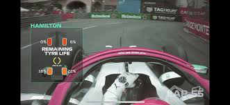
Tire usage/life again?
Hope these are better informed.

Member
Posted 23 June 2020 - 07:56
Who comes up with this useless nonsense? 

Member
Posted 23 June 2020 - 08:01
Some marketing guy and his focus groups I suppose.Who comes up with this useless nonsense?

Member
Posted 23 June 2020 - 08:09

Member
Posted 23 June 2020 - 08:16
pointless graphics info not really necessary. What next a G force chart for who pulls the most G's in the race

Member
Posted 23 June 2020 - 08:16
What utter boll**ks.
Time to throw a load of pointless (that might appeal to perhaps 5% of the audience) graphics to try and take peoples attention away from what will be a Merc bloodbath.

Member
Posted 23 June 2020 - 08:18
Big Head Mode?
Hold Up, the Turbo button, and the Steal button at the start of the race? 

Edited by BCM, 23 June 2020 - 08:19.

RC Forum Host
Posted 23 June 2020 - 08:19
I don't get the backlash, the graphics on mid speed / low speed / high speed corners are pretty informative. Seems pretty sensible to start conveying to the audience where exactly time is being gained or lost, which, you know, is a pretty key part of the sport that hardly ever gets any measurable attention.

Member
Posted 23 June 2020 - 08:27
Who comes up with this useless nonsense?


Member
Posted 23 June 2020 - 08:38
Compared to pure sh*t like this...
...these new graphs don't look half bad and might be somewhat informative. Still seems rather unnecessary however. Especially if they end up making 'power' statistics regardless of who has their DRS open like they do in the video... oh and like Ali623 nicely remarked: how at 1:49 in the video the 'dot' on the map is driving the circuit backwards.
And that's the most painful thing about this whole "F1 Insights powered by AWS", that it seems to be F1 insights created by people who lack the insight. Two years ago F1 just went: "Look, we have lots of data. Create something flashy out of it" and since then a bunch of people who had never heard of the sport have been coming up with the most useless graphs hoping that at some point something sticks. It's so noticeable.
Edited by Lights, 23 June 2020 - 09:31.

Member
Posted 23 June 2020 - 08:44
I don't get the backlash, the graphics on mid speed / low speed / high speed corners are pretty informative. Seems pretty sensible to start conveying to the audience where exactly time is being gained or lost, which, you know, is a pretty key part of the sport that hardly ever gets any measurable attention.
After last year's fiasco it's very difficult for me to trust these graphics. And already it seems like they won't be giving us the raw data, but instead their own x.x/10 rating, which is useless.
And why did they use a picture of Vettel crawling back to the pits with a broken front wing in Monza as part of their example 
 Nonsensical
Edited by TomNokoe, 23 June 2020 - 08:47.

Administrator
Posted 23 June 2020 - 08:50
I'm not a big fan of intrusive on-screen graphics. But if they can get these to work properly I think they could add something to the broadcast.
I'm listening on the radio anyway so they certainly won't be adding anything for me.
Member
Posted 23 June 2020 - 09:02

Racing Sims Forum Host
Posted 23 June 2020 - 09:05
I feel like a lot of this stuff would be better served on some sort of live timing app. On screen I'd rather just see the timing tower to see the race order, a label to show who we're watching if the focus switched to them, a lap counter and a few simple things such as a lap timer for practice and qualifying (with splits) or live gaps to the nearest cars in the race. Notifications of penalties or when someone enters the pits too.
Member
Posted 23 June 2020 - 09:08
The fact they have a car going backwards around Catalunya on the video pretty much sums up how much 'insight' the people who come up with these things have...
Member
Posted 23 June 2020 - 09:10
In fairness though, this could be pretty interesting if the data is actually accurate (unlike that horrible tyre-life stuff they had last year)

Member
Posted 23 June 2020 - 09:23
Advertisement

Member
Posted 23 June 2020 - 09:28
Oh that's hilarious....
"which car can power away down the straights".......shows a clip of a Red Bull overtaking a Ferrari using DRS, anyone with a basic knowledge will know the Red Bull would get eaten alive in a straight-line race without DRS or a tow.
Well, I guess it keeps someone in the job.
Edited by TheMidnight, 23 June 2020 - 09:49.
Member
Posted 23 June 2020 - 09:29
Better said; who comes up with this nonsens but takes away the thermal camera? That was interesting to see. Graphs are not.
They should merge the footage from the thermal camera with the live feed of the car through the normal camera. ie just show the heat map across the tyre and leave the rest of the on board footage as normal imagery. That would be cool.
Edited by BCM, 23 June 2020 - 09:30.

Member
Posted 23 June 2020 - 09:32
Its a sad reflection of where the sport is that Liberty believe the fans need additional information to keep them entertained and stop them from switching channel. If the track action was good enough we wouldn't need all the rubbish.
Member
Posted 23 June 2020 - 09:33

Member
Posted 23 June 2020 - 09:34
I like it.
It's good that they try new things and with the use of "big data" they can find some interesting information in there as well. Change is good, bring it.
Member
Posted 23 June 2020 - 09:38
They should merge the footage from the thermal camera with the live feed of the car through the normal camera. ie just show the heat map across the tyre and leave the rest of the on board footage as normal imagery. That would be cool.
That would make for a better addition than for these useless stats that are being sponsored by AWS. Its just a marketing tool and to promote the "look at what we can do", they spit out graphs that really nobody needs or wants. performance in corners is handicapped if one is tailing behind another car. Of course the front car will always have the better rating. How incredible useless this is going to be. Better show Erja Hakkinen or Toto Wolf the entire race.
Member
Posted 23 June 2020 - 09:47
After last year's fiasco it's very difficult for me to trust these graphics. And already it seems like they won't be giving us the raw data, but instead their own x.x/10 rating, which is useless.
And why did they use a picture of Vettel crawling back to the pits with a broken front wing in Monza as part of their example

Member
Posted 23 June 2020 - 09:49
That would make for a better addition than for these useless stats that are being sponsored by AWS. Its just a marketing tool and to promote the "look at what we can do", they spit out graphs that really nobody needs or wants. performance in corners is handicapped if one is tailing behind another car. Of course the front car will always have the better rating. How incredible useless this is going to be. Better show Erja Hakkinen or Toto Wolf the entire race.
Member
Posted 23 June 2020 - 09:57
How do you know it'll be measured whilst they're behind another car, and not on free air?
Why shouldn't the measure behind another car be relevant anyway, since it can theoretically be used to show us just how much laptime can be lost because of it and in which sections?
Because there is a very high probability that they just munch all the data from the previous x laps and spit out this graph as a comparison between numbers 1 2 and 3 in a race. Which in turn makes it a certainty that the data will not be very accurate as there will always be traffic or number 3 tailing number 2. And still, it wouldnt show how much laptime there is lost. As it is irrelevant data with no benchmark as to how the car of number 3 reacted in a normal way.
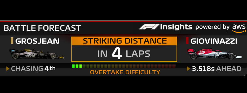
As said, these graphs are hardly ever accurate. The "x laps till striking distance" was such a gem also. Or how about the "x% chance on overtaking"? AWS and Liberty have thrown dog **** at us with these graphs one too many times before. I dont like them as they will never be accurate. Despite Liberty and AWS trying to convince us its accurate data to the tenth.

Member
Posted 23 June 2020 - 09:57
Again for us in this forum it's probably a bit laughable as I'd hope our level of knowledge is probably a bit beyond the simplistic stats, however, if F1 wants to attract more fans then any simple bits of data that makes things more accessible to the newer fans while not taking anything away from other more seasoned fans should be welcomed.
Member
Posted 23 June 2020 - 10:09
Because there is a very high probability that they just munch all the data from the previous x laps and spit out this graph as a comparison between numbers 1 2 and 3 in a race. Which in turn makes it a certainty that the data will not be very accurate as there will always be traffic or number 3 tailing number 2. And still, it wouldnt show how much laptime there is lost. As it is irrelevant data with no benchmark as to how the car of number 3 reacted in a normal way.
As said, these graphs are hardly ever accurate. The "x laps till striking distance" was such a gem also. Or how about the "x% chance on overtaking"? AWS and Liberty have thrown dog **** at us with these graphs one too many times before. I dont like them as they will never be accurate. Despite Liberty and AWS trying to convince us its accurate data to the tenth.
Administrator
Posted 23 June 2020 - 10:15
It's the old "Garbage In, Garbage Out" dilemma, right? If the computer models can't account for drivers being stuck in traffic, or the likely effect of tyre wear, or any of the other things that stop races from unfolding in a simple, linear way, then the forecasts they spit out won't be useful. The technical people will be aware of this (Nick Smedley, who's quoted in the F1.com article, knows more about race strategy than 99% of us) but whether they can solve the problem with the tools they've got to hand is the big question.
Member
Posted 23 June 2020 - 10:19
No idea what on earth was "last years fiasco". Must have been something pretty big since I have absolutely no recollection of it at all.
Why are you guys complaining about the sample images, for god's sake it's just random footage, it doesn't matter, it doesn't mean they'll show these graphics at these times.
It sounds like I'm just reading a full thread of "old men yelling at clouds" (I'd post the Simpsons image but I'm on mobile and can't be arsed). Grrrr, change, we don't like it, etc.

Member
Posted 23 June 2020 - 10:20
Member
Posted 23 June 2020 - 10:23
Member
Posted 23 June 2020 - 10:26
This just makes F1 a numbers game to the uninformed viewer, and will only lead to questions when a slower car overtakes a faster car and its seemingly a mathematical impossibility. What's the graphic for that? Or when wet races skew the data. This is too much black and white there's no real driver variability or account for randomness.
Its like Mario kart. I can already here that guy from beyond the grid excruciatingly advertising this in the next podcast.
Edited by danmills, 23 June 2020 - 10:29.

Member
Posted 23 June 2020 - 10:30
Indeed - this looks like a far more informative version of the existing "Apex speed at Turn X" graphic.
I was worried that the last iteration of Amazon-sponsored graphics would be intrusive and distractive, but in the end they were fine for me. Hopefully the usage level of this new generation will achieve the same result.
Amazon Intrusive? Distractive? Say it isn't so!
I'll keep an open mind until I see this this during the first race, but upon first glance it's just needless gimmickry. And as with anything that Amazon gets involved involved in there's always an underlying motive.
Member
Posted 23 June 2020 - 10:41

Member
Posted 23 June 2020 - 10:43
[rant]
When digital TV broadcast was first announced, I envisaged a future where we would have the live pictures broadcast and all sorts of applicable graphics that the viewer to turn on or off using their remote control (the clock in breakfast programs, the 'ticker' on news channels, the questions in quiz shows,, the stats in sports presentations etc). I still don't understand why, decades later, this is not the case. It's surely not rocket science to achieve this. What is the point of digital broadcasting if you don't get more control over what appears on your screen?
[/rant]
Member
Posted 23 June 2020 - 10:55
Let's see how it works first. Personally I think it'll be most useful in qualifying or even free practice.
See, I don't mind those graphs. They just do automatically for me the calculations I've made mentally for years by looking over at live timing. Driver A is catching driver B at 1 second per lap, there's 10 laps to go, he's 8 seconds behind, holy crap he'll catch him before the end. The graph just does this without having to make me look at live timing and potentially at a calculator. It also allows to pass this information to the more casual viewers who aren't gonna do math whilst they're sitting on the couch chilling watching a race.
That's all it is. I don't get the moaning it's "not accurate". You can't predict the future accurately. More often than not... The driver that's catching the guy in front runs out of tyres and starts winning only 3 tenths per lap rather than the second per lap he was winning earlier. Want the computer to predict that accurately? Oh and if the computer starts predicting that accurately, then you've just ruined the unpredictability of the race.
Advertisement
Member
Posted 23 June 2020 - 10:57
God help us, the US needless uninformative statistic epidemic is upon us. For Pete's sake, what is the use of getting a score for over- or understeer when our eyes inform us what is going on?
Member
Posted 23 June 2020 - 11:10

Member
Posted 23 June 2020 - 11:25
 Now this was awesome, and totally realistic

Member
Posted 23 June 2020 - 11:33
lol as if you can pick anything other than a big slide with your eyes.
Can your eyes also identify a change in balance over a stint? or how it changes with traffic? Or extract trends in balance between different tracks and/or high and low speed corners?
All while you are concentrating on the running order and pitstops?
Let me answer that for you. NO.
Are you telling me you can't see from the onboard cameras when a car is pushing mid cornenr and the driver can't get on the throttle as soon as he would like? Or when a driver has to do more correction on the exit of the corner because his rear tyers are starting to go off?
We get so many onboard camera shots of pretty much every car now through out the race and with overlaid throttle, RPM, brake and KMH that you should be able to put 2 and 2 together.

Member
Posted 23 June 2020 - 11:40
Member
Posted 23 June 2020 - 11:43
Are you telling me you can't see from the onboard cameras when a car is pushing mid cornenr and the driver can't get on the throttle as soon as he would like? Or when a driver has to do more correction on the exit of the corner because his rear tyers are starting to go off?
We get so many onboard camera shots of pretty much every car now through out the race and with overlaid throttle, RPM, brake and KMH that you should be able to put 2 and 2 together.
Member
Posted 23 June 2020 - 12:01
Member
Posted 23 June 2020 - 12:06
This is an insult to us, they're treating motorsport fans like idiots.
Member
Posted 23 June 2020 - 12:10
Cause you can eyeball track position specific balance and grip performance of 20 cars simultaneously while enjoying the race?
Puleeeezzzz you guyyys.
The point is NO ONE cares about that.
Member
Posted 23 June 2020 - 12:13
This is an insult to us, they're treating motorsport fans like idiots.
No, they are treating idiots like idiots - this is not designed for the likes of us at all. But we do not get the option to turn it off.
Member
Posted 23 June 2020 - 12:14
Cause you can eyeball track position specific balance and grip performance of 20 cars simultaneously while enjoying the race?
Puleeeezzzz you guyyys.


© MOTORSPORT NETWORK 2025. All rights reserved. Community Forum Software by IP.Board
