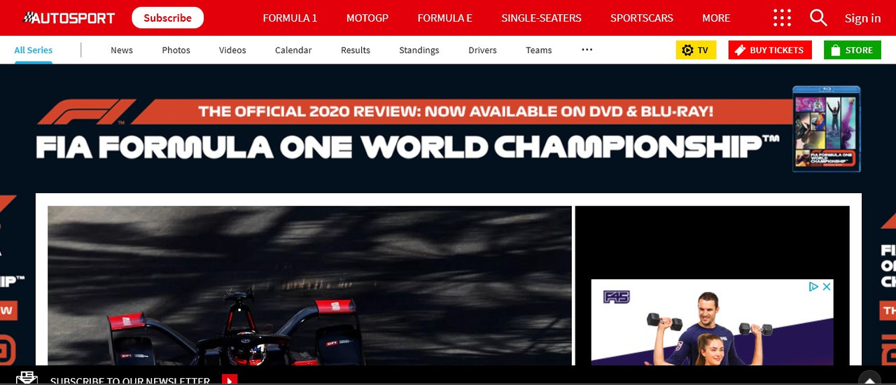
Is it just me or is anyone else seeing the new look on the Autosport news page? It looks...incomplete? Is this WIP or a new design direction?
Edited by BRK, 03 March 2021 - 13:10.

Member
Posted 03 March 2021 - 13:10
Is it just me or is anyone else seeing the new look on the Autosport news page? It looks...incomplete? Is this WIP or a new design direction?
Edited by BRK, 03 March 2021 - 13:10.
Advertisement

Member
Posted 03 March 2021 - 13:16
I'm getting the new look pages. WIll take a little getting used to but the change isn't drastic. I've not seen anything to dislike....so this isn't like the Facebook makeover....

Administrator
Posted 03 March 2021 - 13:26
It's essentially the same style-sheet as motorsport.com - who are of course the current owners of the site.
They're both now hosted on the same server in Germany.

Member
Posted 03 March 2021 - 13:36
It looks decent.
Every time this site evolves its look, people complain.
Usually this isn’t because it’s worse, it’s just because it’s unfamiliar.

Member
Posted 03 March 2021 - 13:47
Haha indeed, just like at work whenever a new database is introduced and the entire organisation is up in arms at how awful it is, and one week later nobody is even talking about it.
Edited by Imperial, 03 March 2021 - 13:48.

Administrator
Posted 03 March 2021 - 14:02
Not sure the fonts are quite right.
Good to see the Forum link up there in the top menu, on desktop and mobile. 

Member
Posted 03 March 2021 - 15:10
Not sure the fonts are quite right.
Good to see the Forum link up there in the top menu, on desktop and mobile.
Am I seeing the same thing Risil? For me the Forum link has gone from the Autosport front page, only accessible through 'More'. Just a single extra click, so no big deal. I use a relatively small screen with my desktop so will this have restricted the visible, one-click options?
Administrator
Posted 03 March 2021 - 15:21
Am I seeing the same thing Risil? For me the Forum link has gone from the Autosport front page, only accessible through 'More'. Just a single extra click, so no big deal. I use a relatively small screen with my desktop so will this have restricted the visible, one-click options?
Sounds about right. Looks like the header options on the right get turned into "More" depending on how wide your browser window is.
Administrator
Posted 03 March 2021 - 17:02
I have a 24" screen here. At 100% magnification there's a white margin both sides and I see the forum link, but it goes to 'more' if I increase it to 110% - I have to go to 120% to fill the whole screen, at which point 'other series' disappears as well. At 170% all the links disappear!

Member
Posted 03 March 2021 - 17:03
Edited by Silberpfeil, 03 March 2021 - 17:04.
Member
Posted 03 March 2021 - 17:14
I'm not complaining, just sharing feedback. I called it incomplete in the OP because I see a lot of white, blank spaces everywhere (including the login landing page), and the content tiles don't appear fully aligned? The 'Plus' features are getting lost against the backdrop. I'm no tech guy but it looks like it could be a CSS styling thing.
Edited by BRK, 03 March 2021 - 17:17.

Member
Posted 03 March 2021 - 17:52
Could be a cache thing with the CSS. Do a hard refresh (shift and F5).

Member
Posted 03 March 2021 - 23:50
What a complete mess!
It's just a mass of pictures shouting for attention, there's no easy logic to navigate without going back to the top menus every time. On the phone it's even worse, as all the large pictures take up all the real estate.
Also, they yet again (3rd time in a month) managed to make my account invalid so I had to think of yet another password for yet another reset.

Member
Posted 04 March 2021 - 00:25
I have a familiar dislike for the massive wasted space on the sides of the screen, it's not great @ 1080p but horrendous @ 4K (the BBC are guilty of it too) but my main issue is that the "profile" pic on the "autosport.com/f1" page is a stinking ferrari!!! 
On the flipside I had no issues logging into the site, not password issues or anything like that. Is there a dark mode coming? My eyes would seriously thank you for that.

Member
Posted 04 March 2021 - 08:31
There's so much wasted space. There is a single trending article from Sept 2010. The news section on the homepage is just 'in the middle' somewhere. Te fonts are too small. The images are too dominating. Thew news filter just looks confusing too. It's a mess.

Member
Posted 04 March 2021 - 16:41
The desktop-page is fine. I would like a dark-mode though, as it is very white.
The website on phone is absolutely awful. It's not yet motorsport.com with their very shady ads under each article, but man this is an awful design!
Member
Posted 05 March 2021 - 17:19
The wasted space is nowhere near as bad as Facebook. That is still totally unusable as far as I'm concerned. Autosport seems to work OK on all my devices. I'm neither/nor on this. I don't see any specific pros or cons to the redesign.
Member
Posted 11 March 2021 - 21:01
Mobile menu on desktop now. That's a bit lazy.
Member
Posted 12 March 2021 - 04:10
This has got to be an average looking website / UX at best by any objective standard, surely -
Edited by BRK, 12 March 2021 - 04:14.
Advertisement
Administrator
Posted 14 March 2021 - 20:33

Member
Posted 14 March 2021 - 20:47
It kind of hides the forum a bit. You have to hover a menu to find the forum option
Member
Posted 14 March 2021 - 20:53
The new look still forces you to go back to the homepage to access F1 Live, will probably be the same for driver ratings.
Member
Posted 14 March 2021 - 23:35
One bonus of the new site seems be that it's cured my problem of being continually logged out.
I'm not able to log in 

Member
Posted 21 March 2021 - 23:42
Quite a few missing links, for example the calendar links are all missing content:
https://www.autosport.com/f1/schedule/
https://www.autospor...edule/upcoming/
https://www.autospor...m/f1/standings/

Member
Posted 23 March 2021 - 20:05
It really does look like the CSS only half loaded. 

Why is half the page white?? Why do I see a massive black box in place of where a article would be?? Why does the article fonts look like Times New Roman or something, which then clash with the other more modern fonts? Actually there's like 5 fonts here and they all clash with one another??
I tried SHIFT+F5, I've tried disabling Adblock to see if it'd fill all the empty spaces with ads, nothing.
Edited by noikeee, 23 March 2021 - 20:06.

Member
Posted 24 March 2021 - 10:33
With ADBlock Off and the Site White Listed, using Firefox on a Windows 10 Laptop this how it displays for me.
Edited by YoungGun, 24 March 2021 - 10:33.
Member
Posted 24 March 2021 - 14:18
I like how I reach the 3 monthly free articles randomly at any point during a month/"month". And it both tells me to subscribe, or try a 30-day trial, which both are useless as I cannot log in at all 
Member
Posted 24 March 2021 - 21:46
The F1 season is about to begin, and the calendar isn't available - that was a big part of the reason I use and subscribe to Autosport, because it gave me local times for upcoming races. Now, its not available at all - "Sorry to disappoint you" is all I get.

Member
Posted 29 March 2021 - 14:48
The F1 season is about to begin, and the calendar isn't available - that was a big part of the reason I use and subscribe to Autosport, because it gave me local times for upcoming races. Now, its not available at all - "Sorry to disappoint you" is all I get.
Member
Posted 07 April 2021 - 03:21
The F1 season is about to begin, and the calendar isn't available - that was a big part of the reason I use and subscribe to Autosport, because it gave me local times for upcoming races. Now, its not available at all - "Sorry to disappoint you" is all I get.
More than 2 weeks later and the calendar is still showing an error page.
Seriously?
Laughing stock. Did anyone actually QA or UAT the new website before it went live? If so, someone should revisit their sign off...

RC Forum Host
Posted 07 April 2021 - 07:07
More than 2 weeks later and the calendar is still showing an error page.
Seriously?
Laughing stock. Did anyone actually QA or UAT the new website before it went live? If so, someone should revisit their sign off...
I am not sure how widespread your experience is - it's working for me:

The above screenshot is what I see using windows 8.1 and Chrome.
Are you signed into the website? I'm not even sure if that makes a difference but I'm puzzled.
Member
Posted 07 April 2021 - 07:35
Member
Posted 07 April 2021 - 07:50
richardprice, your link works fine for me. No errors here on my end and I am using Chrome 89, Windows 10.
Member
Posted 10 April 2021 - 21:25
Member
Posted 09 May 2021 - 22:03
So, an update on my issue - its definitely an issue with the website.
I get the same error in both normal mode in Edge, and in InPrivate mode in a new tab.
If I clear all website storage, including cookies, local storage etc, and refresh the page, then after 2 refreshes I stop getting the "Sorry to disappoint you" error and instead get the calendar. However, this also logs me out of the site (obviously), so I log back into the site and ... I get the "Sorry to disappoint you" error again.
Can reproduce this on demand.
Member
Posted 07 November 2021 - 09:11


© MOTORSPORT NETWORK 2024. All rights reserved. Community Forum Software by IP.Board


