Jump to content


Photo
- - - - -

What makes a "backmarker" livery?


  • Please log in to reply
131 replies to this topic

#1 PayasYouRace

PayasYouRace
  • Racing Sims Forum Host

  • 46,284 posts
  • Joined: January 10

Posted 05 March 2021 - 14:39

So it happens every launch season, so I want to find out the thinking here. What makes a car "look like a backmarker" just from its livery?


Some comments from the Haas and Williams threads, with varying levels of cynicism.


This car has backmarker written all over itself.

Schumacher will suffer what Russell did for the last few seasons now.


amazing, true backmarker spirit


True backmarker aesthetics are something to relish and savor with all your soul.


So is it a particular combination of colours? A particular pattern?


Usually, the hallmarks of a backmarker are a lack of sponsorship, often a single colour livery with space for future logos. But we've also seen backmarkers plastered with sponsor stickers, or with full sponsor liveries. Telefonica Minardis come to mind. The converse has also been seen. The Brawn livery was as basic as it got, but the car was rapid.


I'm hoping for something a bit more solid than what I suspect is actually just a cheap insult because you don't like the team or think they're crap. If you're going to post examples, please explain what makes the livery look like a backmarker, and what you'd change to make it look like a winner.


Advertisement

#2 Cyanide

Cyanide
  • Member

  • 5,312 posts
  • Joined: October 11

Posted 05 March 2021 - 14:40

Anything that looks like this year's Williams and Haas. 


#3 Lights

Lights
  • Member

  • 17,875 posts
  • Joined: February 10

Posted 05 March 2021 - 14:42

It's when you know the car will be a backmarker so it's easy to call it a backmarker livery.


#4 Risil

Risil
  • Administrator

  • 61,738 posts
  • Joined: February 07

Posted 05 March 2021 - 14:43

Sometimes there are design elements that look cheap, or last-minute, that in a snap judgement you take to mean the lack of better alternatives that are the essence of being a backmarker. To take a classic example, the tiny Pennzoil logo on the 1997 Lola's giant sidepod:

F1Lola1997.jpg


#5 ensign14

ensign14
  • Member

  • 61,944 posts
  • Joined: December 01

Posted 05 March 2021 - 14:45

open-uri20120928-15429-1j4fmu.jpg


Classic example of scraping together a budget by getting hold of a grab-bag of sponsors.  These were all Boutsen's personal bods clubbing together for a one-off drive at Belgium that morphed into something more substantial. The 1983 Arrows started out plain white and the sponsors changed on a race-by-race basis towards the close of the season.


Edited by ensign14, 05 March 2021 - 14:47.


#6 Cyanide

Cyanide
  • Member

  • 5,312 posts
  • Joined: October 11

Posted 05 March 2021 - 14:46

On a more serious note however, to me at least both liveries (Haas and Williams) contain elements that look dirt cheap. The Haas features the Russian flag, while the Williams simply uses the generic 'let's split the car into two colors' approach. Also, the Williams seems to have lost quite a few sponsors in comparison to last year, what happened?

And yeah, the white doesn't help either of them. When there are so few sponsors on both cars, it just makes them look naked and poor basically. 


Edited by Cyanide, 05 March 2021 - 14:48.


#7 Risil

Risil
  • Administrator

  • 61,738 posts
  • Joined: February 07

Posted 05 March 2021 - 14:47

Sometimes of course you get a beautiful or harmonious livery on a very slow car, which at least makes you tut and say "that team deserves better". I mean, the Footwork-Porsche looked nice, didn't it?

b394b4c8e0699c08a985cefc89e7b413.jpg


#8 PayasYouRace

PayasYouRace
  • Racing Sims Forum Host

  • 46,284 posts
  • Joined: January 10

Posted 05 March 2021 - 14:49

Sometimes of course you get a beautiful or harmonious livery on a very slow car, which at least makes you tut and say "that team deserves better". I mean, the Footwork-Porsche looked nice, didn't it?

b394b4c8e0699c08a985cefc89e7b413.jpg


I think the 1992 car looked even nicer (with the Jordan style nose)


40aa765679d70939ef8c09d8564010b9.jpg


#9 Risil

Risil
  • Administrator

  • 61,738 posts
  • Joined: February 07

Posted 05 March 2021 - 14:50


Classic example of scraping together a budget by getting hold of a grab-bag of sponsors.  These were all Boutsen's personal bods clubbing together for a one-off drive at Belgium that morphed into something more substantial. The 1983 Arrows started out plain white and the sponsors changed on a race-by-race basis towards the close of the season.


I imagine that if Sherlock Holmes had been born 100 years later and been in the F1 paddock he could've looked at the liveries and told you the precise commercial situation and history of every car on the grid.


#10 DeKnyff

DeKnyff
  • Member

  • 5,358 posts
  • Joined: November 13

Posted 05 March 2021 - 14:52

I think the 1992 car looked even nicer (with the Jordan style nose)


40aa765679d70939ef8c09d8564010b9.jpg


In fact, that livery is not too different from the all-winning Marlboro McLaren's of the time.


#11 noikeee

noikeee
  • Member

  • 23,218 posts
  • Joined: February 06

Posted 05 March 2021 - 14:53

No dominant colour or theme / too many colours.
Either very bare of sponsors (too much empty space, specially if it's white) or the opposite, too many sponsor stickers all with its own different colours.
Reminiscent of prior backmarker colour schemes (ex mid 90s Minardis)

Edited by noikeee, 05 March 2021 - 14:54.


#12 Frood

Frood
  • Member

  • 9,243 posts
  • Joined: January 14

Posted 05 March 2021 - 14:54

To be honest, the only think I can think of that would scream "backmarker" is having a filler sponsor à la the 2011 Hispania "THIS IS A COOL SPOT", "THIS COULD BE YOU!" etc.

Other than that, acres of blank space.

Can be inverted, of course. The 2009 Brawn is the epitome of low-budget, backmarker livery.

#13 ensign14

ensign14
  • Member

  • 61,944 posts
  • Joined: December 01

Posted 05 March 2021 - 14:54

So is it a particular combination of colours? A particular pattern?
 

There are not many front-grid cars whose colour schemata have not looked like there was some thought into integrating different design elements.


Whereas someone like Osella just seemed to get whatever stickers were in the shop that day.


Take a look at this one from 1983 for instance...


9x6-Photograph-Piercarlo-Ghinzani-F1-Ose


...their desperate sponsor search imposed on the nosecone to the extent that there was not enough room for the number, so they had to stick it skew-wiff on the wing to make it fit.


And then in 1986...


Ghinzani-Brazil-1986.jpg


...they had to beg a few number stickers from Ferrari.


#14 Burai

Burai
  • Member

  • 1,896 posts
  • Joined: February 07

Posted 05 March 2021 - 14:56

When it looks like it was designed to fit sponsors who'll never actually materialise. Bonus points if it's a continuation of the livery you had before the sponsors disappeared or evoking a classic livery from when you had money. Empty spaces, numbers or drivers names where logos used to be. Tragic.


Good examples are Brawn 2009, McLaren 2015-17, Williams 2011-13, Prost 2001, Jordan 2003-05, Minardi 2005.


#15 messy

messy
  • Member

  • 7,491 posts
  • Joined: October 15

Posted 05 March 2021 - 14:58

Mishmash of colours, designs etc without any real flair or sense that it’s been carefully thought out. Lack of sponsors, basic looking car, probability of car being slow. Put all these together and voila, a 2021 Williams or Haas.

#16 GiorgioF1

GiorgioF1
  • Member

  • 1,711 posts
  • Joined: December 17

Posted 05 March 2021 - 15:00

Because it looks cheap as hell. There's no flow. A mish-mash of styles. It doesn't even look complete if You look at the sidepods etc. It's a mess. You'd never see something like that on a Mercedes, Aston, Alpine etc. If they wanted to experiment with some lines or stripes they could've painted the car this way:


62a8b56c060e3508c3a09725d3f11156.jpg


It would look modern and aggressive instead of randomly generated.


Edited by GiorgioF1, 05 March 2021 - 15:00.


#17 DoodoolTalla

DoodoolTalla
  • Member

  • 393 posts
  • Joined: June 10

Posted 05 March 2021 - 15:01

The Jordan and Minardi's of the naughties. Lots of small sponsors plastered all over the car. Ironically that's how McLaren looks these days  :lol:


#18 Risil

Risil
  • Administrator

  • 61,738 posts
  • Joined: February 07

Posted 05 March 2021 - 15:01

Good examples are Brawn 2009, McLaren 2015-17, Williams 2011-13, Prost 2001, Jordan 2003-05, Minardi 2005.

 
I think Jordan retained B&H sponsorship (hence the yellow) until 2004 and perhaps even 2005, judging from the "BE ON EDGE" stickers from that year's photos.


#19 DeKnyff

DeKnyff
  • Member

  • 5,358 posts
  • Joined: November 13

Posted 05 March 2021 - 15:01

There are not many front-grid cars whose colour schemata have not looked like there was some thought into integrating different design elements.


I think neither the Williams of the late 80s and early 90s, nor the Renaults of the Alonso era looked like an integrated design.


Advertisement

#20 messy

messy
  • Member

  • 7,491 posts
  • Joined: October 15

Posted 05 March 2021 - 15:06

Because it looks cheap as hell. There's no flow. A mish-mash of styles. It doesn't even look complete if You look at the sidepods etc. It's a mess. You'd never see something like that on a Mercedes, Aston, Alpine etc. If they wanted to experiment with some lines or stripes they could've painted the car this way:
 
62a8b56c060e3508c3a09725d3f11156.jpg
 
It would look modern and aggressive instead of randomly generated.


That is a million times better.

#21 Cornholio

Cornholio
  • Member

  • 895 posts
  • Joined: March 16

Posted 05 March 2021 - 15:09

 
I think Jordan retained B&H sponsorship (hence the yellow) until 2004 and perhaps even 2005, judging from the "BE ON EDGE" stickers from that year's photos.


They did but IIRC the size of the sponsorship was significantly reduced from 2002 (which they covered the first year with DHL title sponsorship)


#22 Risil

Risil
  • Administrator

  • 61,738 posts
  • Joined: February 07

Posted 05 March 2021 - 15:11

I think neither the Williams of the late 80s and early 90s, nor the Renaults of the Alonso era looked like an integrated design.


I'm glad you mentioned that, the Renault/ING mashup in particular was bizarre albeit expensive-looking. As I think you're saying though, not part of the true back marker aesthetic, if such a thing exists.

#23 ensign14

ensign14
  • Member

  • 61,944 posts
  • Joined: December 01

Posted 05 March 2021 - 15:15

I think neither the Williams of the late 80s and early 90s, nor the Renaults of the Alonso era looked like an integrated design.

They were trying to integrate too many elements.  The South African flag is interesting because it has the most colours of any national flag (not counting very tiny details), but it is an excellent coherent design.  Compare it to Mozambique's.


#24 William Hunt

William Hunt
  • Member

  • 11,067 posts
  • Joined: July 01

Posted 05 March 2021 - 15:16

In fact, that livery is not too different from the all-winning Marlboro McLaren's of the time.


I always liked that Footwork livery


#25 Burai

Burai
  • Member

  • 1,896 posts
  • Joined: February 07

Posted 05 March 2021 - 15:36

They did but IIRC the size of the sponsorship was significantly reduced from 2002 (which they covered the first year with DHL title sponsorship)


Yeah, EJ was handing out space just to have any money coming in after DHL buggered off and the Vodafone deal fell through.


The nadir was 2003, when he got, IIRC, a Ford dealership to sponsor their year-old customer Cosworth engines so they could legitimately run with Ford logos to trick sponsors into thinking they had factory backing. His long term plan was to convince Ford he could run a works team better and cheaper than Jaguar so they'd pull the plug on Milton Keynes and give him the money instead.


Safe to say, it didn't work out.


#26 ensign14

ensign14
  • Member

  • 61,944 posts
  • Joined: December 01

Posted 05 March 2021 - 15:40

To be fair he did run a team better and cheaper than Jaguar.


#27 Imperial

Imperial
  • Member

  • 4,820 posts
  • Joined: February 02

Posted 05 March 2021 - 15:44

What makes a backmarker livery in 2021 appears to be when the teams haven't even managed yet to finish building even one car on which the livery will run and so are forced to release awful video-game looking renderings.


.

Edited by Imperial, 05 March 2021 - 15:45.


#28 PayasYouRace

PayasYouRace
  • Racing Sims Forum Host

  • 46,284 posts
  • Joined: January 10

Posted 05 March 2021 - 15:58

 
I think Jordan retained B&H sponsorship (hence the yellow) until 2004 and perhaps even 2005, judging from the "BE ON EDGE" stickers from that year's photos.


You're right. They certainly did.


#29 PayasYouRace

PayasYouRace
  • Racing Sims Forum Host

  • 46,284 posts
  • Joined: January 10

Posted 05 March 2021 - 16:01

Because it looks cheap as hell. There's no flow. A mish-mash of styles. It doesn't even look complete if You look at the sidepods etc. It's a mess. You'd never see something like that on a Mercedes, Aston, Alpine etc. If they wanted to experiment with some lines or stripes they could've painted the car this way:


62a8b56c060e3508c3a09725d3f11156.jpg


It would look modern and aggressive instead of randomly generated.


See this is why I'd like a more coherent answer. To me that looks really amateur and is a right mess.


#30 Cyanide

Cyanide
  • Member

  • 5,312 posts
  • Joined: October 11

Posted 05 March 2021 - 16:06

Because it looks cheap as hell. There's no flow. A mish-mash of styles. It doesn't even look complete if You look at the sidepods etc. It's a mess. You'd never see something like that on a Mercedes, Aston, Alpine etc. If they wanted to experiment with some lines or stripes they could've painted the car this way:


62a8b56c060e3508c3a09725d3f11156.jpg


It would look modern and aggressive instead of randomly generated.


I think when fans put a lot more effort into designs like this and they look infinitely better than the original, it pretty much says it all about how lazy the real designers of the livery are. 


#31 OvDrone

OvDrone
  • Member

  • 16,165 posts
  • Joined: January 13

Posted 05 March 2021 - 16:14

Ah, what a wonderful topic PYR; thank you ^^


All these liveries have some incredible edge of ambiguity about them. Like the people ( hopefully they were made by actual persons, even though you might somehow doubt it ) used the most artificial default hues around and said 'Enough.'

Not 'Good' - 'Yeah, that's Enough.'


JF24936_2020021235804986_20200212053521.


It's all fascinating really. It's like one of those eco detergents made somewhere in Germany that really want to emphasize the anti-bacterial properties over anything else. Or like a box of printer-ink for your 2005-esque Epson printer.

Think of those chips at Lidl or Target. Ya know, the ones without a brand ( not even the store's own brand ) that are half of your usual cheap chips brand. Those bags of this blue or that red that say CHIPS or SALTED POTATO CHIPS on them. Their ingredients are only salt, oil and potatoes. Allegedly.

They are actually good (?), with a lot of quantity but c'mon, we all know it's just enough.


One of the main elements is an overzealous use of completely uninspired white/grey/black with generic other color thrown over in a box shape or whatever. The sponsor need to be as small as possible in very niche, auxiliary placements. Like they are desperately waiting for a main one to phone them up any day now, so they won't dare to fill up the center space.


Let's look at Nascar for example. You might argue that Stewart-Haas have some backmarker aesthetics going on there but no, the colors, even if ridiculously bland, still cohere and interact with each other in a vague productive way. Larson's new #5 Hendricks ride is extremely close to full backmarker aesthetics but narrowly dodges it. McDowell though - wow his Daytona 500 #34 Ford is OG backmarker aesthetics.


1bf7a0c5814084c2f17159416e4e0076.jpg


2101HH2379.jpg


NASCAR+Cup+Series+Bass+Pro+Shops+Night+R


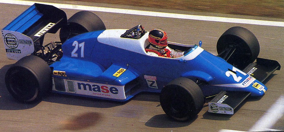
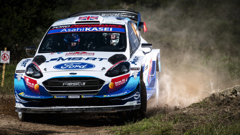
Other close examples are the Hyundais, Toyotas and Fords in WRC now. Dangerously close but their corporate r&d style soullessness saves them from this fate. Like the last great WEC era of a couple of years ago with the LMP1s. Godawful but insanely slick corporate nonsense going on there that somehow mirrors the time put in to make those look so completely edgeless.


SI202010080413_hires_jpeg_24bit_rgb-777x


wec-shanghai-2015-17-porsche-team-porsch


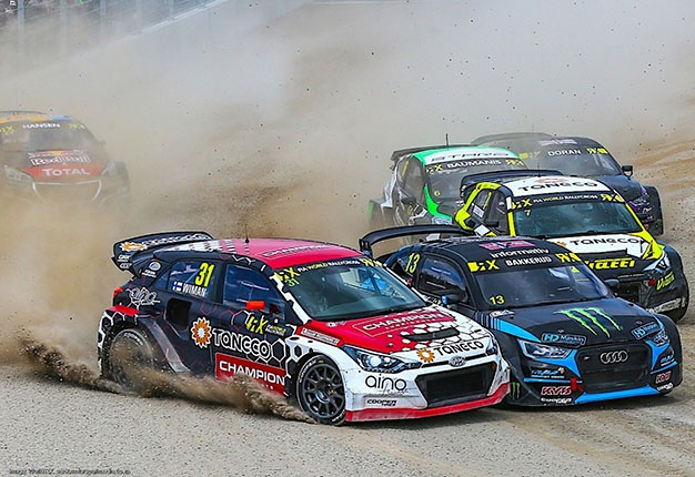
I think that most of the World Rallycross grid of the past 1 or 2 seasons have these aesthetics pretty much nailed down.


46797f913c9e41f599b7ef8bd7d695ce.jpg


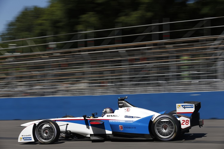
One thing that immediately springs to mind is the Formula E 2014 / 2015 inaugural grid. It's FULL of peak backmarker aesthetics.


trulli-car.jpg


formula-e-july-donington-park-test-2014-


andretti-buenos-aires-practice.jpg


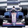
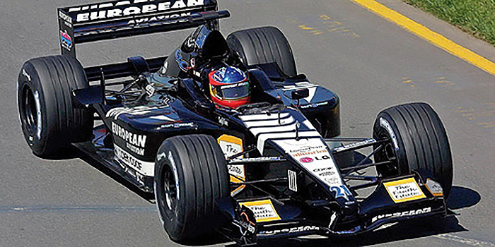
There's something about this incredible unassuming aura that these designs have that are oh-so fantastic. Why even make something so dull and doubtless ? It's like being too honest in your speech with everyone. People do not respond well to that. You might mean well but you totally miss the mark. Like Williams now.


#32 pacificquay

pacificquay
  • Member

  • 6,266 posts
  • Joined: March 07

Posted 05 March 2021 - 16:17


I'm hoping for something a bit more solid than what I suspect is actually just a cheap insult because you don't like the team or think they're crap. If you're going to post examples, please explain what makes the livery look like a backmarker, and what you'd change to make it look like a winner.

I think it is simply that - people taking an ill informed jibe at a team they don’t like.


It’s the 2020s equivalent of the armchair aerodynamicist who used to post “looks fast” or “looks fat” about car launch pictures.


#33 Burai

Burai
  • Member

  • 1,896 posts
  • Joined: February 07

Posted 05 March 2021 - 16:18

I think when fans put a lot more effort into designs like this and they look infinitely better than the original, it pretty much says it all about how lazy the real designers of the livery are. 


That's not really fair. Fan efforts don't have to worry about things like sponsor placement or size, colour reproduction under different lighting on TV, whether the various stakeholders will all sign off on it, etc.


Sean Bull is one of the few to graduate from "fan designer" to actually working for teams in real life and very few of his real life designs look as exciting as the fantasy stuff he comes up with. That's the reality of having a genuinely blank canvas as opposed to designing to a brief handed down by money men.


Edited by Burai, 05 March 2021 - 16:19.


#34 FirstnameLastname

FirstnameLastname
  • Member

  • 7,874 posts
  • Joined: April 18

Posted 05 March 2021 - 16:55

Like when the base colours/contours have been designed with zero thought to the implementation of the sponsor decals

Or just a lack of sponsor decals. Like Monisha K’s Saubers

#35 Izzyeviel

Izzyeviel
  • Member

  • 3,172 posts
  • Joined: March 16

Posted 05 March 2021 - 17:04

I think when fans put a lot more effort into designs like this and they look infinitely better than the original, it pretty much says it all about how lazy the real designers of the livery are. 

You're not wrong, but I think we fans forget that the livery has to look good for the sponsors in all sorts of light conditions/tv screens etc. The image you quoted, it sure looks great on my computer screen, but it would look awful on a grey day at Silverstone.


#36 TomNokoe

TomNokoe
  • Member

  • 33,626 posts
  • Joined: July 11

Posted 05 March 2021 - 17:27

I think in the Williams instance it's because both the bodywork and livery are very generic, with the livery taking precedence.

But at the same time the Williams livery is actually unique because of how generic it is, so ... :D

Edited by TomNokoe, 05 March 2021 - 17:27.


#37 JHSingo

JHSingo
  • Member

  • 8,950 posts
  • Joined: June 13

Posted 05 March 2021 - 17:29


62a8b56c060e3508c3a09725d3f11156.jpg


I'd really love to know who in the Williams' offices sees these concept designs people have come up with on the internet, then compares them to the mess they've come up with, and thinks "well done lads, we've really hit it out the park with this year's livery." 


#38 Spillage

Spillage
  • Member

  • 10,295 posts
  • Joined: May 09

Posted 05 March 2021 - 17:42

I suppose some backmarker cars have a tendency to look a bit basic and cheap And quite often then have about four million sponsors, none of whom are paying very much  A case in point would the Minardi PS01, which managed to make black and white look messy:


P110010121_N.jpg
 

Really though, it's a 'backmarker livery' if it's slow. There have been plenty of nice liveries on crap cars, and plenty of crap liveries on really fast cars too.


#39 GiorgioF1

GiorgioF1
  • Member

  • 1,711 posts
  • Joined: December 17

Posted 05 March 2021 - 17:44

That's not really fair. Fan efforts don't have to worry about things like sponsor placement or size, colour reproduction under different lighting on TV, whether the various stakeholders will all sign off on it, etc.


Teams like Williams in their current state without title sponsorship have much more flexibility regarding their livery. They could just throw anything good looking on it and I bet Latifis Sofina/Lavazza or Acronis wouldnt mind. The car is barebones sponsorship-wise anyways.


Advertisement

#40 PayasYouRace

PayasYouRace
  • Racing Sims Forum Host

  • 46,284 posts
  • Joined: January 10

Posted 05 March 2021 - 18:43

Ah, what a wonderful topic PYR; thank you ^^


2101HH2379.jpg


NASCAR+Cup+Series+Bass+Pro+Shops+Night+R


Thank you for such a well-thought out response Ov.


I really want to drill down into the differences between these two, because to my eyes there's not a lot to choose between them.


As an aside, I love to while away the time designing liveries on Forza 7. One thing I've learned is that it's a good idea to stick to 3 or 4 colours at most, and let either the logos or the underlying design do the talking, but not both. Otherwise it's just too busy. But I can't relate that into whether it looks like a top team or a backmarker.


#41 Afterburner

Afterburner
  • RC Forum Host

  • 9,205 posts
  • Joined: January 11

Posted 05 March 2021 - 18:52

I think the easiest way to test this would be to get photos of every car, show them to someone who has no experience with whichever series you’re assessing, and ask them to rank the cars from fastest to slowest based solely on paint scheme. I say this because looking at those NASCAR liveries above outside of context I’d have no way of telling you where they ran based on how they looked.

IndyCar is the only series where I do think there are obvious “backmarker” liveries–these are teams whose paint schemes look less-polished and professional, i.e. their car has no “identity” outside of just being painted according to whatever the livery designer thought felt good. You can even see this in the same teams–compare Dale Coyne’s Seal Master car to whatever other one is running with a hodge-podge of sponsors on it and it’s immediately clear which car is getting the focus and probably performing better. (EDIT: As an aside, no offense to Brandz07 meant at all here! I don’t mean to imply that you’re a designer of “backmarker” liveries, just to describe the effect that having multiple changing sponsors can have on the impression of a car’s performance.)

So I guess there is something to this, but only to a point. If you go to a club race event it’s impossible to pick out a pecking order based on livery because almost everyone’s car looks like it was painted in their garage. :lol:

#42 PayasYouRace

PayasYouRace
  • Racing Sims Forum Host

  • 46,284 posts
  • Joined: January 10

Posted 05 March 2021 - 18:53

Very scientific AB. It would be worth trying that out and see what we get.


#43 YoungGun

YoungGun
  • Member

  • 29,546 posts
  • Joined: January 10

Posted 05 March 2021 - 18:55

The BAR 01 I think qualifies on both fronts.


#44 OvDrone

OvDrone
  • Member

  • 16,165 posts
  • Joined: January 13

Posted 05 March 2021 - 19:04

Thank you for such a well-thought out response Ov.


I really want to drill down into the differences between these two, because to my eyes there's not a lot to choose between them.


As an aside, I love to while away the time designing liveries on Forza 7. One thing I've learned is that it's a good idea to stick to 3 or 4 colours at most, and let either the logos or the underlying design do the talking, but not both. Otherwise it's just too busy. But I can't relate that into whether it looks like a top team or a backmarker.

Larson's car ain't helped by all that empty space from absolutely no other sponsor decals. But look at how that random teal is swooping through and from the black. If it was full backmarker - would be a much more crude cut and transition from black to teal.

You know what I mean ? Less round and dynamic, and more diagonal and sudden. Like how that blue just starts to choke out the white on the new Williams and how the black from the halo weighs everything down uselessly.


McDowell's is just a yellow car with seemingly random sponsor decals. It's not like Castroneves's Pennzoil yellow at the Indy 500 slick. Just a hue with stickers. Like someone's cheap refrigerator door.


#45 danmills

danmills
  • Member

  • 3,169 posts
  • Joined: June 09

Posted 05 March 2021 - 19:14

Either a plain car or over the top graphic lines.

Think footwork with the ruffles crisps and exploded shapes.

#46 CrossComparisonOracle

CrossComparisonOracle
  • Member

  • 208 posts
  • Joined: February 21

Posted 05 March 2021 - 19:22

Plain white with some boring stickers

#47 Afterburner

Afterburner
  • RC Forum Host

  • 9,205 posts
  • Joined: January 11

Posted 05 March 2021 - 19:43

McDowell's is just a yellow car with seemingly random sponsor decals. It's not like Castroneves's Pennzoil yellow at the Indy 500 slick. Just a hue with stickers. Like someone's cheap refrigerator door.

I think the yellow is supposed to be one of the colors of Love's. Love's is a chain of truck stops; all their signs usually have a backdrop of that exact shade of yellow (if you've spent any length of time on an interstate driving through MoFN America you'll pass at least one).

#48 midgrid

midgrid
  • RC Forum Host

  • 10,151 posts
  • Joined: April 09

Posted 05 March 2021 - 20:35

  1. Plain base colour.
  2. Team name in huge letters, giving the illusion of title sponsorship.
  3. Standard square decals of local pay-driver applied seemingly at random to the remaining empty space.

ff9ec48c856bff95a6151bf455654431.jpg


#49 OvDrone

OvDrone
  • Member

  • 16,165 posts
  • Joined: January 13

Posted 05 March 2021 - 20:37

I think the yellow is supposed to be one of the colors of Love's. Love's is a chain of truck stops; all their signs usually have a backdrop of that exact shade of yellow (if you've spent any length of time on an interstate driving through MoFN America you'll pass at least one).

Yeah, it's the brand's color. The backmarker aspect is how the decals just look haphazardly dropped on it and how it lacks any other ounce of detail. It's that enough quality.


#50 midgrid

midgrid
  • RC Forum Host

  • 10,151 posts
  • Joined: April 09

Posted 05 March 2021 - 20:38

karl_wendlinger__canada_1992__by_f1_hist


Mélange of small local businesses.