Jump to content


Photo
- - - - -

Best and worst F1 livery - 2021 edition


  • Please log in to reply
99 replies to this topic

Poll: Best and worst F1 livery - 2021 edition (233 member(s) have cast votes)

My favourite F1 livery this year is:

  1. Mercedes (9 votes [3.86%])

    Percentage of vote: 3.86%

  2. Red Bull (4 votes [1.72%])

    Percentage of vote: 1.72%

  3. McLaren (17 votes [7.30%])

    Percentage of vote: 7.30%

  4. Aston Martin (60 votes [25.75%])

    Percentage of vote: 25.75%

  5. Alpine (94 votes [40.34%])

    Percentage of vote: 40.34%

  6. Ferrari (6 votes [2.58%])

    Percentage of vote: 2.58%

  7. Alpha Tauri (15 votes [6.44%])

    Percentage of vote: 6.44%

  8. Alfa Romeo (12 votes [5.15%])

    Percentage of vote: 5.15%

  9. Haas (9 votes [3.86%])

    Percentage of vote: 3.86%

  10. Williams (7 votes [3.00%])

    Percentage of vote: 3.00%

My least favourite F1 livery this year is:

  1. Mercedes (21 votes [9.01%])

    Percentage of vote: 9.01%

  2. Red Bull (4 votes [1.72%])

    Percentage of vote: 1.72%

  3. McLaren (3 votes [1.29%])

    Percentage of vote: 1.29%

  4. Aston Martin (4 votes [1.72%])

    Percentage of vote: 1.72%

  5. Alpine (2 votes [0.86%])

    Percentage of vote: 0.86%

  6. Ferrari (59 votes [25.32%])

    Percentage of vote: 25.32%

  7. Alpha Tauri (7 votes [3.00%])

    Percentage of vote: 3.00%

  8. Alfa Romeo (8 votes [3.43%])

    Percentage of vote: 3.43%

  9. Haas (53 votes [22.75%])

    Percentage of vote: 22.75%

  10. Williams (72 votes [30.90%])

    Percentage of vote: 30.90%

Vote Guests cannot vote

#51 YoungGun

YoungGun
  • Member

  • 29,559 posts
  • Joined: January 10

Posted 11 March 2021 - 00:04

I can forgive a harsh gradient blend on the Ferrari considering it's not easy to airbrush one. But sponsors logos that don't fall on the same horizontal plane that is just sloppy work. And who's idea was it to place that Mission Winnow Logo just above the Shell logo?  :rolleyes:


Ferrari-SF21-Ferrari-Launch-2021.jpg


Edited by YoungGun, 11 March 2021 - 00:05.


Advertisement

#52 Rob G

Rob G
  • Member

  • 11,615 posts
  • Joined: April 01

Posted 11 March 2021 - 01:53

My favorite is the Alpine, although I don't like it as much as the last few similarly-hued Toro Rossos. I think it's the treatment of the Mapfre logo that throws me off.


I think the Ferrari looks awful. The back of the engine cover appears to have been lightly singed in a fire, the green Mission Winnow looks like they picked up a one-off local sponsor for a minimal price, and the race numbers that were so appropriate on the throwback livery now appear as professional as Comic Sans on an office memo.


#53 Calum

Calum
  • Member

  • 1,137 posts
  • Joined: January 12

Posted 11 March 2021 - 02:10

I think Alpine's is brilliant. 


I really like RedBull's too even though it's not changed massively in the last 6 seasons. 


#54 CrossComparisonOracle

CrossComparisonOracle
  • Member

  • 208 posts
  • Joined: February 21

Posted 11 March 2021 - 04:54

I freaking love the look of the Williams, different taste I guess.

Ferrari is ugly af though. The green sticks out like a sore thumb.

#55 Quickshifter

Quickshifter
  • Member

  • 5,981 posts
  • Joined: April 15

Posted 11 March 2021 - 06:37

The more i look at the Ferrari livery, the more i get amazed as to how anyone can sign off that livery. It is not just the terrible transition between the red and burgundy but the stickers seem to made by a six year old. Looks can be subjective but you need some semblance of coherence at this level. Each sponsor sticker is pointing in it's own direction, wow, bravo.

Edited by Quickshifter, 11 March 2021 - 06:38.


#56 messy

messy
  • Member

  • 7,496 posts
  • Joined: October 15

Posted 11 March 2021 - 07:56

I must be honest, I don't get the popularity of this year's Alfa Romeo livery. It seems quite popular here. For me it looks far worse than the previous three years - not as simple, not as classy. My first thought looking at it was 'ugh, why did they do that?'


I thought the same about the AlphaTauri initially but have changed view there. Having the blue nose is an improvement - for all it was nice last year, it was yet another plain white front end. I don't think it's as good from the side, but you mainly see F1 cars from the front and I like it better on that score. I also, am sort of warming to the Williams (despite aforementioned plain white front end!). At least it's different, and everyone needs a good backmarker livery. Merc looks worse the more I look at it. 


Haas is just total crap.


Edited by messy, 11 March 2021 - 07:57.


#57 AustinF1

AustinF1
  • Member

  • 20,684 posts
  • Joined: November 10

Posted 11 March 2021 - 09:39

Why can't we have nice things, like this. Simply stunning...


iy8u8r7no8m61.thumb.png.fcdbc1325d80a1ca


2dgj7r7no8m61.thumb.png.da7e2183a1a9775a


I've been calling for a return to something more like this for years, eliminating the use of so much white on the engine cover & wings, and using black wings instead. Every year I hope they'll do it, and every year I'm disappointed. At least they've gone away from using so much white.


#58 KWSN - DSM

KWSN - DSM
  • Member

  • 36,444 posts
  • Joined: January 03

Posted 11 March 2021 - 12:01

My favorite is the Alpine, although I don't like it as much as the last few similarly-hued Toro Rossos. I think it's the treatment of the Mapfre logo that throws me off.


I think the Ferrari looks awful. The back of the engine cover appears to have been lightly singed in a fire, the green Mission Winnow looks like they picked up a one-off local sponsor for a minimal price, and the race numbers that were so appropriate on the throwback livery now appear as professional as Comic Sans on an office memo.


Agree 100%, now I want to change my vote of worst from Mercedes to Ferrari.


#59 Burai

Burai
  • Member

  • 1,896 posts
  • Joined: February 07

Posted 11 March 2021 - 12:43

I can forgive a harsh gradient blend on the Ferrari considering it's not easy to airbrush one. But sponsors logos that don't fall on the same horizontal plane that is just sloppy work. And who's idea was it to place that Mission Winnow Logo just above the Shell logo?  :rolleyes:


Ferrari-SF21-Ferrari-Launch-2021.jpg


From the same genius' that brought us this:


ferrari-side.jpg


The absolute state of the white background behind the drop shadow on the notMarlboro logo.


Advertisement

#60 SenorSjon

SenorSjon
  • Member

  • 17,644 posts
  • Joined: March 12

Posted 11 March 2021 - 12:44

Best: Alpin. love the blue shade on the car and it seems all quite coherent.

Worst: former topteams gunning for glory. I give Williams a bye due to their predicament, but what the hell happened to Italian Design? Did a few spray cans explode? What happened in Maranello and who signed off on this? No wonder there were Binotto rumours last week. The brass was trying to contain their vomit.


#61 Burai

Burai
  • Member

  • 1,896 posts
  • Joined: February 07

Posted 11 March 2021 - 13:01

Best: Alpin. love the blue shade on the car and it seems all quite coherent.

Worst: former topteams gunning for glory. I give Williams a bye due to their predicament, but what the hell happened to Italian Design? Did a few spray cans explode? What happened in Maranello and who signed off on this? No wonder there were Binotto rumours last week. The brass was trying to contain their vomit.


Ferrari don't design their own liveries. It's all done by Philip Morris.


#62 PayasYouRace

PayasYouRace
  • Racing Sims Forum Host

  • 46,532 posts
  • Joined: January 10

Posted 11 March 2021 - 13:07

Ferrari don't design their own liveries. It's all done by Philip Morris.


Does Philip design them himself?

#63 shure

shure
  • Member

  • 9,738 posts
  • Joined: April 17

Posted 11 March 2021 - 13:20


Mercedes, well what can I say, it.....conjures up a vision of deceit and decadence. 


er, what?


#64 jcbc3

jcbc3
  • RC Forum Host

  • 12,973 posts
  • Joined: November 04

Posted 11 March 2021 - 13:27

er, what?


yeah, one can wonder. I guess it's something to do with how Thad view the present political climate. 


#65 tyker

tyker
  • Member

  • 1,160 posts
  • Joined: April 11

Posted 11 March 2021 - 13:57

Compiling the votes thus far its:-


01. Alpine 65

02. Aston Martin 40

03. McLaren 8

04. AlphaTauri 7

05. Alfa Romeo 6

06. Red Bull -1

07. Mercedes -10

08. Haas -27

09. Ferrari -35

10. Williams -53 


#66 cpbell

cpbell
  • Member

  • 6,964 posts
  • Joined: December 07

Posted 11 March 2021 - 17:07

I must be honest, I don't get the popularity of this year's Alfa Romeo livery. It seems quite popular here. For me it looks far worse than the previous three years - not as simple, not as classy. My first thought looking at it was 'ugh, why did they do that?'


I thought the same about the AlphaTauri initially but have changed view there. Having the blue nose is an improvement - for all it was nice last year, it was yet another plain white front end. I don't think it's as good from the side, but you mainly see F1 cars from the front and I like it better on that score. I also, am sort of warming to the Williams (despite aforementioned plain white front end!). At least it's different, and everyone needs a good backmarker livery. Merc looks worse the more I look at it. 


Haas is just total crap.

I don't really like the new Alpha Tauri livery as I don't think that having the darker shade above the waistline is a good idea.


#67 AustinF1

AustinF1
  • Member

  • 20,684 posts
  • Joined: November 10

Posted 11 March 2021 - 19:35

I don't really like the new Alpha Tauri livery as I don't think that having the darker shade above the waistline is a good idea.

Yeah that livery is a mess. I voted it worst of all. Makes me wanna look away whenever I see it. Whomever designed it should feel bad.


Edited by AustinF1, 12 March 2021 - 04:10.


#68 ANF

ANF
  • Member

  • 29,522 posts
  • Joined: April 12

Posted 11 March 2021 - 20:24

I'm still in love with the matte Red Bull with the glowing red and yellow details.
Worst? I guess it's the Ferrari. It isn't vibrant enough and the matte paint makes the car look flat.


#69 romaincrouton

romaincrouton
  • Member

  • 685 posts
  • Joined: June 18

Posted 11 March 2021 - 20:49

I voted best as Hass, for the lolz and worst as AT as it's colourless and unimaginative.

If I was being serious I sort of admire the consistency of red bull so I'm kind of glad to see that back on the grid, I kind of wish Ferrari would go down that road of were the red car.

#70 r4mses

r4mses
  • Member

  • 2,358 posts
  • Joined: April 09

Posted 12 March 2021 - 00:01

Im surprised McLaren got only one other vote besides more for the worst livery of all the cars.

I mean we all love the Papaya, I do too. But when I look at the whole Layout of the colors itโ€™s simply...boring, dull and uninspiring. I honestly think even an orange-only car would have been more exciting in terms of design.


Idd. The only reason McLaren didn't get my vote for worst is they got saved by Williams. For years the McLaren is a waste of potentially great liveries. Year after year they come up with something that's meeeeeh at best.


Edited by r4mses, 12 March 2021 - 00:01.


#71 AustinF1

AustinF1
  • Member

  • 20,684 posts
  • Joined: November 10

Posted 12 March 2021 - 04:45

Idd. The only reason McLaren didn't get my vote for worst is they got saved by Williams. For years the McLaren is a waste of potentially great liveries. Year after year they come up with something that's meeeeeh at best.

The 2019 McLaren livery was fantastic. They've definitely regressed since, however.


#72 cpbell

cpbell
  • Member

  • 6,964 posts
  • Joined: December 07

Posted 12 March 2021 - 12:27

BTW, the Aston shade of green is close to the historic shade they used, which was lighter than the usual British Racing Green.


#73 thegamer23

thegamer23
  • Member

  • 18,108 posts
  • Joined: November 13

Posted 12 March 2021 - 12:29

Gallery

https://www.racefans...in-pictures-01/


#74 Anuity

Anuity
  • Member

  • 1,385 posts
  • Joined: September 17

Posted 12 March 2021 - 13:09

I like Williams because itโ€™s remarkably different from all other cars.
Its not that often we get something like this.
Mclaren is quite nice, much better than the all orange version in 2018.

Alpine looks a bit worse on track so far. I think the matte colour does not suit it that much.
Aston Martin is kind of nice, but is pretty dull and does not stand out.

Red Bull with large Honda logo looks stunning. They have been running this livery for several years now but it still looks amazing and fresh. Also probably the only livery where matte is not out of place.

#75 Gyan

Gyan
  • Member

  • 1,235 posts
  • Joined: April 10

Posted 13 March 2021 - 04:32


racefansdotnet-21-03-12-13-04-27-13.jpg


racefansdotnet-21-03-12-16-12-22-17.jpg


The Williams looks cool AF on track, easily the best on track. I'm completely baffled by the livery's unpopularity. It actually looks like a racecar livery while half the others are just uninspiring, generic designs.


Edited by Gyan, 13 March 2021 - 04:34.


#76 NewMrMe

NewMrMe
  • Member

  • 879 posts
  • Joined: August 12

Posted 13 March 2021 - 05:13

My thoughts on a few of the liveries.


Mercedes - I think the silver part on the engine cover adds a lot to it. Four colours that go really well together. I voted it as my favourite.


Aston Martin - A great livery but I don;t think the black on it works. It would be a lot better if those parts were also green.


Alpine -  Looks great.


Alfa Romeo - Not as good as last year. White and dark red is a great combination of colours but now it doesn't have enough red. Whilst watching testing I thought at some angles the design the engine cover looks like an English flag.


Ferrari - Much prefer the darker red colour. Wish they had gone in that direction like they did at Mugello last year. That was a stunning livery.


Williams - I voted it the worst livery. I think it is a missed opportunity because multiple shades of blue could have been a basis for something great. I understand they are trying to call back to the white, blue and yellow of the 80s and 90s, but I think they have failed in that. To me it looks like the Valvoline Indycar livery of the early 90s crossed with a Ligier.


#77 dannyricsshoe

dannyricsshoe
  • Member

  • 332 posts
  • Joined: October 20

Posted 13 March 2021 - 06:54

racefansdotnet-21-03-12-13-04-27-13.jpg

racefansdotnet-21-03-12-16-12-22-17.jpg

The Williams looks cool AF on track, easily the best on track. I'm completely baffled by the livery's unpopularity. It actually looks like a racecar livery while half the others are just uninspiring, generic designs.

Each to their own but I think it looks like it's wearing a 80s or 90s tracksuit. It's retro but in the worse possible way. By far the worse this year.

#78 CrashPad

CrashPad
  • Member

  • 475 posts
  • Joined: April 10

Posted 13 March 2021 - 07:09

I don't know why exactly, but for some reason the Alpha Tauri really does it for me. Just looks so classy in that mix of white and dark navy blue. One of the nicest cars in ages!


Honorable mentions to Aston Martin & Alpine, also the Alfa Romeo ain't bad at all.


EDIT: Oh, I completely forgot the bad ones. I was torn between Williams and Ferrari and went for the latter, it just gives me erection dysfunction with it's presence. Seeing more of the Williams on track, it actually has some sort of appeal to me! And I hate to admit it, but the Sputnik-Haas doesn't actually look bad on track  :lol:


Edited by CrashPad, 13 March 2021 - 07:13.


#79 PlatenGlass

PlatenGlass
  • Member

  • 4,706 posts
  • Joined: June 14

Posted 13 March 2021 - 07:42

racefansdotnet-21-03-12-13-04-27-13.jpg

racefansdotnet-21-03-12-16-12-22-17.jpg

The Williams looks cool AF on track, easily the best on track. I'm completely baffled by the livery's unpopularity. It actually looks like a racecar livery while half the others are just uninspiring, generic designs.

I don't think it's that bad either. I don't love it or anything but it wasn't in contention for my worst.

Advertisement

#80 PayasYouRace

PayasYouRace
  • Racing Sims Forum Host

  • 46,532 posts
  • Joined: January 10

Posted 13 March 2021 - 09:38

racefansdotnet-21-03-12-13-04-27-13.jpg


racefansdotnet-21-03-12-16-12-22-17.jpg


The Williams looks cool AF on track, easily the best on track. I'm completely baffled by the livery's unpopularity. It actually looks like a racecar livery while half the others are just uninspiring, generic designs.


I think that looks a lot better than in the launch renders.


#81 PayasYouRace

PayasYouRace
  • Racing Sims Forum Host

  • 46,532 posts
  • Joined: January 10

Posted 13 March 2021 - 09:41

The 2019 McLaren livery was fantastic. They've definitely regressed since, however.


Yeah that one with the blue triangle design on the engine cover was my favourite.


#82 FirstnameLastname

FirstnameLastname
  • Member

  • 7,920 posts
  • Joined: April 18

Posted 13 March 2021 - 10:00

What effort goes into the actual painting of the cars? That Williams one looks a real pain in the arse to do and make sure all the lines etc line up on each piece once itโ€™s all slotted together. Youโ€™d think the poorer teams would go for the most simple livery to reduce the effort

#83 krapmeister

krapmeister
  • Member

  • 11,656 posts
  • Joined: August 08

Posted 13 March 2021 - 10:02

Ferrari livery is gash


#84 PayasYouRace

PayasYouRace
  • Racing Sims Forum Host

  • 46,532 posts
  • Joined: January 10

Posted 13 March 2021 - 10:21

What effort goes into the actual painting of the cars? That Williams one looks a real pain in the arse to do and make sure all the lines etc line up on each piece once itโ€™s all slotted together. Youโ€™d think the poorer teams would go for the most simple livery to reduce the effort


It'll be a vinyl wrap, which is very cost effective.


#85 P123

P123
  • Member

  • 23,959 posts
  • Joined: February 09

Posted 13 March 2021 - 10:23

The Williams looks not as bad on track.... and at the other end of the popularity stakes, the AM seems too deep a shade of green to stand out.


#86 Sterzo

Sterzo
  • Member

  • 5,079 posts
  • Joined: September 11

Posted 13 March 2021 - 10:41

I've always preferred simple, unified schemes relying on a distinctive colour. Never been a fan of vomiting multiple sponsor colours all over a car. Therefore the Aston Martin stands out head and shoulders as the best for me. The fact they've used an approximation of the nineteen-fifties Aston colour is a bonus. The scheme shouts "Aston Martin." Brilliant.


(It may not render well on TV - who cares).


#87 FirstnameLastname

FirstnameLastname
  • Member

  • 7,920 posts
  • Joined: April 18

Posted 13 March 2021 - 11:59

It'll be a vinyl wrap, which is very cost effective.


Ahh, makes sense! Would love to see a video of a livery being applied by one of the F1 teams

#88 FirstnameLastname

FirstnameLastname
  • Member

  • 7,920 posts
  • Joined: April 18

Posted 13 March 2021 - 12:02

Found this.... itโ€™s old now but Seb and Webber applying the stickers to their own car

https://youtu.be/zAQBzlz5xYc

#89 dannyricsshoe

dannyricsshoe
  • Member

  • 332 posts
  • Joined: October 20

Posted 13 March 2021 - 12:03

I've always preferred simple, unified schemes relying on a distinctive colour. Never been a fan of vomiting multiple sponsor colours all over a car. Therefore the Aston Martin stands out head and shoulders as the best for me. The fact they've used an approximation of the nineteen-fifties Aston colour is a bonus. The scheme shouts "Aston Martin." Brilliant.

(It may not render well on TV - who cares).

Possibly because most TVs have crap colour accuracy.

I actually don't like the racing point that much. There's a big ugly sponsor on the side that looks worse than lots of smaller ones.

Edited by dannyricsshoe, 13 March 2021 - 12:05.


#90 thegamer23

thegamer23
  • Member

  • 18,108 posts
  • Joined: November 13

Posted 13 March 2021 - 12:05

๐Ÿ˜

racefansdotnet-21-03-13-08-14-29-31-768x

#91 FirstnameLastname

FirstnameLastname
  • Member

  • 7,920 posts
  • Joined: April 18

Posted 13 March 2021 - 13:33

Would look better inverted I think

#92 tourister46a

tourister46a
  • Member

  • 711 posts
  • Joined: September 15

Posted 13 March 2021 - 14:12

What was I thinking NOT voting for the Ferrari as my least favorite? That's the worst Ferrari of all time. On the other hand, I don't get all the hate for the Williams. It's not classy but is distinctive.


#93 Rob G

Rob G
  • Member

  • 11,615 posts
  • Joined: April 01

Posted 13 March 2021 - 17:27

The Williams looks cool AF on track, easily the best on track. I'm completely baffled by the livery's unpopularity. It actually looks like a racecar livery while half the others are just uninspiring, generic designs.


I love the two main blues, but my problem is its lack of cohesiveness. It looks like it was designed by three different people. In my opinion, it looks really good from the nose to the middle of the cockpit, and great from that point back to the end of the Lavazza logo, but they don't really match up that well together. My biggest problem, though, is with the third, darkest blue at the tail, and the thin yellow stripes that aren't quite parallel with the blue stripes ahead. Repaint the tail in that richer royal blue, extend the colors down closer to the floor of the car to smooth out that abrupt black step, and you've got a gorgeous livery.


#94 SilverArrow31

SilverArrow31
  • Member

  • 5,082 posts
  • Joined: April 15

Posted 13 March 2021 - 17:31

The Mercedes has grown on me after watching it on track, the Ferrari gets worse and worse every time I see it


Edited by SilverArrow31, 13 March 2021 - 17:31.


#95 Clrnc

Clrnc
  • Member

  • 6,791 posts
  • Joined: March 15

Posted 13 March 2021 - 17:51

racefansdotnet-21-03-12-13-04-27-13.jpg


racefansdotnet-21-03-12-16-12-22-17.jpg


The Williams looks cool AF on track, easily the best on track. I'm completely baffled by the livery's unpopularity. It actually looks like a racecar livery while half the others are just uninspiring, generic designs.

Yep. I apologised straight away after seeing them on track. The launch renders are just stupidly low in quality, made it look real cheap.


I knew the Mercedes aced it too, I found it an improvement over the last year's ones. Cleaner and the Petronas colors shone more. Bewildered why so many haters in the Mercedes track.


Ferrari's one though...


#96 Paco

Paco
  • Member

  • 7,251 posts
  • Joined: June 02

Posted 26 March 2021 - 15:46

On track under the lights for me:


Mercedes looks way way better then expected.  That black is like Beluga Black from Bentley.  WOW.


RB - same old good one just too bad nothing added to make it pop from what have seen forever now.   Man that car would look Utterly awesome in a great shake of grey or deep wet black like Mercedes vs the matte blue and the little bit of weight it saves i know..


Aston Martin looks even more dull then they launch.


AlphaTauri blue is way too dark, almost black.


Alfa looks really sweet.


Ferrari nothing good with it, but nothing bad either.. kind of like their performance of late..  That green  :cat:


McLaren 0 Engine Cover jsut soo dull with nothing on it.  In same ways, too much blue, in some not enough.


Alpine is better then the old Renault scheme that never really came together.


Williams - have they even been on screen for FP2?????  Little flash I saw of them, just saw yellow and nothing interesting.  

 
Haas - kind of works like it did at launch.  Way better then traditional Haas but then again its not Haas based livery.
 
Track coverage thus far has been bad only showing RB and Mercedes.  even in FP they can't show anyone else.

Edited by Paco, 26 March 2021 - 15:49.


#97 JimmyClark

JimmyClark
  • Member

  • 4,852 posts
  • Joined: July 20

Posted 26 March 2021 - 16:14

Now I've seen them extensively on track, here's my ranking. 


1. Haas - Clean, traditional, quite classy (this is ignoring the reasons behind it!)

2. Alpine - I love the French Racing Blue, but would have preferred it not to be matte. 

3. Alpha Tauri - A bit more white on the front would be nice to differentiate between them and Mercedes, especially when DRS is open.

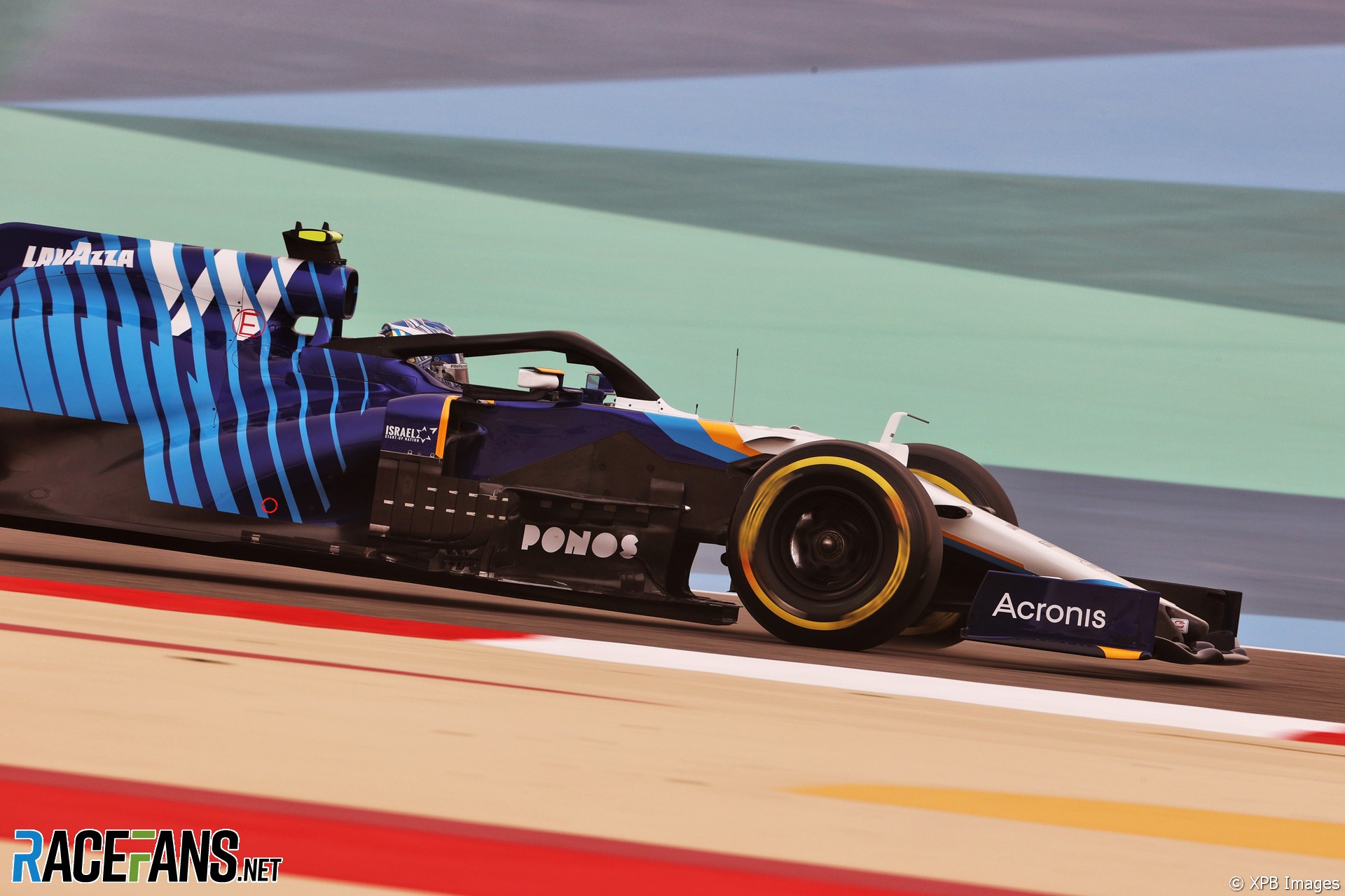
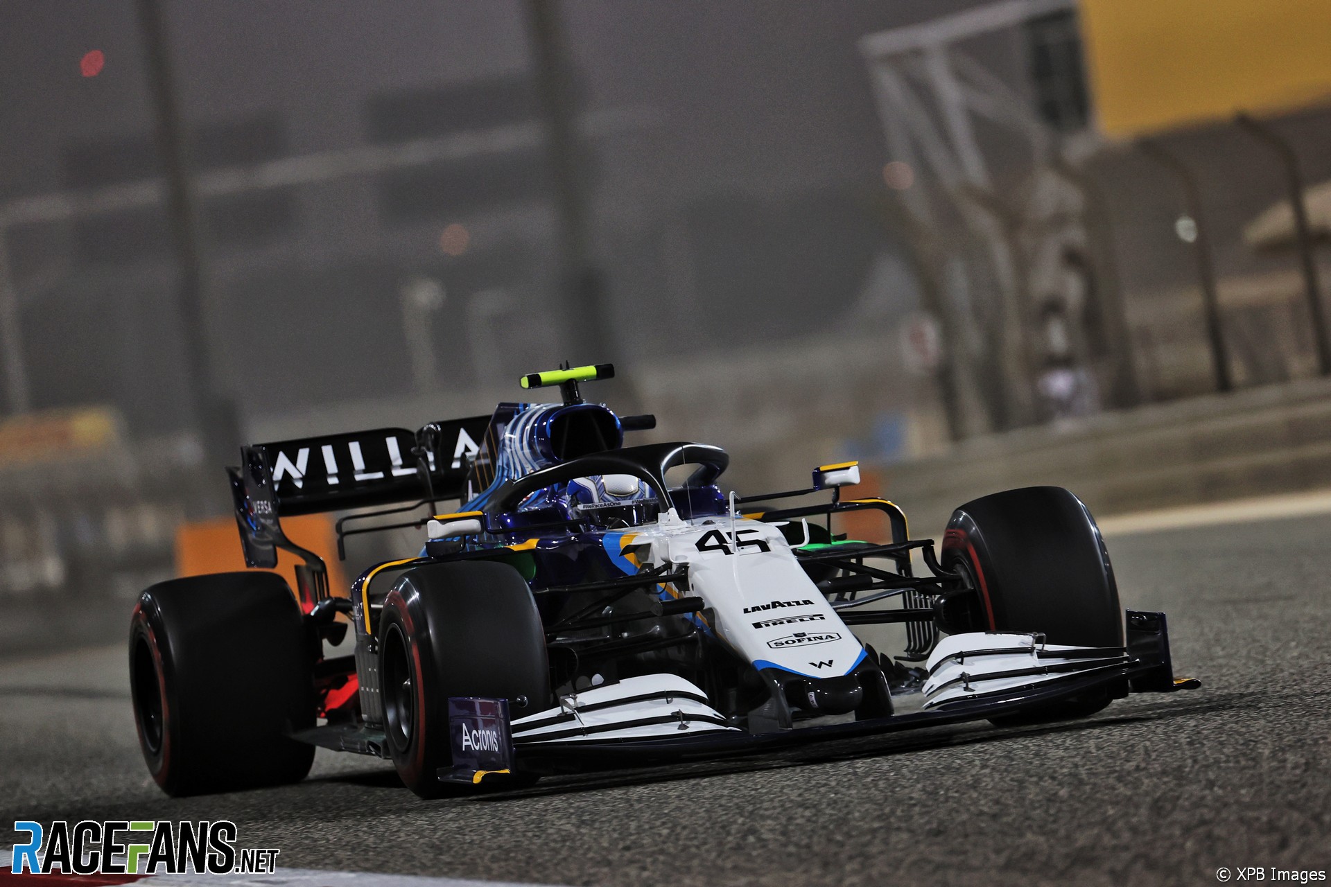
4. Williams - I really like it on track. Let down by the weird black gap at the bottom though. 

5. Aston Martin - Confusing with Merc from a distance, esp in the lights. The pink kind of lets it down up close. 

6. Alfa Romeo - A little messy at the back, but generally nice. 

7. McLaren - Pretty dull, but the blue shade is good. 

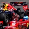
8. Red Bull - Bog standard RBR, nothing terrible but nothing that makes it remarkable. 

9. Mercedes - A complete mess at the back. Looks like a Stoddart era Minardi.  

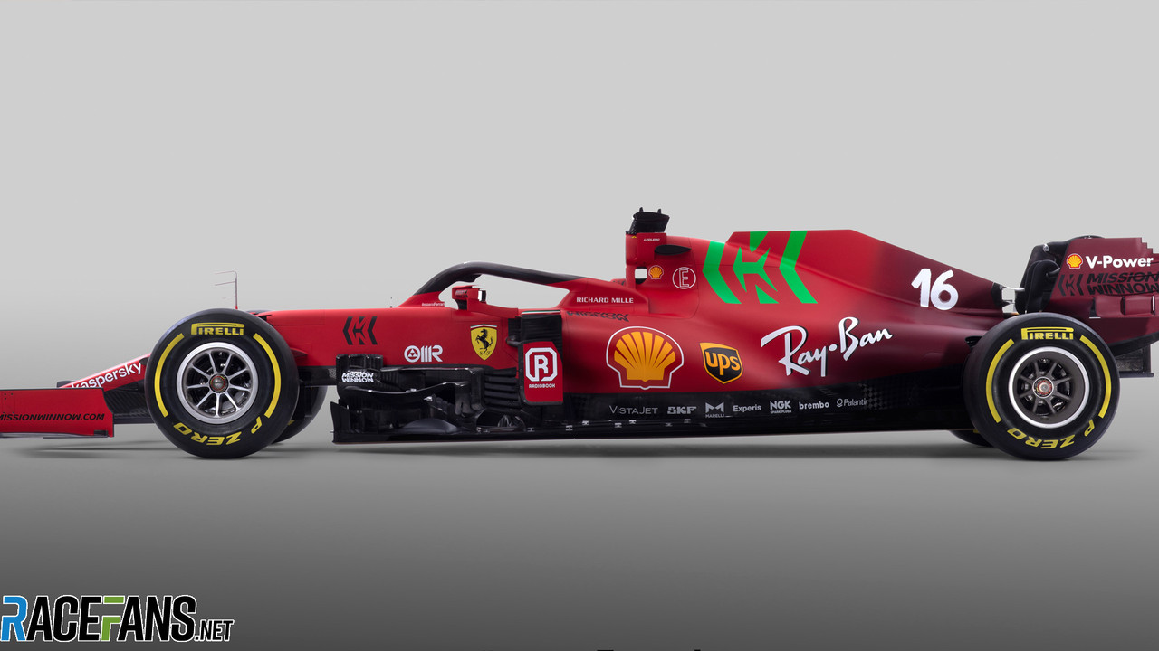
10. Ferrari - I like the idea of the two tones, but the execution is terrible - like an afterthought. Then that green MW... yuck. 


#98 A.Fant

A.Fant
  • Member

  • 985 posts
  • Joined: April 09

Posted 26 March 2021 - 17:17

While I think the Aston is the best looking in pictures, it looks positively dreary on track. Alpine is a similar case, but while I rate it below the Aston in pictures I rate it above the Aston on track.


Voted Mercedes as the best after seeing Free Practice, which seems to be quite opposite to the forum consensus. I agree that the rear of the car isn't great (though better than Ferrari's), but it was hardly noticeable in action shots.


Thinking about it I still have RBR among the top liveries, which is an indictment to the rest since while it's a great livery you've grown tired of it at this point (much like the last years of the Martini Williams and the Vodafone McLaren). Wish they'd move on to a similar but different livery in the vein of Camel Williams -> Rothmans Williams.


While I have no issues with the Russian flags that many seem to have, I rate the Haas livery as the worst on the grid since the 2019 Williams. It just screams low budget.


#99 Ragingjamaican

Ragingjamaican
  • Member

  • 1,001 posts
  • Joined: September 10

Posted 26 March 2021 - 17:24

Only one's notable for me are the Alfa Romeo, Alpine and Aston Martin.


Mercedes - ok

Red Bull - Didn't expect anything different

McLaren - Getting old and this one the worst since they reverted to those colours

Alpha Tauri - Ruined a perfectly good livery, this one just doesn't look good to me at all

Haas - Looks not bad but a cross between USF1 & RussiaF1

Ferrari - It's up there with their 2016 monstrosity

Williams - Puke.


Advertisement

#100 masa90

masa90
  • Member

  • 2,035 posts
  • Joined: November 13

Posted 26 March 2021 - 19:12

Actually most of the liverys look atleast ok on the track tbh.


The Ferrari livery is just odd though. Is there actually reason for the mismatch colors? I know they have history reasons for that darker color, but what in the hell is the reason for that switch? Also it just looks like someone could not colorcode new paintsample. And to top of that, there is that green logo .