Well, the vote is out for you to make.. what is the best F1 livery of 2025?
I've gone for Racing Bulls. Somehow it just strikes me as a great livery. Williams in second and Haas in third.


Best livery of the 2025 F1 class
Started by
Beri
, Feb 19 2025 00:09
87 replies to this topic
Advertisement
#2

OvDrone
-

- 17,842 posts
- Joined: January 13
Member
Posted 19 February 2025 - 00:30
Hp is the new marlboro. It is what it is.
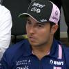
Had to vote for Ferrari as I am too hyped and Maranello-pilled to do otherwise.
#3
STRFerrari4Ever
-

- 15,835 posts
- Joined: December 09
Member
Posted 19 February 2025 - 00:39
Racing Bulls by a landslide.
#4
Laster
-

- 4,573 posts
- Joined: January 10
Member
Posted 19 February 2025 - 00:52
Racing Bulls. Simplicity works.
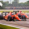
Just to add the one that most disappointed me was Ferrari. Back to the boring white and red but making it worse with that weird white stripe in the middle of the car. They've moved away from the much prettier black and red that I had reallybeen enjoying these last couple years.
Just to add the one that most disappointed me was Ferrari. Back to the boring white and red but making it worse with that weird white stripe in the middle of the car. They've moved away from the much prettier black and red that I had reallybeen enjoying these last couple years.
#5
Nobody
-

- 3,517 posts
- Joined: January 07
Member
Posted 19 February 2025 - 01:37
White Bulls to dominate this and nothing else
#6
Clrnc
-
- 8,405 posts
- Joined: March 15
Member
Posted 19 February 2025 - 02:25
Racing Bulls was fantastic. Absolutely amazing livery
#7
vlado
-

- 6,301 posts
- Joined: September 06
Member
Posted 19 February 2025 - 02:45
HP spending millions to just end up being hated on ..
#8
TecnoRacing
-

- 1,866 posts
- Joined: September 01
Member
Posted 19 February 2025 - 02:49
Agreed the RB/Vcarb is a nice change (oddly though I think their racing suits and team kit look very tacky compared to the car)
(what is this team called anyway? there's still no mention of "Racing Bulls" on their website)
#9
pup
-

- 3,354 posts
- Joined: March 08
Member
Posted 19 February 2025 - 02:53
I voted for McLaren because on a poll without photos what else am I expected to do.
#10
Gravelngrass
-
- 2,249 posts
- Joined: April 21
Member
Posted 19 February 2025 - 03:00
Nothing really outstanding. Voted Racing Bulls just because it’s not bad and somewhat imaginative.
The rest are more or less the same. Mercedes, Red Bull, McLaren, Aston without major changes. Only the Mercedes looks ok but it’s getting old as well as the others.
Alpine and Ferrari are awful. Alpine with that horror pink and now horror blue as well. Ferrari with a white stripe with blue doesn’t work at all. Their worst livery in years.
Williams a missed opportunity. Haas, meh. Sauber a flowvis experiment. As said, corporate logo rules have killed creativity. Too bad. As is becoming the norm, too much hype, not a lot of substance.
#11
maximilian
-

- 8,296 posts
- Joined: February 10
Member
Posted 19 February 2025 - 03:08
Really? The WHITE car is the best?  Too many people seem to have lost their minds on this one.
Overall most liveries were disappointing. Sauber was OK. McLaren not bad, but same same. Mercedes fine, but nothing really new there either. Ferrari ruined by that white monstrosity cutting the car in half. Red Bull yawnnnnn. Alpine was better last year. Williams was a huge disappointment after their test livery actually looked pretty cool - the real one is just plain dull. Aston Martin is fine, but again nothing special - generic solution. Haas is probably the best one, but that's more because the rest suck so much, not because it's particularly good. Racing Bulls is just plain awful.
Edited by maximilian, 19 February 2025 - 03:10.
#12
mclarensmps
-

- 9,308 posts
- Joined: February 02
Member
Posted 19 February 2025 - 03:23
Really it was Racing Bulls, and then Aston Martin just because it's such an aesthetically pleasing colour
#13
SKL
-

- 1,520 posts
- Joined: August 99
Member
Posted 19 February 2025 - 04:08
Thought Racing Bulls looked the best, but if Williams had put that little bit of yellow on the top of the engine cover like they did for a few races last year then it would have been a tie with RB...
Edited by SKL, 19 February 2025 - 04:09.

#15
RedRabbit
-

- 3,933 posts
- Joined: August 12
Member
Posted 19 February 2025 - 06:25
I don't understand why some people even watch F1, and then join a fairly obscure forum of all places just to complain about everything F1.
For the poll, voted Racing Bulls. Well designed, striking livery.
For the poll, voted Racing Bulls. Well designed, striking livery.
#16
Dara
-

- 445 posts
- Joined: March 21
Member
Posted 19 February 2025 - 06:32
No livery really impresses me, so won't vote, but I am glad we've got a slightly more colourful grid this year. A lot less carbon black
#17
Okyo
-

- 3,125 posts
- Joined: March 14
Member
Posted 19 February 2025 - 06:36
Hp is the new marlboro. It is what it is.
Had to vote for Ferrari as I am too hyped and Maranello-pilled to do otherwise.
Same. Mind went blank and before i knew it i've voted red.
#18
lewislorenzo
-

- 5,364 posts
- Joined: March 14
Member
Posted 19 February 2025 - 07:44
Racing Bulls and Merc are nice the rest are meh
#19
Stephane
-

- 5,434 posts
- Joined: February 10
Member
Posted 19 February 2025 - 08:00
always loved the white RB, so Racing Bulls
Advertisement
#20
cyclist
-

- 663 posts
- Joined: March 16
Member
Posted 19 February 2025 - 08:09
Most are either the same as always (Red Bull) or worse than last year (AM)
My rating:
1. Racing Bulls (Clean, simple and effective)
2. Alpine (I like the color scheme, cleaner than last year)
3. Ferrari (The blue is not great, but the white stripe is nice)
4. Williams (Pretty nice colors and clean, but not sure if it will stand out on track)
5. Red Bull (Good livery, just always the same)
6. McLaren (I never liked the liveries of the last seasons and this looks pretty much the same)
7. Sauber (quite nice, stands out)
8. Mercedes (looks the same as last year and was not inspiring)
9. Aston Martin (nice color, but hate the carbon sidepods)
10. Haas (Not bad, just boring)
#21
Anderis
-

- 8,446 posts
- Joined: December 09
Member
Posted 19 February 2025 - 08:17
Man, RB has over 50% of votes in the poll.  How different I'm to everyone else in terms of aesthetic preference. To me, it's one of the least preferable liveries, if not the least pereferable one this year. I've never found liveries where white is the predominant color, appealing.
Or is it that RB's vote count is inflated because of the fact they're the only team with a new concept? Anyway, not my cup of tea.
#22
Frood
-
- 11,678 posts
- Joined: January 14
Member
Posted 19 February 2025 - 08:45
I’m saying it. Alpine.
Not bothered by the RB unlike 80% of F1 social media. It’s just white with some stickers, and the increased Red Bull presence just makes it feel “yep, we’re the B team and we’re not even trying”. Last year’s was much better.
Not bothered by the RB unlike 80% of F1 social media. It’s just white with some stickers, and the increased Red Bull presence just makes it feel “yep, we’re the B team and we’re not even trying”. Last year’s was much better.
Edited by Frood, 19 February 2025 - 08:46.
#23
PayasYouRace
-

- 53,636 posts
- Joined: January 10
Racing Sims Forum Host
Posted 19 February 2025 - 09:03
I’m amazed that despite the group launch, sources showing all 10 in the same place are very hard to come by. Even Autosport’s report of the event only shows four cars.
#24
Psymon
-

- 774 posts
- Joined: May 05
Member
Posted 19 February 2025 - 10:14
I’m amazed that despite the group launch, sources showing all 10 in the same place are very hard to come by. Even Autosport’s report of the event only shows four cars.
From F1's twitter:

https://x.com/F1/sta...3607762/photo/1
#25
MinardiM02
-

- 83 posts
- Joined: October 24
Member
Posted 19 February 2025 - 10:28
A step up
1. Racing bulls
2. Alpine
At least it's something (slightly) different
3. Sauber
4. Williams
Same old boring livery
5. Mercedes
6. Haas
7. Red bull
8. Mclaren
9. Aston Martin
Fugly:
10. Ferrari
#26
NewMrMe
-

- 1,031 posts
- Joined: August 12
Member
Posted 19 February 2025 - 11:03
I voted for Sauber. I liked them last year but I think blending the green and black is an improvement.
#27
PayasYouRace
-
- 53,636 posts
- Joined: January 10
Racing Sims Forum Host
Posted 19 February 2025 - 11:19
Thanks Psymon!
I like what Sauber have done, retaining the colours but much more sympathetic to the shape of the car.
HAAS have a nice variation of their house colours this year.
Most look similar to last year.
Racing Bulls looks like the special Red Bull Honda livery from 2021.
Ferrari dropped the ball with the white stripe.
My vote goes to Sauber.
#28
WilliamsF1Fan
-

- 1,457 posts
- Joined: February 15
Member
Posted 19 February 2025 - 11:27
Voted Williams because, well, obvious reasons.
However the Racing Bulls car is very smart and if I was being entirely fair I'd have voted for that one. I like the simplicity of it but then the details of the blue bulls popping from the area over the rear wheels.
#29
IrvTheSwerve
-
- 6,946 posts
- Joined: July 15
Member
Posted 19 February 2025 - 11:43
Meh...null vote. Honestly nothing stood out and nothing much really changed from last year. I quite like the Alpine with the pink BWT against the blue but nothing worth voting for.
#30
mirrorboy
-

- 125 posts
- Joined: February 13
Member
Posted 19 February 2025 - 12:04
Mercedes for the win. Classy livery.
it's similar to last year's, but that one was already good, and this year's is even better.
PS. Gradient solutions look cheap (Sauber, Williams to some extent).
#31
maximilian
-
- 8,296 posts
- Joined: February 10
Member
Posted 19 February 2025 - 12:23
Man, RB has over 50% of votes in the poll.
Or is it that RB's vote count is inflated because of the fact they're the only team with a new concept? Anyway, not my cup of tea.
You're not alone. I think it's awful. White CAN be done well with the right other color accents, though it always tends to have that "backmarker paint scheme" feel to it. This particular one was not done well, and - to me - those little bulls in the back are rather cheesy and contrived. Makes the whole back end look messy for no reason and obscures the number (then again, they LOVE to obscure the number, don't they?)
Edited by maximilian, 19 February 2025 - 12:32.
#32
Mario5
-

- 369 posts
- Joined: February 10
Member
Posted 19 February 2025 - 12:27
For all those voting for Racing Bulls. Yes, the white looks great since it's completely different. But once you've gotten used to the white, it's going to become very bland looking. If they run the white for a few years then go back to blue, it will be, "Wow, love the new livery!"
#33
Anderis
-
- 8,446 posts
- Joined: December 09
Member
Posted 19 February 2025 - 12:33
You're not alone. I think it's awful. White CAN be done well with the right other color accents, though it always tends to have that "backmarker paint scheme" feel to it. This particular one was not done well.
I don't disagree, I can imagine a relatively nice white livery, but one thing that makes a white livery look especially unappealing is the use of too many secondary colours and this RB has exactly that- I can see black, blue, red, yellow and even traces of green. This always reminds me of a child drawing over a white piece of paper using a lot of different coloured crayons for the sake of it.
#34
danmills
-
- 3,683 posts
- Joined: June 09
Member
Posted 19 February 2025 - 12:40
The HP on the Ferrari is an absolute travesty.
It would have looked cleaner white on red and could have gotten a bigger logo and presence from it without the garish blue.
Williams colour matched it.
Ferrari with their prowess seemingly haven't.
#35
noikeee
-

- 24,376 posts
- Joined: February 06
Member
Posted 19 February 2025 - 12:44
For all those voting for Racing Bulls. Yes, the white looks great since it's completely different. But once you've gotten used to the white, it's going to become very bland looking. If they run the white for a few years then go back to blue, it will be, "Wow, love the new livery!"
And what's wrong with that? Can't give a little meaningless internet award to the only team who decided to a be a bit more creative this year?
For the record I still think the Red Bull, Aston and Merc paint schemes look good.
#36
LolaB0860
-

- 2,931 posts
- Joined: March 22
Member
Posted 19 February 2025 - 12:47
They're all fine whatever. Nothing great nothing terrible. I just wish they were more distinctive from each other.
#37
mirrorboy
-
- 125 posts
- Joined: February 13
Member
Posted 19 February 2025 - 12:51
How is none yellow?
Those Jordans looked amazing + you could tell them apart from far away.
#38
LolaB0860
-
- 2,931 posts
- Joined: March 22
Member
Posted 19 February 2025 - 12:53
How is none yellow?
Those Jordans looked amazing + you could tell them apart from far away.
Yellow Jordan and Black Minardi at the back of the grid was distinctive. Now it all mends together in blandness
I mean I get why "Alpine" is not yellow Renault of 2010 or whatever, but you'd still wish for more distinction
#39
Rob G
-

- 11,652 posts
- Joined: April 01
Member
Posted 19 February 2025 - 13:06
The Racing Bulls livery looks nice, but adding a little blue around the Red Bull logos would really make the yellow pop. Right now it sort of fades into the white.
I'm baffled by the Alpine. It's great that it's not predominantly black, but why is the BWT logo on the sidepod pink on a blue background, and why is the Alpine logo white on pink? If they're going to keep it that way, the BWT sidepod logo needs a really thick outline to make it stand out against the blue. That pencil-thin black stroke isn't working.
I voted for Williams, but my "most-improved" award goes to Sauber. I always hated those squarish green lines on last year's car.
Advertisement
#40
messy
-
- 8,306 posts
- Joined: October 15
Member
Posted 19 February 2025 - 13:14
Every single year, a livery gains at least two bonus marks just for being different, so that puts Racing Bulls and Alpine up top by default - Sauber is improved too but that green is still just a bit too radioactive for me - I liked the special livery they ran towards the end of '24 where it was a lighter, less luminous shade much better. The Racing Bull's livery though is legit brilliant, it just looks soooo good.
#41
ATM
-
- 1,418 posts
- Joined: November 13
Member
Posted 19 February 2025 - 13:17
If there's one positive thing, is that everybody has a different livery; confusions on the track will be minimal. About 8 years ago we had, I think, 3 grey-white teams (Haas, Sauber and I forgot the 3rd one). Man, that was a nightmare.
#42
Sabre1977
-
- 939 posts
- Joined: October 08
Member
Posted 19 February 2025 - 13:24
Voted Williams because, well, obvious reasons.
However the Racing Bulls car is very smart and if I was being entirely fair I'd have voted for that one. I like the simplicity of it but then the details of the blue bulls popping from the area over the rear wheels.
Don´t you think launch livery is better than the one showed yesterday? For me is miles better.

#43
Stoffel
-

- 242 posts
- Joined: May 24
Member
Posted 19 February 2025 - 13:32
I will use this topic to share my dislike for all the matte cars of the last few years. To me it just looks cheap, much prefer the properly painted shiny cars of the past over the vinyl wrapped monstrosities of today.
#44
maximilian
-
- 8,296 posts
- Joined: February 10
Member
Posted 19 February 2025 - 14:18
Don´t you think launch livery is better than the one showed yesterday? For me is miles better.
Correct, this one is MUCH MUCH better. Shame.
#45
maximilian
-
- 8,296 posts
- Joined: February 10
Member
Posted 19 February 2025 - 14:20
I don't disagree, I can imagine a relatively nice white livery, but one thing that makes a white livery look especially unappealing is the use of too many secondary colours and this RB has exactly that- I can see black, blue, red, yellow and even traces of green. This always reminds me of a child drawing over a white piece of paper using a lot of different coloured crayons for the sake of it.
Precisely! There is no overall "color scheme" - they're more like... aw jeez, we have different sponsors who all want different colors, let's just make the car white, and stick those logos on there.
#46
Stephane
-
- 5,434 posts
- Joined: February 10
Member
Posted 19 February 2025 - 14:33
I will use this topic to share my dislike for all the matte cars of the last few years. To me it just looks cheap, much prefer the properly painted shiny cars of the past over the vinyl wrapped monstrosities of today.
That's something that surprised me a lot when attending my first race in '92. How shiny the cars were. You could'nt see that on tv at the time with analog and ****.
I am with you on this.
#47
amerikalei
-
- 404 posts
- Joined: June 22
Member
Posted 19 February 2025 - 14:48
Oddly after all the hoopla, two main sites I use (autosport, racer) didn't actually have either a story or individual stories that show the actual liveries... Thanks to racefans.net for making what appears to be the best presentation of the liveries, by team.
As for my opinion on the best, they're all far too cluttered. Course I first loved the sport when multi-level marketing was embodied in free sponsor stickers handed out to fans at actual, affordable race meetings. When working on projects, my well decorated tool box and I often exchange glances, remembering those days.
#48
TecnoRacing
-
- 1,866 posts
- Joined: September 01
Member
Posted 19 February 2025 - 14:49
Don´t you think launch livery is better than the one showed yesterday? For me is miles better.
That's looks terrible imo.  Unattractive, confused, and tension-filled when stationary, and a muddled mess of blue-black at speed.
#49
JL14
-

- 1,362 posts
- Joined: October 22
Member
Posted 19 February 2025 - 14:50
The Racing Bulls' white livery would have looked quite nice if they hadn't added the yellow to it.
#50
WilliamsF1Fan
-
- 1,457 posts
- Joined: February 15
Member
Posted 19 February 2025 - 14:56
Don´t you think launch livery is better than the one showed yesterday? For me is miles better.
I do like that livery but it is very much an Atlassian launch livery, look how many of their ‘A’ logos are incorporated into the camo livery! Also on the final livery I prefer that the sponsors don’t all have a black background. A reworked version of that livery could have looked great though!


