Edited by Brandz07, 10 April 2012 - 13:20.

do you like / dislike the mclaren logo?
Started by
glorius&victorius
, Apr 09 2012 18:21
71 replies to this topic
#51

Brandz07
-

- 3,500 posts
- Joined: February 10
Member
Posted 10 April 2012 - 13:17
It's fine, nothing special but it's nice and simple. Logo's should never be too complicated and too me that logo shouts McLaren. It's not wild or anything too over the top because that's not what the brand is, it's about class, cleanness and perfection. A logo should represent the brand as much as possible and it does that.
Advertisement
#52
Ross Stonefeld
-

- 70,106 posts
- Joined: August 99
Member
Posted 10 April 2012 - 13:24
PayasYouRace, on Apr 10 2012, 07:45, said:
They obviously knew what they were talking about. I liked that livery
Edit: I'm basically teasing you there Ross. I can certainly understand that company logo guardians would be infuriating to work with. But I do genuinely like that car.

It's the striping that offends me


#53
CaptainJackSparrow
-

- 2,368 posts
- Joined: July 09
Member
Posted 10 April 2012 - 13:24
As far as car logos go, it's not really a classic. I mean it's not exactly Merc or Audi when it comes to elegance in design.
#54
Brandz07
-
- 3,500 posts
- Joined: February 10
Member
Posted 10 April 2012 - 13:28
CaptainJackSparrow, on Apr 10 2012, 14:24, said:
As far as car logos go, it's not really a classic. I mean it's not exactly Merc or Audi when it comes to elegance in design.
But if you saw it day in day out on the road like the Merc or Audi you'd probably think differently

Edited by Brandz07, 10 April 2012 - 13:28.
#55
grandmastashi
-

- 275 posts
- Joined: October 09
Member
Posted 10 April 2012 - 13:41
f1fan1998, on Apr 10 2012, 13:22, said:
Sara Lamden?
No, wrong sex!
#56
Red17
-

- 3,921 posts
- Joined: April 11
Member
Posted 10 April 2012 - 13:48
For me the logo says little because im too used to the McLaren lettering they have used over the years. I suspect that was the case for many people as well.
The «Bruce Kiwi Badge» is too complicated and for all purposes McLaren has been a UK operation for a long time. Tho it feels sad that McLaren seems to have forgotten that there were more than just british sailing the boat.
If Maca starts using this logo more often maybe it can grow, but right now it's still a bit of an underdog.
#57
Markn93
-

- 4,621 posts
- Joined: February 11
Member
Posted 10 April 2012 - 13:56
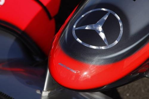
If it's deliberately suposed to be like the end of the nosecone http://t1.gstatic.co...uce4VVRdd-7SpUf I think it's pretty cool, in fact either way I like it just if it's based on the nosecone tip then it adds a bit of racing pedigree.
Edit: Another example, http://www.diariomot...Mercedes_F1.jpg
Edit: Another example, http://www.diariomot...Mercedes_F1.jpg
Edited by Markn93, 10 April 2012 - 13:58.
#58
teejay
-

- 6,274 posts
- Joined: May 09
Member
Posted 10 April 2012 - 15:13
CaptainJackSparrow, on Apr 10 2012, 21:24, said:
As far as car logos go, it's not really a classic. I mean it's not exactly Merc or Audi when it comes to elegance in design.
Interlocking circles are elegant?
Ross, their design sucked. Hated it from day 1.
I like the McLaren logo, but I am a fan so wouldnt expect me to hate it.
#59
f1fan1998
-

- 293 posts
- Joined: October 10
Member
Posted 10 April 2012 - 17:56
grandmastashi, on Apr 10 2012, 14:41, said:
No, wrong sex!
That's what she said!
 I'll leave you to ponder that!
Advertisement
#60
August
-

- 3,310 posts
- Joined: March 10
Member
Posted 10 April 2012 - 19:33
Zava, on Apr 10 2012, 10:55, said:

Those packs show that McLaren logo isn't enough distinctive. Actually it's just derived from the Marlboro years' chevron. It lacks the distinctiveness of e.g. Merc and Audi logos. Kiwi logo would be nice (and distinctive), yet Macca seem to ignore their New Zealand roots, so that won't happen.
#61
4MEN
-

- 1,556 posts
- Joined: June 03
Member
Posted 10 April 2012 - 20:28
PayasYouRace, on Apr 9 2012, 21:45, said:
That's a pretty recent one but they've always had some sort of W based logo.
I prefer the (very) old one

on topic, i don't really like the McLaren logo because it's a bit like the Nike one: it's supposed to be instantly recognizable. Nike works, McLaren ain't.
off topic: actual cars could easily look like that

Edited by 4MEN, 10 April 2012 - 20:32.
#62
PretentiousBread
-

- 2,923 posts
- Joined: February 10
Member
Posted 10 April 2012 - 21:29
SirRacer, on Apr 10 2012, 01:13, said:
The logo itself alone, for me, reflects 3 principal things:
- dynamism
- modernity
- aggressiveness
If McLaren, the company, wants to just reflect those 3 things, the logo is perfectly fine.
Jeese, I thought people only spouted that type of corporate bollox in work.
#63
Ross Stonefeld
-
- 70,106 posts
- Joined: August 99
Member
Posted 10 April 2012 - 21:33
4MEN, on Apr 10 2012, 15:28, said:
on topic, i don't really like the McLaren logo because it's a bit like the Nike one: it's supposed to be instantly recognizable. Nike works, McLaren ain't.
Think about how long Nike have been promoting their logo, and how much they've spent on it.
#64
RoutariEnjinu
-

- 2,442 posts
- Joined: March 09
Member
Posted 10 April 2012 - 21:35
evo, on Apr 10 2012, 04:16, said:
mazda themselves have gone through a few changes - fairly big changes at that. only the word 'Mazda' hadn't changed over time...
http://www.mazda.com...pert/mazda-logo
Not keen on any of them. Mine is a '96 with a '99 front end, so it has the current badge on the front, and an Efini one on the back
#65
RoutariEnjinu
-
- 2,442 posts
- Joined: March 09
Member
Posted 10 April 2012 - 21:40
grandmastashi, on Apr 10 2012, 12:52, said:
adding an edge of carbon fibre to reflect the cutting edge engineering RML do etc, but they weren't accepted.
I can't stand carbon fibre texture on things. Looks cheap to me. Reminds me of all manner of Halfords merchandise including stickers to go around a fuel filler flap.
#66
Dolph
-

- 12,584 posts
- Joined: March 01
Member
Posted 10 April 2012 - 22:40
PayasYouRace, on Apr 10 2012, 15:45, said:
They obviously knew what they were talking about. I liked that livery
Edit: I'm basically teasing you there Ross. I can certainly understand that company logo guardians would be infuriating to work with. But I do genuinely like that car.
I also thought the car looked extremely nice. I don't know what designs Ross was in charge of, though.
#67
Brandz07
-
- 3,500 posts
- Joined: February 10
Member
Posted 16 April 2012 - 20:10
Markn93, on Apr 10 2012, 14:56, said:
If it's deliberately suposed to be like the end of the nosecone http://t1.gstatic.co...uce4VVRdd-7SpUf I think it's pretty cool, in fact either way I like it just if it's based on the nosecone tip then it adds a bit of racing pedigree.
Edit: Another example, http://www.diariomot...Mercedes_F1.jpg
I don't think it is, it was a similar shape before that livery and it's just been modernized and has curves.
Edited by Brandz07, 16 April 2012 - 20:12.
#68
Brother Fox
-

- 6,110 posts
- Joined: January 01
Member
Posted 17 April 2012 - 11:59
It's a stylised kiwi, in orange (or near enough), that is slick and quite conservative and somehow this DOESN'T represent McLaren? 
Also, how can anyone mention the Honda or Toyota badges as good examples? And if there wasnt the history and legend behind the Ferrari badge it would be considered laughable by todays trends.
Also, how can anyone mention the Honda or Toyota badges as good examples? And if there wasnt the history and legend behind the Ferrari badge it would be considered laughable by todays trends.
#69
mclarensmps
-

- 9,312 posts
- Joined: February 02
Member
Posted 17 April 2012 - 13:22
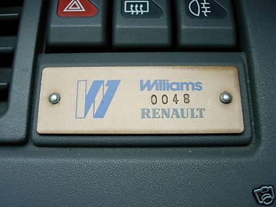
I think the McLaren logo is perfectly fine. It's clean (elegant) and modern. Ferrari's logo is recognizable because it's been around for over 60 years. You guys compare the Williams logo to the McLaren logo, however, outside of F1, nobody would recognise a Williams logo either (a bit unfair, considering that Williams don't make road cars). The thing with McLaren is that, the cars that the logos are put on are instantly recognizable as McLarens. The only car that is an exception is the McMerc SLR, and on that one, the logo actually has the words McLaren before it.
#70
engel
-

- 5,037 posts
- Joined: November 08
Member
Posted 17 April 2012 - 13:30
mclarensmps, on Apr 17 2012, 14:22, said:
I think the McLaren logo is perfectly fine. It's clean (elegant) and modern. Ferrari's logo is recognizable because it's been around for over 60 years. You guys compare the Williams logo to the McLaren logo, however, outside of F1, nobody would recognise a Williams logo either (a bit unfair, considering that Williams don't make road cars). The thing with McLaren is that, the cars that the logos are put on are instantly recognizable as McLarens. The only car that is an exception is the McMerc SLR, and on that one, the logo actually has the words McLaren before it.
or the old McLaren F1 road car (which also has the word McLaren on the bonnet and side panels)
PS there was a few Williams versions of the Clio in the 90s, can't say I recall which Williams badge they used
Edit: they used the old 'gold' Williams badge
Edited by engel, 17 April 2012 - 13:35.
#71
loki0420
-

- 1,071 posts
- Joined: May 11
Member
Posted 17 April 2012 - 14:15
It is for sure the most beautiful logo you could possibly come up with. There's no question about it. 
but of course more complicated than in head post.
but of course more complicated than in head post.
#72
SirRacer
-

- 1,162 posts
- Joined: February 12
Member
Posted 17 April 2012 - 14:21
PretentiousBread, on Apr 10 2012, 23:29, said:
Why is it bollocks?Jeese, I thought people only spouted that type of corporate bollox in work.


