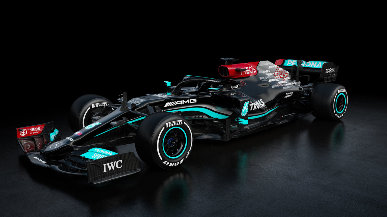
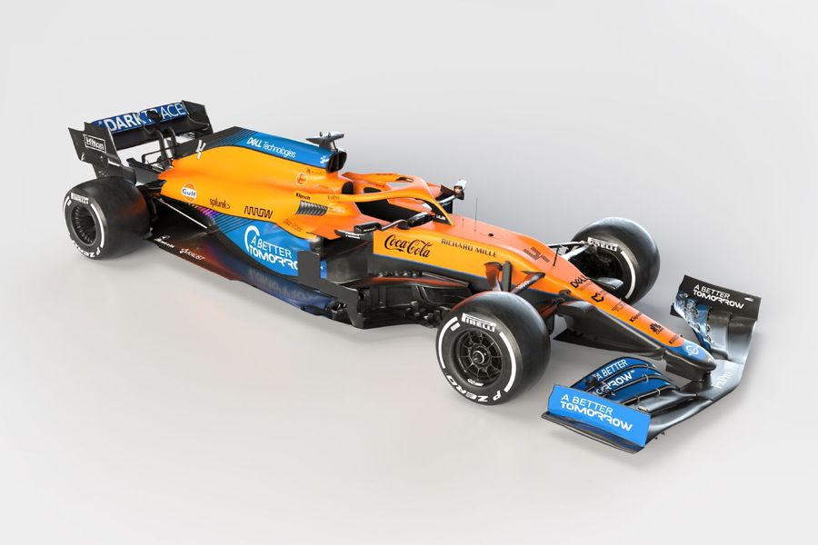
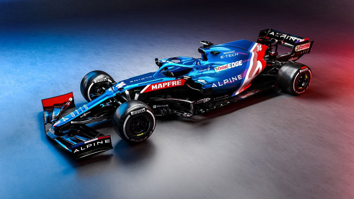
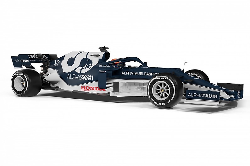
A couple of caveats before I start. First off it's difficult to fully appreciate anything, cars aircraft, boats, women you name it., when viewing it on a flat screen, nothing can compare to standing next to what you are viewing to completely appreciate its beauty. While the appearance of the cars may improve once we see them in action on the track and from different angles it is possible that my opinion of the schemes/liveries may change. Let me hasten to add that my opinion of the liveries in no way reflects how the teams will perform in pursuit of the WCC.
I shall use a grading system from 0 to 10, 10 being the highest score.
I agree with one of the above posters in that I feel this years liveries on the cars are very poor and considering the entire grid I scored it a disappointing 4.4/10.
Individual liveries.
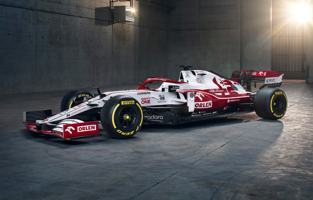
At the top I put the Alfa, a bright eye catching scheme reflecting positive thoughts of clear summer days with an unencumbered future ahead.. 8/10.
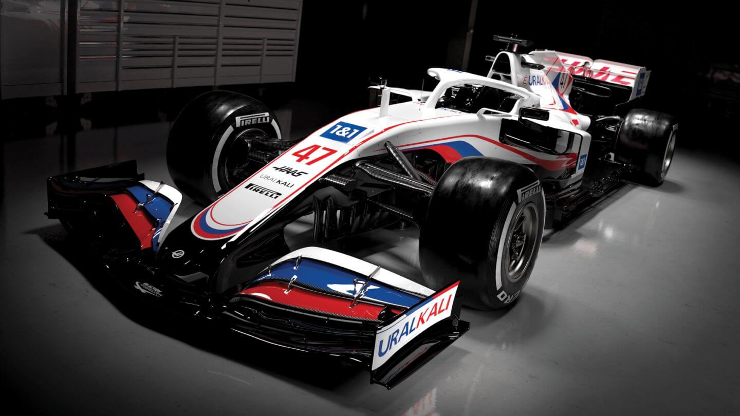
Next is the Haas, another bright scheme which slightly reminds me of the French or Russian flag. 7/10.
Next I would lump the McLaren and Alpine together. They just seem to miss it somehow, the McLaren appears to be chasing their old glory days and the Alpine gives the impression of trying too hard to make an impression. 6/10.
Ferrari is next and what can you say about Ferrari other that livery wise they only seem to vary in the shade of red they apply, I prefer the red Ferraris of the 1960's (F1 and Sports Cars) which I think of as "Monza Red", back then they were breath takingly beautiful, vibrant and said "We are the best" Now they appear passe and, I hate to say it "boring". 5/10. .
Red Bull, they have never changed their F1 livery and are just a moving advertisement which is probably what the ownership wants to accomplish but for me it puts me in the mindset of being in a sports bar. 4/10.
The Williams looks as if it was created by the same child who designed the artwork on George Russell's helmet (the year before last was it?) 3/10.
Alpha Tauri, completely uninspiring and boring. 2/10.
Aston Martin seems to appear as an inside out version of the Mercedes with the only redeeming quality being more green than black. 1/10.
Mercedes, well what can I say, it lacks beauty and conjures up a vision of deceit and decadence.
