As I try to do every year - how are the juniors doing with their designs? Here's the F2 lot for this year. Spoiler: Some are fine. Most are pretty awful.


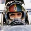
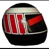
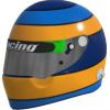
You have to feel sorry for Christian Mansell, who just so happens to not be related to a guy who had one of the most iconic helmets in F1 history, and has to come up with his own design. Tough job.. Montoya's is just his dad's, and that's ok, I guess. To me it felt like Browning is just throwing some early Kimi (the 1st) vibes? Esterson's is simple enough, and although personally I don't like the design, if someone came up to me and asked me to draw his helmet from memory, I think I could maybe nail it? But at this day and age I'm not really how relevant that still is... I'd almost say that there is an interesting idea in Martin's lid. A minimalist version of that could actually be something I haven't seen before. Maybe I'll come up with one and send it to him.


:no_upscale():strip_icc():strip_exif()/f/image/ycFMiE0x00Dit5cs3kBY25HC.jpg?f=user_large)