I just killed half an hour reading about this — out of part interest and part disbelief.
Far more of what I read disputed the theory or phenomenon in terms of colors actually "changing" from lighting over (short) distances. Yet some compared it to distant colors getting bluer, such as in nature, and I don't believe that correlation for a minute. Now, comparing a small model in hand compared to a jumbo jet a mile away, I can believe it for the great distance "screening back" the color's impact, and already a slight "blueing" of all colors as some colors scatter differently than others over great distances.
Other comments I read were about the scale effect method, adding black or white to a color to offset the "change." I can unequivocally say that color isn't that simple, whatever color is dominant in a mix is the only one to properly alter in such a case as this.
Now I want to test it. But I doubt I ever will, in practical terms. My brief read seemed to show that the pro modelers neither believed, nor used it... but the metalflake size reference above is clearly dead on and understandable! But not one to dispute a phenomenon I've not experienced, now I want to see this theory for myself.
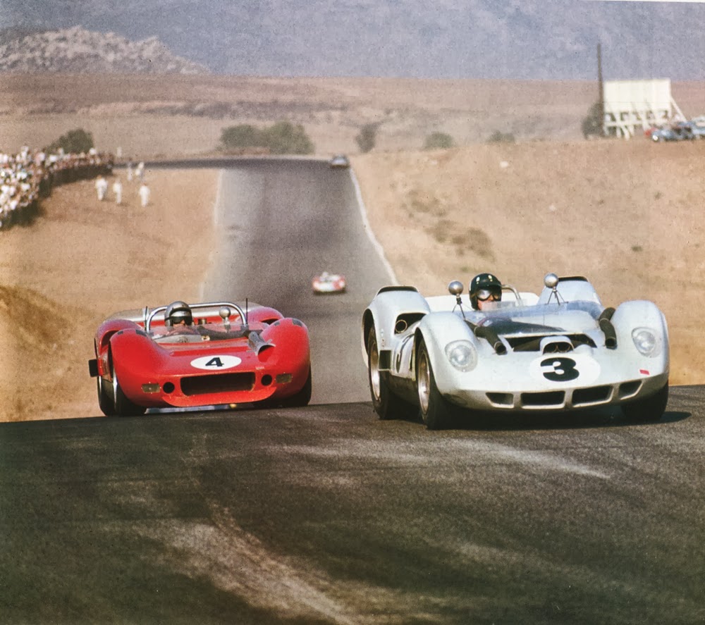
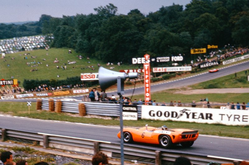
Anyone got a M8F model and the real thing to compare? 
Color plays tricks, and I suspect this is one. One thing I do know is colors can appear to an untrained eye as more intense the closer they are to the eye, size not part of that equation but only being fooled. I'm now curious if I could be, after a lifetime of working with color.
One trick is viewing the same color against white vs. black. To my (long-trained) eye they look the same, when I was starting out definitely not. Take a dark color, for instance, it appears ever-darker the lighter the background is compared to when it's on white, and vice-versa. On my sign work and especially on my pinstriping, it was common for me to mix a hair of the background color in the paint. Even with a gray paint, say, a little blue in it on a blue car for example and the color just "looked right." I did the same with white paints, and to some degree with all colors. If I sought "color contrast," I did the exact opposite.
I am still half-tempted to carry my paint kit and seek out race cars to do as original, but honestly I'm unconvinced the average race car owner gives a damn anymore. I'd do the lettering patterns in Illustrator to hand-paint everything, then output the same art on vinyl so the customer has backup once I leave the job site.
But I digress........ 


